
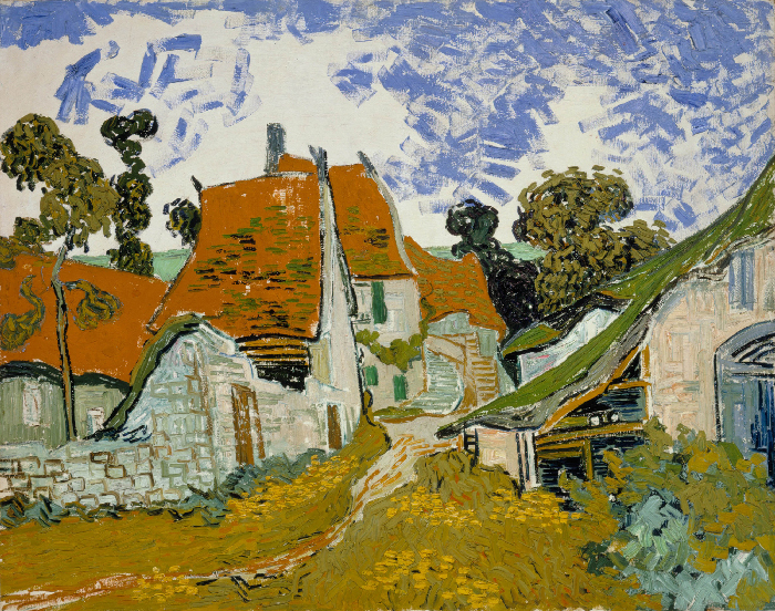
Last week, I shared this gallery of some of my favorite paintings by Paul Cézanne. Let’s take a closer look at one of those paintings to see what exactly is happening behind the scenes. Here’s View of Auvers-sur-Oise—La Barrière.

(Click here to see a high-resolution photo of the painting.)
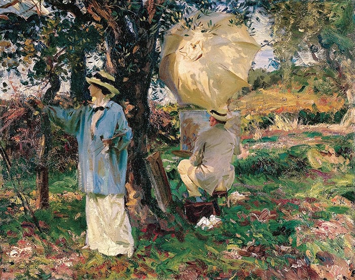
I’ll walk you through the entire process using one of my recent paintings. You’ll see how I go from idea all the way through to reflecting on the finished painting.

A Familiar Subject
The painting conveys Auvers-sur-Oise, a tiny village or commune on the outskirts of Paris, France. There’s a lot of great art history in this area. It seems artists were drawn to its picturesque landscape and light.
Vincent van Gogh lived there from May 1890 until his death in July 1890. He created around 70 paintings during this time.
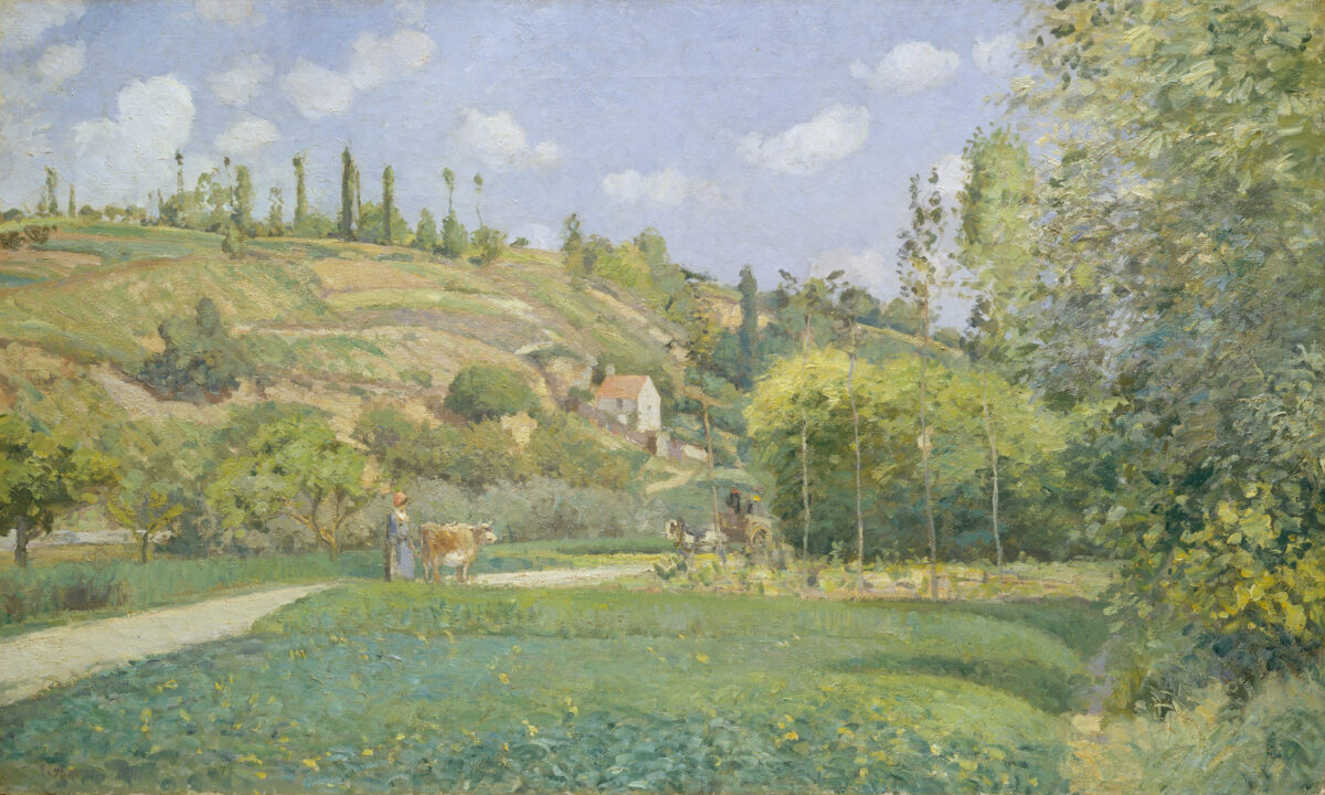
Camille Pissarro often visited and painted there. For a time, he lived in a neighboring town, Pontoise.
Another name that came up frequently in my research is Dr. Paul Gachet, who lived and operated a medical practice in Auvers-sur-Oise. He’s famous for treating van Gogh, but he was also an amateur artist, collector, and keen supporter of Impressionism. He brushed shoulders with Cézanne and many other artists such as Pissarro, Pierre-Auguste Renoir, Édouard Manet, and Norbert Goeneutte.
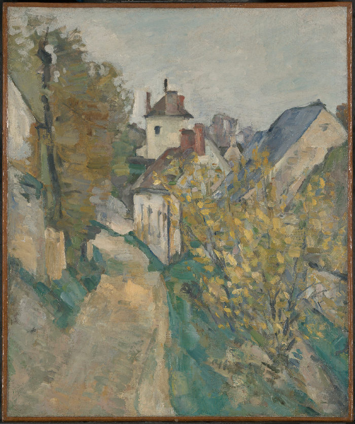
It’s interesting to see how different artists interpreted the same area. It showcases each artist’s style and unique perspective of the world. That’s what art is all about really!
Value Structure (Lights and Darks)
Here’s a grayscale of the painting to give you a clear look at the value structure (the arrangement of lights and darks):

There are a few areas where the value range is compressed. That is, Cézanne didn’t paint with a full range of values from pure white to pure black; rather, he made the lights a bit darker and the darks a bit lighter in the painting. Notice how the land and trees are roughly the same value, apart from a few dark accents and highlights. The same goes for the sky, which is a touch lighter. This is a form of simplification. It makes the painting easier to read by reducing the visual noise.
The downside of simplifying the value range and structure like this is that it makes value contrast less of a feature. Cézanne had to instead rely on other elements like hue, saturation, and brushwork to inject life into the painting.
Around the middle is the focal point—a cluster of buildings represented by sharp, dark accents and highlights. This value contrast draws our attention and gives a sense of life and activity.
A few dark accents represent trees at the top of the hill. This helps separate the sky and land and ensures they don’t melt into one vague shape.
The downside of simplifying the value structure like this is that it makes value contrast less of a feature. You can see this in the notan below. Notan being the most basic, abstract design of lights and darks. As you can see, the notan of this painting is weak and scattered due to the simplified value structure. A strong notan would typically have more distinct groups of lights and darks and you would often be able to identify the subject from the notan alone. Instead of relying on value contrast, Cézanne had to utilize other elements like hue, saturation, and brushwork to inject life into the painting.

Framing to Contain Our Attention
The painting features strong framing around the focal point (the cluster of buildings). The trees frame the sides and the fence frames the bottom. This contains our attention and stops our eyes from wandering out of the painting.
The key to effective framing in a painting is to make it look natural. You don’t want the viewer to feel trapped in the painting; just politely nudged. Draw on the objects and elements already in the scene to frame the focal point and make sure they complement the rest of the painting. In this case, the trees and the fence at the bottom look like part of the painting; they just also happen to help frame the focal point.

Brushwork
The brushwork is typical Cézanne, with distinct, blocky strokes and simplified detail. But he was more refined than usual. Perhaps that’s why I enjoy this painting more than many of his others.
One thing to note is how he used this loose, impressionistic brushwork to convey the buildings and the fence at the bottom. The buildings and the fence appear true to their nature (rigid and geometric) but also consistent with the overall style of the painting. This is not easy to do and it’s a common pitfall I see with beginner artists. There must be a careful tradeoff between conveying the true nature of each object in your painting and retaining a consistent style and a sense of coherency.
Here are some closeups to give you a better look:


Look at All the Different Greens!
My final observation is Cézanne’s use of color variance to convey nature, particularly with the greens. Look how the greens get lighter, darker, warmer, cooler, richer, and duller. This adds so much depth and complexity to the painting and it wouldn’t have been too laborsome for Cézanne.
Static or flat color is one of the most common areas for improvement in the landscape paintings I come across. If you look closely at nature, at grass or the leaves on a tree or the rippling water in a pond, you’ll see infinite color variations. Your job is to capture this without getting lost in the detail. If you ever need inspiration, study the work of Cézanne or other Impressionists. They were masters of color and simplification.

Thanks for Reading!
I appreciate you taking the time to read this post. Feel free to share with friends. Let me know your thoughts in the comments.
Happy painting!
Dan Scott

Draw Paint Academy


I avoid green —use it sparingly —I live in dry part of Central Africa–
green is ok for Europe —wet country —-not for dry arid African wildlife area such as Tsavo–green does no feature much —red soil –is prevalent !–60 years with oil on canvas —
Thanku Dan, I am a novice painter, recently retired and am loving the information you share – it’s invaluable! I so appreciated your study of Cezanne as I want to paint in the impressionist style. Thanks again. Kind wishes Liz 🤗
Your insights, expertise, and willingness to share and teach are so greatly appreciated. Thank you! I think I’m beginning to ‘get it’, even when I can’t put it into words. Last week I struggled with a (watercolor) landscape painting. To me it looked dead, dull, flat. My local teacher thought it was fine, so she was no help. I disagreed and it nagged me to the point I decided to experiment. If I screwed it up worse, I’d try again.
I went to town, adding dibs and dabs of additional color and texture to the ground. It transformed the entire piece.
You put it this way, “Static or flat color is one of the most common areas for improvement in the landscape paintings I come across. If you look closely at nature, at grass or the leaves on a tree or the rippling water in a pond, you’ll see infinite color variations.”
Had you seen my first attempt, that’s exactly what you would have said. That was the exact problem! You put words to what I struggled over. Valuable Lesson learned! Thank you.
Agree, the close ups are fascinating. I’m trying to understand how impressionists put a painting like this together – the brushwork has so much urgency it looks like it was painted on the spot in a short period of time. But when you look at the close ups, there’s a lot of overpainting and scumbling, so presumably it was allowed to dry between takes. I’d like to know more about these techniques and how you plan them into a painting from the start.
Lovely painting and one I have not seen before – think it’s now one of my favourites! Thank you.
I really enjoyed seeing close up photos of this painting and your comments were very educational. Thanks for sharing with this self taught artist.
Thanks a lot for sharing the in-dept analysis. It truly helps to further understand key aspects of landscape paining. Especially the comments about the green variation with simplicity and the use of a similar style while keeping the true nature of the objects in mind is very helpful and something I will definitely use in my paintings and when looking at impressionists paintings to learn.
Thank you, Dan. This is truly a wonderful lesson. Opening up a new interest in Cezanne
for me. Recently I started a painting of the village at Mohegan Is. In Maine. Now I plan to
go back and not to worry so much about the exact strokes of each building and roof top,
but enjoy painting this scene, as Cezanne did.
Thank you for taking the time to analyze this painting, Dan. It’s so easy to forget all the elements that go into a painting like this. I am just wrapping up an eye-opening course on Dynamic Values in Watercolor and it has really impressed the importance of identifying the light and dark values in your subject. And your analysis confirms that.
I was fortunate to spend a day in Auvers-sur-Oise on a 12-day Seine River cruise and we went to many of the sites that Van Gogh painted. The fascinating part is that at each site, Van Gogh’s painting is posted as a large sign, so you can compare the live subject to his painting.
Here is a link to a photo album of my trip that includes photos of these sites on Flickr:
https://www.flickr.com/photos/39384780@N07/5088918808/in/album-72157625180246600/
We went to the actual wheat field where Van Gogh painted his famous “Wheatfield With Crows”, in Auvers Su Oise. That was a thrill for me because I had studied that painting in an Art History class. We stood on the very spot where he set up his stool and painted the wheat field! Throughout the town, signs are posted at each site where he painted, with an image of his painting of that scene and information about his interpretation of that scene. The Town Hall, the church, the wheat field. Fascinating!
Patricia,
Thanks for sharing! Your photo album is beautiful and oh, what an amazing trip. I probably would never have wanted to leave if I was there. Like being in a dream, right? I’ve not been to Auvers Su Oise, but I have been to Venice and felt that way when I saw all the artists plein air painting. I wanted to join them – and I still want to go back all these years later.
Am an old man now, been always love & admired the Impressionists. Many thanks
I love your analysis of the composition and color use. It very instructional for a novice like me. Thanks much. Anita
I am 95 years old and have been been painting and exhibiting since I was 25 . Van Gough has always been my favorite artist. I can’t thank you enough for sending me this wonderful, informative material about other artists in the same time period.
Best wishes, ❤️Elaine
You have a great eye for explaining
Thank you very much. I decided I’m going to challenge myself to mix as many different colors of greens as possible and then use them to make my dull painting as interesting as possible.
I have not heard of a Nolan before. That’s a valuable tool.
What a great experiment, Anita!!!! I would love to see all the greens you make!!! Please let us all know what happens!!! I have just read how the late American artist Richard Schmid suggested students make their own color charts doing this attempt to create as many colors as possible. Thanks for your passion for Green!! What a prolific color!!! Jamie
This is a fascinating study, thank you. I painted in this little town last August, I painted the field where Van Gogh did his last painting, visited his grave and the room where he stayed, I don’t know where he put those 70 plus paintings as it was tiny and the oil paint would have overwhelmed him! It was wonderful to see!
Funny how a seemingly simple painting conveys the genius within the artist; likewise the genius of the teacher to help the student “see” it.
Thank you!
Exactly my impression! Thanks
I really enjoyed your explanations on this painting. Good things to remember and incorporate into my work moving forward. Thanks so much for sharing your wisdom.
As always Dan, thank you for sharing .
dee
What a wonderful lesson. Thank you so much.
I appreciate your efforts in describing the various elements what applicable lesson we can learn. Your call out of finding balance between painting style and conveying the true nature of an object was particularly helpful. Thank you.
Thanks for this in-depth look at the Cezanne! I will probably look at all paintings now with a deeper appreciation of the different aspects you mention.
Your dedication to ART is admirable. Everything you do sings with passion for being an artist and teaching. I truly appreciate these posts. My love of impressionism deepens because of your analysis. Thank you!!
I have read and am still trying to digest all of the marvelous information and insight you’ve provided! I am a true novice and enjoy the learning I am gaining from your study’s. Many thanks!
Thank you – as a beginner, this is all very new to me, so I really appreciate your thoughtful descriptions – slowly I am deepening my understanding. Comprehending values and how they play into a painting is something I am really to grasp, but thus far it has been pretty elusive! The information about the Notan helps a lot; thank you!
i agree, SJH
His 70 paintings, not 79…..
I thank you too for this interesting observation of Cezanne’s piece on the village of Auvers-sur-Oise. I was in Paris several months ago and wanted very much to visit the village because of all I have read about Van Gogh ‘s having lived and died there and of all his paintings done there in the briefest of time – 79. Yikes. But Cezanne’s treatment of the area is luscious, and your remarks on various aspects of this one particular piece are very helpful for the artist’s eye. Un grand merci. I adore Cezanne’s treatment of green. I call a blue-green-blue ‘Cezanne green’. Love it!
Thoroughly enjoyed your review. I have also enjoyed the group of seven they also had a way with creating beautiful work with what I think is color and this type of brushwork
Thank you for sharing your insight on this painting. Excellent! Very informative.
Thanks again. I look forward to more of these!
Sara Jane
Thank you for sharing your insight on this painting. Excellent! Very informative.
Thanks again. I look forward to more of these!
Sara Jane
So interesting, I learn a lot from these insightful explanations. The greens are especially lovely
Thank you for posting all of your observations. I’m going back to read it again, and again. So much information here. I’m most captured by the explanation of value structure. I am trying to learn this. A whole class in one post! Wow!
I always, always look forward to your “closer looks” of a painting. Amazing narrative as usual. The knowledge you share is appreciated. Thank you.
Yes indeed
Thank yiu for the fascinating insight into Cezanne’s panting
I enjoyed the comment on framing as part of the composition. How he used lost and found lines to draw the eye to the subject! Brilliant.
I agree and I would add the darker horizontal above the focal point
I can see what you mean. Thank you for sharing your experience. I seem to learn from your comments. Thanks
Very informative. Causes me to really examine and not just look at the piece.