
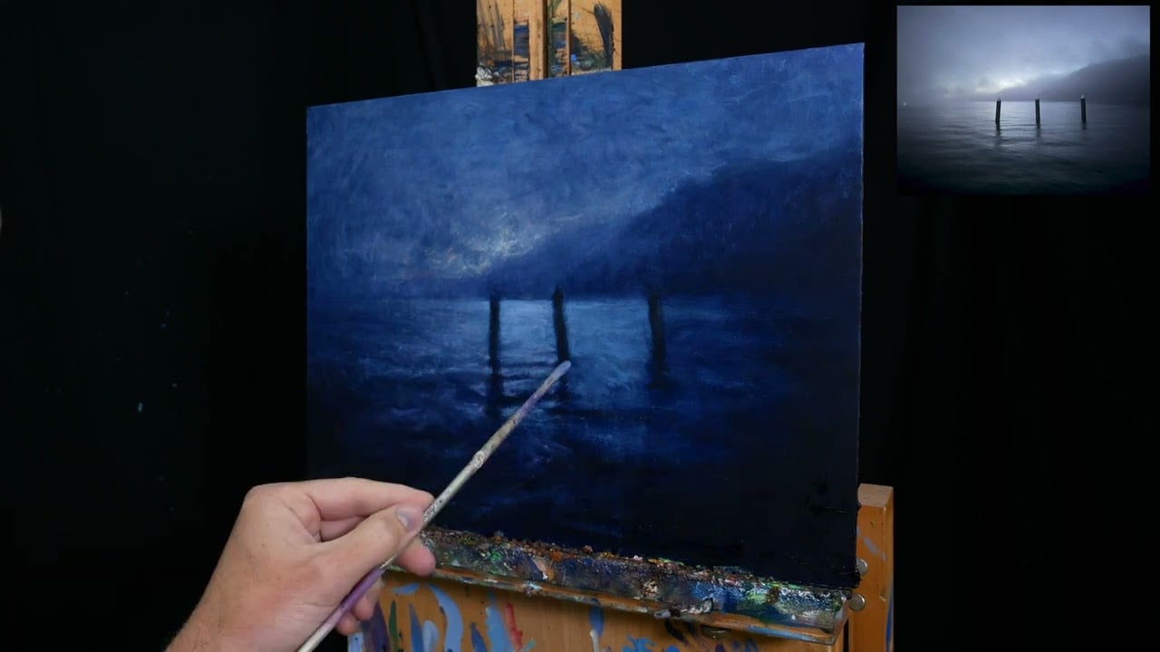
I want to walk you through some of the key points of my Three Pylons painting (shown below). I painted this a few months ago. It’s an eerie seascape viewed from the jetty of Kingfisher Bay, K’gari (formerly Fraser Island). The three pylons are a familiar sight for locals and regulars. The jetty has undergone several changes over the last 30 years, but these pylons have remained largely untouched.

I’ll walk you through the entire process using one of my recent paintings. You’ll see how I go from idea all the way through to reflecting on the finished painting.

Subject
Here’s the reference photo I painted from:

Feel free to paint it for yourself. Just let me know how your painting turns out.
What I Used
The following is what I used for this painting. Fairly standard.
- Brushes, palette knives, and oil paint.
- Surface: Ampersand gessoboard, 12 by 16 inches.
- Colors: Payne’s gray, ultramarine blue, cobalt blue, cobalt turquoise, cadmium red, magenta, alizarin crimson, cadmium yellow, cadmium yellow deep, cadmium yellow light, viridian green, raw umber, and titanium white.
Refer to my supplies list for more details about what I typically use.
Time-Lapse Video
You can watch a time-lapse of how the painting came together below.
Stain and Relaxed Sketch
(Keep in mind, some of the following progress shots are underexposed and are a touch too dark.)
I started by staining the surface with Payne’s grey. I don’t typically use this color, but it seemed perfect for this dark and cool subject.

I then wiped away the excess paint with paper towel and used my finger to map out the mountains, pylons, and reflections. Interestingly, the marks created by my finger did a pretty good job of capturing the pylons and reflections. The challenge from here was to retain that effortless appearance as I progressed through the painting with brushes.

Dark Foundation
Much of my time was spent establishing the dark foundation. I didn’t even touch the lights until I was completely satisfied with the darks. With dark subjects like this, the dark areas do most of the work and act as a point of contrast.
I started by blocking in the darkest areas with Payne’s gray and some ultramarine blue.

I then refined these dark shapes and built up a hazy atmosphere by scumbling color onto the surface.

Introduce Light
With the dark foundation in place, I moved on to the lights, starting with the sky. I worked timidly, scumbling tiny amounts of paint onto the surface with a dry brush. Light blues, yellows, reds, and purples. The idea was to build up layers of various light colors to capture the depth and atmosphere of the sky.

Then the water. I used more solid brushwork to play into the idea of light bouncing off the water’s fairly calm, unbroken surface. The color was a light and dull blue. Basically Payne’s gray, ultramarine blue, titanium white, and a touch of magenta. I also used a softer synthetic brush for this. For the scumbling around the sky and mountains, I used rougher, hog-haired brushes.

A key feature of the water is the play between light and shadow, with the light defining the gentle contours on the water’s surface. As I painted, I used my brush to feel and explore the water’s movement. I tried to follow the water up and over and around the contours. I also used different brushes to convey different aspects. For the more distant and side parts of the water, I used larger brushes and less definition. For the areas around the middle, I incorporated small round brushes and intricate linework. I wanted to capture the idea of a large, connected body of water, along with all the subtle activity occurring on its surface.

Tinkering and Adjusting
By this stage, the painting was about 90% there. To bring the painting home, I had to tinker and adjust to make sure everything worked together as a whole and looked complete. Although the painting was almost at the finish line, that last 10% took several sessions over several days. As I gain more experience, I seem to notice more and more options to improve a painting. So each painting is taking longer to complete these days.

I used a palette knife to rough up the sky a bit and add more atmosphere. I also added a few more light reds, greens, and yellows using a brush.

I did a fair bit of work on the “white” tops of the pylons. The pylons are a key feature of the painting, so I needed to get them right. It was a challenge to add these details whilst staying within the atmospheric and impressionistic style of the painting. If I added too much careful brushwork, it looked out of place. I experimented with different combinations of techniques and tools. I used a fine liner brush to pick up the subtle highlights. I used my finger to create soft, dabbing marks. I used a palette knife to scrape detail into the surface. In the end, a combination of all these did the trick. In terms of color, the pylon tops needed to be a touch lighter than the lower parts. I wrote about the color more in a previous newsletter: A Tricky Color Problem.


I added a few snaking highlights to the water using a fine liner brush and a light blue color. I had to be careful not to go too light with the highlights so that they didn’t overpower the painting. The highlights are darker than you would expect.

Finally, I added a soft green highlight for the distant boat. Below is a short video showing how I went about this. It was a tricky balance of making it stand out as a light source, whilst making it appear hazy and distant.

Sign Complete
I signed the painting complete in the bottom right-hand corner using a fine Kolinsky brush and alizarin crimson.

Overall Thoughts
I’m happy with how this one turned out. It is faithful to the subject and my memory of that morning. For such a simple and reserved subject, it was quite a challenging painting to get right. It provided little margin for error and I had to be spot on with the colors and details.
Here are some close-ups:


Thanks for reading. Let me know your thoughts in the comments.
If you ever want to learn more, check out our fundamentals course.
Happy painting!

Dan Scott
Draw Paint Academy


This was so helpful. I am working on a dark painting today. You are an inspiration and I am grateful.
It’s a good reminder: bearing in mind composition, light, subtle transitions and restraint can make a painting much more evocative, even if the subject seems minimal.
It shows how even a simple subject — just three pylons and water at dawn — can become expressive if you pay attention to value, light, atmosphere and detail.
Thank you, Dan, for sending us your thoughts and reflection on painting via subscribed emails. I’m hardly an amateur but have always loved painting and colors. I feel that being an artist is the “road not taken” for me (I’m an assistant prof in humanities). So reading your emails makes me feel part of the art community. thanks!
Thank you very much for your inspiration! I have been trying to get back to painting so when i came across your page and the beautiful painting, I loved it so much I wanted to try it. So in the early hours of the morning I began following instructions. In the end, however, my painting took off on its own and became a moonlit painting of a St Clair beach, Dunedin, well known in New Zealand, which has 11 decrepid old sand-trap poles. I thoroughly enjoyed the experience.
Lyn
Beautiful in depth painting. Amazing to read and see the variation of colors you used .
Thank you for sharing this and giving permission to attempt it. I think this would be a grest learning ptoject.
Judy
Hi Dan,
I wasn’t captivated at first, it didn’t seem like a good subject matter. However, you turned it into an outstanding piece of art! I love and appreciate the time and effort you put into your blog. Thank you for sharing!
Hello Dan,
I really enjoy your work on this painting. You really created a masterpiece. I believe you took the referance picture up a noche. Its more dramatic in your rendering of the sky and the water. I love it. Thanks again for all your much helpful information you sure with us!
John,
Dan your painting is stunning. Love it!!!
You are a wonderful artist in general but this particular painting is masterful.
So beautiful! Various shades and values of blues all very closely related make such an impact!!! As a watercolor artist I am going to give it a try! I love seeing your paintings they hold so much atmosphere!
Happy Painting!!
teresA
I really love this painting, Dan! It is beautiful!
Ik vind het schilderij mooier dan de foto naar waarheid. Mooie duidelijke stappen waarin het geschilderd is en het lijkt zo weinig kleur maar brengt zo veel sfeer.
Bedrieglijk eenvoudig zou je zeggen maar zo mooi opgebouwd.
What a lovely atmospheric painting!
Thank you very much Dan for this interesting post. I love the texture and the subtle nuances, kind of Turner-like. The close-ups are really useful too.
Regards, Gabriela
I love this painting and you instructions were extremely helpful.
Steve
Love how you brought the depth of the painting in…looks great!
Your Painting is better than the photograph you were working from !!!
I agree. It’s really good.
I’d like to work this in charcoal.. 🙂↔️
Excellent.Very thurough and simple steps.Thank you so much.Please keep it up!