
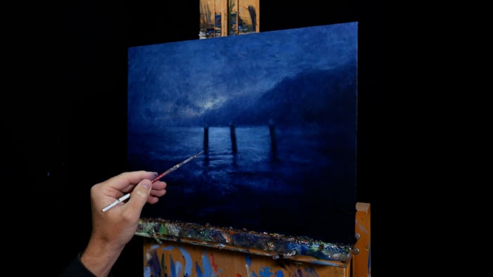
Let’s take a look at some of my favorite night paintings and why they work. I’ll also provide some tips for painting the night at the end.
- Aert van der Neer, Moonlit Landscape With Bridge
- Aert van der Neer, Night Landscape With a River
- Vincent van Gogh, Starry Night Over the Rhône
- Lesser Ury, in Front of the Cafe (Berlin at Night)
- John Atkinson Grimshaw, Nightfall on the Thames
- John Atkinson Grimshaw, Evening on the Pier
- Jean-François Millet, Starry Night
- Joseph Mallord William Turner, Fishermen at Sea
- Ivan Aivazovsky, Stormy Sea at Night
- George Inness, Watching the Sun Glow
- George Henry, River Landscape by Moonlight
- Childe Hassam, Rainy Midnight
- What These Paintings Have in Common
- Tips for Painting the Night
- Additional Resources
- Want to Learn More?
- Thanks for Reading!
I’ll walk you through the entire process using one of my recent paintings. You’ll see how I go from idea all the way through to reflecting on the finished painting.

Aert van der Neer, Moonlit Landscape With Bridge
What a stunning depiction of moonlight. Van der Neer contrasted brilliant highlights against stygian blacks. The moonlight gently outlines the objects in the foreground. The moon’s reflection in the water is framed by the arch of the bridge. And if you look closely, you’ll see a few people on the path, perhaps taking a night stroll.

Aert van der Neer, Night Landscape With a River
Here’s another example by van der Neer. He used more color here, with rich blues and tinted yellows. The sky has a wonderful sense of movement and drama about it and the foreground is busy with trees, glimmering water, and a herd of cows. Notice how light determines where our attention is drawn in the painting.

Vincent van Gogh, Starry Night Over the Rhône
“For my part, I know nothing with any certainty, but the sight of the stars makes me dream.” Vincent van Gogh
Van Gogh had a unique approach to painting the night. He relied more so on emotion than observation. Instead of blacks and grays, he used a patchwork of vibrant blues and yellows.

Lesser Ury, in Front of the Cafe (Berlin at Night)
Ury painted many street-lit night scenes. In Front of the Cafe (Berlin at Night) is a play between the bright, bustling cafe and the dark, ambiguous street. You can really feel the warmth of the cafe lights. This is the power of color contrast. The right colors in the right spots can do remarkable things.
, c.1920")
John Atkinson Grimshaw, Nightfall on the Thames
Nightfall on the Thames has a quiet and peaceful feel to it. It reminds me of an early morning fishing trip, with not a person in sight and only the gentle sound of water lapping the shore.

John Atkinson Grimshaw, Evening on the Pier
I love the color theme in Evening on the Pier. Pale green light radiates from the top right corner. Warm orange light illuminates the busy street. Silhouettes of people, horses, carriages, boats, and buildings act as dark accents.

Jean-François Millet, Starry Night
In Millet’s Starry Night, the foreground is almost completely lost in darkness, allowing us to focus on the stars in the sky (including a few shooting stars). Compare this painting to van Gogh’s interpretation of the starry night shown earlier. The great thing about art is that we can look at the same subject and come up with widely different interpretations.

Joseph Mallord William Turner, Fishermen at Sea
Fisherman at Sea is a dramatic painting. Turner pushed the value contrast, rather than his typical vague and whispy ambiance. Sharp contrast like this is known as chiaroscuro. You’ll see it used in many Renaissance paintings. The use of light focuses our attention on the drama in the ocean and the brilliant sky. And the scale of the painting makes the boat appear futile against nature’s raw and effortless power.

Ivan Aivazovsky, Stormy Sea at Night
Aivazovsky painted in a similar way to Turner’s painting, with dramatic contrast and strong focal points. In Stormy Sea at Night, yellow moonlight illuminates the scene and defines the contours and movement of the sea. Notice how the blues are restrained. Under yellow light, vivid blue cannot exist. If you shine a yellow light on a blue object, the object will appear black.

George Inness, Watching the Sun Glow
George Inness’ style suited the night. He and the Tonalists focused almost entirely on capturing scenes of moody atmosphere and wispy light. The light in this case is conveyed with relatively dark colors, but it still looks like light due to the dark surroundings. Remember, painting is relative.

George Henry, River Landscape by Moonlight
This is one of my favorite paintings. I’ve featured it in several other posts, so you might recognize it. It’s a simple painting done well. Henry pushed the color, with rich purples and blues contrasted against the vivid yellows and oranges. It’s not easy to get away with this much color!

Childe Hassam, Rainy Midnight
Rainy Midnight features a surprisingly light color theme. Instead of using dark colors to represent the night, Hassam used fleeting brushwork, muted colors, and soft contrast. He also used the street lights to make the surroundings appear darker by comparison.

What These Paintings Have in Common
Most of these paintings have three things in common:
- Strong value contrast (brilliant lights against stygian darks).
- Ambigiouty, particularly in the darks.
- Muted colors, with the exception of Vincent van Gogh and George Henry.
Tips for Painting the Night
- Night scenes are tricky in terms of logistics. Painting on location is a challenge as there’s no way to clearly see the subject, your paints, and your painting under the same light. And photos are not that effective in capturing dark or subtle colors. So, to effectively paint night scenes, you should draw on numerous sources for inspiration: your observations, any color studies, photos, famous paintings, and your imagination.
- Consider what it is you are trying to convey, and push those ideas. Is it the moonlight? The reflections on the water? The darks? The lights?
- We cannot paint with light itself. The best we can do is create the illusion of light through clever use of color contrast. With night scenes, it’s better to err on the side of more contrast than less.
Additional Resources
A Closer Look at Café Terrace at Night by Vincent van Gogh
A Closer Look at The Starry Night by Vincent van Gogh
Want to Learn More?
You might be interested in my Painting Academy course. I’ll walk you through the time-tested fundamentals of painting. It’s perfect for absolute beginner to intermediate painters.
Thanks for Reading!
I appreciate you taking the time to read this post and I hope you found it helpful. Feel free to share it with friends.
Happy painting!
Dan Scott

Draw Paint Academy
Hey,I enjoyed your group of famous night time painters.If you’d like to list my fav, Arther Pinkham Ryder,
“ Death on a Pale Horse “I think he’d fit in great
Dan I just caught up with this post; I really love nocturnes and many of these were new to me. Your choices and insight are always so valueable, thank you.
I think Frank Tenny Johnson’s night scenes deserve to be shown with this group. He’s a master.
It is sometimes helpful to scout a night scene and snap a photo one night in advance. Then do the illustration and block-in in the studio the next morning. When you’re in the field later in the evening, you don’t have to fuss with the preliminaries, and the values have been established under lighting that is similar to how the painting will be viewed.
Certainly opens the eye to possibilites colours that set mood good learning excerise.
What an analysis indeed !You are not only brilliant but very empathetic in caring and sharing your thoughts and resources.
Stay blessed!
You are not only brilliant but very empathetic in caring and sharing your thoughts and resources.Stay blessed
Great insights. Many of your selections are some of my favorite artists and works. I am drawn to the contrast of light and dark, and as you called it the “ambiguity.” Thanks. Always a pleasure reading your posts.
Splendid works of art, a treat to the eye. I feel so uplifted.
Thank you Dan sooooo much
Thank you for all the wonderful information you are sharing. I enjoy your posts.
Love your posts. Very helpful. Thank you.
I’ve been invited to lead a group of (amateur) painters who asked specifically to paint a night scene of a lighthouse backlit by a full moon. I’ve been practicing with Van Gogh’s Starry Night and a couple of my own photos – with varied results. After reading this article, it’s back to the canvas! You communicate so well points I sometimes observe but can’t verbalize and therefore miss when I try painting them. Thanks for bringing focus to so many key aspects.
Fabulous! Now you’ve inspired me to try this in…colored pencil! I’ve put away the brushes (for awhile) & trying colored pencils since it has been mentioned I’m a detail freak. I think it’s just part of artistic journey. Yes! I will finally call myself an artist
As always very helpful especially when it comes to the “the tips” Thanks.
I can feel the swell of the sea in the ‘King of the sea’ Ivan Aivazovsky’s Stormy Sea at Night and Turners Fishermen at Sea. All you have selected are evocative, and topping them are these two… thank you for this education…
I’ve never heard of a couple of these painters. Thanks so much.
Thank you Dan, I always enjoy reading your posts and never fail to learn something from them. I’ve never thought about painting a night scene but the paintings you showcased are inspiring.
He REALLY is a natural teacher, isn’t he? And he’s actually becoming a good painter. Sharing like he does shows he’s also a good guy!
Why didn’t you include “Nighthawks” by Hopper? Classic contrast “night picture”.
Thank you, once again, for your explanations of why certain artists and their paintings are considered
so worthy of being admired and appreciated. The detailed breakdown of Van Goth’s Evening Cafe…
was great. As someone mentioned above, if I were to take an Art History course again, I would
certainly be more receptive and connect with the content if it were as interesting as this post.
Thanks for sharing your expertise. Much appreciated.
That is a Beautiful range of night paintings you have selected and shared. Thank you for this and all the inspiration and help you give to Artist’s of all skill and ability
Love your posts! Subject matter is spot on. Thank you.
Dan, can you tell me the range of sizes these painting are? I am curious as to their sizes in response to the image itself and vice versa.
Hi Charles
I would just do a quick search on Google to see what the sizes of the paintings are. They may not have the information, but hopefully you can find some details.
Chontele
Thank you Dan!
I look forward to your insight emails!
Beth
Very helpfull!
Fantastic article. It was great to see an analysis of different night paintings. Makes me want to tackle a night images from memory that has been lurking in the back of my mind for decades but was unsure how to go about it.
Thank you ,love your posts. This collection of work is fantastic!
You are most generous sharing your abundant knowledge .
Thank you
Wishing you continued good health and the joy of life with art.
FYI
I personally create my non -objective art on my iPad
Thank you for the wonderful article. I did one night painting in 2002. I just received a photo of it from a friend that owns the painting, to include it in my website. Your article is an invitation for me to look at it with new yes.
Thank you – very valuable information and great painting tips
I really enjoy how you introduce me to new artists I’m unfamiliar with. It’s inspiring to see how others paint. Thank you for all your sharing.
Your posts are wonderful. I’m fascinated by nocturnes and will try one soon, as the weather warms up here.
I’ve been taking some local courses that involve either tonalism and chiaroscuro. It was fun to see you address both of these. Your discussions and demo paintings have been such a help to me as I explore the world of oil painting. Thanks for the encouragement over these past several months.
Thank you Dan….food for thought.
Thank you for sharing! Such a wealth of information,
I enjoy reading your articles and how they give insight about different aspects of paintings I wouldn’t have thought about. Thanks for sharing.
A wonderful subject night painting . Thank you for raising and discussing it . I have tried it and as a landscape painter the biggest challenge is light in the darkness when the moon reveals little shadow to define form so great to know it is as difficult as i have found it ! Thank you Dan
love your posts. I’ve been playing with night scenes for awhile, working in oils. I find them challenging but fun and often surprised by the results (as opposed to where I imagined it was going to go).
Dear Dan,
Thank you. My recovery from painting avoidance is pretty much over…the game is up.
I am up to Chapter 15 of The Artist’s Way.
I will paint and I will paint and paint and paint.
I subscribed to your email blog quite some time ago. Now, I can see why…Thank you, thank you for what you do, Kyriaki