
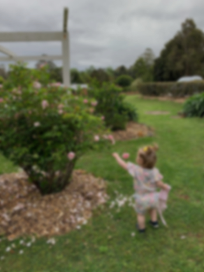
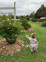
In this post, I’ll share some of the tests you can use to check the accuracy of your paintings or to diagnose mistakes. I’ll use my recent painting, Elora and White Roses (shown below), to demonstrate my points.

I’ll walk you through the entire process using one of my recent paintings. You’ll see how I go from idea all the way through to reflecting on the finished painting.

Why These Tests Are Important and When to Use Them
Of course, the key benefit of these tests is to produce more accurate and believable work. But it’s also about honing your judgment as an artist. It’s impossible to hone your judgment if you’re naive to your own shortcomings or mistakes.
You can use these tests at any point throughout the painting process. I find them particularly useful for the following:
- At the start of a painting when you’re establishing the foundation, especially for complex subjects.
- To make sure you’re on the right track midway through a painting.
- Once you have completed a painting to verify your accuracy.
- When you need to diagnose a mistake or problem.
1. Squint Test
Squint at your painting and the subject and look for any glaring issues or irregularities. Squinting reduces the “noise” of what you see and makes everything appear hazy and a touch darker. It’s an effective test for the big-picture aspects of your work, particularly in relation to value (how light or dark your colors are) and the major shapes.

2. Thumbnail Test
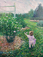
Look at a thumbnail photo of your painting. If it looks realistic, that’s a good sign you got the fundamentals right. You can also compare a thumbnail of your painting to a thumbnail of the reference photo to spot any big-picture irregularities.
3. Use a Collage App to Compare Your Painting to the Reference Photo
Compare a photo of your painting to the reference photo. I use a collage app on my phone, but any editing software such as Photoshop or Canva will do (Canva is free and beginner-friendly). This tests for issues of scale, perspective, and drawing. Portrait painters would find this test particularly useful.

4. Grid and Key Measurements Test
Place a three-by-three grid over a photo of your painting and your reference photo. You could also place vertical and horizontal lines that go through the middle. Use the gridlines and intersections as reference points to take key measurements with which you can test the accuracy of your drawing, scale, and perspective. I typically only do this for complex subjects involving people, animals, or architecture.
I used grids and key measurements in Elora and White Roses to ensure my drawing of Elora was on the right track. It was critical that I got her scale, shape, and proportions right. On several occasions, I got out a ruler and measured the exact distance between parts of Elora and the nearest gridlines. I then had to compare this to the relative distance in the reference photo. Tedious work, but I wanted to get this one right.


I was particularly focused on the areas circled below and their positions in relation to the grid.

I also used the gridlines to check key lines and angles. For example, to verify the accuracy of Elora’s left arm, I mentally drew a line that extended from her arm to the nearest grid line. If the line intersects the grid in the same spot as the reference photo, I know all is right.

5. Grayscale Test
Grayscale a photo of your painting. This will allow you to clearly see the value structure (how light or dark all the colors are). You can compare this to a grayscale of your reference photo. Pay particular attention to the lightest lights, the darkest darks, and the arrangement of light and dark shapes. See below a grayscale of my Elora painting and the reference photo. A few key observations:
- My painting is more compressed in terms of value. That is, the lightest lights are a bit darker, and my darkest darks are a bit lighter than that of the reference photo. This is by design, as I wanted the painting to have a softer finish with less value contrast.
- I’m missing a dark accent on the architecture at the top. This was also by design, as I didn’t want to draw attention to this area and away from Elora. But, it could have worked nicely with the bright, overcast sky as a backdrop.
- My painting has less value contrast in the background (see the trees at the back and the sky). I made up for this by using subtle changes in hue and visible brushwork.


6. Color Checker
Use

7. Negative Space Test
Compare an area of negative space in the painting to that of the reference photo. Negative space being the area between objects and things. For example, I could verify the accuracy of my drawing of Elora by looking at the negative space surrounding her and the shapes that space forms. If the negative space has a different shape to that of the reference photo, then something is wrong with my drawing.

A Word of Warning
Don’t get caught up trying to verify every decision you make in a painting. That would sap the joy out of painting.
Also, there are times when it’s OK to be wrong. Perhaps you want to exaggerate or restrain a certain detail. Or perhaps the error is insignificant and not worth fixing.
Reserve these tests for critical and fundamental aspects of your painting. Things that really push the needle. For example, if you’re painting a portrait, it’s critical that you get the eyes and nose right. But it’s less important to get the exact layout of the hair or the exact skin tones.
Want to Learn More?
You might be interested in my Painting Academy course. I’ll walk you through the time-tested fundamentals of painting. It’s perfect for absolute beginner to intermediate painters.
Thanks for Reading!
I appreciate you taking the time to read this post and I hope you found it helpful. Feel free to share it with friends. Let me know your thoughts in the comments.
Happy painting!
Dan Scott

Draw Paint Academy

Hello there,
I just wanted to leave a little message to say thank you for taking the time to share your thoughts and experiences in art. Your work is both beautiful and inspiring. Your knowledge of art is truly appreciated. 🙂 🎨
Respectfully,
– Lillian Dougherty
(beginning / intermediate level artist)
Thanks, Dan.
Dodie
Beautiful artwork! Great tips with the the gridding!
Spot on as always, Dan! Thank you!
Very helpful as I am always painting portraits of my grandchildren!
Because of my age, 77, I’m not as familiar with or good at using the latest technology to help me. Do you teach a course in Photoshop? Joan
Hi Joan, unfortunately not. Sorry!
Hi Joan
Unfortunately we don’t sorry.
Chontele
Very tender and a beautiful picture. So much food for thought. Thanks
Frieda
Thanks, Dan. This checklist confirms the experiences I have as I paint. You give many useful tips which give structure to my intuitive approach to painting. I am really passionate about painting and growing my painting skills. I am looking forward to continued improvement and to your continued advice.
I enjoy your art and your instruction. These check points are very helpful. They take away some of my fears of looking at a painting and wondering what’s wring here!
Glad to hear thanks Toni!
I agree with Richard Irvine. Viewing your work in reverse by showing it in a mirror is my main go to. Also getting someone else to critique your work especially your wife (mine doesn’t hold back), turn it upside down as well.
Thanks Bob!
Thank you Dan, this is the best tests I have found to analyze my painting and fix it if possible! Appreciate it very much. I always had difficulty as to what and how do I check when I analyze my painting. So thanks again!
Glad to help Sujata!
Thanks Dan, this is very helpful.
I’m glad to know that I’ve been doing a few of these checkpoints by myself.
And couldn’t be more in agreement when you said that sometimes is OK to be wrong. I found myself enjoying most often than not my “mistakes”. Meaning, those details that I don’t capture (either because I did not or either because I did not want to) but that I like more than the actual reference photo.
Thanks Fernando! Well put.
THANKS, very useful tips, particularly the app ref.
Thanks Frances!
Thanks Mr Scott!
It very helpful and hope will have more.
Thanks Ghion! My pleasure.
Hi Dan, Thanks for these great tips, very useful! And I have to say this is my favourite painting of yours!! Simply beautiful. Kind regards, Mary (Brisbane)
Thanks Mary! Really appreciate it. Glad to see a fellow Brisbane artist!
Helpful. Thank you for sharing
Thanks Aurelia!
Thank you Dan,
It’s really good having this check list. I find it especially useful to use before getting to far into the painting so I don’t have to go back and redo. Especially in using pastels. Keeps it from getting muddy.
Thanks Tina. Glad you found it helpful!
THIS IS ONE OF YOUR BEST paintings …… wow! … GREAT JOB! thank you for sharing and your fabulous tips!!! Congrats on such a lovely painting!!!!!!!!!!!!!!!!
Thanks Julie! You’re too kind.
more Tests to Check the Accuracy of Your Paintings
look in mirror.
ask someone to critic the painting.
put the painting where you cannot see it for couple a week’s then look at it with a fresh eye.
thanks for all your helpful tips happy painting.
Thanks for adding those Richard!
Thank you for sharing these helpful tips!
My pleasure Donna. Thanks!
I agree these are really helpful pieces of process to know and use. I’ve been really lucky to find generous artists like yourself who spend the time to explain and give working examples. I’m in Perth WA currently. Really great to find an Australian artist. Thank you.
Glad to help!
Thankyou for all your helpful hints T create is good for the soul and one can always continue to learn. I have picked up a few hints from you Dan my thanks Freda
Very useful simply ways to get your picture right.
My most important revelation is that the picture doesn’t have to match the photo (particularly colours, tones and hues) to get the best effect.
That’s right. We aren’t trying to recreate the photo.
Thanks very much Dan. These are most helpful points.
Reading through them, I find that I probably already do some instinctively – such as when looking at an almost finished work to decide if anything more is needed.
But it is really useful to have a checklist.
As you say, they are probably not all necessary, all of the time.
The joy of painting is such an important part too.
Thanks for your generous sharing!
Thanks Lucy. Glad you found it helpful. Yes these tests are only needed every now and then. I have been using them more lately as I have been venturing into portraits, which I find challenging.
Hi Dan, Thanks for the valuable information.
Just wondering why the ground -grass rather- around Elora’s head and shoulders look raised as compared to the photo. Would a lighter value of green made a difference ? Thanks.
Good observation! Yes it probably should be a touch lighter. But I’ll leave for now.
Thank you very much. Hildur
My pleasure Hildur.
Venturing into figural painting, thanks for the great tips.
Yup – it has me hooked. Not easy though. Thanks Barbara!
I would like to know how to drive huma figure and animals well
Thanks Dan. That was very helpful.
My pleasure thanks Paul!
Hello,
I am from India and self taught after superannuation from Job and now painting from the past 2 and half years. I actually like to do all kinds of things, though highly influenced by
Monet. Then I realised that I was becoming a copy -cat which was never my intension.
Originally being a scientist I like to experiment and never a reference photo. I use my imaginations and whatever I see around me. People here call me as contemporary artist and they do like my work both oil and water colour. Under that circumstances how do I follow your check-list?
Thanks Dan. What is the collage app on your phone? How can I get one?
Hi Lisa. I actually just got a new phone so I need to fine a new app. There are many of them and it will depend on what phone you have. Do a search for “collage” in your app store. Thanks!
Hi Dr Pushpa. The tests in this post are only optional. You don’t need to do any of them. I usually only do some of them for complex paintings or when I need to diagnose a mistake. Thanks!