
The visual elements of art are the building blocks of an artwork and the principles of art are the framework for how you arrange these elements.
Understanding the visual elements of art is of key importance to see like an artist. Rather than looking at an object as what it represents, you will learn to see that object as an arrangement of different visual elements (shapes, textures, colors, lines, etc).
If you do not learn how to see the world in terms of visual elements, then you will struggle to let go of your ideas about what objects are supposed to look like. This may influence your art, usually not for the better.
For example, most of us have some kind of ideological view of what a tree is supposed to look like. When I think of a tree, I see lush green leaves and a rich brown trunk and branches. But obviously, not all trees look like this. If I did not see a tree as an arrangement of visual elements then I may be inclined to use more green for the leaves and brown for the trunk and branches that are actually there.
In this post, iI give an explanation of what the visual elements of art are. I cover:
I’ll walk you through the entire process using one of my recent paintings. You’ll see how I go from idea all the way through to reflecting on the finished painting.

Line
Line refers to a mark that spans between two points and it is one of the most dynamic visual elements at your disposal in painting. Here are some of the ways you can make use of line:
- To indicate form by following the contour or outline of an object. Vincent van Gogh often used lines in this way. In the painting below, observe how van Gogh used lines to follow the contour of the shoes.

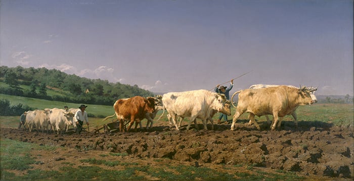
- To create a sense of movement through the use of pattern or repetition. In the painting below, notice how the short, jabbing lines appear to give a sense of the choppy, shallow water. Then look at the long, smooth strokes in the distance of the water to indicate the more gradual flow of the ocean.

- To lead people through your painting. Our eyes like to follow lines and you can use this to your advantage in your paintings to lead people to your focal point. I often refer to this technique as “leading lines“
Shape
Shape refers to two-dimensional enclosed areas in your painting. An important aspect of painting is being able to break a scene down into simple shapes. This not only makes it easier to actually paint, but it also focuses your composition on the important elements.
When I start a painting, I usually try to break the scene down into the most dominant shapes. Then, as I progress, I will break those dominant shapes into smaller shapes.
In the painting below by van Gogh, the dominant shape is the circular shape of the crab. Notice how I simplify the shape to a very basic oval. That shape can then be broken down into a number of smaller, organic shapes.


Color
When light bounces off an object and hits our eyes, our brain translates the light wavelengths into what we perceive as color. Color has three main elements:
Hue: The term “hue” is often used as a simile for the term color. Hue generally refers to the dominant wavelength of a color. Red, blue, yellow, orange, green – these are all different hues. Hue is independent of saturation and value.
Saturation: Refers to the richness, vividness or intensity of a color. Saturation is often used interchangeably with the term chroma (though they do have slightly different meanings but I will not go into that here).
Value: Refers to the lightness of a color.
I will use the following painting to demonstrate how you should think about color and what these terms mean. The hues in the painting are reds, purples, greens, yellows and blues. Notice how this gives you no information about the value or saturation of the colors.

If I reduce the saturation of the painting, then this is what I am left with. Notice how the colors are much less vibrant and intense.

If I take hue out of the picture, then all I am left with are values.

Value
Value is a subset of color but because of its importance, it is usually considered as a separate visual element.
Value in art is essentially how light or dark something is on a scale of white to black. It is widely considered to be one of the most important variables to the success of a painting, even more so than your selection of color (hue).
Value should be simple to understand, however, the inclusion of hue and saturation can make it a challenging concept to grasp.
You could have two different colors which appear completely different but have exactly the same value. There would be no contrast in value, only contrast in hue or saturation.
On the other hand, you could have many different values with the same hue. These are called tints. shades or tones. You can produce tints of a color by adding white and shades by adding black.
Space
Space comes in two forms – positive and negative space. Positive space refers to areas where an object is positioned. Negative space is the area surrounding the object.
You could also think about space in terms of foreground, middle ground and background. By creating some kind of differentiation between these spaces, you can give the illusion of depth in your painting.
You can read more about positive and negative space here.
Form
In painting, form refers to the illusion of a three-dimensional object on a two-dimensional surface. There are many ways you can create this illusion such as:
- Shading
- A contrast between cool and warm colors
- Contour drawing
In the painting below, Giovanni Boldini uses all of these techniques to indicate form in the cup. There is a gradation of light to dark to indicate how light is hitting the object. There is a subtle contrast in color temperature, with the areas in light being relatively warmer than the areas in shadow. Finally, there are subtle brush markings to indicate the contour of the object.

Texture
Texture in painting could refer to two things:
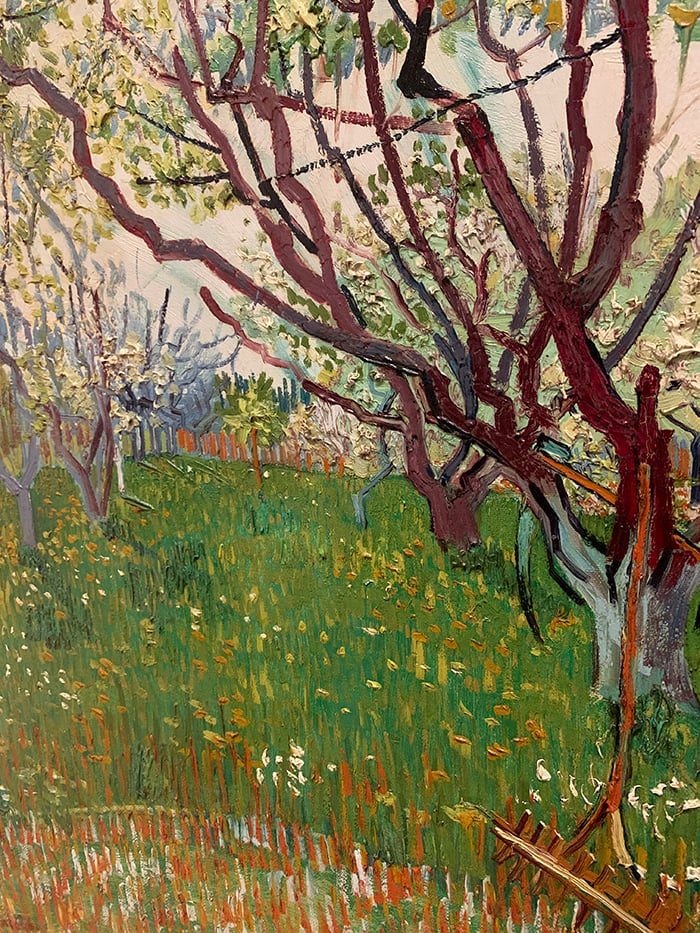
1. The physical texture of your paint. I will often contrast smooth areas of thinned paint against thick, impasto areas of paint.
2. The illusion of texture. You could create the illusion of texture of bark on a tree by scumbling some broken color over the top of an underpainting. The paint may not have that much physical texture, but there would be an illusion of texture on the tree.
Below is a painting by Monet and a close up of the brushwork. Notice how Monet built up physical texture in some areas and left other areas relatively smooth.


Want to Learn More?
You might be interested in my Painting Academy course. I’ll walk you through the time-tested fundamentals of painting. It’s perfect for absolute beginner to intermediate painters.
Thanks for Reading!
I appreciate you taking the time to read this post and I hope you found it helpful. Feel free to share it with friends.
Happy painting!
Dan Scott

Draw Paint Academy


Hi Dan, Im really enjoying the course. I love the hyperlinks which can be read at the time or read later as the desire takes the reader.
I’ve been a really left brain thinker for 50 years. I have done a few creative pursuits but im now taking a few pastel lessons. I’m finding it really hard to START without help or prompts. I cant seem to get out of that left brain approach. I guess that’s why I like your course too as I can READ about art instead of DOING it. I find it hard that there are rules, but they can be broken. This is not like maths, science that I have done for so long. Do you have any suggestions to help me loose that left brain approach and just “let go” and find some freedom and enjoyment in beginning art?
I think this will be helpful. Thank for breaking information down so I understand it. I hope I can remember when frustrated. Thanks for information
No problem Suzanne! Hope it helps. Dan
I’ve been enjoying your writing and teaching. I really appreciate how much information you offer for the ‘free’ viewer, as I am just starting out in the art world, and have yet to build income up yet. So the freebies are so very appreciated. I’ll continue to follow your email and such, and when I can afford to take classes, I will be back, and I will refer others to you. Thank you for not just ‘teasing’ about paid class content, but giving lots of help.
Dan, I appreciate the good information in your posts, and in your 21 Easy Ways PDF.
I wonder, does anyone else have challenges determining the difference between warm and cool colors at times? Honestly, in your Form section, I do not see how the colors in the light are so much warmer than the ones in shadow. The yellow on the right in the light is warm, yes. But the gold in the shadows also appears warm to me, warm and rich. What do you think? Thanks!
I learn so much from your explanations, thank you!
Glad to hear thanks Nancy! Dan
Hi Dan, Once again a marvelous educational article from you, so concise and wonderfully illustrated as usual. I do so appreciate your work. All very inspiring too.
Kinest regards, Hazel
Thanks Hazel 🙂
Dan
Thoroughly enjoyed this article. Very informative using paintings to give examples of colour.
The three paintings demonstrate how different a project could look if saturation is reduced.
A difference between a flat painting and a much more attractive outcome.
I am only a beginner with drawing and painting but I feel this is something that I would take into account with every drawing which I do.
Thank you for this
Dan
I just want to Thank you soooo very much for all the written info you provide and I also have watched many videos from Paint Academy !!
I have on file the painting course you emailed me, along with other things, so I can re-read them.!
Can you tell me who if not you, is the artist doing the stunning dramatic sky videos by Paint Acadamy?
Whoever it is, blows my mind!!
I believe you are left-handed, but the artist doing the pastels is right-handed.
Once again I wish to thank you for everything you provide. It is really helping me grow as a newbie artist.
I started with acrylics in Nov of 2016. A year later I tried water soluble oils. (Did not like them).
Then Jan of 2018 I found I had a love for soft Pastels!! I still use my Acrylics, but my passion is pastels!
Take care Dan
Respectfully
Cheryl Parr
Thanks Cheryl 🙂
Dan
Hello Dan
I have been receiving your emails for a long time now, I will never be a Van Goph or a Monet artist, but i do like the idea. Thank you for sharing so many of your idea, painting etc.
I have always appreciated and enjoyed them.
Again thank you very much all the way from Ireland
Regards
Bridget
Hi Bridget, really glad to read that! More to come.
Dan