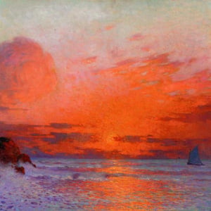
In this post, I’ll walk you through how I painted Fraser Island, Sunset using oil paints, brushes, and palette knives. It features a striking sunset witnessed from the jetty, with brilliant warm lights, ambiguous shadows, and shimmering water. All up, it took about three and a half hours spread over a few sessions.

(I also published a video on this painting here for those of you who prefer to watch rather than read.)
Reference Photo
Below is the reference photo I painted from. I took this in May 2023 during my last visit to K’gari in Queensland, Australia (formerly Fraser Island). Chontele and I got married on this trip.

What I Used
Here’s what I used for this painting:
- Various brushes and palette knives;
- Ampersand Gessobord, 12 x 16 inches;
- Paper towel;
- French easel;
- Glass New Wave Palette;
- Odorless solvent;
- Tablet (for viewing the reference photo); and
- Oil paints in titanium white, raw umber, transparent red oxide, ultramarine blue, cobalt blue, viridian green, magenta, cadmium red, cadmium orange, yellow ochre, cadmium yellow, cadmium yellow deep, and cadmium yellow light.
Refer to the supplies page for full details about what I use and recommend.
Stain the Surface
I start by staining the surface with a dark, muddy color. As this subject is relatively dark, I want to start with a dark foundation and work my way up to the lighter colors.
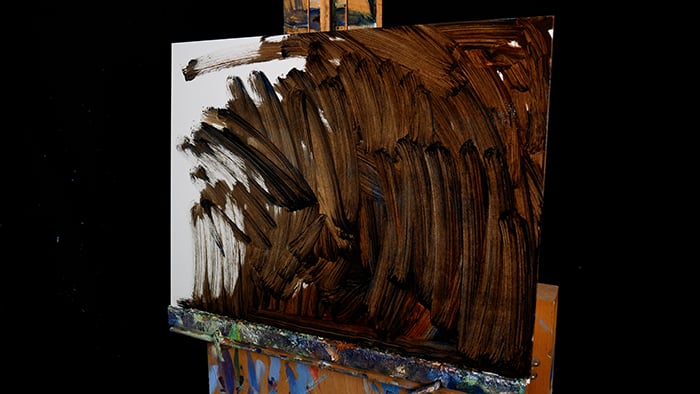
I then use paper towel to lift paint from the surface and map out some of the major shapes. I also use my finger to loosely sketch the subject. I don’t go into much detail. I focus mostly on capturing the jetty, jetty lights, clouds, and the horizon line. Whilst I’ll eventually paint over this sketch, it’s still important to get it right, as small mistakes here can compound into critical mistakes later.


First Color Strokes
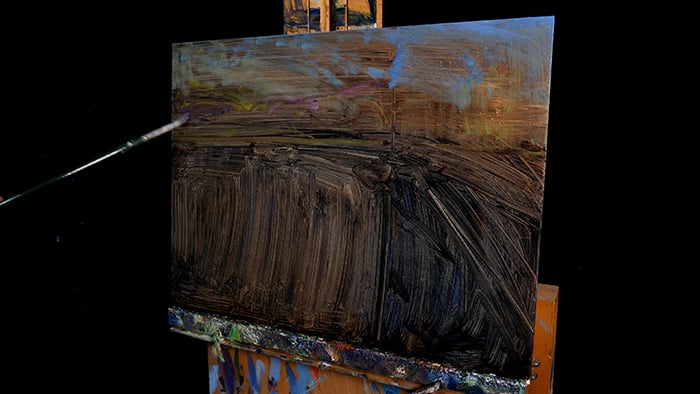
After letting the paint dry for about an hour, I start introducing color. I use timid strokes, as I don’t want to commit to any particular direction just yet. All I want to do is get a feel for the subject and see what the colors look like on the surface.


The Sky
The sky is the focal point of the painting. It needs to really “pop” and showcase all those brilliant sunset colors.
The colors are strongest around the left-hand side, where the sun just fell below the horizon line. I use mostly cadmium yellow deep and a few touches of cadmium orange here.
The colors gradually get weaker and cooler as we move away from the sun. I make sure to pick up the soft gradation from the bright yellows and oranges to pale yellows and purples to pale blues to stronger and darker blues in the top right corner. I keep my brushwork fairly relaxed to convey a somewhat hazy atmosphere and the idea of fading sunlight. I also go over the clouds with darker purples and blues. The clouds play an important role in acting as a point of contrast for the surrounding sky colors. Darker and cooler clouds = more contrast against the bright sky colors.


Using Broken Color for the Water
The water is tricky because it’s partly reflective and partly translucent by nature. Some areas reflect light from the sky, and some don’t, allowing us to see through into the water. It’s important to convey both of these qualities in my painting.
My strategy is to build up layers of broken color to capture the shimmering light on the water. I weave together light yellows and oranges to suggest reflected light and dark blues and greens to suggest areas where we can see below the water’s surface.
The broken color technique is fairly simple. I pick up a color on my brush and make a few strokes. Then, I pick up another color and make a few more strokes. And I do this repeatedly until I have a nice patchwork of color.


Painting the Vague People on the Jetty
The people wandering the jetty are vague and ambiguous, but I still need to paint them with accuracy. Their heads, shoulders, and torsos need to be in the right spots and in the right proportions. Mistakes here tend to stand out, whereas, say, with the clouds, you probably won’t care if I make them too big or small or a different shape. This is a good lesson for every painting. Think about which parts of the subject you have less room for error and focus on getting those parts right. You can be a bit more relaxed in the other areas.
The vague people also need to fit with the impressionistic style of the painting. They would look out of place if I painted them with too much detail and clarity. This is one of those times when it’s good to depart from the reference photo. In this case, the photo captures too much detail in these dark areas. When I’m standing there on the jetty, I’m not focusing on the jetty and the people; my attention is on the sunset and its brilliant colors. Everything else is slightly vague and out of focus, so that’s how I should paint it.


Negative Space
I spend a fair bit of time on the water on the right-hand side. This is a tricky color to get right. It’s a deeper and more solid blue than the rest of the water. It also acts as negative space for the vague people on the jetty. That means I can use the water to carve out and better define the people.
I also work on the negative space between the jetty pillars. Again, I can use these areas of negative space to help define and carve out the jetty. I do a fair bit of tinkering and adjusting as I try to get the colors, edges, and negative space just right. I know what I want the painting to look like, but I need to experiment with a few different techniques and colors to get there.


Green Lights
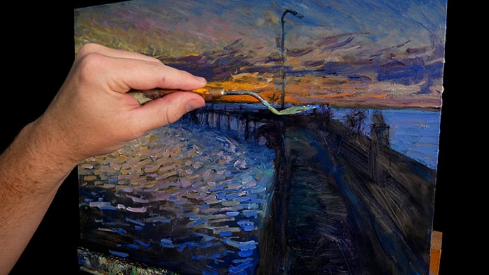
The painting is almost finished. All that’s left to do is add the green lights along the jetty and the green reflections on the water. These are small but key details that really bring the painting home. For the color, I use viridian green plus titanium white. These jetty lights are fairly weak, so I don’t want the color to be too light, just light enough to appear as a light source. I also scumble a bit of the green color on the jetty to pick up more of that soft glow.
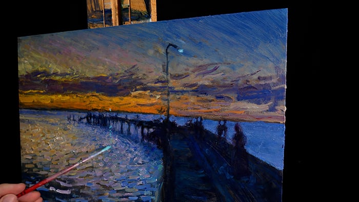
Signing the Painting Complete
I sign the painting complete in the bottom left-hand corner with a small round brush and magenta. I’m quite happy with this one. I think the sky, in particular, really “pops” and the painting says what I want it to say. It will also be a pleasant reminder of getting married to Chontele.

Here’s the finished painting alongside the reference photo:

Thanks for Reading!
I appreciate you taking the time to read this post. Feel free to share with friends. If you ever want to learn more, start with my fundamentals course.
Happy painting!

Dan Scott

