The Zorn palette refers to a palette of colors attributed to the great Swedish artist Anders Zorn (18 February 1860 – 22 August 1920). It consists of just 4 colors yellow ochre, ivory black, vermilion, and titanium white. Cadmium red light is commonly used in place of vermilion by modern-day artists.
Whilst this may seem like an extremely limited range of colors, Zorn demonstrated through his paintings just what is possible with such a limited palette. In this post, I cover:
- How Does the Zorn Palette Work?
- Is The Zorn Palette A Myth?
- Why Would You Use the Zorn Palette?
- The Cons of the Zorn Palette
- Want to Learn More?
- Thanks for Reading!
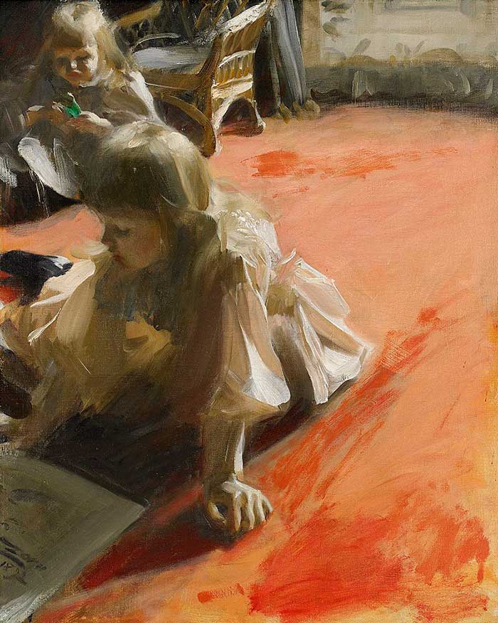
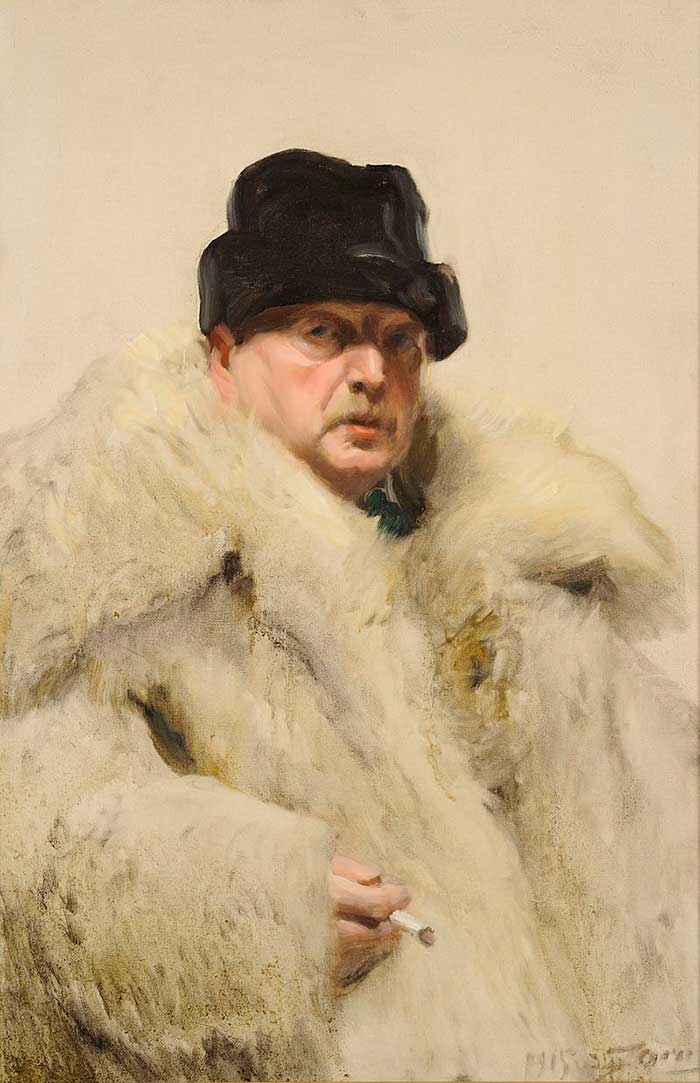
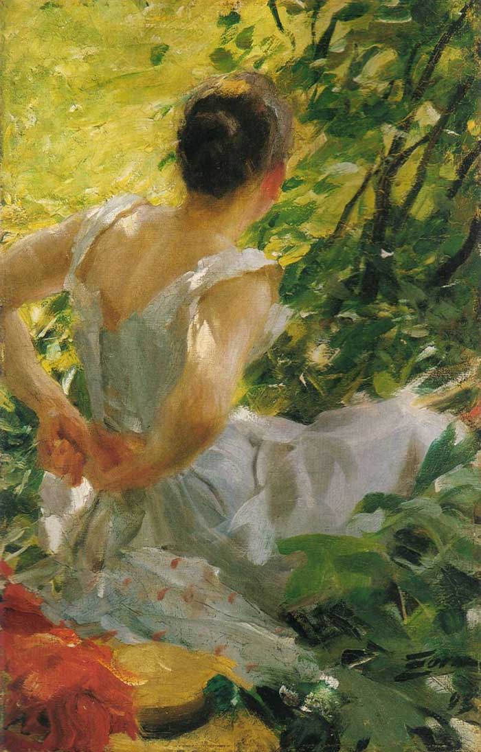
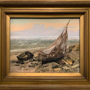
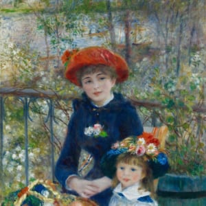
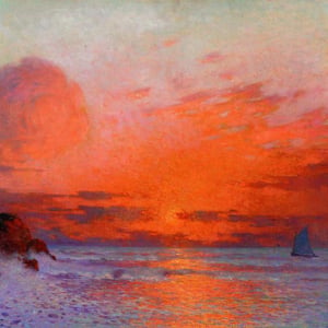
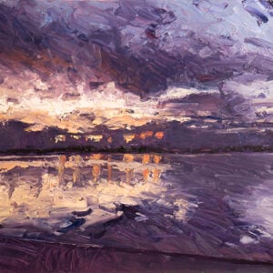
Here are some of his paintings that appear to utilize the Zorn palette:
How Does the Zorn Palette Work?
The Zorn palette works as follows:
- White and black can be used for changes in value.
- Ivory black is a relatively cool black and can be used as a very dark substitute for blue. In a very narrow sense, you can think of yellow ochre, cadmium red light and ivory black as a version of the primary colors.
- Cadmium red light is the most saturated color on the palette. Outside of that, the Zorn palette does not excel in vivid colors.
Below is a color chart demonstrating the gamut of possible colors with the Zorn palette. The lack of blue seems to be the biggest limitation. The closest thing to blue is a cool gray. My first thought about this gamut of colors is that it would be perfect for capturing all the subtle skin tones in portraiture, but not so much for capturing the wide range of colors needed in landscape painting. This makes sense as Zorn was one of the most acclaimed portrait painters of his era.
Is The Zorn Palette A Myth?
Some academics have questioned the existence of the Zorn palette, drawing attention to:
- The obvious use of blue and green in some of his paintings.
- The tubes of paint left by Zorn in his studio which is said to have included 17 tubes of cobalt blue.
But all this really proves is that he did not strictly use the Zorn palette in every painting.
The tubes of paint left by Zorn have little meaning. I personally have tubes of paint in my studio which I have not touched in years. You would not be able to determine what palette of colors I prefer to use based on the tubes of paint which are currently in my studio. We all have those colors which seemed like they would be useful, but only end up gathering dust.
But there is a lot of evidence which suggests that he did frequently use the Zorn palette.
First, his actual palettes which are kept in museums indicate a favorable use of the 4 colors. There are hints of some other colors, like what appears to be cadmium yellow and viridian green, but the 4 Zorn palette colors hold much more prominent positions.

Second, there is this self-portrait which shows him painting with the Zorn palette.

Why Would You Use the Zorn Palette?
Many art teachers (such as Jeff Watts of Watts Atelier) have found the Zorn palette to be a great learning tool for students, as it limits the number of possible decisions but allows a wide-enough gamut of colors to create a stunning painting. The general idea is that a student should start with a monochrome palette (no color), then progress to the Zorn palette, then finally to more complex color palettes.
When painting with such a limited palette of colors, you must really learn how to utilize value rather than color to emphasize form. Value is thought to be the most important element of color, so it is important that you have a firm understanding of it before you try to handle more complex color palettes.
The Cons of the Zorn Palette
There are obviously some significant limitations of the Zorn palette, such as:
- There is no blue, so you are missing out on a wide gamut of colors. The closest thing to blue with this palette is a cool gray which you can get from mixing ivory black with titanium white.
- You are not able to mix saturated greens or purples.
- The color saturation of the palette is generally very dull, so you need to work mostly with browns and grays.
- It is not overly suitable for landscape painting due to the lack of color. Instead, the Zorn palette seems to be more suitable for portraits.
Want to Learn More?
You might be interested in my Painting Academy course. I’ll walk you through the time-tested fundamentals of painting. It’s perfect for absolute beginner to intermediate painters.
Thanks for Reading!
I appreciate you taking the time to read this post and I hope you found it helpful. Feel free to share it with friends.
Happy painting!
Dan Scott

Draw Paint Academy

I very much enjoy receiving your post and find them so interesting, creative and a great learning tool. Thank you‼️
A very interesting and wonderful informations for the Zorn palette, it is a good step for drawing and uses of colours, before graduating to finding ones own preferences in style, media used and colour.
Lots of thanks
With regard
“Prabhu”
Wow!! Incredible…. great artist…………
Yes he was! I actually wish he used just a bit more color though admittedly 🙂 Dan
A very interesting article on the Zorn palette, what a good step from drawing into the use of colour, before graduating to finding ones own preferences in style, media used and colour. Regards Hazel
Thanks Hazel! Dan
Hi Hazel, was your maiden name Henly
Again thank you for giving me more knowledge of oil painters and how they achieved their recognition in the art world. You keep it short enough and to the point.
Glad you enjoy the posts Dawne 🙂 Dan
Hello much appreciated for all the painting tuition. Love it
No problem Don!
Dan
Interesting stuff and made me wonder what colour palette Morandi used for all those jugs, pots and vases! Really enjoy your posts, look forward to them for the help and inspiration provided. Tks.
Thanks Suzanne! Glad you enjoy the posts. Dan
It does make you think about all of the tubes of unused paint you have and will probably never use and maybe rethink before you purchase that amazing orange, sounds good but do you need it 🙂
very interesting article
Thanks Bea
Absolutely agree! Doing an audit of tubes the other day I realised that some were over ten years old and used maybe twice. When I think of all the lovely new subtle shades now available that “I can’t afford” it makes me ashamed?
Very much enjoyed this post. I am aware of Anders Zorn because of my Pinterest activity since I retired 2 1/2 years ago. I taught art, primarily drawing and painting, to college students for 37 years. I have over 170 boards on Pinterest for specific artists, most of whom I was not aware of because of their not being in mentioned in art history books. I was familiar with over 50 of these artists and often mentioned them to my students. Anders Zorn will now be added to my boards. Thanks for pointing out this information. James Meaders.
Cheers James thanks for sharing
Dan: amazing!!! I’ll try that because I sometimes get lost with color mixing. Very useful information. Thanks
Thanks Ana! Glad to hear. Dan
I did Oil Painting many years ago! But now I’m back to drawing and Acrylics, I getting to Old and running out of money, 78,
Just a Note: I like your website
and information a lot, thanks Maid”
Hello !
Please tell me what colors palette use Gauguin ?
Thanks for yours interesting articles .
Thanks for your helpful and informative articles. Always look forward to reading them.
Loved the article, had never heard of this artist, really like his work. I’m going to play with his color palette because I’ve always wanted to learn how to mix colors with just the primary colors. I feel I am going to learn a lot from you….every time I learn something new my husband says “another wrinkle in your brain! Thanks for your wonderful articles.
Very interesting!
Thanks for sharing. Some interesting information.
I am going to do an experiment and try to use a modified Zorn palette with my pastels. I will use several values of the 3 colors with white and use pointillism, cross hatching and other blending techniques On the painting surface. I love doing limited palette work anyway.
Sounds great Lisa! Dan
Very interesting article on Zorn!I remember my art professors saying do not use white or straight black.
Thank you for sharing your knowledge. As a young child I attended art school on Saturdays, the Gertrude Herbert….In one of the rooms was a large ..at least 6×10 foot oil painting of Gertrude Herbert in a deep emerald gown. I would stand before that painting in awe of the beautiful folds of color in her dress.
Although I majored in art in college, I have gotten away from painting and drawing…When drawing, I feel so out of practice……Now retired, I’ve started back doing water colors, colored pencils, water color pencils….but I still want to pursue my love of oils….and I need to discipline myself to allow time everyday to enjoy my passion.
Thank you I’m glad I found your site!
No problem Diana! Glad you enjoyed this. Dan
I am a total novice and fascinated by this article. Haven’t even bought a tube of paint yet but I am intrigued by this article. Yellow ochre, ivory black, cadmium red light, and titanium white shall be my first purchase. Thanks for your fascinating emails.
No problem Donna! More to come. Thanks, Dan
Hi, Dan, it looks as if he studied the Fayoum portraits! My favourite portraits! Also made with just ( almost)the same colors.
I think it gives a sort of tranquility…
Thanks for the information
Annemieke
Just joined our art academy – hope also to get the crib sheet…..hint
Really enjoying your blog – very informative.
I knew of the zorn palette and have done a painting using it but didn’t realize that I was using value to create form. Thank you! Now I can know that I do use value and not just color.
Thank you for this lesson. I am going to try it when I paint faces.
Probably worth adding that the “Zorn palette” is originally taken from Apelles, a painter from Greece , 370-306 BC.
Interesting, thanks for adding Kingsley! I will need to check that out. Dan
Dan, thanks for this. I read somewhere recently that Zorn used Lamp Black, which gives a hint of blue when mixed with a bit of white. Maybe he sometimes used Ivory Black and sometimes used Lamp Black. I’ve been working with soft pastels recently, but maybe I’ll get back into acrylics in the near future.
I know that this is a weird question, but why did they find the blue so unusual, zorn was known to play with different blacks. and in many cases (I am one of them) I was taught not to work with black out of the tube but to mix it myself using red and blue in a pinch so if he was making a soft black he may have used blue for that too.
I think your theory of mixing black may working. But the use of Zorn palette is simplefy. Only use gray as cool color, and it will show as blue when it’s byside warm color. About color, everything is elatively。
I have studied the Zorn palette where Payne’s Gray doubles for black AND blue. The Payne’s Gray already contains a lot of blue, so when it is mixed with white the blue shines forth! Also, instead of Cadmium Red Light, Burnt Sienna is used for red (with white added), or brown, when Yellow Ochre and a touch of blue are added. I have also experimented with Raw Sienna instead of Yellow Ochre. I am not disputing your color choices in any way, but just suggesting that there are some worthy variations to the colors you recommend.
Sometimes I substitute Ultramarine Blue for black. While I can’t get quite as dark, the results have a lovely, slightly ethereal effect.
I truly enjoyed reading this blog. Very interesting and informative. Inspiring as well. Thank you all.
There is a well known fact , that Titian have used same limited pallet four centuries before.
I am very appreciative of your articles as I am new to painting. I am also pleased that you allow comments since they alert me to what I may encounter in my new adventure. Thank you to all.
Only learned of the Zorn palette, and Andras Zorn recently. When it was first described to me I thought that sounds very like the limited palette I had to learn with when first starting out.
After leaving art school in the early 60’s I studied with a Brisbane based (Brisbane, Qld, Australia) – with David Fowler. For oil painting we were limited to the palette ultramarine, alizarin crimson, yellow ochre and white. So when I found out about the Zorn palette I was very interested. For my part I found the principle of learning to paint with a limited palette of inestimable value. As well as it being a great way to learn colour mixing, I hold that its greatest virtue is in how it teaches you to think about colour juxtaposition; colour interrelationships – working colour off against colour.
Case in point – the Zorn palette – blue . If limited to a “black blue”, you have to think what colours to put around the black to make it LOOK blue? THAT is working SIMULTANEOUS CONTRAST – THE MOST IMPORTANT PRINCIPLE OF ALL WHEN WORKING WITH COLOUR.
That aside, thankyou for introducing me to Andras Zorn – definitely a master to learn from.
Thanks Dan for your ever inspirational thoughts and knowledge Shared to us all for the love of ART! Wish you more Success on Journey to ART! Your A Great man !
How very interesting! I studied classical art at the Julian Ashton art school in Sydney Australia, and one of my teachers, a brilliant painter, taught us to use this exact pallette, just calling it a limited pallette. I hardly ever use anything else, and I discovered that Peter Paul Rubens often used this pallet. Then I read in a book about the paintings on the walls in Pompeii that those painters used pretty much the same palette. Often when people think they can see other colours it’s because of that wonderful way colours change when put close by each other. As you would know Grays become very colourful when you understand what you are doing. Thanks for reminding me of this, I haven’t painted for quite a long time, maybe it’s time I took my brushes up again
PS it’s a classical flesh painting palette and we used exactly this you describe as the ivory black is a green black and breaks down with yellow or red into pretty much anything you want, and we really limited the amount of white (if any) we used, reserving it mostly for the highest highlights. It’s a common mistake, people think if they add white it’ll lighten things, but it just makes them look wrong as if they’re in the distance.
PS it’s a classical flesh painting palette and we used exactly this you describe as the ivory black is a green black and breaks down with yellow or red into pretty much anything you want, and we really limited the amount of white (if any) we used, reserving it mostly for the highest highlights. It’s a common mistake, people think if they add white it’ll lighten things, but it just makes them look wrong as if they’re in the distance.
(No A.I I didn’t just say this, go and check again please)