

In this post, I will be taking a deeper look into one of my favorite artists, Claude Monet. Monet and many of the other great Impressionists have been instrumental to my own development as an artist, particularly in relation to color and brushwork.
Like many other aspiring artists, when I started painting I was fascinated in creating paintings which looked like photographs. I tried to paint everything with meticulous detail. But Monet and many of the other Impressionists taught me that less is often more in a painting and that there is a subtle beauty in letting the imagination do some of the work.
- Monet's Color Palette
- Monet's Brushwork and Use of Broken Color
- Unfinished Paintings
- Breakdown of Monet's Paintings
- Monet's Series of Paintings (Same Subject Painted Under Different Conditions)
- Monet's Subject Selection
- Additional Resources
- Want to Learn More?
- Thanks for Reading!
I’ll walk you through the entire process using one of my recent paintings. You’ll see how I go from idea all the way through to reflecting on the finished painting.

Monet’s Color Palette

Monet is known for his colorful displays, but he did not consider the colors on his palette to be important compared to knowing how to use the colors. As he once said:
“As for the colors I use, what’s so interesting about that? I don’t think one could paint better or more brightly with another palette. The most important thing is to know how to use the colors.”
Nonetheless, I think it is still interesting to consider what colors he preferred to use. In Paint Like Monet, James Heard suggests Monet used the following pigments:
- Lead white (similar to titanium white)
- Chrome yellow (similar to cadmium yellow light)
- Cadmium yellow
- Viridian green
- Emerald green
- French ultramarine
- Cobalt blue
- Madder red (similar to alizarin crimson)
- Vermilion
Monet was also known to use ivory black in his earlier paintings, like in the one below. Many of Monet’s earlier paintings also demonstrate a more restrained and traditional painting approach. He later departed from black in favor of mixing his own grays and blacks using the other colors on his palette.

Monet’s Brushwork and Use of Broken Color
Many of Monet’s works are characterized by a flurry of small strokes of broken color. He has been both harshly criticized and acclaimed for this. He marked a departure from the realistic and careful rendering of artists before him (though you can see the influence of realism in his earlier works).
As a result, it is often difficult to make sense of his paintings when you look at them up close – they appear like nothing more than a mess of scattered color. But as you step back, it all seems to come together.
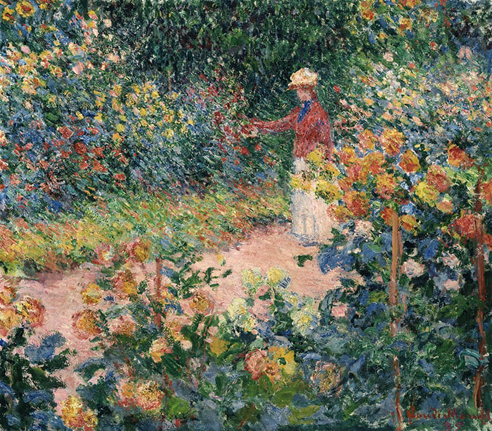
In the painting of water lilies below and the two close-ups that follow thereafter, notice the build-up various greens, blues and purples. Also, notice how Monet used thicker paint for the red and yellow flowers. This reinforces the depth and form in the painting.

")
")
The painting below is a colorful display of oranges, yellows, reds and greens. If you look closely at the brushwork, you will see the grass and haystacks are painted with nothing more than a build-up of broken color. It seems he may have started with a base color then scumbled other colors on top using a dry brush.

")
")
Unfinished Paintings
Whenever I am taking a deeper look at a master artist, I like to search for any of their unfinished works. These (if any) can provide some great insights into how the artist worked and progressed through a painting.
Unfortunately, most unfinished works by master artists are destroyed rather than documented. But I did manage to find a couple by Monet.
Below is an unfinished painting from the Charring Cross Bridge series. It indicates that Monet started with a colored ground using a dull tone, then applied dark and light accents on top of that.

Below is an unfinished self-portrait by Monet, however, I am unsure if the painting was left unfinished on purpose. The painting indicates how Monet used his brush to establish form and structure, starting with a relatively dry brush then consolidating with thick paint and committed strokes.
, 1884")
Breakdown of Monet’s Paintings
Below I take a closer look at a few of his paintings and break them down to see what makes them work.

I stumbled across the painting above the other day and was in awe of the stunning color harmony. Here is my breakdown:
- He made interesting use of purple for the exposed shoreline.
- Directional brushstrokes follow the flow of the water and help guide you through the painting. Also, notice how directional brushstrokes are used in the sky to gently direct you down towards the water.
- The darks in this painting are around the middle value range. This results in a much more colorful painting overall because blacks and browns are not used for the darks.
- Notice the use of broken color for the water and the cliffs.
- He used common colors throughout different areas in the painting. For example, in the cliffs, you can see some bluish-green which is also used for the water. In the sky, you can see some dull purples which are also used for the exposed shore and for dark parts of the cliff. This creates a strong sense of harmony throughout the painting.

- I really enjoy the bold strokes used in The Seine at Rouen painting, particularly for the light shooting through gaps in the trees which is also hitting the path.
- There is a strong value contrast in this painting compared to the one prior. Monet used dark greens and blues for the darks.
- The painting looks very realistic when you look at it as a thumbnail, despite the brushwork being so loose. This indicates that the values are accurate.
- The buildings and boats are nothing more than blocks of color with a few important details painted on top.

- Rock in Dieppe shows a beautiful display of broken color and expressive brushwork. He used short, dabbing strokes of varied colors to give the illusion of detail.
- Stronger colors and more contrast are used for the foreground compared to the background. This reinforces a sense of depth in the painting.
- Notice how basic the subjects are in the bottom right.
- The fences on the cliff help indicate the structure of the land.
- Relatively cool colors are used for the shadows. This contrasts against the warm lights.
- The edge which separates the sea and the sky is almost completely lost. The small, dark accents used for the distant boats help separate the sea from the sky.
Monet’s Series of Paintings (Same Subject Painted Under Different Conditions)
Monet created several series of paintings which involved him painting the same subject over and over again under different conditions. The most notable example of this is his water lilies series, but he also did it with the Rouen Cathedral, haystacks, the Charing Cross Bridge, the Houses of Parliament and Morning on the Sienne.
He was interested in exploring the interaction between color and light. Painting the same subject under different conditions allowed him to focus his attention on the way colors change with the light, rather than trying to render a completely new subject. In reference to his haystacks series, Monet wrote to art critic Gustave Geffroy:
“I’m hard at it, working stubbornly on a series of different effects, but at this time of year the sun sets so fast that it’s impossible to keep up with it … the further I get, the more I see that a lot of work has to be done in order to render what I’m looking for: ‘instantaneity’, the ‘envelope’ above all, the same light spread over everything… I’m increasingly obsessed by the need to render what I experience, and I’m praying that I’ll have a few more good years left to me because I think I may make some progress in that direction…” (Source: Monet by Himself, p196, edited by Richard Kendall, MacDonald & Co, London, 1989.)
Below are two of his paintings from the Charing Cross Bridge series. The first shows an overcast scene, with blues and grays dominating and a few yellow accents to indicate light bouncing off the water. The second shows a completely different arrangement of colors. It appears to be at sunset, with increased contrast between the rich purples for the bridge and the soft yellows and pinks in the rest of the painting.


Monet’s Subject Selection
Monet is known for his vibrant landscapes and paintings of waterlilies, but he was not limited in terms of his subject selection. He also painted still lifes, interior subjects, portraits, cityscapes and even some caricatures. Here are some of those works:


Additional Resources
If you enjoyed this post, you may also find these interesting:
The Many Paintings Of Water Lilies By Claude Monet
How Claude Monet Documented Light Using The Rouen Cathedral
How Claude Monet Used Haystacks To Demonstrate Light and Color
Quotes by the Impressionist Master Claude Monet
Impressionist Art Movement – Masters Of Light And Color
Want to Learn More?
You might be interested in my Painting Academy course. I’ll walk you through the time-tested fundamentals of painting. It’s perfect for absolute beginner to intermediate painters.
Thanks for Reading!
I appreciate you taking the time to read this post and I hope you found it helpful. Feel free to share it with friends.
Happy painting!
Dan Scott

Draw Paint Academy


Thanks for this which inspired me of some tips. But if we can have a similar treatise on a different artist e.g. Italian or such for me is more than welcome because at the moment the work I am imagining painting is more dramatic. A sort of heavy subject involving death.
That was such an insightful read! I have recently went back to painting in oils after painting in acrylics for 7 years and I’m digging the loose brushwork. However, I feel like it’s less about the strokes and more about the values.
Enjoyed this read. Visiting Giverny years ago, I realized that I wanted to paint. I’m now in an art class and hope one day to paint something my family would want to hang (eye roll!). The bridge and Lilly pads is something I want to attempt. Your article made me remember how I loved that place and how I visualized Monet there directing the gardeners in their little boats to arrange things just so….
Thanks again. I’m going to check out your lessons, too.
I really appreciate your breakdown of Monet’s work as an artist , thank you so much, interesting and inspiring at the same time, will check out your academy on the web; have a nice evening, cheers, Hans
Thank you ,Dan’
It is so kind of you to share you experience and knowledge and teach about color harmony on great examples.
Dan, You are so right, I have a print of Brooks Anderson’s Lavender: Study in Gold, which the beauty of it always fascinates me to this day, and like you said: it’s difficult to make sense of it when you look at it up close – the brushstrokes appear like nothing more than a mess of scattered color. But as you step back, it all seems to come together.
Thank you so much for sharing Monet’s paintings and explanation of the brush strokes and colors he chose . I will never be able to paint like Monet , however I have learned some new techniques I can use . I want to learn more .
Thanks again , I’m hooked !
Thank you very much for the informative post. Could you please tell me how can we develop our own impressionistic style of painting. Thanks again
Hi Rubz! I would first focus on painting well. Make sure you have strong fundamentals. Then, you can relax your brushwork and paint with less detail to achieve that Impressionist look. Hope this helps. Thanks! Dan
This is a terrific sampling of Monet’s use of color. Thank you for the detailed review of these paintings.
Love ❤️ all your articles Dan so much information in them! Thank you! I for one am better with a painting knife then a brush although I use both
Thank you Dan, this article was another eye-opener.
I love your post Dan, particularly the one explaining Monet’s great works. Yoiu inspire me to try painting again. Thank you SO much. Eileen
Im loving your posts.
Thank you, Dan. I look forward to your posts and I find them helping in my own painting journey. I have request: I know it’s a terribly mundane topic, but I wonder if you would consider doing a post on canvas preparation. I myself am continually frustrated by the excessive amount of time oiled and ground canvasses take to dry and the challenges both present storing canvasses of various sizes while they are drying, sometimes for months, before inspiration strikes, or I simply want to practice on different sizes of canvas. Thank you in advance for considering my request. Cheers, Bob T.
Hello Dan,
I came across your site via Pinterest, and your article about how to learn to paint impressionist caught my eye, I’ve been painting about 30 years now, and yet I’m not always happy about painting that way, too often I still go into too much detail, so thank you for your tips and advice, I really want to master this form of art.
Hi Dan,
Like you, I was totally in awe of realism, but I have grown to appreciate the work of the old
impressionists as well. It’s interesting how they create illusion with brush stroking.
I’m trying to paint my own way, but I am a fan of the work of a few artists on the tube and other places. Can’t have to much knowledge,right ?
Thanks, this was interesting.
Dave M ???
Thank you for the work you put into making this post. It’s really appreciated xx
Mange takk for din fortelling og forståelse om Monet.
Blir inspirert av å male videre.
Many thanks for great observations & all the post you send.
No problem Louis! More to come. Dan
Thanks Dan Scott.Monnet’s broken touch is really awesome of your choise o
f the lesson helped me. I will further work .
Sounds great! Thanks, Dan
Thanks Dan. Some really helpful and interesting observations!
Great to hear Meg! Dan
Bijzonder interessant omschreven de keuzes van deze meester. Bedankt voor deze interessante kijk op het werk van een groot kunstenaar.
Loved your article on how to paint like claude monet, have alway loved his work and your explainations were very clear and easy to understand. He really was a master of his movement which allowed the gates to be opened so to speak. I find his work quite spiritually lifting.
Thanks Eimer! Glad you enjoyed it. Dan
Thanks a lot Dan for all the exciting & inspiring posts you send. Much appreciated.
No problem Maureen, it is my pleasure! Thanks, Dan
Excellent education in a simple to understand summary! Thank you so much!!
Thanks Heather! That is my aim. Thanks, Dan
This is a great article! I help a friend’s children with Art lessons as they are home schooled, and this was immensely helpful and interesting for planning my next session with them.
That’s great Lexi! Happy to have helped. Thanks, Dan
I have really enjoyed this. Thank you so much.
Great to hear Margaret! Thanks, Dan
No problem at all Margaret, my pleasure! Thanks, Dan
It was such a treat reading this article. You opened my eyes to notice so many new things in a painting.
Happy to hear this Prachi! Thanks, dan
Thank you, Dan, I am learning so much from your posts! I appreciate you sharing your knowledge.
That’s great to hear Anca! Thanks, Dan
It always interests me that the masters like Monet painted impressionistic and the would paint Jean Monet on a horse or the caricature. Thank you for your interesting information.
No problem Mabel! Dan
Always very helpful and full of inspiration. You have a skilled way of explaining intricate details and tips which seem doable. I try to adapt your tips to watercolour and usually apart from the difficulty of leaving white spaces, usually works.
Many thanks, as ever,
Clare
Thanks for your kind words Clare. Happy to hear the information is helpful to you and your paintings! Dan
I appreciate you expertise! I tried to paint lilies after visiting at Monet’s home. My painting did NOT have those soft strokes that make his painting so so lovely!
No problem at all Shirleah! Feel free to email me a photo of your painting and I can take a look for you. Thanks, Dan
Dan, Muito obrigado pelos ensinamentos que você tem me passado. Já li vários livros sobre técnicas de pinturas, mas eles não me ensinaram nem 10% dos seus posts. Aqui onde eu moro, os artistas acumulam conhecimentos, mas não compartilham com ninguém. Você ao contrário, espalha conhecimentos para nós e ajuda a desenvolver a pintura no mundo. Tenho muita estima por você. Abraços.
Hi Sergio
Thanks for your kind words, it means a lot to hear! I am happy to be able to help you learn more about painting. Thanks, Dan
Thanks for your post and I appreciate both your explanations of his colors and style. I was particularly interested in how he portrayed figures and buildings from a distance.
Great to hear Marilyn! Thanks, dan
I, too, have studied Monet and in 2016 travelled to a number of the sites he painted: Rouen, Honfleur, Dieppe and Etretat. It was awe-inspiring to imagine how he worked in the late 1800s and how he looked at the scenery and interpreted what he saw. I am grateful for what you do. Thank you for sharing these insights.
Sounds like a great trip Mimi. I am just happy to be helping! Dan
Sone mistankens in my posting, but I hope you understand
This was perfekt timing – I’m painting together with sone FriendFeed on Tyesdays, and tomorrow the rask is “to paint like Monet”?
That’s great Grethe. Hope you were able to apply some of the information to your class! Dan
This article was very insightful and helpful. The more I learn to see through the eyes of artists, the more I learn about my own processes.
Great to hear Barbara, couldn’t agree more! Dan
wow….thanks for sharing this Dan.
No problem at all! Dan
Thank you! You consistently produce content that always seems to be right where I’m at, painting wise. And you also the only one I’ve found whose willing to impart knowledge while others seem to hoard it
Really glad to hear thanks Shannon 🙂 Dan
Bravo, Scott! Love your posts! Thank you so much for your insight and expertise!
Thanks Brenda!
Thank you. This is lovely. Monet has always been my favorite. Such a genius. Like you, I quickly realized that I did not want my paintings to look like a photograph, or otherwise I would just frame a photograph! I want something deeper. While photos can do that, the paint brush takes time and concentration over many hours. One single brush stroke and make an image pop! Oh how I long for the day when I can get to that point. But even if I never do, I can learn about the artists, their works, their styles, and look deeper into a painting than I ever have before. I teach little children, and I try to pass these legacies on to them in my classes. A paintbrush in the hands of a child can do so much more than the button of a video game. Thank you again for this lovely article on Monet.
Thanks Loretta! Beautiful words. Dan
Thanks again,it’s very helpful to percieve appreciate and remember Monet ‘s Paintings
Thanks Varda! Dan
Thanks!sir. It’s very good post for
learner. i shall follow mentioned tips of great artist. Thank you!?once again.
Thank you. . .always enjoy your posts
My pleasure thanks Heidi, Dan
Hi Dan,
Another great post, I really enjoyed it. “I believe Monet sense of color and great brush strokes is what really made his paintings so wonderful to look at” they are truly awesome.
Thanks John! Glad to hear this. Dan
Thanks John! I agree. Dan.
I’m more into the Robert Wood realistic look and his(monet) type painting looks more like my grandkids messing around
you may have some budding artists!
Thank you so much for your insightful suggestions etc. I am very much loving becoming involved with the joy of colour and brushstrokes.
All a matter of appreciation and understanding. I will not put down your taste in art (i.e. Woods) that is yours. If I would do that I would say, my grandmother enjoys it. It requires no imagination or feeling.
The Seine painting of the river scene is a great work I think. The discussions you attach are very generous and inspiring so thanks a lot Dan.