
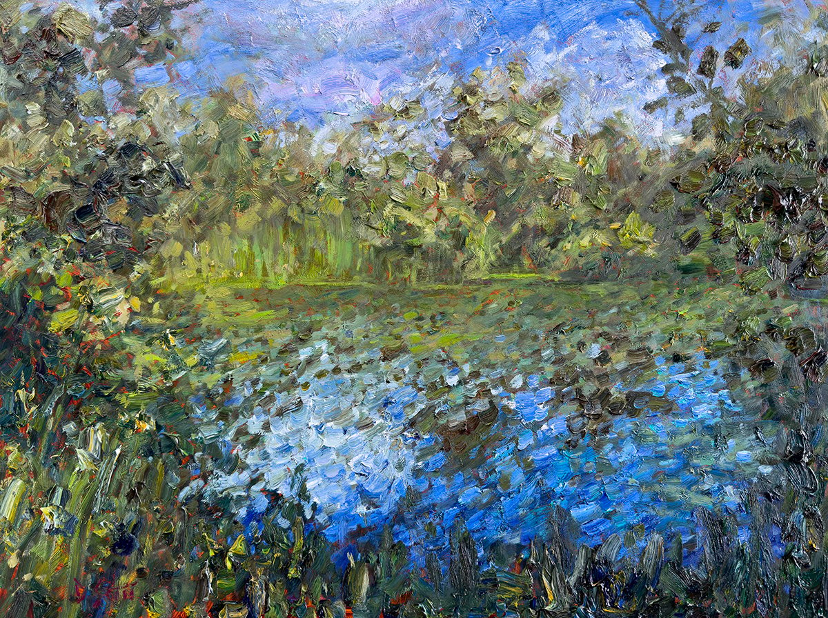
I recently put the finishing touches on Fraser Island, Analogous Colors (see below). It’s a simple landscape with a sea of analogous greens and blues. In light of this painting, I put together a few tips for painting with analogous colors.
- Recap: What are Analogous Colors?
- Use the Stain as a Point of Contrast
- Compress the Values
- Visible Brushwork and Texture
- Dark or Colorful Accents
- Key Takeaways
- Want to Learn More?
- Thanks for Reading!
(I also published a video walking you through the key steps of this painting. You can watch it here.)
I’ll walk you through the entire process using one of my recent paintings. You’ll see how I go from idea all the way through to reflecting on the finished painting.

Recap: What are Analogous Colors?
First, let’s make sure we are all on the same page about the meaning of analogous colors.
Analogous colors are groups of colors that are close to each other on the color wheel, such as yellow, green, and blue or red, orange, and yellow. These colors have a natural harmony and cohesiveness, which can be utilized in painting.
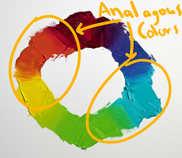
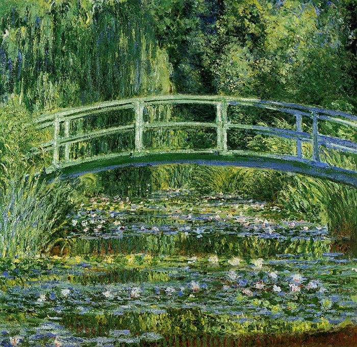
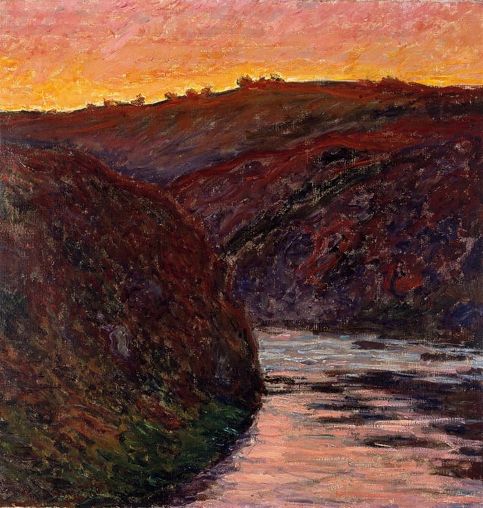
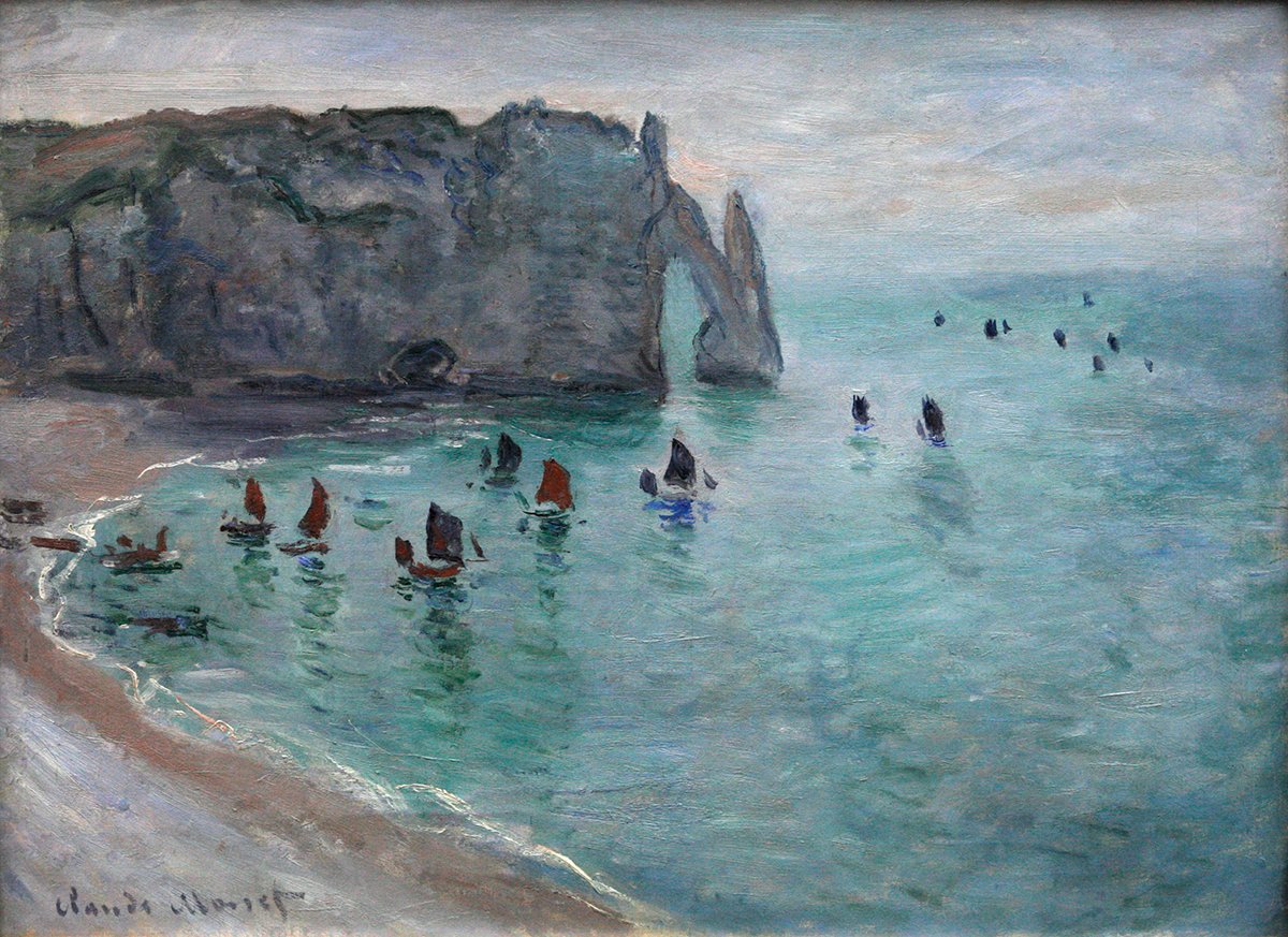
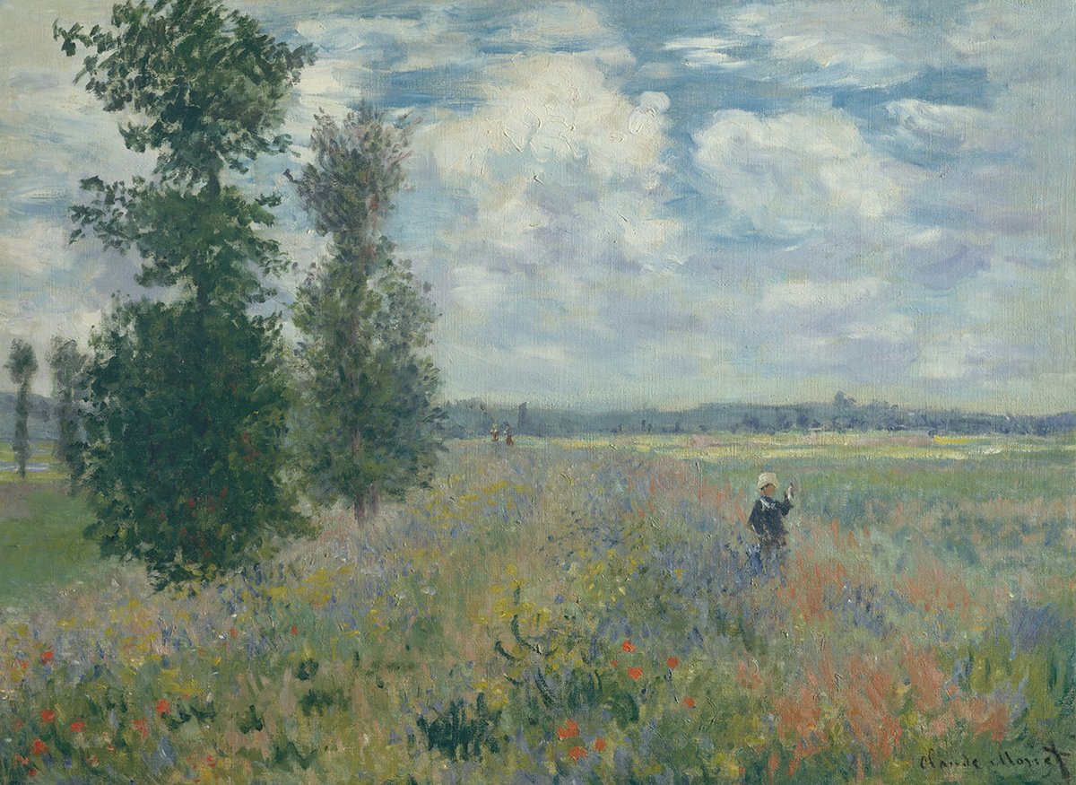
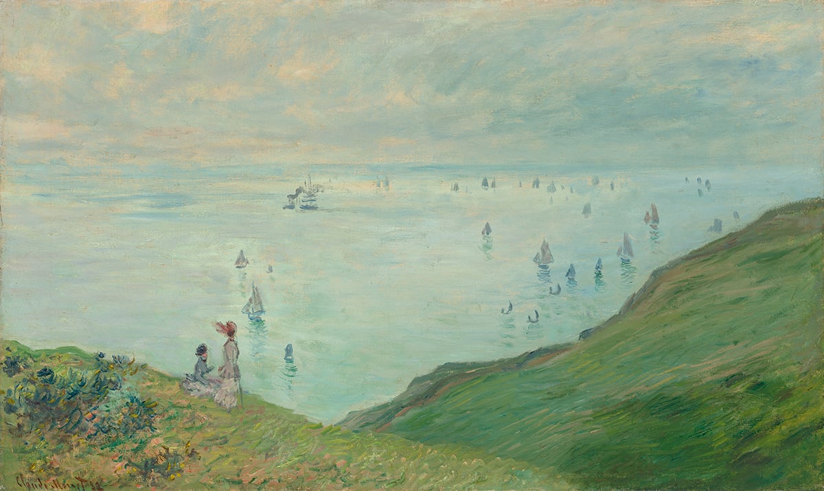
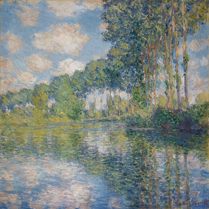
Often, you’ll find that analogous colors have a cool or warm theme, and this can influence the overall feel of the painting. Cool analogous colors (greens and blues) are typically calm, peaceful, and serene. Warm analogous colors (reds, oranges, and yellows) tend to have a more fiery and dramatic appearance. Look at the difference between the following two paintings by Claude Monet. The first showcases cool analogous colors and the second showcases warm analogous colors. Keep in mind, this is all subjective, but it does matter.
Use the Stain as a Point of Contrast
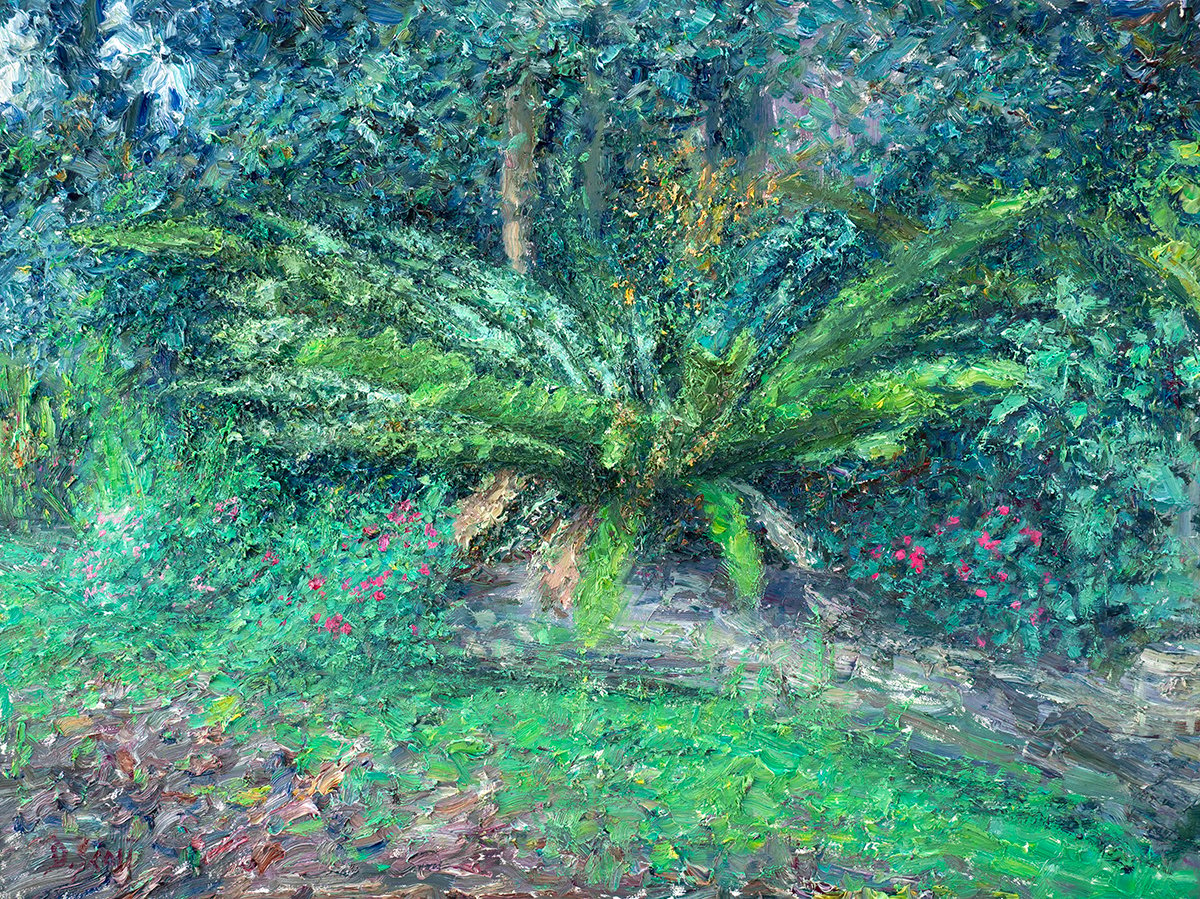
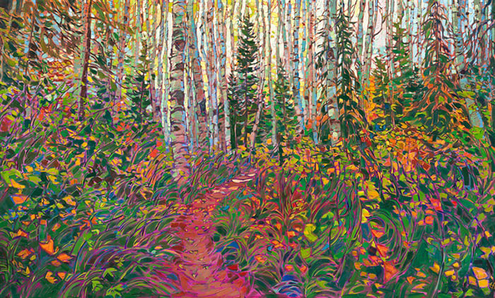
A simple but effective strategy for painting with analogous colors is to stain the surface with a contrasting color. So if the subject features cool analogous colors, stain the surface with a warm color, and vice versa. I did this with Fraser Island, Analogous Colors. I used transparent oxide red for the stain and painted all the blues and greens over the top.
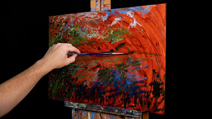
The idea is to make it easier to judge the colors. It also gives you the option to leave tiny parts of the stained surface exposed in the finished painting, which can produce some interesting effects and finishes. In my Fraser Island painting, you can see parts of the warm stained surface in the finished painting through gaps between my strokes. This seems to give the painting a warm glow and makes the greens and blues “pop” just a bit more due to the temperature contrast. But it’s only subtle and doesn’t compromise the analogous theme.
Compress the Values
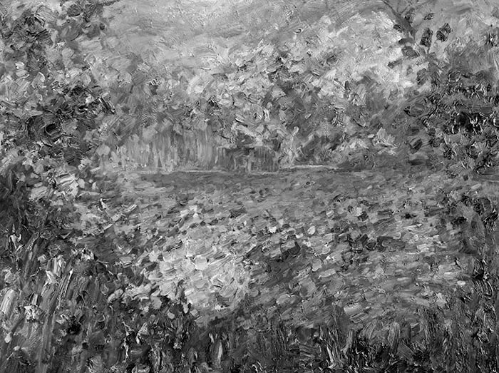
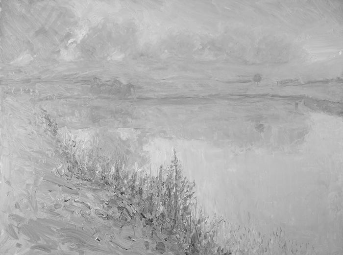
Another effective strategy for painting with analogous colors is to compress the value range so that the colors have a similar lightness. This works well for particularly quiet and serene subjects. My Fraser Island painting isn’t the best example of this, but I did compress the values of the lighter areas somewhat, as you can see in the grayscale below.
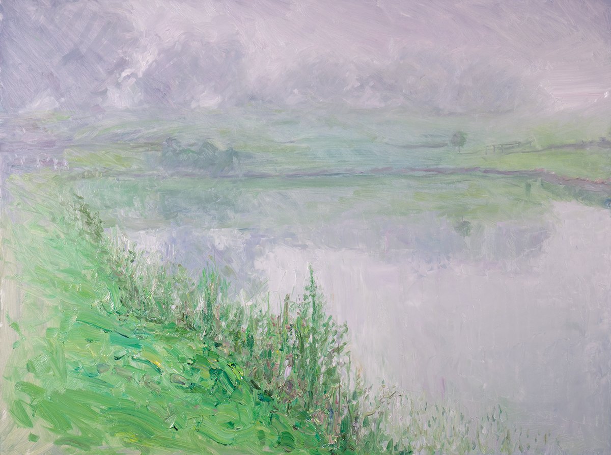
Maryvale, Mist is a better example. It features different greens, blues, and purples compressed around the middle to light end of the value scale. The lack of contrast plays into the idea of a misty day on the land.
Visible Brushwork and Texture
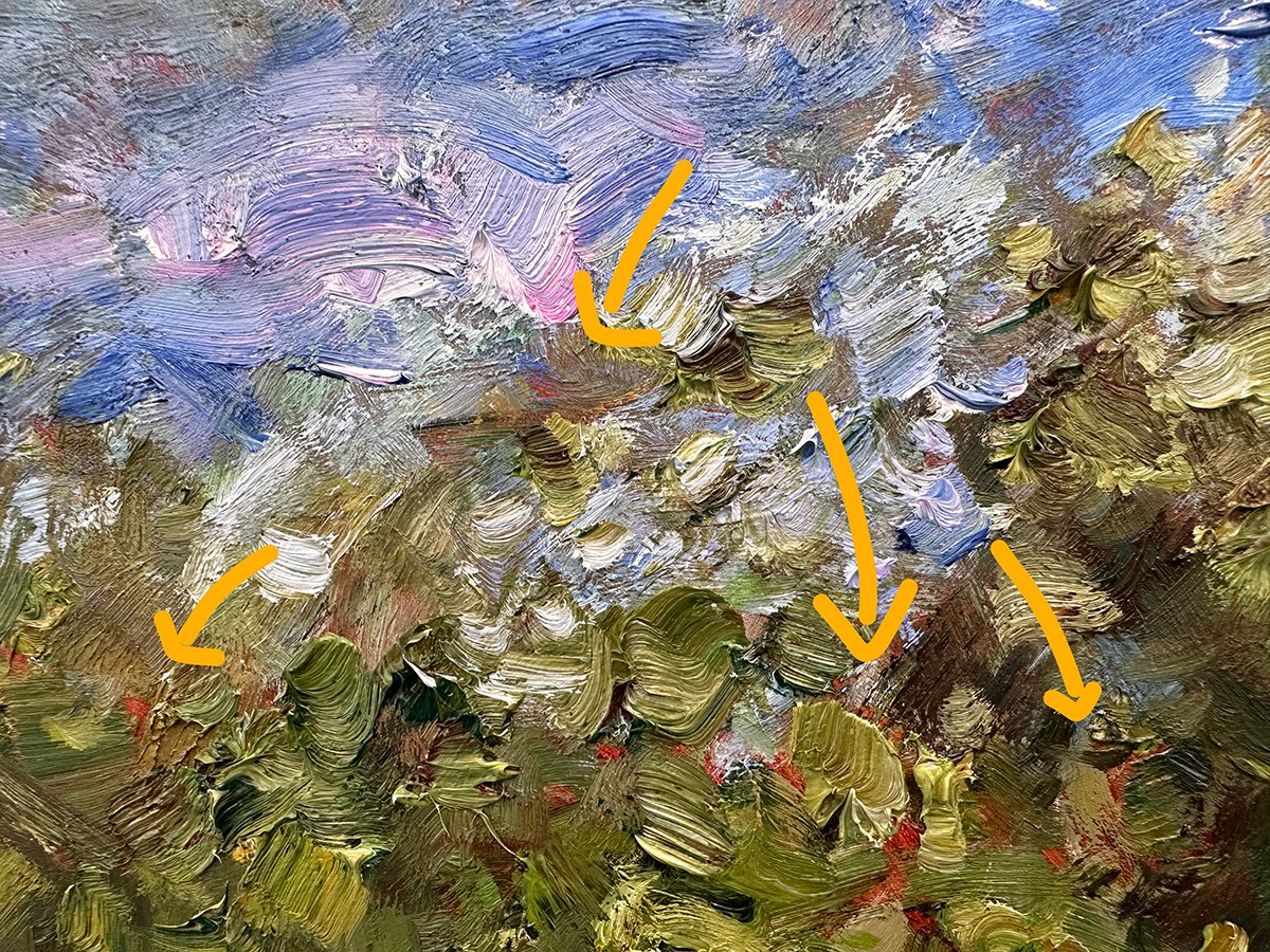
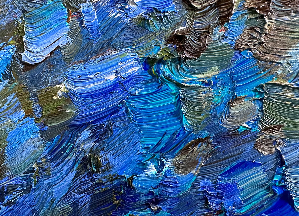
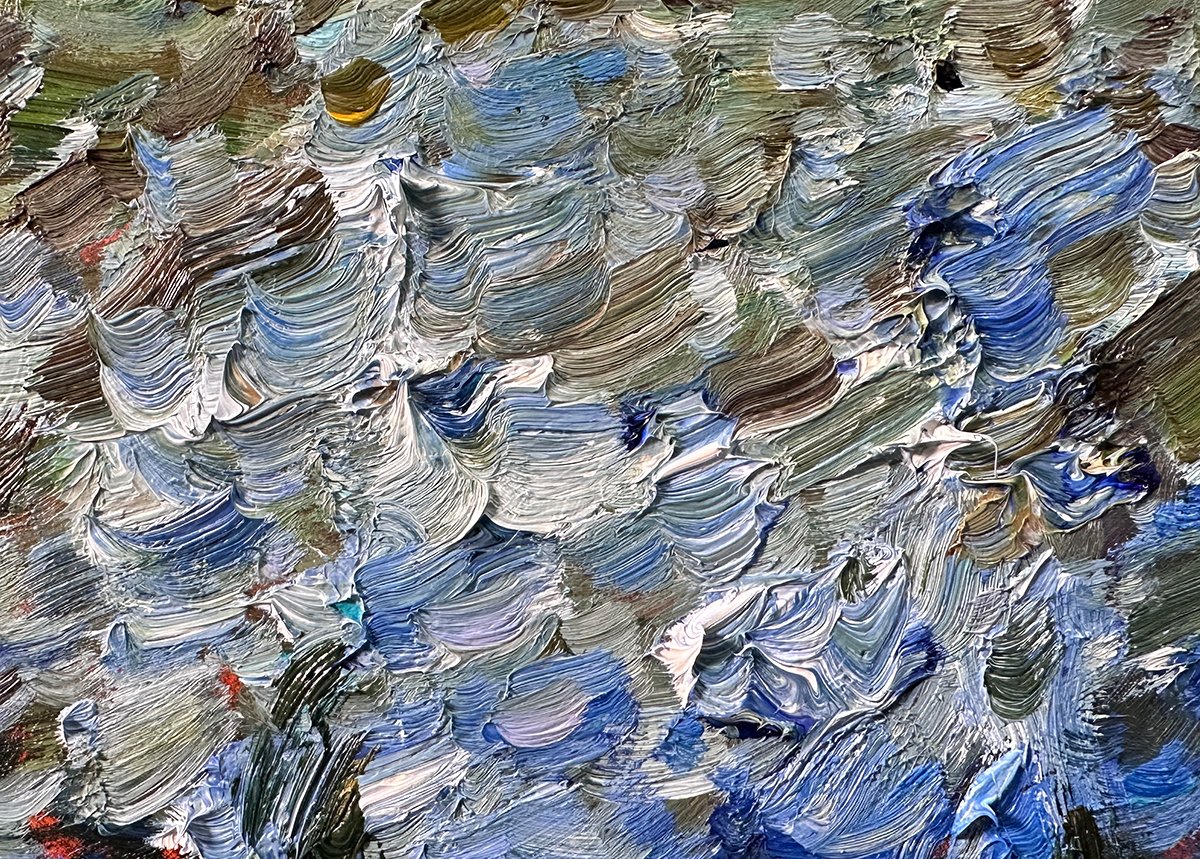
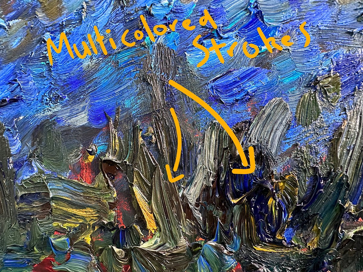
When painting with analogous colors, you may need to inject a bit of life and energy into the painting to make it work. Especially if you’re also painting within a compressed value range. Visible brushwork and texture are great ways to do this. They allow you to add a bit of flare without compromising the overall feel and structure of the painting. Below are a few detail shots of my Fraser Island painting. Notice how my strokes also play into the nature of the subject. For the water, I used more horizontal and repetitive strokes. Whereas for the land, grass, and trees, I used more vertical and varied strokes.
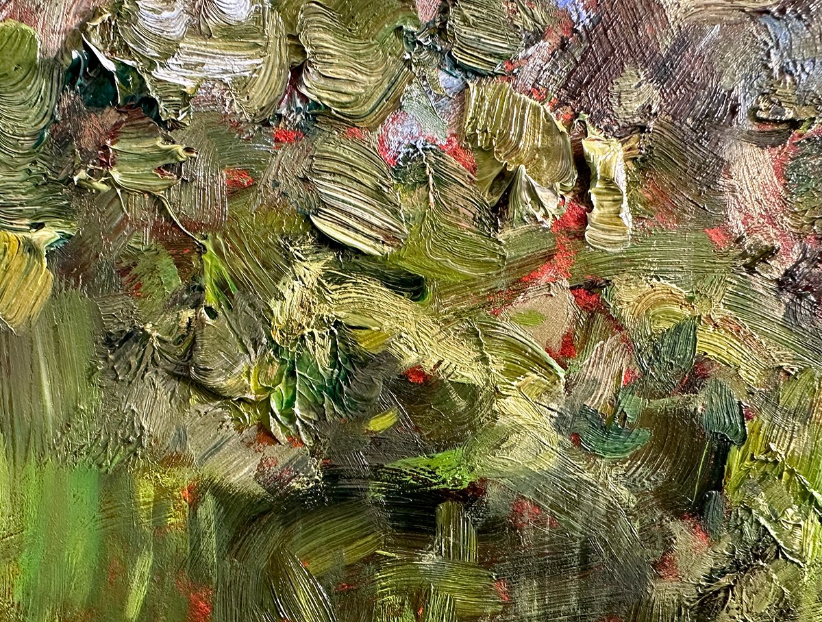
Multicolored strokes are also effective. This technique involves picking up a few different colors on the brush and leaving them partially unmixed. It’s particularly effective for landscape painting. With a single stroke, you can capture all kinds of information and detail.
Dark or Colorful Accents
Dark or colorful accents can act as exclamation points in your analogous painting that draw attention and break up monotonous areas. It can be effective to go against the analogous theme here. For example, a sharp, dark accent amongst light analogous colors. Or a burst of warm color amongst cool analogous colors. In my Montville, Lush Greens, Rainy Day painting, the pink flowers and ochre leaves provide bursts of warmth amongst the sea of greens and blues.
Monet also did this in many of his analogous paintings. Below are a few examples.
Key Takeaways
- Analogous colors are groups of colors that are close to each other on the color wheel, such as yellow, green, and blue or red, orange, and yellow.
- The dominant temperature of the analogous colors can influence the overall feel and finish of your painting. Cool analogous colors (greens and blues) are typically calm, peaceful, and serene. Warm analogous colors (reds, oranges, and yellows) tend to have a more fiery and dramatic appearance.
- Consider staining the surface with a contrasting color. This will help the analogous colors “pop” and make your judgment of the colors more accurate.
- Combine analogous colors with compressed values for particularly peaceful and serene subjects.
- When painting with analogous colors, you may need to inject a bit of life and energy into the painting to make it work. Visible brushwork and texture are great ways to do this.
- You can use dark or colorful accents to draw attention or break up monotonous areas in analogous paintings.
Want to Learn More?
You might be interested in my Painting Academy course. I’ll walk you through the time-tested fundamentals of painting. It’s perfect for absolute beginner to intermediate painters.
Thanks for Reading!
I appreciate you taking the time to read this post and I hope you found it helpful. Feel free to share it with friends.
Happy painting!

Dan Scott

I love your new painting New Zealand autumn colors!
This was a very clear and helpful lesson on painting with analogous colors. Thank you.
Dan, A novice painter, I use watercolour paint, so would underpainting be an issue. Would a light wash of cad yellow or cobalt be an option? Also, can you explain how to ‘compress’ colours; I haven’t come across that term. Pamela
Thank you Dan so much for this brilliant easy to understand lesson in analogous colours.
Who everreads your posts is so privileged to share what you so generously and capably share as a brilliant artist, a brilliant teacher and I’m sure now a brilliant father also
Thank you for you and your family
Dan thank you for all the advice and lessons so far. I treasure them.
Thank you, Dan, for sharing so much of your art and your talents. I have been quite sick and have not had the energy and the motivation to paint since my infirmity started. Your emails lately, and especially this one, has given me the desire to begin again.
Ileana
Thank you so much DAN the information is so engaging and builds excitement for what can be put on a canvas.
I’m drawn to pastels at this time so I don’t know if you ever have lessons on those?
Hi Anne! I have not used pastels in many, many years but much of the color information can be applied to pastels. The main difference is in the application and techniques.
Loved this post, truly one of my favorite art forms
Thank you!!
I loved your very helpful tips! Thank you and have a great day.
Really useful, thank you. I especially love the idea of Using the Stain!
Thanks so much for all this good information. I am still trying to improve my use of value to improve my paintings. This lesson on analogous color was great and permitted me to see different and similar values and their affect on the painting . Thanks. I look forward to your sharing and usually save them to study again.
Thank you Dan, This is so helpful and explains simply how effective following this “receipe” can be.
Am 72 and started painting when I was downsized. My wife told me to find a hobby. I tell people that I used to have a day job but when I was downsized my wife hired me to do Excel data summaries and accounting entries. So I have a new day job of sorts. The pay is not much. basically room and board, but I get to sleep with my boss.
C:\Users\Dell\Pictures\paintings.jpg
original photoshopped C:\Users\Dell\Pictures\IMG_20170816_173139.jpg
imagine C:\Users\Dell\Pictures\Camera Roll\WIN_20170812_225033.JPG that was me about 80 lbs ago.
C:\Users\Dell\Pictures\ControlCenter4\IMG_20160724_145407154.jpg
C:\Users\Dell\OneDrive\Pictures\IMG_20200805_092451.jpg
I have others but have not recorded them.
What do you think?
Hi Hanoch. Unfortunately I cannot see those images. I also cannot give out critiques to everyone sorry! Time is a bit scarce at the moment between painting and parenting.
Excellent. Love your Maryvale Mist.
Dan, thank you so much for your email article’s. You’re blessed with sharing helpful information about painting etc.!
Thank you! Interesting and informative!
Would I be able to use this technique with watercolors?
Hi Jeanne! Yup for sure. Most of the color principles can be applied broadly across all traditional mediums.
Thanks Dan, I’m just getting ready to paint 2 boys on the bank of a misty stream so this was perfect timing.
I appreciate your teaching.
Julie
Thank you for your service!The colours are so tender! Monet must have been a gentle man with a warm heart! L.v.B.
I have printed off all of your tips and keep them in a binder. I appreciate all of your help! Thank you
Dan, Thanks so much for this amazingly simple yet complete description of this topic. I especially liked how you used a visual example of each point you made with your work and Monet. You are an excellent teacher. Well done!
I look forward to your postings. They keep me connected to art on days that I can’t actually be painting or drawing.
Thank you.
Excellent, thanks a lot Dan and have a great day –
Thank you
Great info.
Enjoy all your emails
I have been looking into Monet’s work and although I like his work I didn’t understand his use of colors. You clarified his use of colors so that I could understand them. I have been new to painting for about 3 years now. I am a slow learner and I shake and at times jerk abit. I haven’t the means to take actual classes so I search youtube.
Thank You
Hi Thomas. Can you narrow your question a bit? Which aspect of Monet’s color do you want to know more about? Keep in mind, there are no secret techniques or colors Monet used. A lot of it is fundamental stuff. But he did it well. Also, sometimes it is enough to just appreciate the beauty of it!
Thank you
Great info.
Gorgeous painting! Brings back happy memories of camping on Fraser Island in the early 80’s. Love your work!
Back when there were brumbies and many more dingos!
I appreciate your concise way of conveying key points. Once again, very on point.
Great, simple explanation. Thanks for the tips
Wonderful. Teaching art genius
THIS WAS ON EOF THE BEST EXPLANATIONS OF ANALOGOUS COLORS I HAVE EVER HEARD THANK YOU FOR TAKING YOUR TIME TO SHARE WITH ME
Love this ❤️