
Mountains form an interesting component of many landscape paintings. They are large, dominant shapes that you can use to really set the foundation of your composition.
But many beginners seem to struggle with how to paint mountains.
In this post, I will give you some tips for painting mountains with depth. I cover:
- Mountains Are Just Arrangements of Large Shapes and Colors
- Contrasts Between Light and Shadow
- Sometimes, the Most Important Mountains Are the Most Simple
- Summary
- Want to Learn More?
- Thanks for Reading!
Mountains Are Just Arrangements of Large Shapes and Colors
Painting mountains is no different to painting a face, tree or any other object. It is all just an arrangement of shapes and colors.
Mountains are actually easy elements to paint. Most of the time people overcomplicate them and try to paint them with too much detail.
Let’s take a look at some mountains in a painting by Edgar Payne (who is really the first person who comes to my mind when I think of great paintings of mountains). Notice in the painting below how dominant and beautiful the mountains appear. They are really a feature of the painting.

When you look at the painting as a whole, it looks very complex. You may even say to yourself that you would never be able to paint that. But let’s break it down.
The mountains by Edgar Payne are really just large shapes of color. I have outlined some of the dominant shapes below.

There is really not much variation in color or tone in the mountains. It is basically just different purple tones with some high-value gray tones mixed in for the snow.
When you break the mountains down into these basic shapes and colors, then they become much easier to paint.
Contrasts Between Light and Shadow
As mountains are so large, you usually need to paint them from a distance. But from a distance, atmospheric perspective comes into play, and you are not able to see all the intricate details.
So, how do you create interest in an object when you cannot even see the details? Well, one of the most interesting elements of mountains are the sharp contrasts between light and dark (shadow).
When you are painting this contrast, you should take note of the color temperature of the light source as it may determine how warm/cool your colors should be.
You may have heard about the phrase…
“Warm light, cool shadow (and vice versa)”.
Well, what this means in terms of painting mountains is, if you are painting in the warm light of a sunset, then generally the highlights will be warm and the shadows will be cool (think blues and purples).
On the other hand, if you are painting in the cool light of an overcast day, then the highlights may be cool and the shadows may be warm.
There are no hard and fast rules here and you will need to use your observation skills to really determine what colors to use. But this is generally handy knowledge to fall back on.
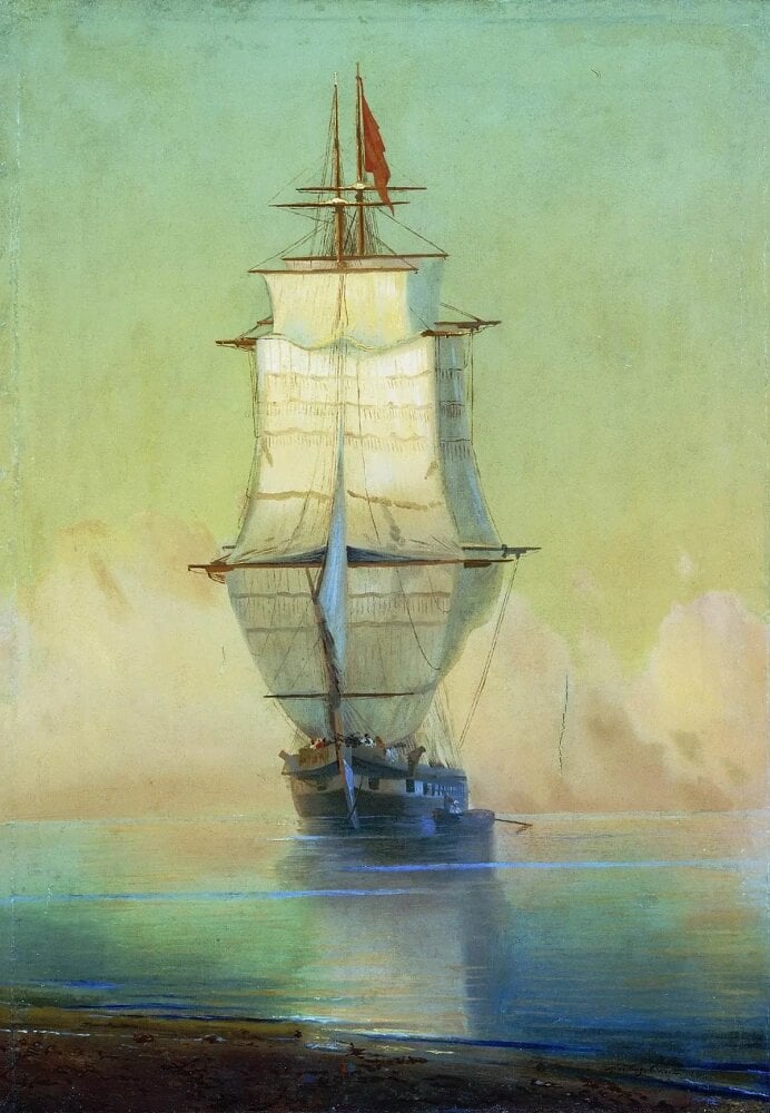
Check out this painting by Albert Bierstadt. You should note a few things:
- The mountains are the sole subject of the painting.
- It is painted from a distance so you cannot see the intricate details of the mountains.
- At this was painted during sunrise, the light is warm. Therefore, the highlights are a warm orange and the shadows are a cool blue. This creates an interesting contrast in an otherwise bland scene.

Also, check out the contrast between light and shadow in this painting.

Sometimes, the Most Important Mountains Are the Most Simple
As we discussed in my post on atmospheric perspective, as something recedes into the distance, the clarity decreases.
So, if you are painting mountains in the far distance, then you may not even be able to see the contrast between light and shadow. It may only be a solid shape of color.
Check out these paintings below. These are brilliant paintings by Arthur Streeton and the mountains are nothing more than shapes of blue.


Summary
I hope you found these tips useful for how to paint mountains. If you can master the way you paint mountains, then you can really use them as a feature in your paintings (like Edgar Payne did in many of his paintings).
Want to Learn More?
You might be interested in my Painting Academy course. I’ll walk you through the time-tested fundamentals of painting. It’s perfect for absolute beginner to intermediate painters.
Thanks for Reading!
I appreciate you taking the time to read this post and I hope you found it helpful. Feel free to share it with friends.
Happy painting!
Dan Scott

Draw Paint Academy


Great suggestions. I paint a lot of mountains so this was a special help for me. Thank you.
Great insights, Dan.
I paint in watercolours, but all the aspects of painting you cover apply to all media.
Keep up the good work!
Trevor
Thanks Dan, valuable info about cool and warmth when painting mountains. This post made me aware of sunrise or sunset effect on mountain painting.
I don’t have mountains here in sw Ms. But I was interested in your basic shapes breakdown of the mountains. I learned from that. Thank you.
I love mountains! This information will help me make more realistic mountains, very helpful.
Very useful information about light n shadow. Thanks Dan!
No problem Dipali!
Dan
Fantastic info Dan. Thanks!
No problem Margie!
Dan
Good information about when to use cool highlights and warm shadows. Thank you!
No problem 🙂
Dan