Color

Why Broken Color Is So Effective for Painting the Landscape

By Dan Scott / May 28, 2022 / Comments Off on Why Broken Color Is So Effective for Painting the Landscape

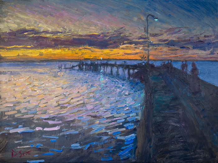
​I often write about the broken color technique. Which basically refers to using a brush or palette knife to create a patchwork of distinct, interwoven colors. You’ll see it up close in many of the top Impressionist paintings. Like Claude Monet’s Haystacks. Or Pierre-Auguste Renoir’s Chestnut Tree in Bloom. Broken color is one of my … Read more

Read More
Dan Scott, Morning Lookout, 2020

How to Paint Color Gradations

By Dan Scott / November 20, 2020 / 88 Comments

This is a detailed guide on how to paint color gradations. I wrote this in light of a recent painting, Morning Lookout (shown below). It’s a study of the early morning’s subtle color gradations just before the sun peers above the horizon line. I cover: Color Gradation Meaning Color gradation refers to the transition from … Read more

Read More
Anders Zorn, Jugend, 1908

How to Paint Highlights

By Dan Scott / August 27, 2020 / 106 Comments

Highlights are tricky. Get them wrong and your whole painting will look slightly off. Get them right and it pulls everything together, like slotting the missing piece into a jigsaw puzzle. Let’s take a closer look at what highlights are, how to paint them, and some of the nuances to look out for. I’ll cover: … Read more

Read More
Color Charts (4)

Creating the Richard Schmid Color Charts

By Dan Scott / March 9, 2020 / 95 Comments

I have been busy over the past few weeks creating color charts as recommended by Richard Schmid in his book Alla Prima. My charts are still in progress, but I thought I would publish this post in the meantime for others who may want to join me in doing this exercise. I cover: Be warned, … Read more

Read More
Claude Monet, San Giorgio Maggiore at Dusk, 1908

Color Saturation – The Ultimate Guide for Artists

By Dan Scott / October 14, 2019 / 49 Comments

Color saturation refers to how vivid, rich, or intense a color is. It is one of the three elements of color, with the other two being hue and value. Below is a saturation scale showing what happens when you take a vivid red and gradually lower the saturation until you have pure gray: Most artists … Read more

Read More
Dan Scott, Queenstown, New Zealand, 2019

Color Mixing and Application – The Ultimate Guide for Artists

By Dan Scott / September 27, 2019 / 26 Comments

Successful use of color in painting requires a thorough understanding of both color theory and color mixing and application. I wrote about the theory in a previous post. This post will provide you with everything you need to know about color mixing and application. I’ll cover: Basic Color Mixing Terms Color is a complicated area, … Read more

Read More
Split Primary Palette

Split Primary Color Palette – Using It to Mix Vivid Secondary Colors

By Dan Scott / May 5, 2019 / 41 Comments

A split primary color palette refers to a palette of colors with both warm and cool variations of the primary colors (being red, blue and yellow). The purpose is to mix a wider gamut of colors. I explain this in more detail below and cover the following in this post: Color Wheel Using Just the … Read more

Read More
Sir Isaac Newton

Subtractive and Additive Color – Different Systems for How We See Color

By Dan Scott / April 23, 2019 / 53 Comments

There are two systems that determine how we see color – subtractive and additive color. As an artist, it is essential that you understand these two color systems so that you can make informed decisions about the colors you use. In this post, I cover: Subtractive Color Subtractive color is how we see color in … Read more

Read More
Dan Scott, Brisbane City, Mist, 2022

A Guide to Color Schemes in Art and How to Use Them Effectively

By Dan Scott / March 7, 2019 / 20 Comments

This is a detailed guide on color schemes. I’ll discuss what they are, the different types, and provide master examples. What Are Color Schemes in Art? A color scheme is used to describe the overall selection of colors in an artwork. The major color schemes in art are analogous, complementary, split-complementary, triadic, rectangular and monochromatic. … Read more

Read More
Claude Monet, Haystacks, 1891

Broken Color and Optical Color Mixing

By Dan Scott / February 28, 2019 / 8 Comments

Broken color in art refers to the technique of building up layers of different colors on the canvas in a way which allows lower layers to be exposed. This usually involves painting with small dabs of color until the canvas is filled. The end result can appear like a vibration of color, as your eyes … Read more

Read More