
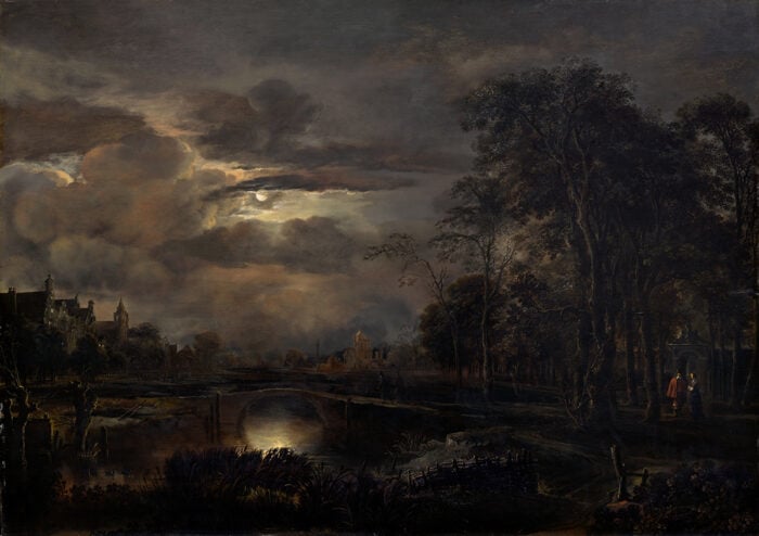
Black is a very polarizing color in the art world. Some people swear by using black, and others avoid it all together.
In this post, I want to try and clear up some of the confusion around black and provide you with some information on how to use it in your paintings and how to mix your own.
- What Is Black?
- Do You Need Black on Your Palette?
- Mixing Your Own Black
- Our Black Is Not Absolute Black
- Other Tips for Using Black in Your Paintings
- Want to Learn More?
- Thanks for Reading!
I’ll walk you through the entire process using one of my recent paintings. You’ll see how I go from idea all the way through to reflecting on the finished painting.

What Is Black?
This may seem like a silly question to some of you, but I think it is important to start with.
You may have noticed that black is absent from the color wheel. That is because it does not actually have a place on the visible color spectrum.

But does that mean that black is not a color itself? The answer depends on how you define color.
If we are talking from a purely scientific standpoint, then black and also white are outcasts and are not true colors. Black is what we see when very little light is reflected off an object. White is what we see when all wavelengths of light are reflected off an object. So in a sense, black is not a color by itself but rather the absence of color.
But as artists we use black as a physical color just like red, green, blue and so on. That is because we are also interested in the perception of color. Our definition of color is not limited to the colors on the visual spectrum, but also all the different ways we are able to perceive color and light. I wrote about this more in this post.
Do You Need Black on Your Palette?
Black can be an incredibly useful color on your palette, but it is far from a necessary color as you can mix your own (I will discuss how in the sections below).
Whether or not you have black on your palette also depends on what kind of subjects you like to paint. If you paint mostly inside still lifes and portraits, then black may be much more useful than if you mostly paint outside like the impressionists.

For inside subjects, the darks are much deeper than the darks outside.

Personally, I do not use black on my palette as I prefer to mix it myself. That is what suits me and I may even change this in the future. But you might find it easier to paint with black on your palette.
When John Singer Sargent and Claude Monet painted together, Sargent questioned “where’s the black?” in reference to Monet’s palette. Sargent struggled to comprehend how one could paint without black on the palette. But Monet was true to the impressionist theory and made use of blues, greens and earth tones as more colorful alternatives to black. Two masters, two different opinions on black. So there is no right or wrong answer here.

Mixing Your Own Black
The downside of mixing your own black is that you will not be able to reach that deep black which you can get straight from the tube. But we can get pretty close with our own mixtures.
I mix my own black by combining raw umber with ultramarine blue. It is not a deep black, but it is close enough, especially since I mostly paint landscapes. I think this is a very natural black which meshes well with the rest of the colors in my landscapes.
So why does raw umber and ultramarine blue result in a near black color? If you think about it, raw umber is really just a dark orange, and ultramarine blue is a dark blue. Orange and blue are complements, and when you mix two dark complements, then you get a dark gray (or near black).
This brings me to the other way you could mix your own black, and that is by mixing all three primary colors together (red, blue and yellow). This is essentially the same as mixing two complements together (mixing orange and blue is the same as mixing red, yellow and blue). However, I find that when you mix black by combining all three primary colors together that the addition of yellow makes it slightly lighter in value.
Also, the black you get from this will be pretty inconsistent as it depends on the types and proportions of primary colors you use. If you have more blue you will get a cool black and if you have more red you will get a warm black.
Our Black Is Not Absolute Black
In painting, we do not have the luxury of painting with absolute black. The closest we can get is near black.
The black we use in art will also rarely be completely neutral. Most of the time your black will have a slight bias towards another color.
In relation to paint straight from the tube, mars black is warmer whereas ivory black is slightly cooler. This becomes more obvious when you mix these black with white.
Other Tips for Using Black in Your Paintings
Here are some tips for using black in your paintings (whether that be a black from the tube or a black you have mixed yourself):
- Be careful with getting any white in your blacks in a painting. Your darks will not appear as rich and deep if you get even a small amount of white in them.
- Black is the darkest value you can use in painting, but that does not mean you must go that dark. You could easily push your darkest dark to around the middle value range, like many of impressionists do in landscape painting.
- Black is more useful for inside subjects like portraits and still lifes. When you are outside, there is much more light and you will rarely see deep dark colors.
- You can use black to reduce the saturation and value of a color (make it less intense and darker).
- Black is not the only option you have for making a color darker. You could also use blue, raw umber, or any color that is darker than your base color.
Want to Learn More?
You might be interested in my Painting Academy course. I’ll walk you through the time-tested fundamentals of painting. It’s perfect for absolute beginner to intermediate painters.
Thanks for Reading!
I appreciate you taking the time to read this post and I hope you found it helpful. Feel free to share it with friends.
Happy painting!
Dan Scott

Draw Paint Academy


I use my pallet rarely use black itself. Love your emails
Thanks Gail! Appreciate it. Dan
Thanks Dan for this very informative article. I have only painted for just over a year and am always learning something new.The phthalo green and cadmium red were new to me too. I’ll give it a try.
No problem thanks Trudy for the comment. Dan
This was very helpful Dan. Thank you
No problem thanks Victoria
Hi Dan
Thanks for those tips, I am going to try raw umber and UM blue as I have always used pthalo green and cadmium red deep or an even more purply red which I have found works well too and keeps it vibrant, but your solution sounds like it gives a darker black. I think it is easier to keep harmony within the painting by mixing your own black because you know what is in it. It is great for dulling your colours without creating mud. Thanks again
No problem thanks Leonie. I will need to try phthalo green and cadmium red deep. Dan
As a matter of interest I only use black to darken a colour. For example I will mix 2 parts blue and 1 part yellow for a dark green. Then use black to daken the green.
Thanks Mike
on the color wheel raw umber is in the yellow family and is compliment to purple. Burnt umber is compliment to blue! This mixture will give you a very vibtant Black. (I was taught by Master Artist, Frank Covino.)
Thanks Marcelle! Dan
Sorry, Black is a Primary Color as is White. Coal is black, snow is white as are many other items. I have a Color Wheel I developed that uses all Five Primary Colors, with Secondaries etc. if interested, let me know. I discovered it over a decade,ago, and used it ever since.
Hi Brian – sure feel free to send it to dan@drawpaintacademy.com. Cheers!
The blind leading the half-blind. Go away Brian.
I would love to know about your Color wheel. Thank you Jennifer