
 Share to X
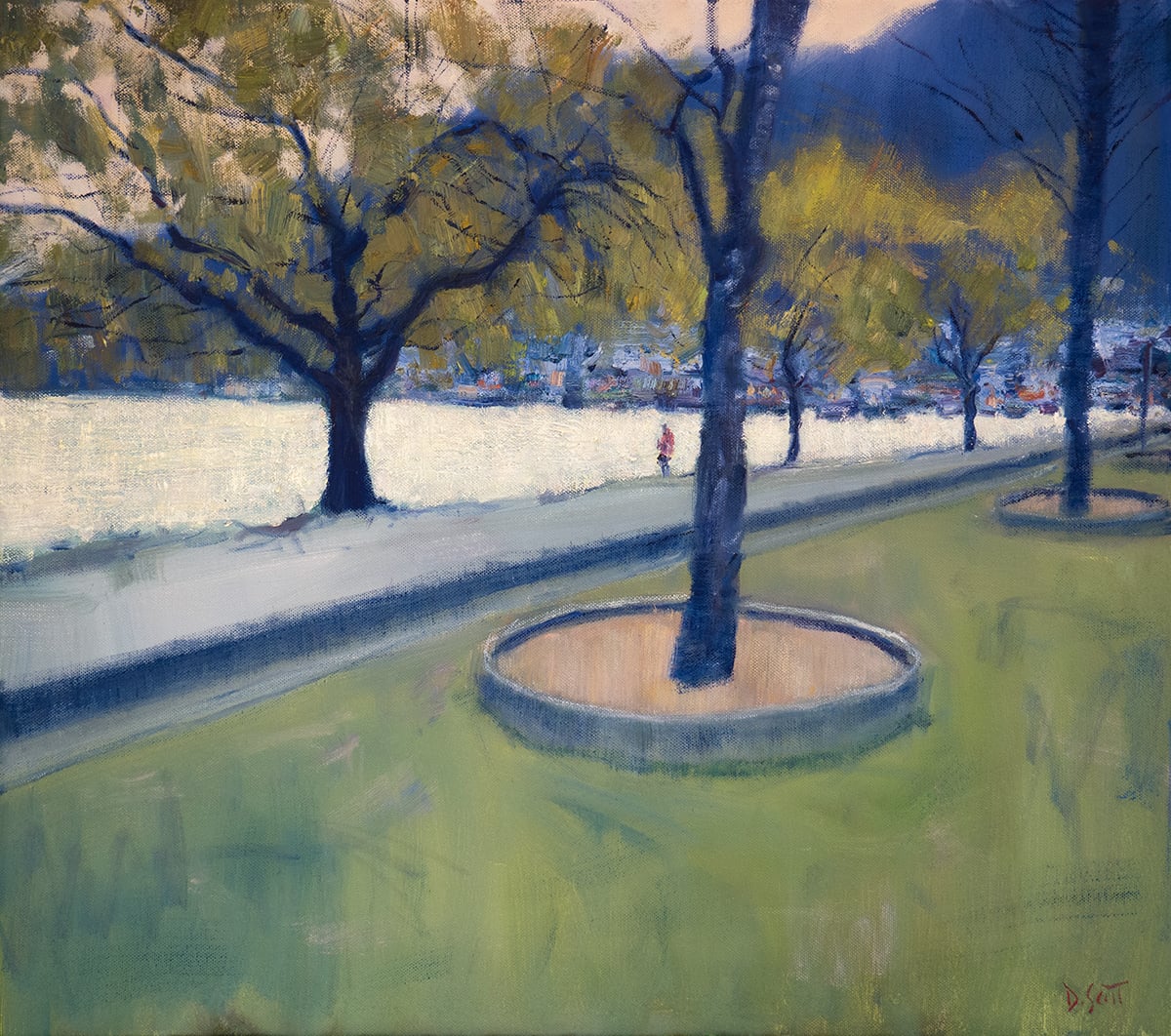
I just put the finishing touches on this New Zealand painting:
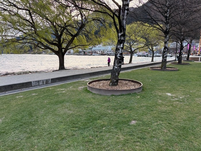
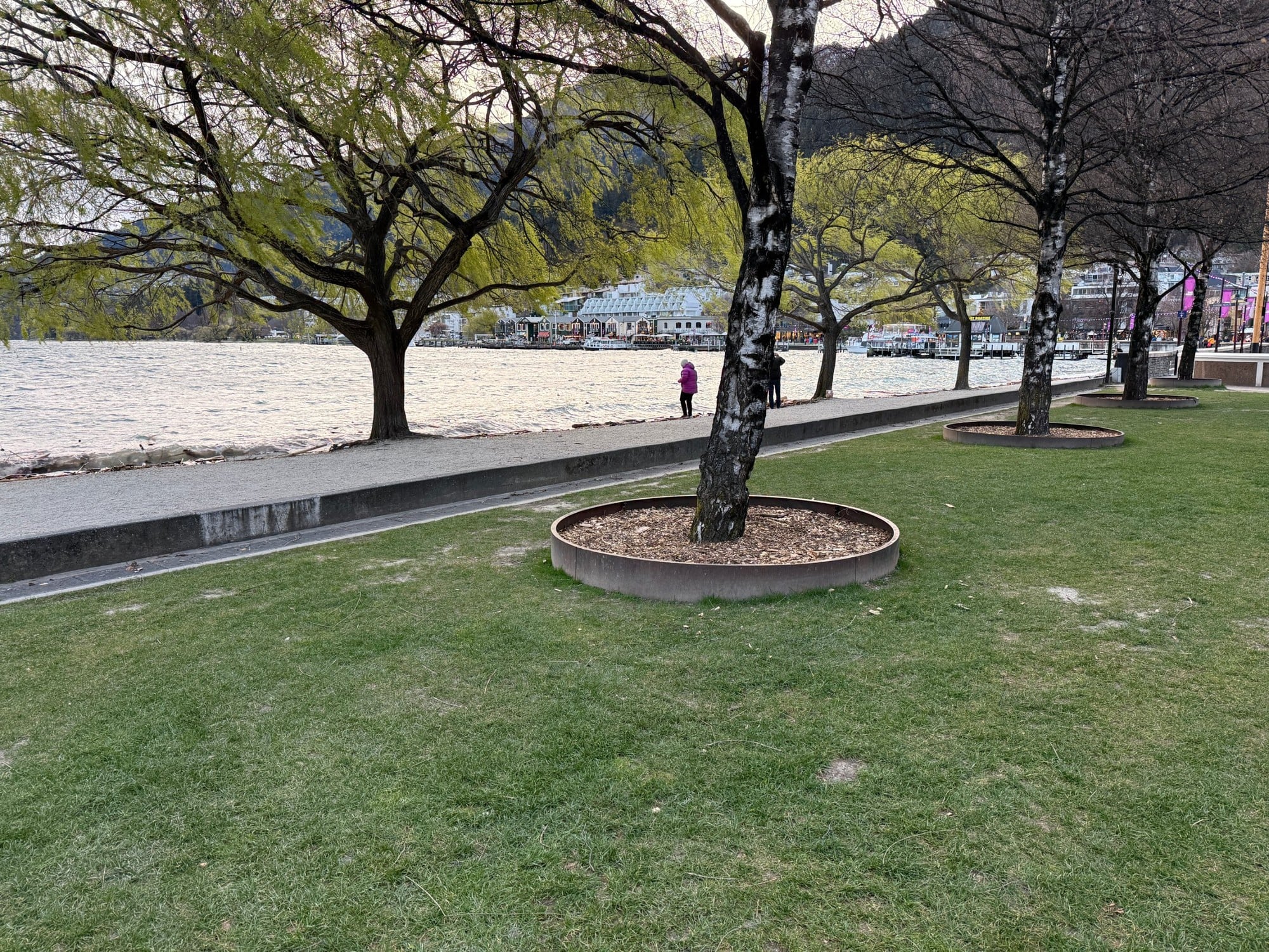
Below is the reference photo I painted from. I took this from our latest family trip to Queenstown. Feel free to paint it yourself. Just let us know how you go. You can download a high-resolution version here. (You can get access to all my reference photos here if interested.)
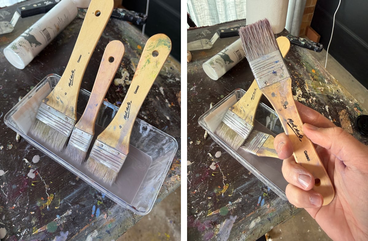
I painted on an 18 by 24 inch stretched canvas. I haven’t painted on canvas in a fair while, as I have been almost exclusively painting on hard Ampersand Gessobord. Whilst I like the sturdiness of Gessobord, there’s something unique about painting on canvas. There’s a gentleness to it. With each stroke, the canvas gives way and absorbs some of the pressure. I missed that feeling.
I painted fast and with large brushes. The brushes are even larger than I typically use. You can see them below. The painting was basically complete within 2 hours. It took me longer just to take a decent photo of it!
The water is the focal point. In person, it glowed gold and silver and had a silky appearance. It looked like a satin dress in a Sargent painting. The rest of the scene is a little vague and hazy, as you would expect on a late-afternoon stroll before the sun goes down.
In the distance, you can see the Queenstown center, and a person stands by the shore looking out over the water. The main challenge was to convey the person and all the buildings and activity in the background with vague and hazy brushwork. I didn’t overthink it. I painted these parts fast and without hesitation. This worked well. In other paintings, I have fallen into the trap of being too careful and timid with the complex parts.
I like to believe the viewer can feel what state of mind you were in as you painted. If you feel tight and cautious as you paint, the viewer will probably feel that. But if you feel confident and decisive, they will feel that too.
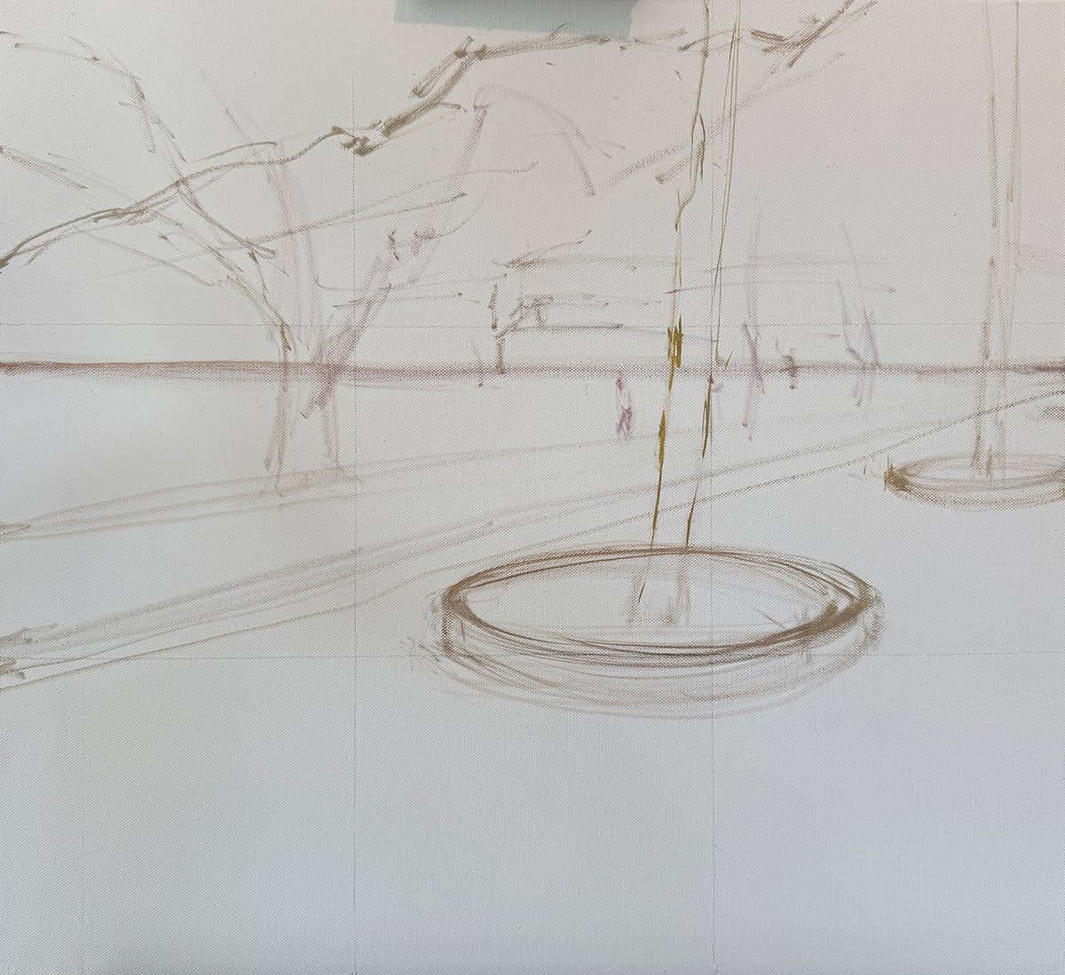
Below are some progress shots. I started with a brief sketch, mapping out the major shapes and lines.
Then I rapidly mapped out the colors. I used stronger colors than in the reference. The idea was to start with strong colors, then gradually tame them.
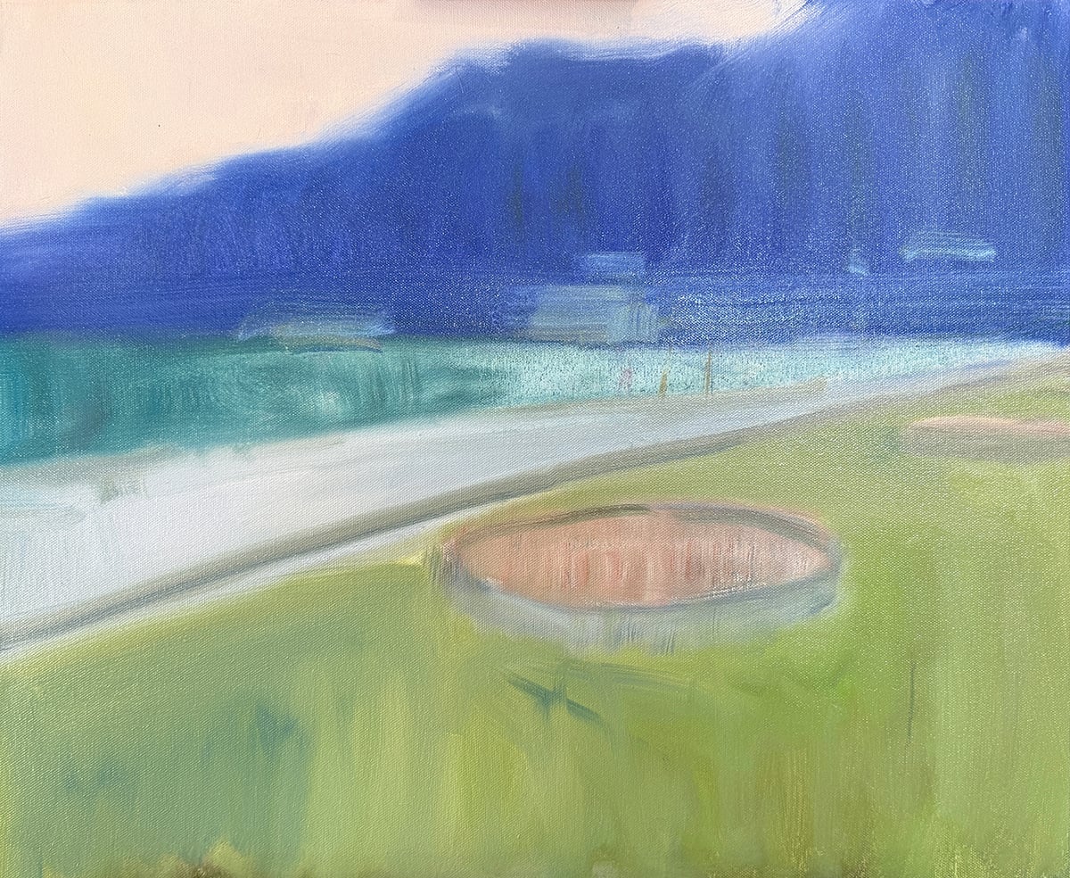
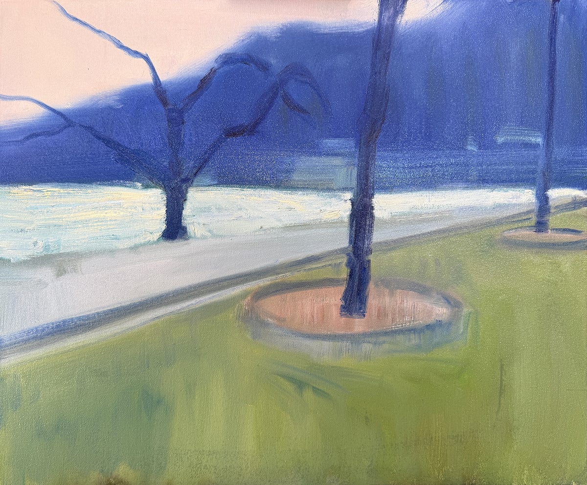
I painted the dark trees using almost pure ultramarine blue, and I mapped out the light water.
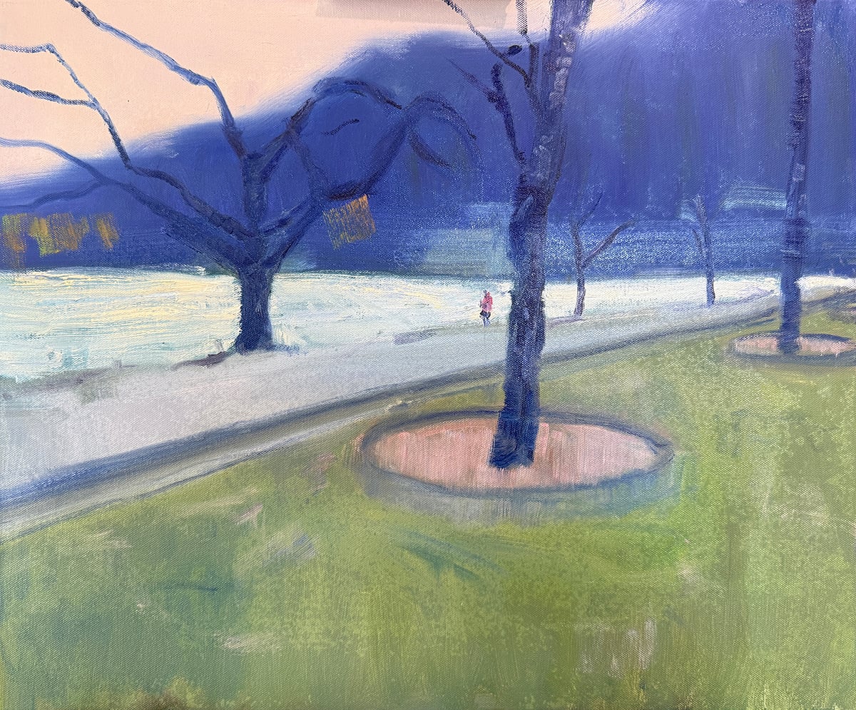
I captured the person standing on the shore with just 3 or so decisive strokes. Just enough to convey the person, and not a detail more.
I painted in the golden leaves and the buildings in the background. I continued to use large brushes even for these more finicky parts.
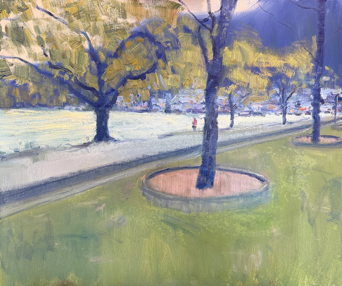
To bring it home, I added some of the finer details and made sure it all worked together as a whole.
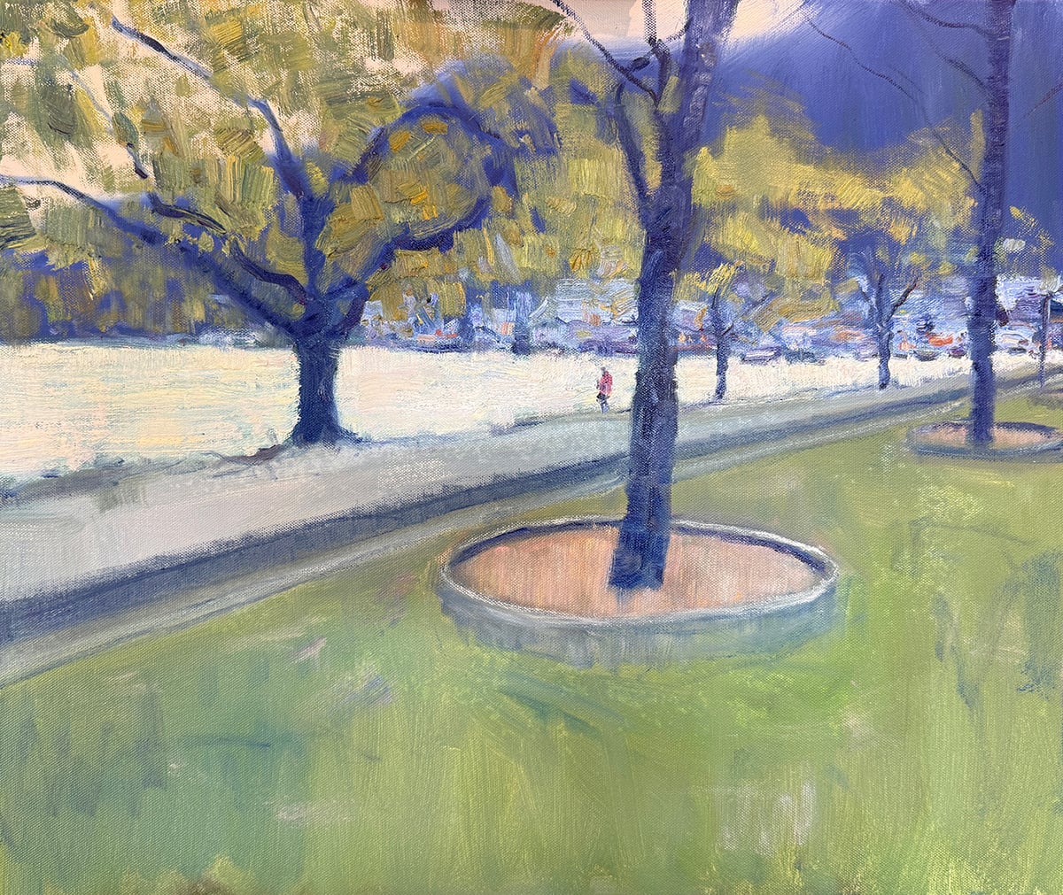
Here are some close-ups of the detail and brushwork:


Some key takeaways from this painting:
- Paint fast and without hesitation. The viewer will feel your confidence.
- Try going larger with your brushes. It will encourage you to paint with broader, simpler strokes.
- Don’t overthink the complex parts. Try painting them with the same confidence as the simpler areas.
- With the initial color block-in, I sometimes like to push the saturation of the colors and then try to tame them. The idea is that it’s easier to make colors weaker than stronger. So start strong, then weaken them to where you need.
Thanks for reading! Let me know your thoughts in the comment section below.
If you ever want to learn more, start with our fundamentals course.
Regards

Dan Scott
Draw Paint Academy

Thank you, Dan! Magnificent colors, and the painting itself is quite striking. It was worth reading this article.
love this style Dan
Thank you for you for sharing your thoughts & process. I really like it.
Thank you for sharing the stages of this wonderful New Zealand painting!
I live in Colorado, USA and have recently started subscribing.
I am a beginner who is very interested in learning French Impressionism oil painting.
I see part of what looks like a marina. Is this painting taken from a view of the marina in Auckland, New Zealand? You certainly managed to portray the feel of being in New Zealand. It’s a lovely place and I would love to visit again. Your painting is spot on.
~C.
Hey C. The photo is taken in Queenstown, near the park / gardens end 🙂
Chontele
I love the simplicity of this painting. I have never used such big brushes.
Reminds me of Edouard Manet.
At almost 83 I have dabbled for years and whilst I have had a few successes I just find the whole process of putting paint to paper relaxing. I am now a Chelsea Pensioner and have the luxury of a small workshop so following your ideas I hope to learn a few techniques on the way
Lovely painting!! Gosh, how did you paint the houses/buildings in the background and tree branches with the large brushes?
Hi Dan,
I have been a long-time lurker on your site and have always enjoyed your posts. I really like how you showed the progress of this painting and how it turned out. Just wondering if this painting would have benefited from an underpainting? Thanks. Pam Wardner, Sunshine Coast, QLD
Hi Pam
I actually think this may be the only one Dan has done in a while, where he hasn’t done an underpainting and honestly, I mentioned something similar. Especially the sky color to me seems off, too warm I think? But generally he does do an underpainting and it does help with getting the colors right. In my opinion anyway (from a non-artist wife) 🙂
Chontele
Thanks so much for sharing this painting – it’s soft vibrancy and at the same time energy, the brush strokes; and wow– the effects we can get with a large brush. 😊
Wow! I love this painting. Cannot believe it was done with large brushes and completed in such a short time.
This is a nice demo Dan. Easy to understand and the reference photos of your close-up work really help. Everything in this lesson can be applied to my watercolor painting. The only thing I might add is the directionality of the tree leaf strokes that suggest a windy day. Thanks for continuing to offer this daily inspiration.
Beautiful. This is how I want to paint, but I am holding myself back as I learn, if that makes sense. I may try and copy this one, to see how it turns out. I also have a portrait that I plan on copying. I am a writer, and I remember being told, write a page in the style of Hemingway, Woolfe, etc. It helped! So I figure I should do the same thing with painting.
Thank you so much for your inspiration!
One of these days, I’m going to learn to sketch in lively buildings like that! Well done, Dan, and thanks for being such an open and great teacher!
I think this is wonderful! Great composition. Thanks for sharing both the painting and your process.
The painting reminded me of the Impressionist’s style. I liked it. Well done!
I think it must be easier to paint fast and confidently when you have painted lots of pictures.
Kind regards, Eileen. (UK)
Thanks for sharing.
Wow Dan, I see some definite stylistic changes here, specifically in the softness of the look of the large areas. Your trees are magnificent, as is the populated area on the far shore. A beautiful painting, and inspirational as well. Thank you for such generous sharing.
your commentary = very helpful! like the idea of starting with bolder colors then taming them
Your bold confidence is inspiring. The fresh quality of this painting makes me want to be there. Right there, right now! Thanks for sharing!
a beautiful painting that drew my eye in to the background buildings, the shimmering water, and the lone figure on the shoreline!
My only suggestion would be to make the light brown front circle look like pebbles rather than dried grass.
I absolutely love your choice of colours!
Well-done!
Elaine
I love your painting and thankyou for the progress shots. It’s very helpful to see those ! Also your discussion on how you proceeded with your painting is wonderful!
Wonderful! Love the whole mood and feel. Over the years your work has begun to more and more incredible.
I was thinking the same thing. Watching the progress of his work has been just wonderful. So inspiring.
This is a beautiful painting!! And, it’s amazing to know that it took you only two hours and with using larger brushes, mostly. I love your style of painting and I aspire to learn more from your workshops/classes and to have the confidence in creating similar works of art.
WoW !
Beautiful and relaxing….I particularly love the loose strokes… the painting keeps your eyes lingering like the persona strolling along the water….
This really captured my attention. I loved the final image without it being obviously overworked. This is my goal as I’m super anal about realism and trying to loosen up and just have fun. You Re very generous with your help. Thanks
.
I LOVE it! The very first glimpse of the leaves as I scrolled into the post captured me right away. Those loose forms and colors did a wonderful job of capturing the magic of that place and time. …. if I could only learn to let go of details…. 😉
Thanks for sharing.