
 Share to X
I’m still making my way through my new Arabella painting. You can see the initial drawing of it here:
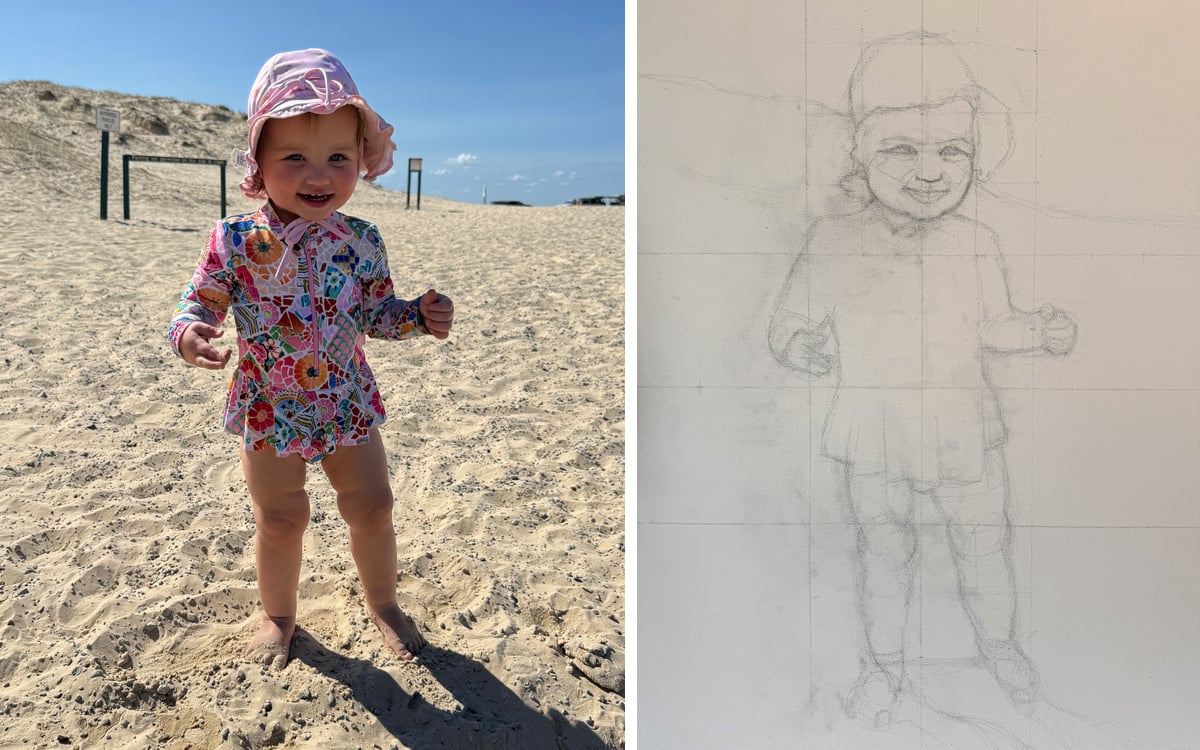
In doing the initial drawing, I was careful to lean into the direction of Arabella’s character. That is, if I were to make a mistake, I would aim to do so in a way that accentuates her character and identity.
For example, I’d rather make her cheeks appear fuller and rounder than thinner and leaner.
I’d rather make her eyes and lips bigger and fuller than smaller and flatter.
I’d rather make her legs appear chunkier and rounder than thinner and straighter.
These “mistakes” would make her appear more childlike and joyful.
Some other examples:
If painting a storm, err on the side of more dramatic and moody.
If painting a serene, glassy lake, err on the side of more subtle and quiet.
If painting a vivid sunset, err on the side of warmer and more brilliant.
I know I harp on about this, but it’s a valuable lesson. I believe I first learned it from Steve Huston.
On the topic of sunsets, we are doing a brief promotion on our Sunrise and Sunset Workshop. You can join at a reduced price over the next few days.
I’ll let you know how the Arabella painting turns out. It is proving to be a tricky one to finish.

Dan Scott
Draw Paint Academy

My art Teacher always used to say “With painting, there’s no such thing as a “mistake”, only “feedback””.
That word “mistake” is a negative word in the art world.
Thanks, Dan!
This is a really important bit of info for me. I’ve been considering what is important to me about how my landscapes turn out, the style of my work. The word “character “ as you use it here, seems to fit with what I want to get across in my paintings. I can now see this is a better focus for my work, as opposed to focusing on duplicating details.