
Below is Morning Lookout. It depicts Toowoomba’s landscape (Queensland, Australia), just before the sun peered above the horizon. All of nature’s pastel colors were out to play.

Reference Photo and Color Studies
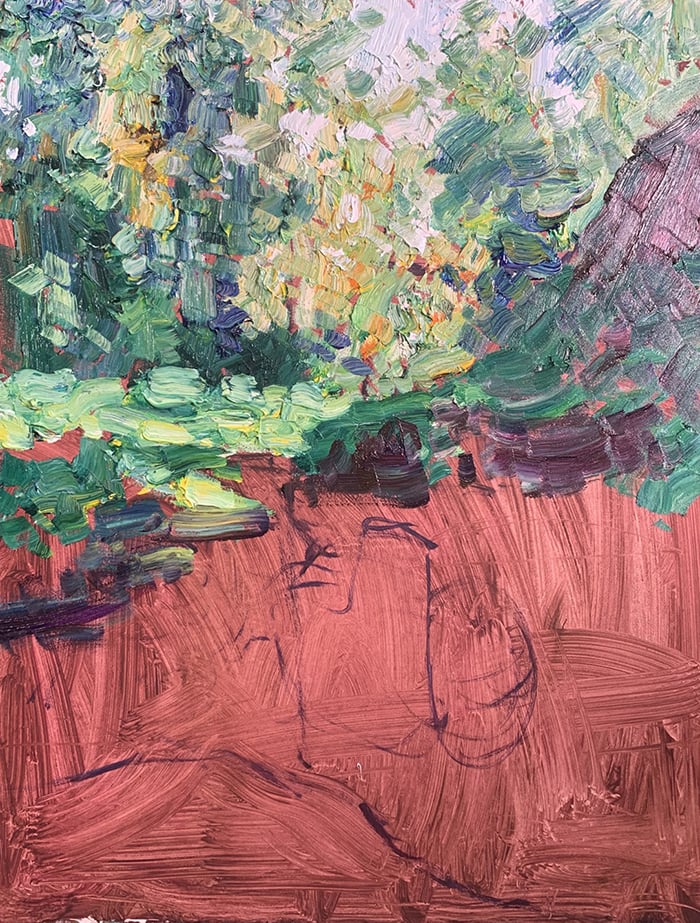
Here’s the reference photo I painted from:

I also painted a few watercolor studies on location (see below). I haven’t touched watercolors in years. What a frustrating yet enjoyable medium! Especially when the wind is blowing and the colors change every time I look up. The results are spontaneous and fresh. Perfect for a color study. Plus the clean-up is easier compared to oils.
")
Tip: Reference photos are great, but they are no substitute for how we perceive the subject in life. Our eyes are much more sophisticated than any camera. It’s best to complement reference photos with color studies done on location. That way, you get the convenience of the camera paired with a more accurate color reference.
Details
- Oil on Ampersand Gessoboard. 24 x 18 inches.
- Main colors: Ultramarine blue, cobalt blue, cadmium red, alizarin crimson, cadmium yellow, cadmium yellow deep, viridian green, and titanium white.
Refer to my supplies list for more details on what I use.
Notes
- It’s a simple composition. A clear sky with some faint clouds just above the horizon, distant mountains, a foggy middle ground, and trees in the foreground. No intricate drawing needed. This allowed me to focus on color, which is what the painting is all about. In particular, the sky’s subtle color gradations.
- I departed slightly from the reference photo. My darks are lighter and more colorful. My foreground colors also lean towards purple and blue, rather than green and earth tones. I believe this fits better with the painting’s overall color harmony.
- I used scumbling to build up a sense of dynamic, vibrating color. This involved taking small amounts of paint on a dry brush and gently “scumbling” it over the surface.
- I was careful not to build up too much paint on the surface. The thicker the paint, the harder it is to manage.
- I used paper towel to remove any excess paint and scruff up overworked areas. Gessoboard comes in handy here, as I don’t have to worry about damaging the surface. I can be as rough as I like.
- There are a few dark accents at the bottom of the painting. Small bursts of contrast that create interest and focus your attention. Especially the trees on the right, which protrude into the pastel sky.
Tip: There are always two ways to increase contrast. You could change the subject itself (make it darker, lighter, more colorful). Or you could change its surroundings. In this painting, the trees on the right command attention. But they are not that dissimilar to the trees on the left. The difference is, the trees on the left have a dark purple background.
- Most of the painting features soft edges, giving an atmospheric feel. The hardest edges are the horizon line and the trees in the foreground. Also, notice how the horizon line goes from soft to hard, from left to right. This is one of those subtle yet important details. It conveys depth, perhaps some fog on the left, and the sun’s light coming from the right.
Progress Shots
Step 1: Simple sketch.
")
Step 2: Thin wash of color. Use paper towel to wipe away any excess paint.
")
Step 3: Refine the shapes and scumble color over the top.
")
Step 4: Finishing touches, sign, and photograph the painting. I signed with a palette knife in the bottom right corner. It’s hard to see from afar.

Additional Resources
Thanks for Reading!
Thanks for taking the time to read this post. I appreciate it! Feel free to share with friends. If you want more painting tips, check out my Painting Academy course.
Happy painting!
Dan Scott
Draw Paint Academy

I like Dan Scott’s painting style.
I choose to make a copy with colored pencils before doing it in paint on canvas.
I’m a young 79 year old girl.
thank you so much ❤️❤️❤️ for teaching us and sharing free God bless sir.Dan