
In this post, I discuss how you can paint under different light sources. This post is a follow-on to my post about color temperature.

- Introduction
- The Two-Step Process for Correctly Painting the Light
- Example – How to Paint Under the Warm Light of a Sunset
- Example – How to Paint Under the Cool Light of a Blue Sky
- The Optimal Natural Light
- Summary
- Want to Learn More?
- Thanks for Reading!
I’ll walk you through the entire process using one of my recent paintings. You’ll see how I go from idea all the way through to reflecting on the finished painting.

Introduction
The single most important factor which determines what colors we see is the light source. It is light which allows us to experience color. Light is also what unites all the colors.
But not all light is the same. Different light sources have different temperatures. Your colors will look different under the warm light of a sunset compared to the cool light of an overcast day.
The Two-Step Process for Correctly Painting the Light
Step 1: Determine the primary color of the light source
This is the first and most important step to correctly painting the light. If you do not know the color of the light which illuminates your subject, then you are painting blind!
So how do you identify the color of the light? The easiest method would be to use obvious reference points. Some kinds of light will always be warm (yellow-red) and other kinds of light will always be cool (bluish-white). Some important reference points are shown in the following image:

So if you were painting a sunset, you know that the dominant light source is a warm, yellow-orange color. If you were painting under a clear blue sky, then the dominant light source will be a cool bluish-white color.
It is not usually this simple, as there are many other variables such as reflected light and the general unpredictableness of nature. But I like to keep things relatively simple.
Sometimes there will be no clear reference point which you can use, or the light is so close to neutral that you cannot tell if there is a warm or cool bias. In those cases, you need to rely on observation to identify the color of the light source.
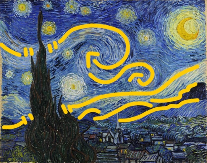
This is where the warm light, cool shadow; cool light, warm shadow guideline comes in handy. If the shadows appear relatively cool compared to the light areas, then it is usually safe to assume the light source is warm. If the shadows appear relatively warm compared to the light areas, then it is usually safe to assume the light source is cool. This is not an exact science, but it is close enough for our purposes as artists.
The painting below is an example of using the warm light, cool shadow guideline. The light source is clearly a warm yellow color, but the areas in shadow are relatively cool.

Note: The warm light, cool shadow (and vice versa) guideline does not mean the shadow must be a cool blue color. It is meant to be interpreted in a relative sense, so the shadow will be cooler than the areas in light, but not necessarily a cool blue color.
If you cannot identify if the light source is warm or cool, then it might just be so evenly balanced that there is no warm or cool bias.
Step 2: Paint according to the light source
If you can determine the primary color of the light, then all you need to do is use colors which align with that light source.
There are certain colors which cannot exist under certain light. For example, if you take a red ball and place it under a blue light, it will appear closer to black than red. If you were painting a scene which is illuminated by just blue light, then using a vivid cadmium red would simply look out of place. That is why it is so important to understand the color temperature of the light which illuminates your subject.
A really simple way to paint under different light sources is to follow the following guides:
If the light is warm – restrict your cool colors (like blue). Your warm colors will retain saturation.
If the light is cool – restrict your warm colors (like orange and red). Your cool colors will retain saturation.
This is a very basic way to think about it but it will be effective for you in most cases. However, don’t forget to always use observation. I go into more detail on how to paint under warm or cool light below.
Example – How to Paint Under the Warm Light of a Sunset
As you learned earlier, a sunset has a very warm color temperature and leans towards orange. So if you were to paint under the warm light of a sunset, then it would not make sense to have any strong blues under that light.
If there is an object which has a blue local color (like the cool blue of the ocean) then the color you would see under a warm light would be closer to gray than a rich blue. The stronger the light, the less blue you would see.
Based on the warm light, cool shadow guideline, the colors you see in the shadows would be cooler than the colors in light. If you really want to give a sense of temperature contrast, then you could use strong blues and purples in the shadows. Otherwise, you might just want to mix the local color of the subject with a hint of blue.
So, under the warm light of a sunset, you would:
- Restrict your cool colors which are exposed to the light; and
- Make the shadows appear relatively cool compared to the lights.
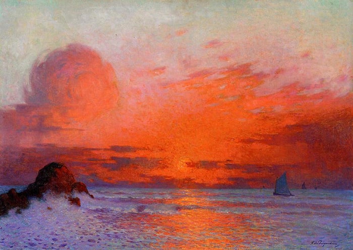
The painting below is a stunning demonstration of temperature contrast. Under the warmth of the sunset, there are no strong cool colors, but rather a mix of yellows, oranges and warm grays. However, in the shadows there is a mix of relatively cool colors like purples and blues.

Example – How to Paint Under the Cool Light of a Blue Sky
On the other hand, if you were painting under the cool light of a blue sky, then you would paint your cool colors as normal but restrict your warm colors.

In the painting above, notice how the orange rocks in light are less saturated than both the rocks in shadow and the blues of the water. The cool blue light is hitting the orange rocks, making them appear less saturated. The result is kind of like what you would get if you mix orange with a bluish-white.
The rocks in shadow appear more saturated due to the cool light, warm shadow guideline. The blues of the water appear generally saturated under the cool light. If the light was warm, then the water would probably look much closer to gray.
The Optimal Natural Light
My favorite light to paint under is on an overcast day, when the sun’s light is diffused by all the clouds. On an overcast day you will often notice:
- The color temperature is slightly cool.
- There are no sharp contrasts in value (like what you get under a clear midday sun).
- You are able to see all the colors in full force. Under a midday sun, you will notice all the colors either appear tinted in the highlights, or lost into darkness in the shadows. On an overcast day, all the colors will appear much more saturated. More light does not always mean more color!
- The colors work with your color mixing. In painting, you will usually need to use white to lighten your colors. White is a cool color, so that becomes a problem when you are trying to paint under a warm light such as a sunset. When you lighten your colors with white, the colors also become cooler, so it can be a struggle to mix those warm oranges, reds and yellows. But the cool light of an overcast day works with your color mixing, in that when you lighten a color, it also becomes cooler.
Summary
- Not all light is equal. Different light sources have different color temperatures.
- There are two steps to correctly painting the light. First, you need to correctly identify the color temperature of the light. Second, you need to paint in accordance with that temperature.
- If you are painting under a warm light source, then restrict your cool colors. If you are painting under a cool light source, then restrict your warm colors.
Want to Learn More?
You might be interested in my Painting Academy course. I’ll walk you through the time-tested fundamentals of painting. It’s perfect for absolute beginner to intermediate painters.
Thanks for Reading!
I appreciate you taking the time to read this post and I hope you found it helpful. Feel free to share it with friends.
Happy painting!
Dan Scott

Draw Paint Academy


Hi How many lumens would you recommend for a desk lamp? Thanks:)🌹
Thank you for this very helpful article. I am painting a very warm outback landscape using a mix of cadmium red, cadmium yellows, raw sienna and mars violet burnt umber for shadowing. I am completely torn between an overcast grey sky which makes the red dirt and rocks outstanding, or a warm orange sky, which blankets the red dirt and rocks in a more glowy light. However i am afraid that my warm orange sky would by general rules make my foreground objects appear more black silouhette. Where i need them to be quite clarified and lighter to see detail and understand the story. In your opinion would you ultimately choose the cool grey sky bright red land contrasting or the warm orange sky on warm red land complimenting. What has more impact? So hard to choose…….
Hi Stacey
Thanks for the comment. To be honest, it is hard to say without seeing what you are painting. Your best bet would be to do two quick color studies to see what they look like. Or, just pick one and go with it. I don’t think you would go wrong with either of those options you have said.
Dan
tres interessant
Thanks! Dan
I have been “hacked” so many times lately that I am afraid to buy anything on line. Your comments on color temperature are so clear and concise…..I am sorely tempted!
Sorry to hear Dolores! Happy the hear that the articles seem to be helping you out though! Thanks, Dan
Dan,
To a novice painter (acrylics to start) this article was very informative. I still need to practice to get a fill for the different light sources.
What exercises do you recommend to help.
Thank you,
John Colombo
Hi John, you might want to do some of the exercises in this post: https://drawpaintacademy.com/simple-drawing-exercises/