
I absolutely love sunset (and sunrise) paintings. During these times of the day, the contrast between light and dark sharpens, the details start to fade and all these beautiful colors start to get involved.
As there is generally less clarity in sunset scenes, you need to rely more on color and light to create interest in your painting.
In this post, I will discuss some of the steps involved in creating a beautiful sunset painting and feature some master painting examples.

- Step 1 – Observe the Light Source
- Step 2 – Create a Solid Foundation for Your Highlights
- Step 3 – Add the Vivid Highlights
- A Note on Architecture
- For Watercolorists
- Master Painting Examples
- Sunset Painting Demonstration
- Want to Learn More?
- Thanks for Reading!
I’ll walk you through the entire process using one of my recent paintings. You’ll see how I go from idea all the way through to reflecting on the finished painting.

Step 1 – Observe the Light Source
The first step in creating a beautiful sunset painting is observation. In particular, you need to determine the lighting situation.
- Where is the light coming from (where is the sun positioned)?
- How much direct sunlight is there?
- How much reflective light is there (light bouncing around in your scene)?
- Are there any clouds (which might diffuse the light)?
Every sunset will be slightly different depending on the conditions, so you need to observe all the elements and try not to make assumptions. For example, generally, the color temperature in a sunset is warm, however, perhaps it is a stormy day and clouds are diffusing all the light, creating an overall cool temperature.
In the reference photo below, the light is coming directly at us and is very low on the horizon. This creates silhouettes of any objects (the boats and land). The clouds diffuse much of the light and spread it generally across the scene.

Step 2 – Create a Solid Foundation for Your Highlights
The next step in creating a visually stunning sunset painting is to build a solid foundation so that you can really show off the highlights (usually the vivid sunlight).
Why is this so important?
Because you are not able to actually paint light. This is sadly one of the limitations of paint. However, with the clever use of the elements available to us, we are able to create a fairly accurate illusion of light.
It is all about relativity.
Because we are not able to hit the vividness of sunlight, we may need to accentuate the dullness and darkness of the surrounding environment. By doing this, we can add power to the sunlight in our painting.
This is why it is so important to build a solid foundation for the highlights in sunset paintings. Without a solid foundation, you will never be able to faithfully represent the sunlight you are trying to paint. It will always look weak and lifeless.
I heard an artist once say…..
“You must earn your highlights”.
I am not sure who said it but I will give credit if I find out.


Step 3 – Add the Vivid Highlights
In my opinion, one of the most fascinating parts of painting sunsets is the challenge of capturing the elusive light with the same level of vividness and brilliance. In a way, this is something that I could never fully achieve. But we can come pretty close if we lay down a solid base of darks and mid-tones.
A few tips for the highlights:
- Brighter is often more powerful than lighter. Be careful with how much white you are adding to your highlights. The more white you add, the less saturated your colors will be.
- Try using a palette knife to apply the highlights in an impasto fashion. This can contrast nicely against a soft foundation of darks and mid-tones.
- Sometimes less is more with the highlights. The most appropriate highlights could be nothing more than a thin streak of orange to indicate light peeking through clouds.

A Note on Architecture
The tips in this post are mostly for landscapes and seascapes. If you want to paint a cityscape at sunset, then your painting is going to be much more complicated.
At sunset, there is a sharp contrast between lights and darks and long shadows cast on any objects. When architectural elements are involved, the light source may create a complex arrangement of light and shadow which could be challenging to render.
Try not to get caught up in the details and do your best to generalize all the shapes. The painting below is a perfect example of painting a cityscape at sunset.

For Watercolorists
One of the advantages of oil painting (and acrylic painting to an extent) is being able to achieve rich and deep darks and mid-tones. This allows you to create such stunning sunset paintings. But with watercolors, your darks and mid-tones may not appear nearly as strong.
That is not to say you are not able to paint stunning sunsets with watercolors, but you just may need to take a different approach to what is suggested in this post.
Here are some watercolor paintings by Winslow Homer of sunsets:


Master Painting Examples

This is one of Vincent van Gogh’s more simple paintings. There is a general haze as the light is diffused by the clouds. Observe the sharp contrast between the high-value sun and the rest of the painting which is in the mid to low-value range.

Here is a more complex and vibrant painting by Vincent van Gogh. I love the contrast between the dull violets and saturated yellows.

This is a very basic painting by Renoir which demonstrates some striking use of color and vibrant brushwork.

This is one of my absolute favorite sunset paintings by Mykola Yaroshenko (another brilliant Russian artist). There must be something in the water over at Russia which allows them to produce so many amazing artists.
You can see more of his works here.

This is a beautiful example of using a narrow value range and relying on subtle changes in tone to give the illusion of form.

In this painting, John Grimshaw uses a sharp contrast in value to draw attention to the sunset. He also incorporates a high level of detail even in the darker areas (which is not easy to do).

Here is an example of creating a very calming painting using high-key colors. The high-key colors create an almost glimmering effect, especially when contrast against the dark foreground.

On the other hand, here is an example of using a bolder color palette.
There is a beautiful contrast here between the saturated reds and the very dull green-grays.

Frederic Church painted some incredibly realistic paintings. In this painting, the yellow almost glows as it is nestled between the dark clouds and land.

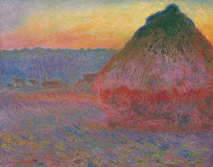
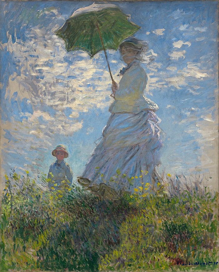
This is a beautifully soft painting by Claude Monet. It is painted in a generally high-key with a pleasing balance between warm and cool colors. The sun is a much higher saturation than the colors in the rest of the painting.

Not every sunset painting needs to be warm and dramatic. Here is a relatively cool and gloomy sunset, with a mix of green and blue-grays contrast against the yellows of the sunlight.
Observe how Claude Monet uses more detail in the foreground compared to the background to create a sense of depth.
Here is one of Claude Monet’s most dramatic paintings. A far cry from his harmonious paintings of water lilies.

This is perhaps the most vibrant painting in this post. The highly saturated reds and yellows contrast sharply against the black in the foreground. This is such a simple but effective composition that showcases the power of color.

Finally, here are two very warm landscape paintings by the great Albert Bierstadt. As usual, he painted these with an amazing level of detail.


Sunset Painting Demonstration
If you want a sunset painting demonstration, watch this video on YouTube: How I Painted This Striking Sunset, or read the article version here.

Want to Learn More?
You might be interested in my Painting Academy course. I’ll walk you through the time-tested fundamentals of painting. It’s perfect for absolute beginner to intermediate painters.
Thanks for Reading!
I appreciate you taking the time to read this post and I hope you found it helpful. Feel free to share it with friends.
Happy painting!
Dan Scott

Draw Paint Academy

Dan, I gained a lot from this reading. My Favorite painting is the “Sunset” by Mykola Yaroshenko. I would love to try and paint it..Although I am so inexperienced, Don’t know if I should..
Regards,
Glenda
I am in love with the sun! Aside from the fact that I lived in a country where
the sun looked larger and more majestic with its gold oranges and fire red!
I have been following your remarks closely. Thank you for that.
Thank you for the magnificent walk through these paintings. I learned more in this half-hour than I have in hours of class. I am especially interested in the Bierstadt, as they are so refined as to resemble photographs. As for hanging in my home, I’d choose the van Gogh’s or the Steppes sunrise! Who wouldn’t!
I just found this Dan, and as usual it is very helpful. I just tossed a small sunrise that I tried – it just didn’t do anything for me. I think the colors were not saturated enough…practice, practice. Thank you!
My pleasure Joan! Keep up the good work with your painting. Dan
This is an awesome guide! The pictures alone can teach a lot but the text is very, very useful. It’s also nice to note the way they use shadows in these sunsets, especially on more distant elements. And it’s also a very good way to see what you like, or don’t like, in terms of various styles, which I think helps you know what to aim for.
(I will note that I think the author meant “diffuse” rather than “defuse,” in a few places, which could maybe use correcting, but that’s minor.)
Thank you for the guide!
Thank you for your comment, sounds like you found the post helpful. Also, thanks for the pick up of word error. I have now fixed this! Thanks again, Dan
I found this very educational and interesting as well… (they don’t always go together). I also found some painting that I would love to try myself… So thank you so much for sharing this..
No problem Robin glad you enjoyed 🙂
Dan