
Highlights are tricky. Get them wrong and your whole painting will look slightly off. Get them right and it pulls everything together, like slotting the missing piece into a jigsaw puzzle.
Let’s take a closer look at what highlights are, how to paint them, and some of the nuances to look out for. I’ll cover:
- What Are Highlights?
- Highlight – A Relative Term
- Position of Highlights
- Highlights, Edges, Structure, and Gesture
- Color of Highlights
- Brushwork and Timing of Highlights
- Highlights and Focal Points
- Other Master Painting Examples
- Key Takeaways
- Want to Learn More?
- Thanks for Reading!

What Are Highlights?
Highlights are basically areas of concentrated light, where light bounces off an object and hits our eyes. Below is a simple example using an egg. Light comes from the right, bounces off the egg, and hits our eyes. On a separate note, this is also a wonderful demonstration of the “warm light, cool shadow” idea.

In Lilla Cabot Perry’s portrait below, the strongest highlights are on the tip of the nose and the specs of light in her eyes. There are also less brilliant highlights above and below her eye on the light side, around her lips, and above the fringe of her hair. Notice how the highlights are picking up edges and structures, but more on that later in this post.

There are numerous highlights throughout Pieter Claesz’s intricate painting below. See if you can spot them. (Hint: Look for edges and corners.)

Highlights might also be direct light sources. Like the scattered lights and their reflections in Claude Monet’s The Port of Le Havre, Night Effect (below).

A good exercise for seeing and understanding highlights is to scroll through the Old Masters’ toned paper drawings. These typically have three values: darks, mid-tones (the color of the paper), and distinct highlights. Here’s one by François Boucher:

Highlight – A Relative Term
Highlights are often mistaken as being fixed and independent. As if they are specs of white light that must always be painted with dabs of pure titanium white. Sometimes that’s the case, but certainly not always.
In a low-lit scene, highlights might be much darker than what you would typically expect. For example, look at John Singer Sargent’s portrait below. In isolation, the highlights on the face look more like mid-tones. But they appear as highlights in the context of the dark surroundings.

Under the bright midday sun, highlights might be glimmering specs of white that we can only dream of capturing on the canvas (but of course it’s our job to try). Bato Dugarzhapov’s work comes to mind.
Think of highlight as a relative term. What does the highlight look like in relation to the surrounding colors, mid-tones, and shadows? Refer to my image below if you need a recap on the major light and shadow terms and to see where highlights fall in the light spectrum.

Remember, highlights have no meaning without mid-tones and shadows. If you were to paint a highlight in isolation, you would end up with a white canvas (on the plus side, you might be able to sell it for a few million to high-end art collectors).
Position of Highlights
Highlights are not fixed in position. Unlike shadows and mid-tones, highlights move when we move in relation to the subject. To see what I mean, grab an egg from your fridge and place it on a desk under a lamp. Move your head and watch as the highlight moves, emerges, or disappears.
Imagine there’s a line going from the light source, bouncing off the egg, and hitting your eyes. The “bounce” point is the highlight.
Of course, an egg is a simple example. But the idea runs true even for the most complex subjects. Just break the subject down into basic forms and consider where light is bouncing back at your eyes.
Highlights, Edges, Structure, and Gesture
Steve Huston’s book, Figure Drawing for Artists: Making Every Mark Count, has a fantastic section on highlights and how they can be used to reiterate edges, structure, and gesture. I’ll summarize some of his points but I urge you to invest in his book if you want more explanation. It’s worth getting if only for his beautiful drawings.
- You will often (not always) find highlights at edges of objects. Refer to Boucher’s drawing below. Notice how the highlights track the folds in the clothing. This drawing also shows how much of art comes down to simply getting your lights and darks right.

- Placing a highlight close to a core shadow can create a powerful statement. Huston does this all the time in his work.
- When portrait painting, consider using highlights to reiterate the overall gesture of the pose. Just make sure you stay in touch with what you actually see. In Boucher’s drawing below, notice how the highlights not only reiterate the muscles, bones, and curves of the figure, but they also help your eyes move throughout the pose’s overall gesture.

Color of Highlights
Highlights are light by nature, but perhaps not as light as you initially think. The sharp contrast of highlights against mid-tones and shadows can make them appear lighter than they really are. Be careful of these optical traps; our eyes often deceive us to make sense of the world. Try to look at highlights objectively. Consider:
- How much light is being reflected?
- How reflective is the object? (Some objects reflect more light; think silver cutlery, a wine glass, or a copper kettle.)
- How strong is the light?
- What is the color temperature of the light? (Is it warm like candlelight or cool like an overcast day?)
As for the color or hue of the highlight, it will get whiter as it gets stronger. Highlights are concentrated light and when you combine all the colors of light together, you get white light.
Highlights which are a bit darker (more like light mid-tones) will have more color. Take this wonderful portrait by Jan Lievens for example. The highlights are subtle and naturally extend from the mid-tones.

Even with strong highlights, like in the portrait below, I think you’ll find they are not as light as they look. If you ever want to check, use the eyedrop tool in Photoshop or any other editing software.

In the image below, the inner rectangle is the color of the strongest highlight on the subject’s nose. The outer rectangle is pure white for reference.
")
Whatever color you use to paint highlights, make sure they fit with the rest of your painting. If you’re painting a candlelit interior scene, blue highlights won’t make sense. If you’re painting an overcast landscape, warm highlights might look out of place.
Brushwork and Timing of Highlights
You don’t need virtuoso brushwork to paint highlights; a dab of paint will usually suffice. Be careful not to overthink or overdo it.
My best advice is to work up to the highlights and be patient. If the foundation of your painting is sound, the highlights should come naturally. But highlights won’t save a sloppy painting; they will be the killing blow. I heard an artist once say, “you need to earn your highlights”. Unfortunately, I cannot remember who, but there’s truth in those words.
Highlights will usually come last in your painting, unless you’re using watercolors. As John Singer Sargent put it:
“If you begin with the middle-tone and work up from it toward the darks so that you deal last with your highest lights and darkest darks, you avoid false accents.” John Singer Sargent
If you paint them too early, you might spend the rest of your painting trying to protect them. However, I have seen some artists lay down highlights early in the painting to act as a reference point (with the highlights in place, you know that all other colors need to be darker).
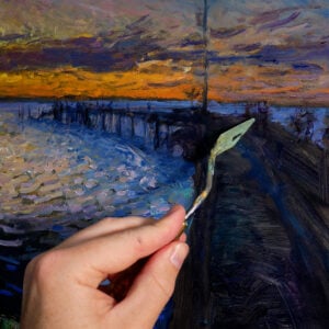
Painting highlights last means that you will usually be painting wet on wet. This requires a loaded brush; otherwise, the paint will mix and your highlights won’t look crisp.
I like to use thick paint for highlights. This seems to add a little extra punch and can play into a theme of thick lights, thin shadows. And there’s nothing more beautiful than luscious highlights.
Whatever you do, don’t get reckless. It’s always a shame when you get through 95% of a painting only to mess it all up with poor highlights. Slow it down, think about your strokes, and when you’re ready to pull the trigger, go at it with confidence. Remember, you usually only need one good stroke for a highlight. So make it a good one.

Highlights and Focal Points
Our eyes are drawn toward highlights. You can use this to your advantage when designing your composition. Concentrate highlights around points of interest. (Don’t place highlights in the bottom corner of your painting, unless that’s where you want people to look.)
The Russians are masters of this. They use concentrated bursts of color and light to draw your attention to focal points. Here are some examples by Konstantin Korovin:


Other Master Painting Examples
I’ll run through some other master paintings and point out the highlights along with some comments. It’s worth doing this yourself-try to pinpoint the highlights in your favorite master paintings and consider why the work.
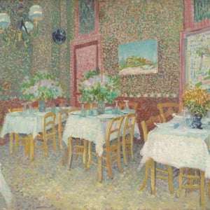
Let’s start with an intricate still life by Willem Claesz. Heda. This is a great example of how some objects have stronger highlights. Compare the metal and glass highlights to the wood highlights at the bottom.

Notice how Rembrandt worked up to the highlights in his portrait below. We get to see an almost full range of values, from the almost black background to the almost white highlight on his nose.

Below is a grayscale of the painting to give you a clearer look at all the values. It’s interesting how the highlight on the nose appears even stronger with color out of the equation. Remember from earlier in this post how the appearance of a highlight changes based on the surrounding colors, among other things. It’s not fixed.
")
In Eva Gonzalès’ stunning portrait below, the delicate highlights match the delicate features of the subject.

In Monet’s Houses of Parliament at Sunset, the highlight is the sun itself. Everything else in the painting is there for atmosphere.

In Anders Zorn’s sketch below, notice how much information just a few clever highlights can convey.

Strong light means strong highlights, as shown in Abram Arkhipov’s Visiting.

Key Takeaways
- Highlights are small but powerful. Get them right and they will pull everything in your painting together.
- Think of highlight as a relative term. What do the highlights look like in relation to the other colors?
- Don’t mindlessly reach for titanium white every time you need to paint a highlight.
- Highlights occur when light bounces off an object and hits your eyes.
- You can use highlights to reiterate edges, structure, and gesture.
- Highlights get whiter as they get stronger. Darker highlights tend to be more colorful.
- Work up to your highlights. Don’t rush them. If you set the stage correctly, the highlights should come easily.
- You can use highlights to draw attention to focal points, as you see in many of the great Russian paintings.

Want to Learn More?
You might be interested in my Painting Academy course. I’ll walk you through the time-tested fundamentals of painting. It’s perfect for absolute beginner to intermediate painters.
Thanks for Reading!
I appreciate you taking the time to read this post and I hope you found it helpful. Feel free to share it with friends.
Happy painting!
Dan Scott

Draw Paint Academy

A wonderful example of highlights, so well described too, thank you just wonderful.
I really enjoy receiving these short but informative lessons. Thank you so much!
Excellent lesson on highlights. Thank you.
Yes, inspirational as always. I’m so grateful to Dan for his generous sharing of knowledge.
Thank you!r
Excellent reading and advice in highlights
Learning never ends
Thank you
This was a great little reminder to “think it through” when dealing with highllights..also great paintings, some which I’ve never seen. Thank you!!
I am busy with a stormy cloud scene and was interested when i saw your email. I am busy with the highlights on the clouds.
Thank you for your comments on highlights. Mush appreciated.
Comments on highlights meant so much. I think I used highlights correctly on a picture I painted of the back of a sitting nude. Then again, I could have done better with cloud highlights. I can now use this information on my next painting. Thanks.
I could only wish to accomplish this. Remarkable works of art! Thank you!
This is great information
I enjoy all. Your comments but have been working on my highlights in recent paintings and this is helpful info
Thank you
Carolyn
Thank you for your insight, this was very helpful! 👍👏👏
This is excellent. Thank you.
Thanks for this artical. Very helpful
That was great. Bless you for doing this for us free of charge, you are a great man.
Ella
Marvellous reading.
Lots of info …. more relevant and easy to understand as it is “example with pictures” at every step.
Special touch of Dan Scott every time…. helps small learner artists like us (trying with pastels) so much.
Eagerly waiting for your next lessons….
Kindest regards.
Thankyou. Excellent article on highlights. Always learning
Thank you, this has been a very helpful lesson.
This is very helpful and I will make a copy, so that I will have it for reference.
I enjoy your ideas and your boundless use of so many different artists.
Thank you, most sincerely,
Jean Fava
Thank you so much – your generosity with information on painting and art history is unparalleled.
Thank you! I love these lessons – they are always really informative and easy to digest. Really appreciate you sharing your expertise and experience with us.
A really valuable lesson Dan, thanks so much.
passing this well explained sudject to my artist friends.thanks
Highlights are much more complicated than one would think, thanks for “shedding some light” on the subject
Thank you for sharing this. Your posts are always VERY helpful and inspiring.
YOU ARE AN AMAZING TEACHER!!!!
Thank you for pointing out the not so obvious. I love looking at the world through your eyes.
Thank you. Interesting and most helpful.
I’ve painted for 57 years but still find articles, particularly this one .( high lights) very refreshing, your choice of examples is very very wise. Really beginning to enjoy your blog.
Thank you!
Thank you for this very en”lightening” article! All of your emails are much appreciated.
I have been concentrating on highlights more diligently in my work this year, paying closer attention to the brightness of direct and reflected light. As always, your article and examples are very helpful and well worth the time to read and examine closely. Thank you.
Wonderful, wonderful– many thanks!
Very helpful , informative and well explained. I will think differently about highlights the next time. Thank you so much for analyzing and explaining it to us. Greatly appreciated. 🙏🏻👍🏻❤️
Great read, and very relevant for me now. I’m painting a morning scene, and getting the light on the trees correct has been quite an education! The mid-tones and highlights are so close in value, if I make the latter even a fraction of a value step too light they stand out immediately. It’s really just a subtle gradation of hue and a slight bump in intensity.
Thank you, this is an excellent article. I found your subject clearly explained and with useful examples as illustrations.
Com sempre, gràcies per les teves lliçons magistrals
So look forward to your wonderful knowledgeable and educational emails … a blessing to receive and most of all helping one be more and a better painter. Thank You so very much for the time you give so generously enhancing the knowledge of others who so wish to learn.
GRACIAS DAN POR TUS LECCIONES QUE LLEGAN DE VEZ EN CUANDO-
TENGO YA 78 AÑOS Y LAMENTO NO HABER RECIBIDO TUS CLASES CUANDO ERA MUCHO MAS JOVEN- NO OBSTANTE, APROVECHO TODO LO QUE TU GENEROSIDAD INMENSA NOS HACE LLEGAR EN ESTOS ARTICULOS-
REITERO: SOLO LOS GRANDES MAESTROS SON GENEROSOS COMO TU- TE VUELVO A AGRADECER POR TENER ESTA ACTITUD PARA CON LOS QUE AMAMOS LA PINTURA
What a great lesson. Thank you for this detail explanation of highlights. It really makes me think before painting anything! Where is the light coming from and how does it cast its shadow? Nicely done.
This is great! Thanks so much.
Dan I am signed up to receive many art related newsletters by email. So many that I don’t have time to read them all. Yours is one of just a very few, that I click to eagerly read as soon as I see it. I am never disappointed. You are a master at teaching complex things in a simple way. Thank You! I can’t wait for a published book someday?!?!
Very nice read. Lots of highlights ☺️ of paintings. Thanks so much.
Thanks so much
Thanks so much–wonderful examples
DEA LITTLE BROTHER DAN,
THANK YOU VERY MUCH FOR YOUR FREE LESSONS.That was great. Bless you for doing this for us free of charge, you are a great man.
THANK YOU VERY MUCH.
WONDERFUL EXAMPLES.. WONDERFUL LESSONS.
Dan,
You are THE BEST!
Thank you for your insights and brilliant perspectives.
Cheers!
David
Ahhhhhhhh The masters nothing like studying the masters. AMAZING. Makes me want to paint 🥰 can’t wait to pick up my brush and using these examples of highlights.
THANK YOU SO MUCH FOR THIS INSPIRING LESSON.
Thank you. I so enjoy your post.
Very helpful. Now I am going to check out highlights on my older work, to see if I used them correctly.
These are so fantastic! So well expressed and illustrated!
Thank you Dan for sharing these and your beautiful work!
Note the subtle highlight on the guitar chord held by Boberg in Zorn’s painting above. Not sure if that was an implied gesture in1880, however it absolutely compliments the expression of the guitar player. Apologies, I couldn’t help it.
Thank you, it is very interesting reading.
Dan, such lovely master’s examples that you give with your lessons. Those alone are enough to make me read your posts but throw in free advice of such quality and it’s delightfully instructional. Thank you for your dedication to educating us in this way.
Thank you so much for this valuable information, As usual you are a great mentor!
-Liz
Muchas gracias por sus lecciones. Me gusta su forma de explicar claro y sencillo. Saludos.
It’s nice to be reminded of the elements that make highlights the connection between the viewer and What the artist’s composition is trying to communicate through those highlights. The examples you used are very good.
Thank you Dan for sharing
Thank you so much, you have highlighted me. I was always afraid of highlights and now because of you I am much more confident.
Thanks so much.
Thank you so much for these tutorials! I especially appreciated the tip about how more reflective surfaces (metal, glass) give stronger, more condensed highlights!
Thank you. I am hoping I can use this lesson in the near future and not mess up. Thanks again.
than you
Thank you – your tutorials are so helpful. As I am a beginner you are teaching me so much that I have never thought about – I guess I observed highlights but didn’t think how to paint them.
Really enjoy your informative posts I keep them all thank you.
In addition to your painting talent, I think you are telepathic! This is the 3rd time I have gone to bed thinking about an aspect of painting that I was struggling with and I wake up the next day to your post that discusses exactly what I need! THANK YOU SO MUCH!
Many thanks , wonderfull illustrative examples
thank you so much. I enjoy all your tips and advice and comments.
Such an enlightening article ( and no I wasn’t trying to be clever….but I was. haha) I spent most of yesterday reading through your articles which I have been saving until I had time to study them. I have found your explanations and information really helpful. Thank you.
Again, I am ever so thankful, having not painted for over a year, to be reminded of technique.
Soon, I shall experiment. Thank you.
Always so helpful, informative, and interesting ! Thank you ! To read these short lessons is a highlight of my day!
Thanks Dan, this post has put a new light on the subject for me. ( chuckle to self). I found it very interesting, I’m one of those people who heads for the white instinctively for highlights. Now I will mend my ways and hopefully become a slightly better artist. Keep up the good work.
Great Article on highlights. Thank you so much.
Thank you!
Thank you!
The surety of these Masters strokes can only produce the hope for the amateur that their waste paper baskets are equally full.
Then we can have something in common.
Thank you you are indeed a natural ex plainer.
Very good lesson and, most of all, very well organised information.
Dan, I feel like you are looking inside my studio thru the window and pinpoint all the mistakes I make and drow me to the right path.
Thank you for your altruism in puting all this knowledge at our disposal!
Terrific summary with wonderful insights.
Dan, I greatly appreciate the time you take in your research and sharing of information. I always learn something!
I also appreciate the introduction to artists of whom I have never heard!!!
Thank you so much for sharing this useful information with us you are so kind with your free information thankyou
Thank you for the lesson ,very illustrative. I am very happy reading all your information.
Thank you Dan for sending your easy to understand lessons. I read them all and have learned so much. You have a way to make it all look easy. All I have to do is remember everything I’ve read and my paintings will improve. Thanks again Rod
Thank you Dan for sending your easy to understand notes and lessons. I read them all and have learned so much. You have a way to make it all look easy. All I have to do is remember everything I’ve read and my paintings will improve. Thanks again Rod
Thank you for sharing your knowledge. Much appreciated.
Very interesting subject, still studying and reading your
Article on highlights.
Very much appreciated, thanks and greetings
from Anita Quintana
Wow, what a following you have.
Thank you Dan.
Wonderfully explained
You’re the best teacher!
Your advice is always welcome and helps enormously. Thank you for taking time to do so
Thank you many times over. You give us so much of yourself.
Thank You Dan for your wonderful presentation and sharing.
Thanking you from South of France. Very helpful.
From Quebec, Canada. Thank you so much for this lesson. I had never really thought of highlights in this way. You make things clearer.
A wonderful, informative article. Thank you for sharing.
Very inspiring and well explained. I’ve been learning inductively placement the why, where and how of highlights, but I hadn’t understood it well until I read Dan’s reflections on the subject. I’m working ow on a painting and I will enjoy experimenting anew. Thank you!
Thank you for the interesting article. Fabulous artworks.
You are an inspirational teacher. Thank you so very much for giving your time and sharing your expertise so generously to enhance the knowledge of others. I’m learning so much reading your blogs.
This was extremely helpful. I do alot of underwater sealife scenes and highlights are sometimes distorted by the water. Lots of practice lies ahead.
Wonderful illustrations and clear explanations. Thank you so much for providing such helpful information!
Fantastic explanation and examples. Thanks!
Thank you I love when you analysis a concept using the masters to explain this concept. I have learned and relearned reading this tutorial.
What an amazing and well designed work on topic of highlights. You continue to amaze. Thank you 🙏🏻 😊
‘Thank you once again for wonderful instruction. Love the samples of artists works to reinforce your points… love being introduced to artists that I may be unfamiliar with… also your recommendations regarding additional resources are spot on and very useful… I look forward to your emails and eagerly open them for your direction… thank you very much.
Thank you for your detailed information about highlights for paintings. I agree with all of the comments and examples you have provided for the explanation, as I absorbed the notes. I wish I could show you some of my paintings with the highlights that seem to bring them to life, near the final strokes of the painting – just as you described! some have even the slighted change in tone but, bold or gentle, highlights are my favorite part in bringing my painted “figures” (human or wildlife) to life.
I am a beginning painter. Thank you so much for your wonderful explanantions.
What a helpful article! Really changed the way I paint!
thank you Dan you are the best teacher.
Thank you Dan,
You are such a good teacher! This article was yet another example of how you reach people
In the arts. I enjoy and treasure each post .
Ann Morrison
Thank you Dan for your lesson on highlights. I really appreciate it. I liked the paintings you used to demonstrate. Again thanks.
Liked your information on highlights. Recently switched to addressing warm and cool hues rather than brand names. That way I can transition charcoal sketches to real values.
Bob Durocher
Thank you . It is informative and I liked the insertion of the examples and the definition.
Thank you for the wonderful lesson on highlighting, working with soft pastels and your information on light is so valuable. I hope to instill this in my future works.