
When you start painting you will make all kinds of mistakes. That is just part of the journey.
Making mistakes is not an issue in painting, provided you are able to identify the mistakes and learn from them. The problem when you are a beginner is that you will not be able to see most of the mistakes you make. You may be able to tell that something is off in your painting, but you will struggle to narrow down on what that problem actually is.
In this post, I will go through some of the most common mistakes made by beginners and what you can do about those mistakes. I cover:
- Inappropriate Edges
- Poor Subject Selection
- Incorrect Shadows
- Trying to Paint Too Many Values
- Stopping Too Early or Too Late
- Using Too Much Color
- Overusing White
- Summary
- Want to Learn More?
- Thanks for Reading!
I’ll walk you through the entire process using one of my recent paintings. You’ll see how I go from idea all the way through to reflecting on the finished painting.

Inappropriate Edges
An edge in painting marks a transition from one element to another. There are a few different types of edges:
A hard edge means there is a very crisp transition between the two shapes.
A soft edge has some kind of gradation between the shapes. So the transition is smooth.
A lost edge is one where the edge is so soft that you can barely see it or it does not exist (but you know an edge is there due to the context of the painting). This usually occurs when there are two shapes next to each other which have the same color.
Here is an example I used in my post about painting more realistically:

The interesting thing about edges is that they can give so much information about the subject. In the example above, the hard edge provides the most information and indicates the building is close in perspective and separate from the background.
The soft edge suggests there is a change in plane at the top of the building which is receiving more direct light, but not so much that the edge is hard.
The lost edge indicates the side of the building is not receiving any direct light.
Most beginners will make all the edges either too hard or too soft.
If you make all the edges too hard, then your painting may not appear natural. It is not necessarily a bad thing to use all hard edges as it could produce some interesting stylistic results, but you need to be aware of the impact of using hard edges. If you want to see some hard edges in action, check out Edgar Payne’s landscape paintings.
If you make all your edges too soft, then everything in your painting will appear out of focus. Again, if that is what you are going for then it is not an issue. Many of the impressionists painted with all soft edges to produce these very ethereal paintings.

The other issue is using inappropriate edges, like a hard edge that should be soft, or a soft edge that should be lost. As noted above, the edges in a painting give a lot of information about the subject, so it is important that you get them mostly correct. And I say correct in a very loose sense. There is usually no one way to do things in painting, so correct just means that it works within the context of your painting and it helps you communicate what you want to say.
Poor Subject Selection
Poor subject selection is a mistake you could make before you even pick up your brush. Sometimes, a subject will not make a great painting no matter how well you paint it.
You should paint something which you are actually inspired and excited to paint. You should be able to envision yourself creating a great painting from the subject.
Below is a reference photo of Brisbane which is technically a decent composition. But, I am not inspired to paint this. I am not able to go into details why. It just does not inspire me – there is no X factor.

On the other hand, I can see a great painting from this reference photo. I think it is because of the interesting light in the background.

I spend a considerable amount of time deciding what to paint. I find that if I start a painting with no vision in mind, then rarely does that painting turn out well. Sometimes there are happy accidents, but only rarely.
However, this needs to be balanced with making sure I am actually painting enough. So I do not want to be too selective, otherwise I would never start a painting.
I like to keep a large folder of all my reference photos so if I am ever lacking for inspiration, I can go through the photos to see if anything can spark my inspiration.
Incorrect Shadows
Many people focus on highlights rather than shadows when starting out. Highlights do seem more interesting after all.
But the shadows actually provide you with much greater opportunity to create the illusion of light rather than the highlights. The shadows should really do most of the work and the highlights are just there as accents.
Shadows indicate the direction, intensity and temperature of the light. This is a lot of information so it is important that you properly understand how shadows work.
The good news is that light and shadow are much more predictable than color and composition, which are more subjective by nature. When you shine a light on an object, you can reliably predict the outcome of the shadow, provided you know what kind of light it is. This is great for us artists as so many other aspects of painting are subjective to some extent.
Being good at color or composition is largely based on who is actually judging. For example, some may look at the great impressionist paintings and see a stunning display of vibrant color, whilst others may see a jarring mess.
But being good at light and shadow is not subjective. You either understand it or you don’t.
Here are some of the most common problems I see with shadows:
- Relying on black for shadows. You have so much color available to you. Black should be the last alternative.
- Ignoring the shadows altogether. Nothing looks more unnatural than an object with a missing shadow.
- Using the wrong temperature for the shadow. As a general rule, cool light will produce warm shadows and vice versa.
- Not accounting for reflected light (light bouncing back into the shadow).
Still lifes are a great way to learn more about how light and shadow work.

Trying to Paint Too Many Values
Value refers to how light or dark something is on a scale of pure white to pure black. It is widely considered to be the most important aspect for achieving a quality of realism in your paintings.
Most of the time, the subject will not be organized into a neat value structure, unless you set up your own still life. You will usually need to do a bit of work to simplify the value structure to make it more manageable and cohesive.
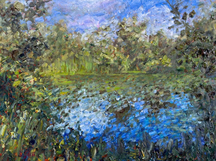
I will use my reference photo below as an example. There are two ways to look at the reference photo for a painting.
I could see every change in value no matter how small or insignificant. This is how normal people would look at the scene.

Or, if I were to think as an artist, then I would break the subject down into large values masses and ignore all the noise. When I actually painted this scene I broke the scene down into groups and then kept all the values within those groups around the same.


Stopping Too Early or Too Late
Knowing when to put down the brush is one of the most challenging aspects of painting. If you stop too early, then your painting may appear incomplete. If you stop too late, then your painting may appear overworked.
I like to call a painting finished once I have reached a stage where nothing of significance is missing or needs to be changed. At this stage, I must be confident that any additional work would only distract from the overall feel of the painting.
It can be difficult to judge when this time occurs. I personally will just ask myself this:
“… will this next brush stroke add any more value to my painting?”
If the answer is a solid no, then I will stop painting. At this stage, I am confident that any further work will not add anything to the overall appeal of the painting.
Also, I try not to paint with a fear of messing things up. If I see opportunities to improve the painting, I will take those opportunities, even if it means risking the current state of the painting. Taking the safe approach is a sure way of having many average paintings.
Using Too Much Color
By color, I am just referring to highly saturated (vivid) colors. When starting out in painting, many people try to cram as much color into the painting as possible. They think of the stunning displays of color by Claude Monet and Vincent van Gogh and try to achieve a similar result.

If you use too many saturated colors then the most likely result will be a painting which is jarring and uncomfortable to look at.
A vast majority of the colors you see in nature are not vivid colors. Rather, most of the colors you see are low-intensity versions. The image below demonstrates a range from vivid at the top, weak in the middle and finally neutral gray at the bottom. Rarely would you need to use the colors at the top.

Of course, there are times to use highly saturated colors. Like when you need to paint the vivid red of a rose, or when you are just going for that kind of style (like in Monet’s painting above and many of van Gogh’s). But most of the time, you will need to dull the colors down for your painting to some extent.
The dull colors should do most of the work in your paintings and the vivid colors can be used as accents.
To reduce the saturation of your colors, you could either:
- Add white (which would also make the color lighter)
- Add black (which would also make the color darker)
- Add gray
- Add the complement of the color (for example, to reduce the saturation of a vivid red, you could add green)
Overusing White
Overusing white is a particularly common problem for beginners. In many cases, I see white straight from the tube being used for all highlights, which appears very unnatural and not part of the subject.
This problem can be easily solved by learning how white works and some basic understanding of color mixing.
When you add white to a color, it increases the value and reduces the saturation of the color. Once the white is added, it is very difficult to get the richness of the color back.
You need to be very careful with getting white in your darks. Even just a touch of white could make your darks lose that rich and full appearance.
You do not need to rely on white to lighten your colors. In many cases, it makes more sense to use yellow to lighten your colors. Yellow is a relatively light color. Just be aware that adding yellow will also shift the hue.
Very rarely should you use pure white as a highlight. It will usually look out of place. Instead, you should use weak versions of colors. In the painting below, even the brightest part of the sun is not pure white but rather a very tinted yellow. In fact, pure white is not used at all in this painting.

Even when you are actually painting a white local color on a subject, you will probably not need to use white straight from the tube. Instead, you should rely on grays and weak colors. In the painting below, notice how little white is actually used for the white dress. But it still appears white.

Summary
I hope you have found this post useful. Have you made any of these mistakes in the past? Or are there any other mistakes you find yourself frequently making? Please let me know in the comments.
Also, I will just say that a mistake is only really a mistake if you do not learn from it. Do not paint with a fear of making mistakes, as they will happen. Just try to only make the same mistake once.
Want to Learn More?
You might be interested in my Painting Academy course. I’ll walk you through the time-tested fundamentals of painting. It’s perfect for absolute beginner to intermediate painters.
Thanks for Reading!
I appreciate you taking the time to read this post and I hope you found it helpful. Feel free to share it with friends.
Happy painting!
Dan Scott

Draw Paint Academy


Fabulous information, thanks Dan
Dan, you talked about white, I was commissioned to paint a local attraction, the ivory tower, it is white. I have finished the painting but the subject is too bright, what can I do to fix it. I wish I could post a picture so you could see what it needs, thankyou
Interesting and helpful.
As a beginner, I see myself have done all these mistakes. My mentor is correcting my progress exactly the same remarks you have mentioned. A second opinion from you from another different foreign perspective is highly appreciated and gives me a push to improve my paintings. Thank you a lot
We need more of you.
The most challenging issue for me is choosing the hard/soft/lost edges in a purposeful way. It is such a complex decision, involving all the aspects of light, atmospheric perspective and subject focus. I invariably get this not quite right and find my intention for a painting doesn’t quite work because of it. I am beginning to find ways to adjust these basic errors by scumbling/ glazing at the end but would much rather develop the skill to get it right when painting wet into wet. Your article is very succinct and helpful. I think I shall make myself a simple prompt sheet based on it and keep it by me when I start a new painting. Thank-you Dan.
I work in watercolour for botanical illustration. The most common mistake I make is not making shadows dark enough out of fear of losing important details. The end result is rather flat looking.
Thank you, great informations .
I appreciate your emails
I’m a beginner and starting my 2nd painting. Each point you bring up is something that I can apply to my next painting so I am grateful for the instruction. I have highlights, that I surely would have painted white out of the tube but will now adjust per your article. I’m looking forward to more helpful information that will shape me into a better artist. Thank you! ~~ Linda from Arizona
Thank you, great informations .
I appreciate your emails
Hi Dan..I.new to your site I’ll keep my comment short.i like what you said about fear. Fear of making a mistake caused me to stop painting for 10 years.
Also, it stopped me from painting detail pictures to favoring abstracts. Fear is a terrible thing. Thank you for calling attention to this mental hurdle….. Jerry brink of Buhl Idaho
Thanks. Yes, I tend to use too intense colours. They look good while I’m doing the painting and I prefer them over duller colours, but the end result when finished can be overwhelming. On my next one I’ll concentrate on softening. Thanks again.
Trying to paint too many values is a mistake I often make. I want variety but instead I end up with too much contrast. Thank you for the example.
All really good, helpful advice. Thank-you for explaining it all so clearly. The examples were very useful.
Thanks, Dan.
I am painting a lot these days (2021) and am always learning. Your post helps.
Very interesting and helpful. Thank you so much for sharing your great knowledge.
Thank you very much for your advice.
Thanks so much I have learn from this article!!! Please do more!! I love this!!! A friend of mine turned me on to this!! I’m in a nursing home and did not know I could paint!! Is it cheating to use carbine paper to transfer an image to my canvases to paint??? Thanks again for your help!!!
Thank you very much for that, I am making the transition from acrylics to watercolour, a bit like learning to drive on the left when you are used to driving on the right, aren’t some of those roundabouts confusing!!
Thanks for this posting. I am new to your site. I use acrylics mainly, have made all of these mistakes (and probably more) so now will be more aware. “Values” seem hard for me, also shadows, to some extent. Am now aware of overuse of white due to your post. Thanks!
Hi Dan,
Thanks for your direction. It does feel a bit overwhelming for me, as to date I’ve just struggled along with no idea, only persistence! Mostly I draw with pencil and do a bit of watercolour. It’s good to get some tips.
Thanks you
Cheers Christine
Subject selection tip most useful, as well as seeing how you simplified the value structure, and interpenetrated the reference photo. Thanks for sharing your expertise.
Tako pomoč pa res rabim. Kako odlične razlage in to konkretne. Dan, koliko stane ta pomoč?
Ne obvladam dobro angleščine!
Danijela Jermol
Thanks for your comment Danijela. I will translate your message for others:
“But I really need that help. What a great explanation and concrete. Dan, how much does this help cost?
I don’t speak English very well!
Danijela Jermol”
In response to your comment, I put out a lot of free articles to help out other artists. I do have paid products, but they are optional.
Hope this helps!
Thanks, Dan
Thanks.. I found it very useful.. Would certainly help me to improve. I had been to an art school many years back but then I didn’t take it up seriously as a profession. I Love to use both oil and acrylic…
Thanks once again
Hello Dan, I’m really happy I found you! Thank you for the Color Theory Cheat-sheet it’s now part of my go to sources and the above information too. I’ve made and still make many, no all, of the mistakes you mentioned above. I’m learning more with each painting I paint but the hardest think is knowing when to stop. I paint with acrylics mostly, dabble with oils … so different; love doing pen and ink drawing too. Thanks again for the information now all I have to do is absorb all the information with practice.
Hi Dan, I’m new to your site,
Thank you
Hi Dan, I’m new to your site,
Thank you for the many tips and I look forward to further emails and advice, kind regards
Hi Dan, I’m new to your site, I received your email today and thoroughly enjoyed reading your advice on mistakes.
Just like everybody else I have made my share of mistakes, I rarely use white, I tend to use variations of cream,I have never tried yellow 🤔 however I will now 🙂
Thank you for the many tips and I look forward to further emails and advice, kind regards
Ok so thankyou Dan for helping me out .
I get to know some of my mistakes from it.
Thankyou so much
And if i face any problem further i will ask you again .
Hi Dan! I am so glad I discovered your lessons! Two questions: How do you suggest a new painter “practice” colors. In other words, I know when something doesn’t look right; I just don’t know what to do about it. Second, I would find “bad” examples next to “good” examples helpful. Having a visual reference of what not to do would be very helpful.
Thanks!
Hi Dan, it was simply wonderful to read your informative mail and knowing what we’re actually doing and where we must focus . Bro, the foremost problem is that we don’t acknowledge the mistakes we are committing
Avoiding too much white is very difficult for me. I understand that you shouldn’t use too much of it, but yellow is very yellow and nothing else is light… it will click eventually ;-D I recently signed up for your newsletter and I’m enjoying every one of them. Thank you for the information and inspiration! And the painting on the cover of your free book absolutely blows me away! Every stroke right where it belongs in the right color and value, like it grew there, and how on earth you knew where to put them is like magic to me! Beautiful!
At last, at the age of 72, I have time to pursue what I’ve always wanted to do. Paint. I’ve painted “in my head” for years and thought putting the ideas on canvas would be a challenge but not nearly as hard as It actually is! Thanks to your wonderful articles (I think I have read most of them by now) I have learned to overcome many of my mistakes. We are traveling at the moment but as soon as I get home I will join your online academy. Thank you for sharing your knowledge so generously with so many of us who want to learn.
Very helpful article 👍👍
Dan, I do abstracts, which stretch some of the usual rules, but I always find some great insight from your posts. Thanks so much for sharing you knowledge and skill. You always have some pointers that help me create better work. Thanks,
Leila
It is so useful to have these problems summarised for me, thank-you so much. They are all things I have slowly become aware of but it is easy to forget any one of them during the process of painting.
Thank you, Dan. I have made all of these mistakes at one time or other. The one I make the most is probably stopping too early, because I’m afraid of ruining my painting. I’ve been trying to learn when to trust my intuition. Great post!
i have just joined your club dan and found your comments very true, i have been a life long painter but recently started painting again after 20 year abcence, it is very true what you say if you dont yearn to paint a subjectit will go nowhere.
best regards don.
Super insightful. I’ve had my fair share of mess ups in all those tidbits. 😬😂 ah the life of a beginner… going to work on these next time I sit down to paint!
Thank you Dan for this informative post. Yes there is so much to learn. I wonder IF I can be successful in selling my art even if I do not draw. Colour is my thing. I’m trying to step up and reach a new level in impressionism. I use acrylics mostly but possibly introducing watercolour for variety. Also is it necessary to produce big canvases for sale or do small ones sell just as well?.
This was very helpful and yes I see where I make those mistakes. Thank you for posting this.
thank you again sir. Dan i hope ypu you never be tired for teaching us
Thank you Mr. Scott. I’m a retired USAF pilot of the Vietnam era. I’ve never done oil painting in my life
however, I’ve started taking some lessons and am interested in starting. I’ve been doing this now for about 6 months. I’ve completed 4 paintings, but have started about 6 more that I just can’t complete.
The lessons are not formal. It is merely a supervised location with a dozen women who have been painting for 15-25 years. The elderly woman who is the “teacher” is a highly experienced artist, makes suggestions. She is very helpful, but not that instructive. Your article is the most helpful that I’ve read.
I’m a 78 year old “wanna be” oil painter.
Very
Thanks Dan !
Thanks Dan lots of good information!
Thank you Dan, My biggest mistake is trying to make too many values, but I regognice them all.
Thankyou so much for this. I was really doing that type of mistake . now i understood but not completely.
I will follow that rules.
Thanks.
Very well written Dan, I look forward to receiving your articles. The subject matter is always on point and relevant. Even the most seasoned artist can benefit from your insights (definitely not me!) We could all use a refresher course or at least reminders of the right questions we should be asking ourselves before calling any work done.
Thank you! I seem to have difficulty getting edges the way I want. This was very helpful!
Excellent post
Very helpful
Thank you so much
I have just started out to paint so haven’t done enough painting to make all the mistakes..!!!
Reading this has been very helpful to avoid them ..Thanks
I am so happy I’ve found you. Now I know why my second (ever) landscape painting just isn’t working, and I can go in and fix it (once it’s dry).
This is a valuable resource and I appreciate it very much.
This helped me a lot. Thank you! I have a mountain picture I painted a few months ago and it just doesn’t look right to me. I think it is because I have a considerable amount of pure white in it with clouds and highlights on the mountains. Thank you!!
Very useful information. Thank you so much!
This really made me think about my use of white on its own. So many great things to learn here. I’m looking forward to reading more?
Hi Dan
Thank you, you are inspiring me to get the brushes out again. I am a new painter & I’m sure this will get me going again.
Many thanks
Kay
As a beginner I found this most interesting and useful. I especially noted the use of yellow instead stark white. More natural. Thanks.
Thanks Dan,
these points helped me in understanding some of my mistakes. Very usefull.
Hello there! Found your site a while back and I have to say it is one of the best reads out there on this topic. Very practical, down to earth and useful and interesting posts. Well done and keep it up!
Thank you! I often forget to put in the more subtle shadows and generally use a mix of ultra blue and burnt sienna to create the shades. I had been painting with a group of plein air painters and realise that we often are in “poor subject” areas so had lost my focus and found that painting from photos at home more rewarding. I cannot thank you enough for sharing your valuable knowledge.
What a great write up, very thorough. I’ve made all those mistakes. I do not paint realism except an occasional still life – which has to be set up to identify shadows correctly. My designs start when I have an initial line idea. Also I have to be in the flow for it to work out. I’m learning and experimenting with color which I think it rather complicated. I’m self taught. I’ve used oils, acrylics, watercolor, but I prefer pastels.
I appreciate your sharing your experience. It is very helpful.
Thanks Dan
You have addressed all the problems that I am facing. It’s a great help to me
Arvind
An excellent summary of common mistakes – I have the urge to tattoo them on myself somewhere as I still seem to make them in my enthusiasm for one of the elements you mention.
Thanks Dan – very helpful thank you. Very interested in any insights on the juxtaposition of colors from various points on the color wheel and what impact that has in terms of warmth, coolness, tone etc.
Greatly appreciated my first “lesson”
Paul, Washington DC
Hi Dan
Thanks so much! I just read 7 mistakes and found it so helpful. Looking forward to applying it to my painting!
You have a gift for teaching which I appreciate. I’ve been looking for this sort of information. I’m glad I found you.
Cathy
This has been very helpful, thank you so much Dan.
How often do you send emails like this one?
You mentioned other emails that might be available?
Hi Diane
Thanks for your comment.
I try to put out articles a few times a week. Feel free to scroll through all the other articles on my website. I also send out regular emails giving helpful tips, if you are subscribed to Draw Paint Academy.
Thanks
Dan
Very helpful, I think I’ve encountered all these problems but mastered most except when to stop painting…..
Hi Dan,
I’m just starting and your tips will be very useful. One that applies to me and probably to many others is not to start painting until one feels inspired to do so. A second one is knowing when to stop painting.
Thank you for making the effort to teach the beginners,
Rob from Howick, SA
Hi Eila
I think any earth tone is great for staining the canvas (raw umber, burnt umber or even yellow ochre). It just provides a more level playing field to paint over.
Thanks!
Dan
Please tell me which coloured ‘stains’ on canvas suit land & seascapes rather than the weird white stuff sometimes advised to enable alterations more easily – Is the smudgy rust coloured one illustrated a good allrounder? Also I am about to embark on 11 ! such ‘scapes’ where lots of atmospheric mist will be involved! for a special local Art’s Festival in Dorset by mid-June! (thanks to your ‘oil’tips I feel NOW is the time to start despite being a ‘carer’ & having to move house! within next couple of months but I have atleast prepared all the pictures with sketches etc. like Turner /Constable etc. did but was procrastinating in fear of starting such a large project I am Eila /Raoul’s wife- He does not paint but I share his e-mail.My passion for painting most things is unrelenting and consuming so hopefully this ‘ll compensate me as I begin -Please let me know the answers to my 2 queries A.S.A.P! Eila de Rohan
Dan,
Helpful, informative and excellent jumping off place for me to use before teaching watercolors to others. You simplify each mistake with concrete models of what to do or avoid doing. Thank you! I often find that when a watercolor lacks the shadows and too much vibrant color usage my students or I pick up a permanent, fine-tip marker and create a watercolor and ink image. I love that you remind us to choose subject matter and images that we are passionate about painting. This is essential to my work.
Keep sharing, thank you. May I link this to my site.
Deji jacob. says thank you Dan scott for sharing your knowledge about practical painting.
you are gifted painter, bless you.
Hi Suzanne
Yes that is fine, no problem at all.
Thanks
Dan
I can see that I’m working my way through these errors. I’ve only started painting a lot this year and am taking colour mixing seriously now. It’s fascinating.
Nicely written and presented example on edges, thanks, that’s very useful.
I am sure I make all these mistakes, mostly not stopping when I should do.
Your article is very helpful
Happy to have helped Rosanna! Thanks
Thank you Dan, I have found this article very helpful and like so many others I have been using to much white
No problem Archie. Dan
Yes, I have made all of these mistakes. Thanks for the help.
No problem Deb! Keep practicing. Thanks, Dan
Hi,
Thank you for the informative piece. I did a painting today and had an issue with my dark colours…. and realised… I added white…? Now I can fix it ?
You are an amazing artist!
Greetings from South Africa ?
Good work Eileen! Thanks, Dan
I am an amateur. I make many errors. Your information is so helpful. I feel at times I try too hard and tend to over-do. Thank you for your help. I hope to find you on the net more often.
Keep practicing Sis! Happy the information is helping you. Dan
Hi Dan,
I’m a new subscriber, thanks for these fantastic tips, much appreciated!
Best Regards
Julie
No problem at all Julie! Hope they all help you out. Thanks, Dan
Hey Dan
Well the tip about not useing Pure White directly from the tube for highlights was really helpful as that’s exactly what I used to do till date. As you say it looks unnatural. But the funny thing is I never realised it looked unnatural till I just read it in today’s tip.
Thanks a lot Dan
Regards
Ritina
I am happy this post has helped you Ritina! Keep up the good work. Thanks, Dan
Thanks! I’ve only been painting a year, and thanks to a great teacher have improved a lot in that time. But your info here is helpfuland I take it to heart and will definitely share it. I’m glad to see someone true to his word in wanting to help novice painters!
Glad to hear Peggy! Just happy to help. Thanks, Dan
Great tips, thanks Dan.I am using too much white.Cold color’s warm shadow was new for me.
Happy to help Mikael! Thanks, Dan
Am in my 80s & painting as an hobby going on 6 yrs , great help from your guidance, bought books ,DVDs
Etc. but your advices are the best in comparison , so far. Many thanks
Thanks for your kind words Louis! Dan
I have been painting most of my life but am always looking to learn. This post settled some things in my mind about edges, etc. I find that I unconsciencely correct some of the problems you mention as I go along – as if my painting muse has just spoken to me. Keep up the great posts, they help a lot.
Happy to be helping you out Jim! Will do. Thanks, Dan
Hi Dan,
You explain everything in such an understanding way. I’m going to read this article a few times and remember all of these important tips when I paint. Thank you so much! Teresa
Thanks Teresa! Happy to help. Dan
Salud. Llevo poco tiempo con esto de pintar y creo que ya he cometido todos los errores posibles. Espero corregirlos pronto. Necesito un consejo sobre la luz natural y la eléctrica cuando pintas a diferentes horas del día sobre el mismo cuadro. Gracias por todo.
Hi there. I will translate for the rest of us.
“Health. I have been painting for a short time and I think I have already made all the possible mistakes. I hope to correct them soon. I need some advice on natural and electric light when you paint at different times of the day on the same painting. Thanks for everything.”
This post might help you out in terms of lighting: https://drawpaintacademy.com/art-studio-lighting/
Thanks! Dan
Great tips, thanks Dan. Just finished a painting from a demo we were given at our art group. Pleased with end result, until I looked at it more closely, snow scene, winter, but the trees in the background have green foliage!! Will definitely have to correct it. You are teaching me to be critical and look at my paintings carefully
Happy to be helping you out Barbara! Feel free to send me through a photo of your recent painting privately. Dan
I am another one who made the majority of these mistakes. Thanks for the help.
No problem at all Robert! Thanks, Dan
Thanks for the info, Dan…..hopefully I can remember these hints when I am painting. I find that I often overdo…….when I make a stroke that looks particularly good, I look for other places to put it and then I’ve gone way overboard. I have a hard time controlling myself from doing that.
Soft and hard edges are under control for me……saturation is half way under control……I have to really think about cool and warm colors and that the shadows should be just the opposite……color mixing is a challenge for me, but I’m learning. I’m anxious for whatever help you can give me.
Mary
No problem Mary. Thanks Dan
Thank you very much. I love reading your posts and learning from you, simple accurate and easy to follow.
Keep up with the good work
Glad to hear you are enjoying the posts Adriana! Thanks, Dan
A good refresher. My last teacher imprinted on us to never use white. Scared us to death. Also he said I use too much color. I kept trying to tone it down. Not sure how successful I’ve been. I do love color, could be my fate. I’ve done only watercolor. I’ve invested a lot in it and this is what I want to do. This is a hobby for me. I want to do it well, not for sale. Your information is great. Muchas Gracias.
Thanks Louisa! Dan
Dan,
I use multimedia which seldom involves me using a brush. Because of that I wasn’t sure if these tips would be appropriate for me. After reading your info. I realized that everything you mentioned would work for me as well.
The white garment, using little or no white, really made an impression on me.
Thanks to you I can now see what I’m doing with new eyes.
Best Dave Graham
Thanks Dave, happy to help! Dan
Very interesting article, I have started a beach and sunset painting and l am struggling with the white in the waves, l beleive it’s to bright, do you have any suggestions?
Hi Tania, sorry for my delay. White from the tube should probably be reserved for just the brightest highlights on the wave. Otherwise, try weak versions of colors.
Cheers, Dan
Dan I’ve made all these mistakes too. Especially when I started to paint again. I have built in forgeters. Thanks for reminding me. Just the other day I used straight white on a still water scene that looked so awful. I waited for the paint to dry (acrylic) to try to fix it,
thanks again – Rich
No problem Rich, Thanks! Dan
Thank you so much for your writing, “A Beginner’s Guide To Painting”! I painted my first painting when I was 15, in art class. I won 2nd place in the exhibit, but I HATED it! It lacked the 3D depth that I was struggling for. Anyway, I started to paint again (now, almost 40 years later). I am learning so much, so fast, but it’s been on my own. I am now working on a painting that I started a couple of years ago, but I didn’t know that you should gesso your canvas. The paint was soaking through the canvas. Well, I might be nuts, but I applied gesso OVER the existing paint. I’ve restarted the painting and have made some “mistakes” but I “fix” them. I’m not afraid to paint over paint. I hope to learn MUCH more, now that I have subscribed. Mixing colors, learning the Moore method (not real fond of it…yet), buying quality products, etc. I am so excited to finish my sunset over the ocean!!
Thanks Christine, just happy to be helping you. Good luck with finishing your sunset painting, Dan.
Sooo helpful thank you. Started painting in Nov so will try to incorporate all your points
My hardest part is mixing colours to get the one I need. I paint dogs faces/neck on stones and find the tans and fur colour tricky to achieve
Painting fine lines on small stones is hard to manage too
Really really appreciate your help. V generous of you!
Thanks, no problem at all!
Dan
Dan, thank you for reminding and illustrating those mistakes beginners often make. I am guilty as charged.
More practice and better decisions before starting will help. And you explain everything quite clearly. Please keep up the good work. Best wishes
Thank you for your kind words! More to come, Dan.
Thanks i am very great full for your wise words,
Kimberley
No problem Kimberley! Thanks, Dan
I have been taking lessons for about twelve years in acrylic, oil, and water color.
The class is usually about getting the paint on the canvas or paper since there is a time limit.
You are making me so smart and wise in my painting talent.
Thank you,
Ann
That’s great to hear Ann. Just happy to be helping, Dan
Thank you. Some points certainly were ‘to the point!’ As I teach a couple of seniors’ classes I hope you don’t mind my sharing your insights. And I will promote your site.
No problem at all Warwick, go for it! Thanks, Dan
Very useful and very well explained. Section on ‘ Shadows’ and ‘ Values’ for me are very useful.
I will read the entire lesson again. Thanks Dan.
Thank you Lily, great to hear! Keep up the good work. Dan
Yes, your post really useful. I used to make mistake as you pointed, to paint taking white straight from tube. Your guidance helped me a lot. Thanks Dan
Happy to hear, Thanks Dan.
So true on your comments. So much of what I learn is “trial and error”. As I look at my earlier paintings I clearly see now so many things I could have done or not done. I liked your recommendation to make each brush stroke count or have a purpose. So often I catch myself painting away and not being mindful of why I am adding this or that stroke. That’s when I look at the subject picture carefully and make sure I’m trying to paint that and not some idea in my head.
Good work Jerry, Thanks. Dan
Your e-mail was very helpful, and I learned that I have been making a lot of mistakes. I hit all seven of them! Looking forward to becoming a better painter with your help.
Look forward to be helping you Joann, Thanks Dan.
This was so interesting and helpful! I could relate to so much and look forward do more help from you! Thank you
That’s great to hear Marilyn. Thanks, Dan.
Thanks, Dan. Great post. I am working on a still life as a study to refresh myself on some of the basics of painting and I have made the hard, soft, lost edge mistake. The instructor pointed out some hard edges that needed to be blended and dry brushed to give the object its shape and create a soft edge instead.
Thanks Michelle! Dan
Dan, I’ve just started painting for a year with acrylics as a hobby since I retired and enjoy it immensely. I just read my first of your posts. It is certainly packed with great hints. I really like the idea of using yellow instead of white to lighten a color and how cool light will create warm shadows and vice versa. So much information in this letter. Can’t wait to go thru it again and incorporate some of the ideas into my painting. Thank you so much.
No problem at all Jerry, glad to be helping! Thanks, Dan
Of course I also make these same mistakes thanks for this email. What is the cost of subscribing?
Hi Leatha.
Thanks for your comment, glad this post helped!
The cost to subscribe is free. I also send out a lot of free content each week plus there are paid courses available should you wish to dive a little deeper.
Let me know if you want details on these and I can email you privately.
Thanks again, Dan.
Nice discussion, Dan. Truly for beginners like me hehehe. Thanks a lot.
No problem Doms. Thanks, Dan
I just found out about using yellow to soften and lighten. I didn’t know about all the edges now I’m going back and checking my previous “bad” painting s.
Thanks for sharing, Dan. This last post gave me new perspectives when I have my brush on hand. Love the exemples you showed about edges. I have always a mistake when paint a lake, the water always seems to be uphill, any suggestion how I can correct the luck of perspective on it?
Thank you!
I am using straight white way too often! Thanks for the advice re: shadows v. highlights. Being a beginner, I also appreciated the advice about when to put the brush down.
Thank you for this great post. It is easily read and understand, with great examples. It has helped me to make sense of things I’ve read in books but didn’t really understand. Have learnt a lot from reading it.
The post is very useful for me . I ‘m a beginner painting .I used to use a little white color in my painting .
Thank you so much .
Thank you very much. These are the best practical tips I have received and will put into use immediately. I am ‘guilty’ of using too much direct whites in my painting.
Glad to hear thanks! Dan
So happy I found your site. You can paint and teach….SCORE! Thanks, I am looking forward to learning more from you
Haha thanks Jackie! Dan
Thank you for your kind and great help.
MY
My pleasure thanks MY
I will definitely continue to read your posts – you give some very valuable tips. One of the problems I have the most problem with is creating THIN lines. It seems no matter how small a brush I use, any lines I paint will be too wide. Any ideas? Do you think I may have too “heavy a hand”? Thanks!
Thank you for very good lections
I’ve been doing the mistakes you describe. A lot of them. Two very characteristic of all I aware:
– When painting sunflowers in a glass vase, I painted water with too much white. It’s getting out of the picture and it bothers me.
– In the beginning, I painted sharp edges everywhere. I made a lot of pictures before I found out that they were disturbing,
And my big mistake – the biggest one: I am not painting every day. I must improve all.
Thank u so much Dan.i really appreciate your willing to share tips from your experience as an artist,with a ‘simple’ beginners..
The post is very helpful to me,especially regarding shadows.
Your exposure is very useful for me, thank you Dan! I still have problems with shadows and the edges, but I will try to be more attentive! Thanks again for your support! Have a nice evening!
Great advice, thanks Dan. Great to have these areas defined, with sensible explanations.
This lesson was supper helpful. I have been painting for years and have taken many different art classes yet no one has ever broken it down in such an easy and applicable way.
What do you think about starting a painting with a “color” painted as a background, partly so no white from the canvas will ever show through?
A lot of watercolourists start with a wash from top to bottom as background and build from there. Not sure about other mediums though.
It was a vetlry helpful post and great information.
An art teacher at a prep school where I worked suggested using Payne’s gray for shadows; adding the gray to the ground/background color to add some depth and easily get shadows in paintings. Another teacher at the same school suggested putting a very watery and light lavender shade in amongst trees for the “negative” parts of forests. That helped too. Thank you for your great pointers.
Well done Dan, more than useful instruction.
I am self taught as a painter. Worst student I have ever had! Thank you for taking over.
Stan, I relate to this! Great messages from Dan, I’m learning a lot.
Thank You for sharing these most valuable tips. It is wonderful to read and very informative. The best part was getting to read this without being charged! Seems like most everyone wants to make money these days, so they don’t share anything without a price.
Thank You again for sharing these valuable tips.
Yes I have made many of the mistakes, correcting them was the difficul part. Using pure white my biggest mustake. Valuable pointers, thanks
Thank you for the wonderful tips. The first things that I changed on my current painting were the edges, most needing more sharpness. The tip about too much white made me wonder if you could see me painting somehow when you wrote it, lol. BIG differences with little changes are amazing. Thanks again!
Thanks for an excellent post. I’ ve been painting for 9 years now. Sure I still make
a lot of mistakes but my biggest difficulty
is to find a good subject.
Thanks for the great tutorials, I find myself undecided about where my shadows should be. This will help tremendously.
You are a great teacher! Edges & values are both things I have trouble with.
Thanks Margaret! Appreciate it.
Thank you very much Dan , I paint 4 years ago and am only an amateur but I learn from people like you, all your tips are very useful especially the edges point which I never consider,thank you again 🙂
Thanks Abeer. Glad to hear 🙂 Dan
Great tips! Another mistake I think is very common for beginners as Ive done it many Xs is you shouldnt have anything in your painting that draws the eye straight to it unless of course its your focal point… you want the viewer to take the painting in as a whole and not draw the eye to one spot. Am I making any sense not sure here! Lets say you are painting a cat and you accidentally highlight the tail… the eye will look at the tail first and thats not what you obv are going for… anyways excellent post and you are a much better tutor than I!!!
Thanks for sharing Toni!
Absolutely excellent tutorial! I am a new artist with natural talent but making some of these mistakes. I also appreciate your specific detail with out overwhelming “artist talk”.
Thanks Susan! I try to keep away from “art talk”. I makes everything unreadable.. Dan
Interesting lessons. in few phrases explained the essence of every aspect to be taken into account.
Thank you
Thanks Marina
I’ve been painting a total of two months. It’s fun and eye opening. I expecially enjoyed your comments about using white. Your teaching is good reading.
Thanks Tom glad to hear. Dan
Thanks Dan I found this very helpful especially about not using white I do tend to over use it a lot. I will try not to do that in future.
Thanks Jenny
Hi just started to paint over a sketch and found this was just what I needed thanks
Great thanks Sheila!
I loved reading about colors. Not using pure white etc.
my funniest mistake was as a real beginner, painting a cottage in the woods with the creek. It actually tuned out good, till some years later, I happened to count the light sources.. there were six!!!!!
Thanks Mary, that sounds like a hard subject to paint with so many light sources! Dan
Thanks Dan good post. I am quit new at this venture, so my mistakes are many. But I believe I am learning. Mistakes are a good teacher..
Thanks Ray! Dan
I enjoy reading your suggestions. Although I have been painting acrylic, mixed media and pastel for many years, I’m relatively new to watercolour and very new to oils so I find your suggestions very helpful because I have never analysed my previous paintings so thoroughly and I think they will help
Thanks Judith! Glad to hear.
Thanks Dan.
Very helpful especially with light and dark, viewing work from a distance and different angles and colour mixing.
Thanks Joy!
I enjoyed your article very much. It helped to answer several questions for me. Thanks for posting it.
Thanks Linda!
Really enjoyed reading this, packed with vital information, put together in a refreshing and easy to understand way.
Thanks Dan
Thanks Judy! Glad to read that. Dan
Thank you so much, Dan, this is very helpful! I do all of these things I think…and have a fear of messing up which keeps me from trying to fix things – so I don’t finish the painting.
No problem thanks Joan!
I enjoy reading your emails, and will try to focus on your suggestions and learn more about composing a painting. Thank you for sharing.
Thanks Peggy, Dan
Excellent post Dan. I had similar issues in respect of hard, soft and hidden edges on a painting I did a while ago of the church square in Los Cristianos, Tenerife but overcame it and the painting came out well.
Thanks Mike!
I make ALL of the mistakes listed. Especially the use of white and of vivid colours. Thank you!
Thanks Eseta! Glad to help. Dan
Certainly covers many mistakes I have made. getting enough paint onto canvas can be an issue for me at times.
Thanks Shirley!
Wonderful tips!! Thank you so much for the energy you put into these posts. It truly is appreciated.
My pleasure Victoria! Dan
Thank you. Yes i v done most with out realizing.
On another note i have painted 2 beautiful scenerys and was told i didn’t have enough paint on canvas. I tryed to add more.
But recked it so painted over it.
I use acrylic. Thank you.
Kind regards janine
Thanks Janine
Hi Dan
Your tips was great! I have and are still making some of these mistakes!
Perhaps I still doesn’t fully grab the rule of thirds in compositions as I always tend to make my own pictures and do not stick to a picture or photo. But I will follow your edges and value tips definitely! Thanks again! Rina
Very helpful reminders, Dan. I am very guilty of using too many saturated colors and I’m trying to tone it down. Good advice about the values and showing the example in your painting of keeping the same values not too far apart. Otherwise the viewer’s eyes will be bouncing around looking for a focal point.
Thank you, Dan!!
Thanks Laurelle!
I am guilty in the use of my whites. Thanks for re-directing my vision in this respect.
Thanks Peter, Dan
Dear Dan,
Thank you very much for your valuable painting instructions.
I have made the mistake with the white colour many times.
Now I will stop. Not the painting but making the mistake.
Thanks again.
No problem thanks Antonis!
Great article, thank you!
Thanks Claudia
Very good post this. viveca Dahlen
Thanks Viveca! Dan
Very helpful post, I like it and learn a lot of paintings, thank you Dan!
Thank you Dan, I have made just about all of these mistakes. I find this very helpful.
No problem thanks Jennie! Dan
This was a great read and I’m feeling really good about my pickyness. It’s good to be objective! You learn from mistakes.
Thank you! Very helpful.
You have incorrectly titled a Turner painting as BASKET OF APPLES..
Hi Sherry, thanks for letting us know. I have fixed this up. The painting is J.M.W. Turner, Norham Castle, Sunrise, 1845.
Greetings Dan, I think I have made some of your mentioned mistakes, one at present, a portrait of a child. the eyes are too close and too small. How do I correct it without mixing in the original colors? This is an oil painting. Thank you Vincent
Hi Vincent, sorry for my delay. If you make a mistake with your drawing, then that tends to be difficult to fix, especially if the paint has dried. If you are working wet on wet, then you might be able to adjust the drawing. That is just one of the challenges of painting. Dan
Thank you, very helpfull!
No problem thanks Michelle! Dan
Yes, solid shadows, colors too bright, highlights in pure white, no focal point, but I’m learning!
Thank you, I’ll certainly look out for edges now, and highlights/shadows, interesting article. I need more drawing practice, and I’m learning not to add too much white, which has caused some expensive mistakes. Trying to get more fluid and realistic paintings.
Thanks Isabel! Dan
i used to love using white but now i’ve changed my mind thanks Dan
Oh Dan…this is great information. I’m new to your site and wish i’d found you years ago.
Thank you so much for sharing your wisdom.
Love Rob
Great stuff, Dan!! Especially about weighing each stroke before you put it on the canvas. I’ve gotten in the habit of adding strokes randomly when the painting doesn’t look right. Your suggestion to step back and get more insight before applying more paint haphazardly
Oh my goodness I so agree. Thankyou Dan for this information. I knew about edges but never knew their specific use. Everyone tells you about them and how to produce them but not why they were used in a particular place.
Cheers, Lyn.
No problem Lyn, happy to have helped. Thanks, Dan
Hello Dan.. been very busy with my job at school.i found your post really very very useful and very professionally prepared..i made a lot of those mistakes in the past…. you have güven evert one of these individual problems and mistakes and the subject matters that should be taken care of..wow!.it is a very effective summary of years and years experience and academic education and training.i am a watercolorist.. my difficulties stem from the medium itself..firstly watercokour is the.mist difficult medium to work with..the amount.of water ,paint, gravity,the degree of tilt you use while painting.. choising the right colour and muting it ir knowing how to mute and when to use colours vividly..there is a huge bundle of problems…and sometimes the fact that we can not persevere..and you should keep trying and trying keep painting and painting .. thank you very much for all the information yiu have given..really useful and valuable..it might ve frustrating when you do not have a painting teacher or a more experienced eye
Thanks Ercsn! Glad to help. Dan
This was very helpful. Especially about the color white.
Glad to hear Lu! Thanks, Dan
I have made many of these mistakes. This was really helpful!
Happy to hear this was helpful to you Maureen! Thanks, Dan
Very helpful and clearly explained – really gives you something to work on. All aspects really useful.
Look forward to reading more. Thankyou.
Great to hear this Jilly! More to come. Dan
Thank you Dan, Each one of these insights I can see will benefit my projects. So helpful and I will apply today!
That is great Kate! Keep up the good work. Thanks, Dan
Good day Dan i have and still do some times make all of these mistakes probably because i have never been told how not to. I just struggled on and thought it was my lack of experience so thanks for that big big help for me. Regards Paul Stanley in the U.K.
Glad the post has helped you out Paul! Keep up the good work. Dan
Great intro
Thanks. Dan Very helpful I will start painting again soon ,Interesting about the white and dark lots to Learn. Thanks Patrice
All the best with your next painting Patrice! Thanks, Dan
Respected Dan,
Good Morning,
I wish to God for your good health.
I read your valuable tips for realistic painting, which are wonderful and very much guidable for a new learner like me.
Although I am not a professional , but I have an interest for painting, now when I received your guidance for these techniques I really feel proud, and lots of thanks for yourself for this kindness.
I will try my best to keep in mind these techniques in future and always remains in hope for your valuable suggestions and Guidance’s in this regard in future to achieve and paint the perfect paintings.
Thanks again,
With regard
“Prabhu”
Haryana ( India)
Thank you for these tips , but each one of them can be a seperate lesson to fully comprehent so , if u made video tutorials that helps us avoid these mistakes by practising , i think it would be great .. thank u again
Thanks Heba. I do have video tutorials in my courses which go deeper into certain topics.
Dan
Thanks for your blog. Very useful &informative I really get about being inspired by a subject before one paints it
ALWAYS GREAT IMFO. Thank You for Sharing…
Thank you very much mate!
All this teachings are very helpful!
If you can look at my paintings and give some criticise will be so much more better.
If you do that , will you charge any money?
Hi Jerry
Thanks for your comment.
At the moment I don’t offer critiques. Most of my time goes into creating these posts and other products which can reach more people. But, I might consider it in the future when I have more time!
Thanks
Dan
Thank you so much for the tips on painting I have been painting for a few years now and I feel there is much more to learn. This article been so helpful. Thank you
Loved your article on painting. Very few people write something which is actually useful
Really enjoyed the ‘value’ discussion. I looked at the reference photo, liked it and mentally started laying it out in my mind to paint. Then I saw the way you handled the values and had to totally rethink my dark placement. Reading why you used the value/colors you did made perfect sense. I have gotten in the habit of putting very dark values in, like this photo on the left, when a bit lighter allowed some detail and still captured the feeling of the photo.
Thank you!! Great info!
Really enjoy reading this with reference pictures……… As I I’m a beginner so these all instructions are very helpful. Thanks a lot………..😇
Wow…thank you…I’m a newby and didn’t even know these were mistake I could make…now I’m aware.
very clear explanation of common mistakes. thanks!
Thank you Dan! Yes I have made these mistakes and I am slowly learning from them. I found your instructions very helpful! Regards Jo
Very useful information, I can see all the places I am going wrong with colour mixing. Thank you.
Thanks Dan,
Although I have been painting for many years I found your advice a reminder of many things I need to rethink. I am grateful for this.
Helene Bonney