(My “On the Easel” posts give you a behind-the-scenes look at what I am working on, what went well, what went wrong, and things I learn.)
Let’s take a look at how I painted Boats at Wynnum. I painted this toward the end of 2022 and gifted it to my parents for Christmas.
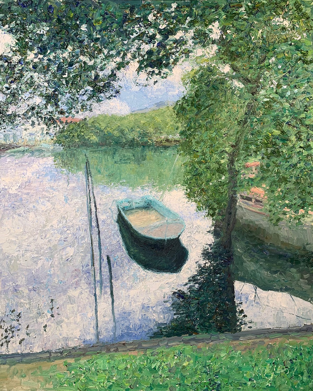
Reference Photo
Below is the reference photo I painted from. You can download the full-size image here. Feel free to paint it yourself.

(Need reference photos to paint from? Check out the Reference Photo Library.)
What I Used
- Oil on Ampersand gessoboard, 18 by 24 inches.
- Main colors: Ultramarine blue, cobalt blue, cadmium red, magenta, cadmium yellow, cadmium yellow light, cadmium orange, viridian green, and titanium white.
Refer to my supplies list for more details.
Notes and Lessons Learned
- I used a diverse range of techniques: scratching, flicking, dabbing, broken color, palette knife strokes, multicolored strokes, wet over dry, impasto texture, and scumbling. Notice how I used different techniques to convey different segments in the painting. The challenge of using such a diverse range of techniques is getting them all to work together in harmony. Complexity for the sake of complexity is never a good thing.
- This painting involved considerable problem-solving. The boat was particularly challenging. I encountered an issue with the boat around halfway through the painting process. I initially thought the issue had something to do with the drawing, scale, and perspective of the boat. I spent ages adjusting the drawing here, but nothing worked. I eventually realized the problem had nothing to do with the boat but rather the surrounding water. The water was too smooth and flat, and for some reason, that was messing with my perception of the boat. The solution was to paint the water with broken palette knife strokes. The key lesson here is to be open-minded when you encounter a problem. Don’t tunnel vision one element as I did with the boat’s drawing, scale, and perspective. The best solution is not always the obvious one.
- The color theme is rich greens and blues against pale reds and oranges. Green and red are complementary colors, as are blue and orange. By restraining the reds and oranges, I allow the cooler colors to dominate the painting.
Tip: When painting with complementary colors, consider restraining one so that the other can be dominant. Two complementary colors at full strength can be garish and jarring to look at.
Progress Shots
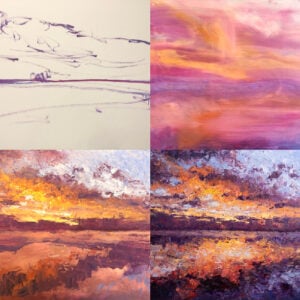
Below are some progress shots. The broad process I followed was:
- Rough sketch with the assistance of a three-by-three grid.
- Block in the major shapes and colors.
- Refine and add more intricate details.
- Make sure all the parts work together as a whole, make finishing touches, sign, and photograph the painting.


Detail Shots


Want to Learn More?
You might be interested in my Painting Academy course. I’ll walk you through the time-tested fundamentals of painting. It’s perfect for absolute beginner to intermediate painters.
Thanks for Reading!
I appreciate you taking the time to read this post and I hope you found it helpful. Feel free to share with friends.
Happy painting!
Dan Scott

Draw Paint Academy

