
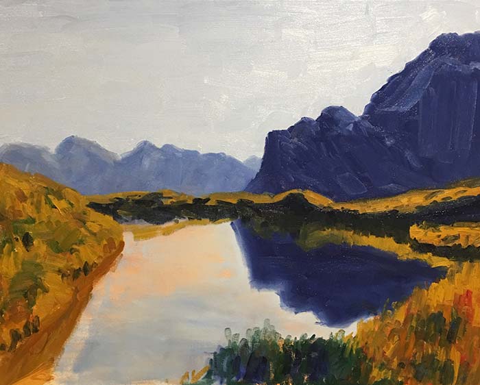
My brother went to New Zealand recently and I have had the privilege of painting some of his photos.
New Zealand has some of the best landscape scenery in the world. It is really a landscape painter’s dream.
For this painting tutorial, I walk you through my painting of the following photo.
I will be using oils, but the general principles will be the same for all mediums.
- Materials Used
- Step 1 – Stain and Sketch
- Step 2 – Sky and Water
- Step 3 – Start Detailing the Mountain Ranges
- Step 4 – Commit to the Mountain Ranges and Reflection
- Step 5 – Introduce the Greens, Yellows and Oranges
- Step 6 – Create Some Texture With Palette Knives and Blunt Paint Brush Tips
- Step 7 – Finishing Touches, Sign and Photograph
- Want to Learn More?
- Thanks for Reading!
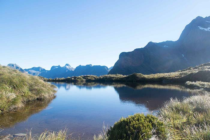
So why did I want to paint this photo?
Well, other than it just being an almost surreal scene, I enjoyed the calmness of the scene and the beautiful reflection in the water.
Materials Used
The following are links to Blick Art Supplies (one of the largest art suppliers in the world). I am an affiliate so if you decide to purchase through my links then I will receive a small commission at no additional cost to you. These funds are used to support this website.
- Medium Sized Filbert Paint Brush
- Medium Sized Flat Paint Brush
- Medium Sized Round Brush
- Palette Knife
- Toned Disposable Palette
- Linseed Oil
- Odorless Solvent
- Alizarin Crimson
- Yellow Ochre
- French Ultra Marine Blue
- Viridian Green
- Cadmium Orange
- Titanium White
- Raw Umber
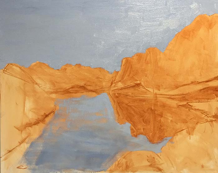
Step 1 – Stain and Sketch

First I stain the canvas with a wash of raw umber then lay down a simple sketch of the scene.
With the sketch all I am trying to capture is the dominant shapes of the mountains and land. I also block in some of the darker values in the scene.
Step 2 – Sky and Water
Here I block in the sky and water with a dull blue (a mixture of french ultra marine blue, titanium white and some cadmium orange to tone it down).
I want the water to be slightly darker than the sky, so I add a bit more french ultra marine blue.
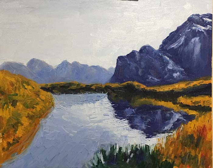
Step 3 – Start Detailing the Mountain Ranges
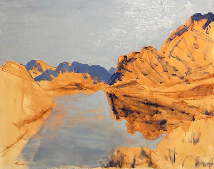
Here I am trying to get a feel for the rest of the painting. I am not really committing yet to the mountain ranges and land. I am just trying to determine what color to use really.
Step 4 – Commit to the Mountain Ranges and Reflection
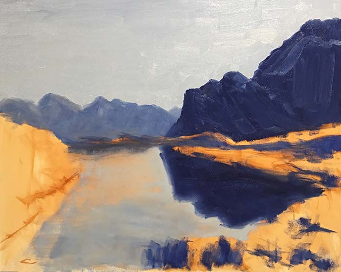
In this step I commit to blocking in the mountain ranges and any other similar values (dark areas) in the painting.
Notice how I have not actually added much detail. I have merely blocked in the major shapes.
More detail will come later.
Step 5 – Introduce the Greens, Yellows and Oranges
Once I have the blues blocked in, it is time to move onto the warmer colors, being yellows, oranges and some warm greens. I use different combinations of alizarin crimson, yellow ochre and viridian green.
I am not using much titanium white here. I am saving the white for later stages in the painting. If you introduce white too early, then you risk clouding up all your colors.
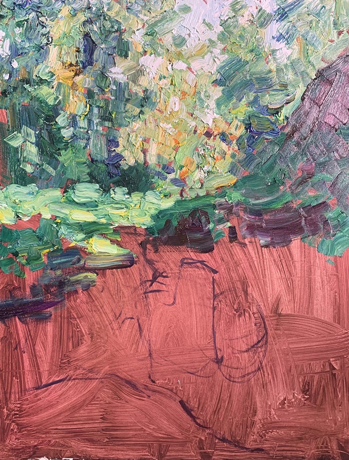
Step 6 – Create Some Texture With Palette Knives and Blunt Paint Brush Tips
Here I pull out the palette knife and start adding some texture to the mountain ranges, the water and the grass.
You can create very interesting effects by dragging the palette knife over brushwork.
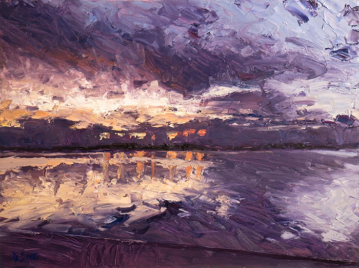
Step 7 – Finishing Touches, Sign and Photograph
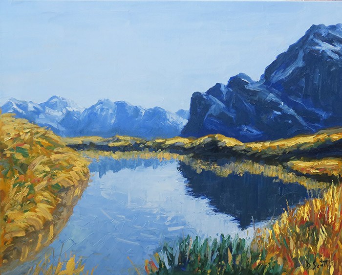
Above is the finished painting.
You can see I have added some highlights here and there and refined certain areas. No dramatic changes as all the foundations were placed in the earlier stages.
You may also notice the colors appear more vibrant in this photo. That is because I paint in my room which does not have the best lighting. The above is a more faithful representation of the painting.
This is why it is important if possible to paint with good lighting in place.
Want to Learn More?
You might be interested in my Painting Academy course. I’ll walk you through the time-tested fundamentals of painting. It’s perfect for absolute beginner to intermediate painters.
Thanks for Reading!
I appreciate you taking the time to read this post and I hope you found it helpful. Feel free to share it with friends.
Happy painting!
Dan Scott

Draw Paint Academy
Thankyou so much. I had a question about the dark color on the mountain, what did you use?
No problem Kathy. The mountain I used french ultra marine blue mixed with cadmium orange (to de-saturate the blue so it is not too powerful).
Regards
Dan