
In this post, I’ll discuss how you can critique your own art. Critiquing art is no easy task, especially when it’s your own. We’re either far too critical or far too generous.
But it’s a valuable skill that allows you to identify areas for improvement and to give yourself a pat on the back when you do something well. Also, you will often be your own best judge. So you may as well be a good one.
I’ll start by outlining a process you can use to critique your own work. I’ll then show you the process in action by critiquing my recent New Zealand, Foggy Mountains (shown below).
- Step 1. Be Objective
- Step 2. Identify Areas for Improvement
- Step 3. Give Yourself a Pat on the Back
- Critique Demonstration
- Key Takeaways
- Want to Learn More?
- Thanks for Reading!

I’ll walk you through the entire process using one of my recent paintings. You’ll see how I go from idea all the way through to reflecting on the finished painting.

Step 1. Be Objective
The main challenge of critiquing your own art is a lack of objectivity. We are all biased. We see our own work differently from everyone else. We are painfully aware of all the mistakes, struggles, sweat, and tears that went into its creation. We are also prone to comparing our work to that of the greats.
I cannot provide you with a sure-fire solution. I’m sure even the great masters battle these things. It’s often what makes them so great. But ruthless honesty helps. Don’t hide from your mistakes and don’t ignore things you did well. Shine a light on them.
Step 2. Identify Areas for Improvement
Put your ego aside. What areas are weak and need improvement? Think big picture, not tiny mistakes.
Are there glaring issues?
Is anything too big or too small (perspective and scale)?
Do any colors look out of place (often meaning incorrect temperature or value)?
Is it uninviting and bland?
Is it faithful to the subject?
Once you identify a few areas for improvement, narrow down further to the root issues. Don’t be vague. If the drawing looks off, why? Maybe you need to work on your dexterity and control. If a color looks out of place, why? Is it because you don’t fully understand color, or is it because you don’t know how to use it? Maybe you need to improve your color mixing skills?
Then, work on improving those areas. Read some books, do some exercises, focus on that weak area in your next painting. Give the weakness some of your attention and it won’t be a weakness for long.
Step 3. Give Yourself a Pat on the Back
Painting is hard, so you need to give yourself credit when credits due. But again, radical honesty is needed. Don’t fluff up your ego if you don’t deserve it.
It doesn’t need to be much. Perhaps you mixed a color just right. Or your painting is just a little bit better than the last one. Or you held your calm after making a mistake. If you did something well, give yourself a pat on the back. Acknowledge wins as they happen.
Critique Demonstration
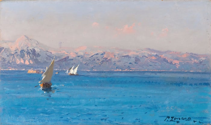
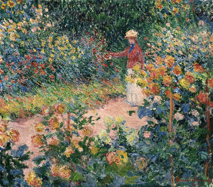
To give you a demonstration, I’ll critique my recent New Zealand, Foggy Mountains painting. Here it is again:

It’s based on a photo I took whilst hiking New Zealand’s Routeburn track with my brother and father. Unfortunately, I didn’t have time to paint any studies on the hike, so all I have is a reference photo plus my memory. Ideally, I like to have color studies plus reference photos. Cameras are fantastic, but they are no substitute for what we actually see.
Below is the reference photo. Keep in mind, when I paint from a reference photo, my aim isn’t to copy it. It’s merely a reference. The painting needs to stand on its own.

Let’s take a look at what’s going on in the painting. This is about me trying to look at the painting objectively, as if it’s not my own work.
The first thing I notice is this lovely snaking line created by the stream. This is the main reason I chose to paint this scene. It gives a sense of gesture, movement, and life. It also helps your eyes move through the painting.

There are also several more subtle lines around the mountains. This helps reiterate the overall gesture. And notice where all these lines are directing you towards—that distant waterfall. It doesn’t smack you over the head, but it is a key feature in the painting. Remember, less is often more in painting. If I made the waterfall stronger, say with lighter colors and more detail, it would compromise the sense of depth and atmosphere.

Notice these other subtle lines on the right-hand side. They help convey the land’s form. I want you to feel the land as it changes, tilts, and leans in space.

Let’s take a look at the sky. The clouds and blue sky are woven together, creating a sense of movement and ambiance. If you look closely, you’ll also see a subtle change in color saturation. The blue gets just a bit stronger around the area circled below. It’s not obvious, but small details like this can play an important role in the big picture.

In terms of the overall color strategy, most of the colors are compressed around the middle-value range, except for a few dark accents (circled below). These dark accents are small but powerful outliers. They create interest and command attention.

Here’s the painting in grayscale to show what I mean. Notice how, apart from these dark accents, most of the colors are around the same value. Even the sky is not that much lighter than the foreground. This creates a subtle link between all these colors, even though they might vary in terms of hue and saturation.

Let’s move onto my overall critique of the painting. What could be improved:
1st. The sky appears a touch too dark. Though in this case, the darker sky seems to work with the overall theme of the painting. But that wasn’t intentional, so I’ll put it in the “area for improvement” category.
2nd. The distant waterfall was very close to being overworked. I actually had to scrape this area down and try again. Luckily, it worked out, but it could have just as easily gone the other way. I need to be careful about reckless brushwork in future paintings.
3rd. The brushwork I used for the river is a bit sloppy. I painted with too much guesswork and not enough control. It also needs to swing further left on the nearest turn.

Now, what went well:
1st. There’s a good sense of depth. Which is important given that’s basically the whole idea of the painting.
2nd. I finished the painting at a good point. I didn’t overwork it.
3rd. I used a wide range of techniques to get the desired marks. Such as using the tip of the palette knife to scrape details into the painting and add subtle directional lines.
Tip: Every time you use a new technique or do something unusual, it’s worth giving yourself a pat on the back. It’s very easy to get caught up in your own ways, doing the same thing over and over again. Make sure you mix it up and experiment with new things.

All in all, I like how the painting turned out. It reflects how I remember the scene, which is what’s important. But, as Peter Fiore suggests in his quote below, the next painting will be better!
“The best thing about painting is the next painting. It’s going to be the best painting. Because if it wasn’t that way, you wouldn’t pick up a brush again. If you fell in love with a painting so much that you’re afraid to paint again, what is the point of that.” Peter Fiore, from his Savvy Painter interview.
(Peter Fiore is featured in my Exploring the Masters series. You can sign up here if interested.)
Key Takeaways
- Critiquing your own art is a valuable skill. Often, you are your own best judge. So you may as well be a good one.
- Be objective. Pretend it’s someone else’s work.
- Be honest with yourself. Shine a light on your weaknesses and strengths (don’t hide them).
- Painting is hard, so make sure you give yourself a pat on the back when things go well.
Want to Learn More?
You might be interested in my Painting Academy course. I’ll walk you through the time-tested fundamentals of painting. It’s perfect for absolute beginner to intermediate painters.
Thanks for Reading!
I appreciate you taking the time to read this post and I hope you found it helpful. Feel free to share it with friends.
Happy painting!
Dan Scott

Draw Paint Academy

Thanks very much for this post, Dan.
I am running a critical analysis class with my textile artist group and this is an excellent example of self-critique. All points are relevant to textile artwork too, although some words used might need to change – stitch instead of brushstroke for example.
I will make reference to you and this article in my handout for the session – it has made my preparation so much easier!
I do not possess the necessary artist’s jargon to ascribe the creation of my paintings to any specific thought or emotion.
No matter how I paint, I’m never completely satisfied with the result. My own worst critic.
I am my own worst critic when it comes to painting, I would stop halfway because it didn’t look exactly as the photo because I feel I have to copy the photo or a scene just exactly as it appears so thank you Dan for pointing out that it doesn’t have to be exact but to show the representation of it.
Thankyou very much Dan for your generous sharing and great skill and knowledge to students and to other artists.
Best wishes to you
Diana
Love everything about your painting.Annaxx
Very helpful and I hope you do more like this. Thanks
Thanks again for such an important lesson. You give us freedom to do so many things that, I at least, have not thought about. You are a great teacher!
Mister Scott, you are a TEACHER!! You are missing out on much higher income and a good pension by not working at a school. And for that matter, the students who are never experiencing your instruction are losing out. Oh. And in this ptg, you have way too much mousey brown.
Hi Dan,
If you had shifted the waterfall slightly to the left it would have fit in better to look like it was feeding into the river. That’s my two cents.
-Liz
Life shrinks or expands in proportion to one’s courage. I feel courageous when I paint but am painfully critical of my own work. I fear showing my finished work to others and know this takes courage, but it helps me to improve. Feedback is important and is often an eye opener.
I love your comment about pretending you’re critiquing someone else’s work.
Thanks for your article, it was very informative as always.
Lisa
I love the painting. I have not explored the brushwork you use or the use of the pallet knife, but I love the brushwork you have in this painting. I think my only critique would be moving the stream with a little more left hand turn. At any rate I am using your suggestions in critiquing my work. I will be taking one of my paintings and reworking a tree limb just to provide more balance. BTW, I just finished a painting of Bullard Lake Michigan. Could not have done this without all of the advice and guidance that I am getting from your emails and website! I am a fan!!!
I appreciate this for youngsters, however, I will say one thing you could possibly work on. The closer something is, the more detail you see. However, your painting has pretty bland land throughout, and doesn’t change much from the very back to the very front.
I rather love your sky and water.
All in all, a decent painting, and I hope to see you develop soon.
With grandmotherly love,
Ms. Worth
Although I am no great artist by any means, actually a virtual beginner, I agree with your critique except for one big point for me….
Love the snaking S shape but it takes me right off the page. There is nothing there to block it. Although not in the reference pic, you might have placed some tall grasses or a bush to take me back up into the picture. Just saying…. my opinion only
Cheers Terry
Dan, thanks for this! It’s really helpful and tells me how to improve .
Many art school critique sessions can be laughably cliched, towards “Meaningful Art” versus craft. I once listened to a small earnest group, lavishing all sort of interpretive psychological analyses on a rather peculiar painting, of somewhat cloying cute animals, yet rendered in jarring hues, with clumsy drawing skills to boot. Angst, anguish, suppressed emotional rage, etc. were discussed, along with irony, etc. Yet, the painter eventually shared that the intention was to just portray cutesy adorable animals, with no deep meaning at all. It was just an awfully executed kitsch painting, mistaken for some grand psychodrama! Self-critiquing can be brutal; letting it sit for a few days can help greatly, in forgetting every tiny detail you struggled with, and letting the initial overview soak in. Try to stay detached, and look abstractly, at areas that are interesting, adding to the whole, then areas of less harmony, distracting or inconsistent with the overall style and method. Also, regarding tedious technical methods to try and perfectly match every color somehow to the original – if the original is really that great, just pay for the best professional print and show that. I’ve chosen entirely arbitrary, simplified palettes in pastels, with only an approximate comparison to the source, yet the final artwork came together, because the colors were internally consistent and created a “representational” work that cohered better as a whole. Slaving to replicate either nature or a photo source misses the point. The world on canvas or paper may be borne from a source, but it has to gel in its own separate reality, whether as a photorealistic depiction, or abstracted color tone poem.
Thank you Dan for your critique technique tips. They are specific and thus can be put to use. I will now go and look at my most recent efforts and apply them. Being a watercolourist I envy your being able to scrape things off.
That is a lovely rendition of the Routeburn. I wondered when you’d been able to come, this being the Covid era. May you come soon again!!
You are always so generous with your insights, techniques you’ve learned from experience, and your encouragement. I learn so much from your posts and articles. I am so grateful that you take the time to share your wisdom. Thank you!
Hi Dan, Thanks for all the wonderful lessons. I think many times I am too concerned with whether I have shown my emotional response to a particular location or happening and should be checking more technical aspects. I’m sorry but I did not identify the waterfall in either the photo or the painting and would have missed it had you not mentioned it. My eye went right to the light spot on the rocks on the upper left. Maybe it’s because the water in the creek that your eye follows is flowing in the opposite direction than the waterfall source. Anyhow it’s a beautiful painting and I wondered when I saw it what you could possibly find to improve.
Hi Dan,
Thanks for this post. I did one of my first painting lastly of an apple and did a post about it. I talked about the things that I have learned.
The way I see things is that I start, then I learn, I do another painting and learn again. I learn techniques and add them constantly to my skills and I go better and better each time.
I know I will make mistakes and will have weaknesses but I’m happy that I’m learning.
Instinctively, I did an auto-critique of my painting in my post. This way, if people wanted to criticize it, then I will be the 1st one to have done it and perhaps they will go more easy on me. 🙂 seeing that I already know that my painting is not perfect.
I don’t pretend to be an expert or perfect.
Thanks for this inspiring post that will help me get better and be my best judge.
Marie-Josée, Canada
About 10 years ago I tried to make it as a pro-photographer. This was my gear. I had a Nikon D300 camera. This was not the most pro camera at that time but good enough. I had a pro monitor about $3,000 at that time. I had a spyder to calibrate the monitor. On that monitor you could adjust the color (red, green and blue) to make the red on the monitor real red etc. I had a pro- printer. An Epson. The printer had a rol of photo paper. Also the printer had 7 ink cartridges. A light and normal for cyaan, magenta, and yellow plus a black cartridge. I had photoshop to connect it all. In photoshop you profiles for a printer and the printer paper you use.
Why all these color adjustments? First your camera records a subject. The monitor is adjusted to make sure the data from the camera is shows on your monitor as recorded. For instance if your adjustment button on your monitor for red is out wack your correction in photoshop for red will be off. The printer profiel makes sure that when your file coming out of photoshop is printed correctly on the paper you use.
Ok this seems complicated and it was 10 years ago maybe it is simpler now. I like Epson printers because the seems to do the things a wanted. However make sure the you have the possibility to calibrate the monitor, use photoshop, and use printer profiles to makes sure that you get a pro result.
If you want good Acceptable results you can use color test cards. Kodak used to make one. It sounds weird but you could print one with your printer. you make photos of the test card and adjust the monitor until it looks good. Print the result and play with the printer profile until it result looks good.
Thank you, Dan for this really helpful lesson!
a question:
I am looking for a new printer that will reproduce pictures of paintings like the one in this lesson with true colors and details so that I can work from them. One class I have taken sends paintings to work from on line and I need these to come out well also. I’ve read and asked some people (but not artists) and am confused by the replies. I would love any suggestions you might have.
A tip to make the colors in the field equivalent to the colors in your photo.
In the field add a calibrated color chart in one or more of your photos of the scene. ThIs chart has calibrated colors with a color code. In photoshop you can compare the colors on the chart you photographed with the color codes they should be according the calibrated chart. In photoshop you can sample colors you get a code for the Red Green Blue in that point. For instance on your photo of The red Color on the cart it shows R170 but the number on the chart shows R200 what it should now you adjust the color red in your photo with PS to R200.
Using the adjustment tools in photoshop you can adjust the colors in your photo to the one in the field.
Very helpful. Thanks. I’m a beginner and will undoubtably use your well planned instruction.
Dan, As usual, when you address a subject you put so much into it. The act of critiquing your own art – heady stuff. I, myself, am past the beginner phase and never can gage how really I have advanced. Still exploring use of color and techniques. When I finish a painting, I tend to focus on area(s) of where I did something well – something I had not achieved before, and I am proud of the painting for that. I tend to overlook the weaker parts and, of course, THOSE are the parts that are picked up and expounded on when I show the painting. That critique from others never goes well but I learn things from it. Your critique steps are invaluable.
In your painting discussed, I wonder if there is not enough attention drawn to the foreground to emphasize the depth. I want to fall in love with the foreground to appreciate how much depth there is in the scene. I know the reference photo does not show this but I suspect some darker values in the foreground mountain might help with that, give more contrast to the light tops of the mountains on the right; and perhaps a bit more detail in the front ground leading up to the river might also help increase the illusion of depth across the scene. The leading edge of the river could be better defined. This may not really work artistically, but my eyes want to see that to appreciate the distance.
In any event, thanks so much for the post. This is a process I have to get more comfortable with.
Excellent information and helpful pictures. I’ve nearly finished a picture and have been looking at it to critique it, and this has given me timely guidance. Thanks ,
After more than 5 years of watercolor painting which included 2 years of group instruction, I’m struck by how much I’ve learned and evolved. Thankfully, I didn’t or couldn’t have given up my dream of becoming an artist; and that took a lot of critique of my evolving artwork. I never forgot what one great painter said about and his love of seeing students’ first paintings and how valuable they are to teaching and learning.
Thank you.
Thank you for the information on critiquing your own work. I have found that if I am nearly finished with a painting, I will take a snapshot of it. Sometimes the glaring mistake will show up in the photo and I can then work on it.
Excellent topic and excellent advice as always. It would be great if you can expand the topic a bit more. Everyone’s comments are also very interesting and helpful. How to step back and put on a second pair of eyes to view our work is so important. Especially now when another pair of eyes is not readily available in person due to pandemic restrictions. Taking a photo and posting for feedback never really works as you cannot show the feel of the WIP. More on this topic please please please.
Thank you. I found this helpful and look forward to using the ideas. My next painting is to be a landscape.
Alvi
I love that you said you had to scrape off the waterfall and try again. It’s so encouraging to those of us just getting into painting to hear that experienced painters make mistakes too. And the pat on the back – I always do that when critiquing someone else’s work. I am getting better about doing that for my own work. It is so important for us to remind ourselves that we didn’t mess up completely! Thanks for all you do.
Thanks always for your tutorials. Dan I am not trying to rain on your parade, however I would like to comment on the painting. If you had not identified the waterfall I would not and did not read it as such. The highlights on the rocks tend to be very close to the waterfall colour. I liked the lighter sky with more variation of lights and darks on the mountain, with perhaps some darks leading to the ‘waterfall’. To resolve the question is it or isn’t it a waterfall would a closer view of the waterfall, getting up close and personal with the waterfall? Painting the waterfall at a different angle? This would leave no doubt in the viewers interpretation. I find that because I am unfamiliar with the landscape there is something missing. To my mind there needs to be more emphasis on the waterfall. The river meandering thru the landscape is lovely. Am I misinterpreting the view, and the river is the focus?
not being familiar with the landscape/view, to me there is something missing in the painting.
Jean, I am just another observing painter hoping to improve my work. I think in order to maintain depth and distance the waterfall was best toned down. This keeps the painting soft and the eye focused on the shapes & texture while remaining pleasing to the eye.
Years ago I read that it takes two people to make a great painting-one to paint and another to stop him when it’s finished. Now I’m painting water lilies; I like as is but want to do more. Waiting to see which side “wins.”
.
The Peter Fiore comment is an eye opener. Maybe that’s what stalls a lot of us, we fear we have done our best work and can’t follow on with something that may be inferior. Every work is different though, and each teaches us something .
Dan, Thank You so much for this post!!!! Very well done and useful! Artists at all levels need this information.
Love the encouraging trial and error attempts as novices that keep refining our skills until we feel better about it and try it again to tell a better story line behind it. Thanks,
Bob Durocher
“Pretend it’s someone else’s work”. I love that!
Thanks for the article on critiquing our own work. I do this regularly through my works, making a list of steps to take.
I critique from a photo taken of my work at varying stages. For some reason looking at a photo of the the painting in progress creates an extra step of distance to allow for the added objectivity required.
I was told before digital cameras, artists used to use a mirror and inspect their own work by looking at it in a mirror.
The one thing I am now aware of is ‘the pat on the back’s has never happened for most of my art at completion. The painting would finish when the critique list of adjustments ended…. I don’t fiddle. The painting is then turned around and I will leave it a week, then take a fresh look.
It always looks amazing at that point, even if I was absolutely certain that I had stuffed up. But still no pat on the back and I think in this case, this is the most important message from your article.
We as artists need to be our own fan club and encourage ourselves.
Thank you for your messages of support and inspiration.
Sophia Helene
Important to view our work objectively…this has been very helpful in sectioning areas of the photograph to explore whilst being conscious of the eyeline… the mountain slope and fall of the land…
Thank you! 👍🏻
I found this very helpful. I’m new at this and always over correct and never want to finish. I’m so critical of my work, it’s frustrating.
I think we all are critical of our work.in class when all explain whatthey havedone the first thing we do is point out our mistakes.
Well said and some useful tips there x
Critique of the kind you offer is most often omitted in the books, etc, i read. Few teachers know their students well enough to render them ideas to concider,reconsider, in the process of leaving a finished work.
You do this very well, and I thank you for that.
Thank you for explaining the values and pitfalls of our work I find it very hard now as my lovely tutor passed away recently she was my mentor and great friend I am trying to remember the things she taught me aand I belong to a nice group of people who help each other but I read your art page and find it helpful Thank you Elizabeth Taylor NZ