 Share to X
I know I write about Claude Monet often, but I think this one is warranted. When I think of sunrises and sunsets, few artists do it better than Monet. His energetic strokes and dancing colors are particularly well suited to these subjects. Sunrise and sunset are vague and fleeting by nature. We often have only a brief impression of them before they fade. And who better to capture that impression than Monet?
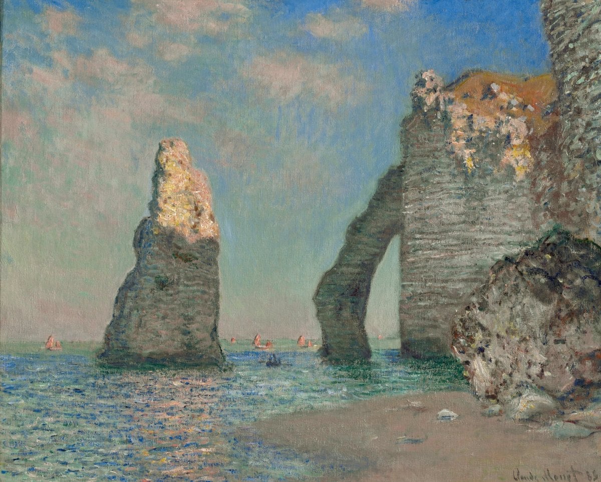
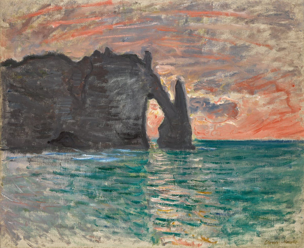
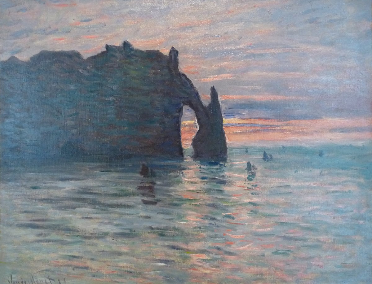
Let’s take a look at some of my favorites, starting with three paintings from his Cliffs of Étretat series. What a simple yet strong subject. It’s no wonder several famous artists painted them, such as Gustave Courbet, Camille Corot, and Eugène Boudin, to name a few. The cliffs form an interesting abstract shape, silhouetted against the brilliant sky and its reflected colors on the water. An arch frames part of the sky, with a needle-like formation at the end. The needle formation is actually separate from the cliffs, but in Monet’s paintings below, they melt together to form a single abstract mass. You can see what I mean in this painting by Monet, which shows a different perspective of the cliffs in daylight. This is an important point about painting sunrise and sunset: the dark areas out of direct sunlight typically melt together into a single abstract shape.
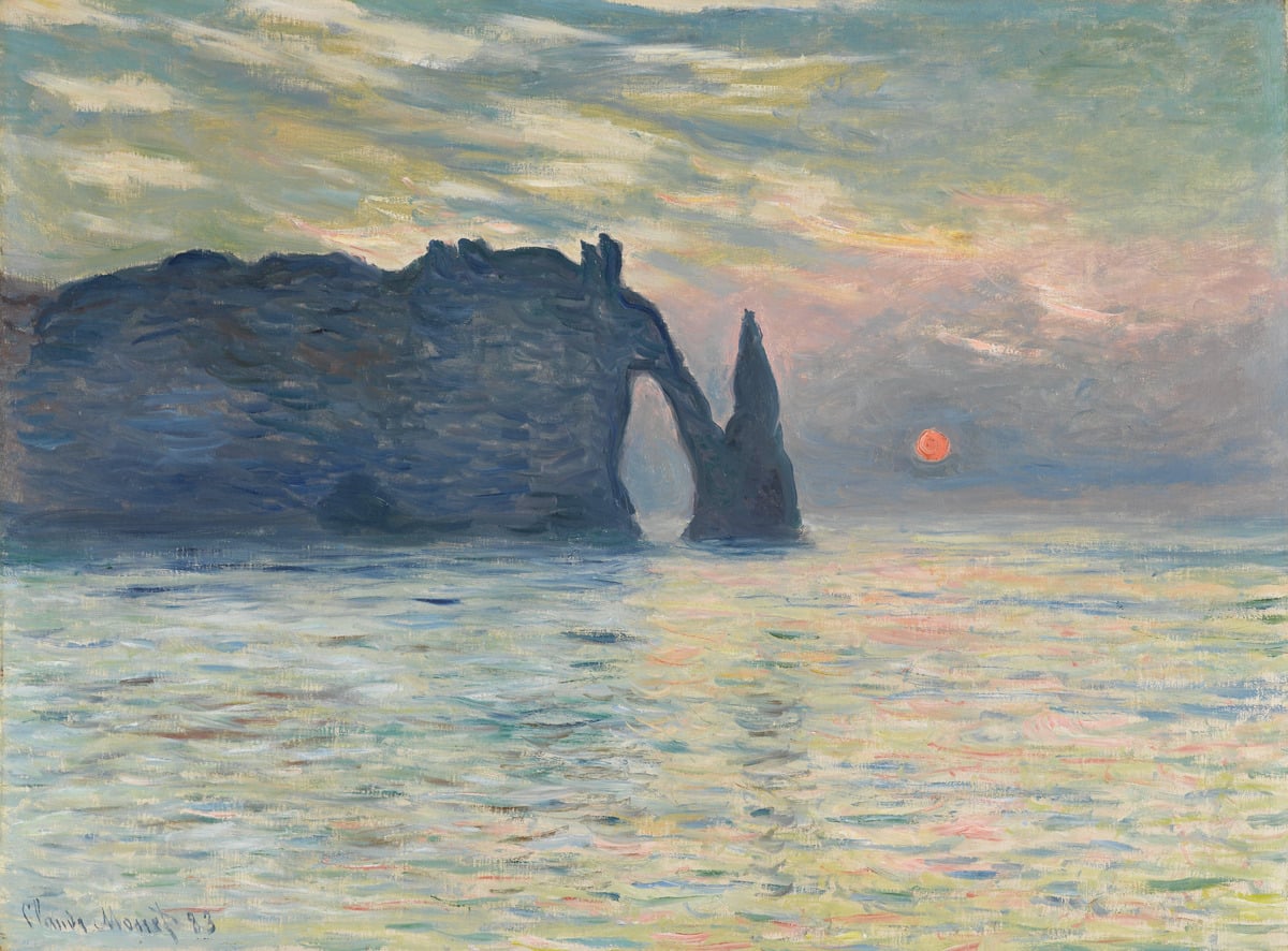
This one is a vibrant display! Perhaps one of Monet’s most aggressively colorful paintings. Look at the shadows in particular. I can see rich blues, reds, greens, purples, oranges, and yellows, all woven together in some kind of harmony. The sky has a rough gradation from cadmium yellow, to orange, to green, to teal, to blue, with the brushwork radiating out from the sun. This rough gradation and brushwork fit with the overall impressionist style of the painting. A smooth and refined gradation might look out of place. Little decisions like these matter!
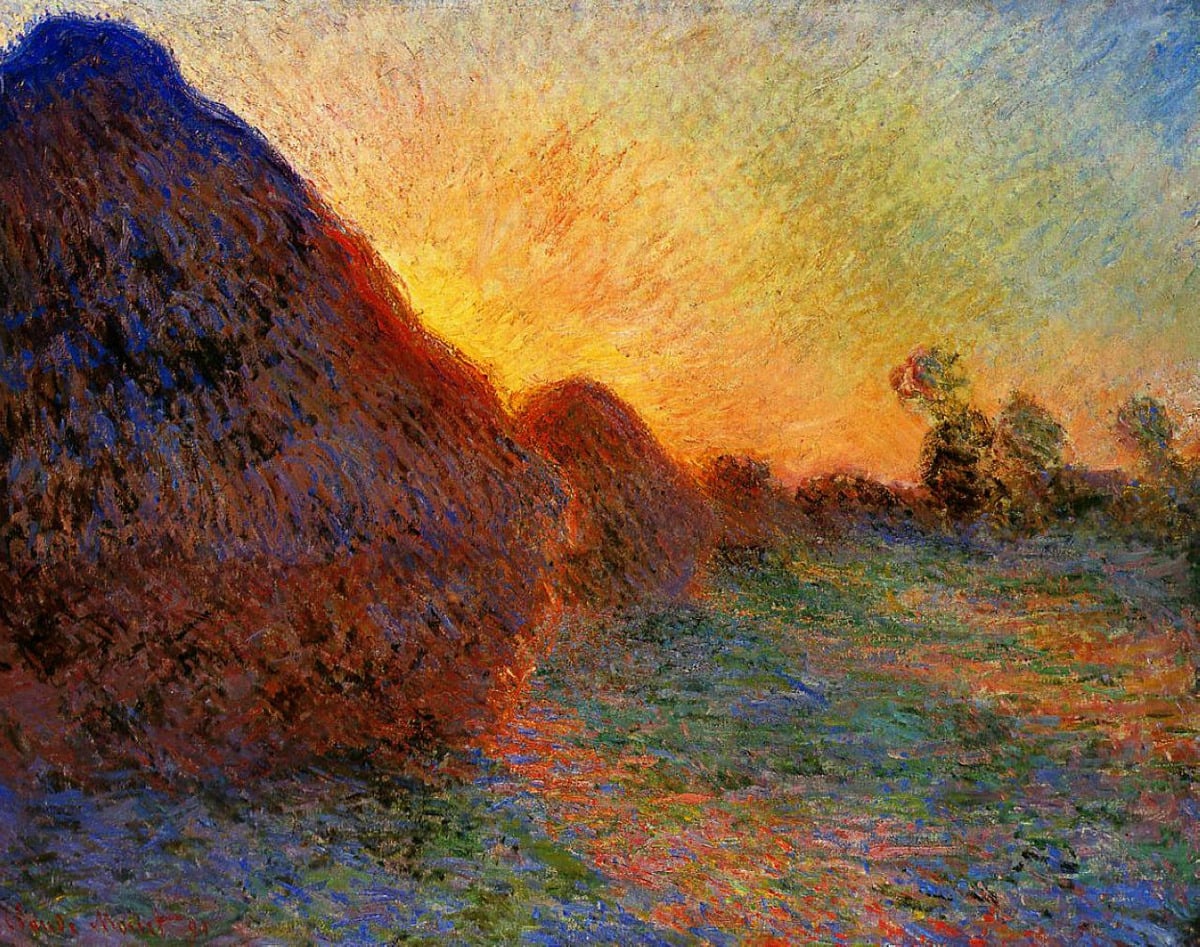
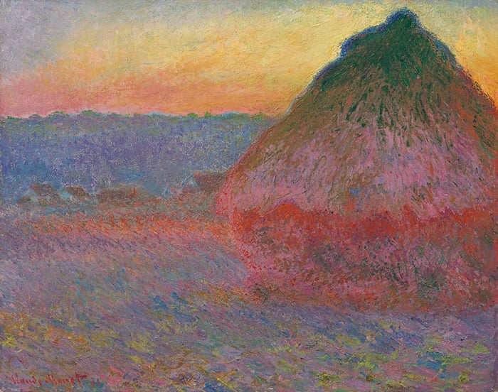
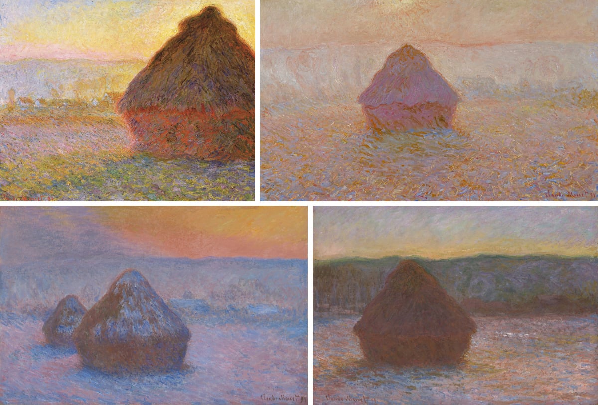
Below are several others from his Haystack series. These showcase the diverse nature of sunset (and sunrise). No two are the same. They vary based on the clouds, light, atmosphere, the sun, and the location. So whilst you can approach sunrise and sunset with general principles and ideas, you should always keep an open mind and see each moment as a unique subject.
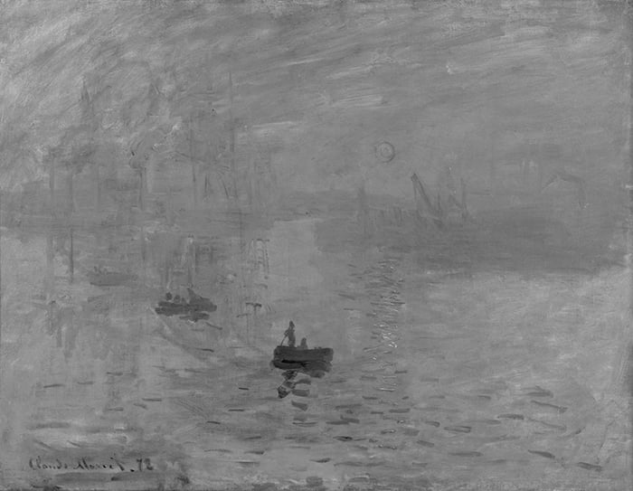
This painting gave Impressionism its name. Notice how the sun and its reflections are similar in value (lightness) to the surroundings. Refer to the grayscale below the painting. Usually when we paint the sun, we make it stand out in value by making it lighter than the surroundings. But Monet didn’t do that here. Instead, he relied on saturation and temperature contrast to draw attention to the sun and its reflections. This may explain why the sun stands out but feels strangely quiet and soft.
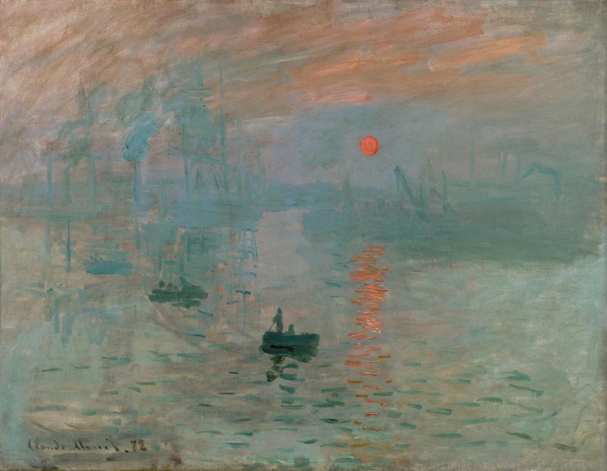
I came across an interesting study regarding the sun in Impression, Sunrise. Apparently, if you stare at the sailor standing on the boat, the sun gradually fades and melts into the surroundings. “Troxler fading” they call it. I tried it myself and this does seem to be the case. I imagine the effect is more prominent when viewing the painting in person. Below is an extract:
“Over two decades ago, Safran and Landis noticed that staring for a few seconds at the head of the sailor standing in the boat in Monet’s painting causes the sun to seemingly fade away. The perceptual result is a sunless sky, as the region occupied by the vanished sun fills in with visual information from the surrounding background. Safran and Landis suggested that such fading—and subsequent filling-in—of Monet’s sun is due to the phenomenon known as Troxler fading. This hypothesis is supported by prior reports that Troxler fading, the perceptual disappearance of stationary images upon sustained fixation, is quite common for peripheral objects with equivalent luminance to that of the background. However, no previous studies have quantified the temporal dynamics of perceptual fading in “Impression, Sunrise,” or determined their potential relationship to ongoing fixational eye movements.”
You can read the full study here if interested.
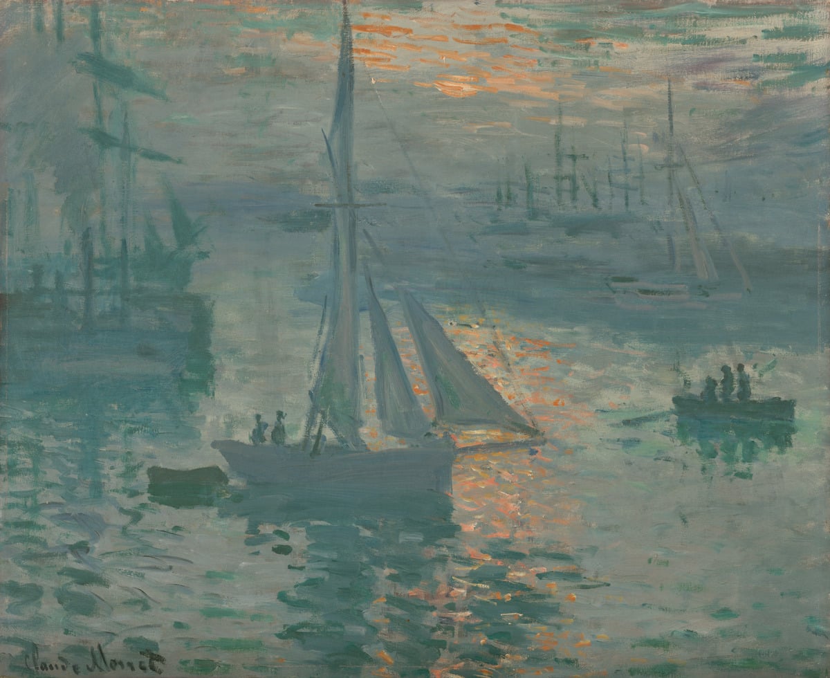
This one is similar, though less famous. There’s something pleasing about those dancing orange tones against the sea of grays and weak greens.
Sunset Foggy Weather, Pourville is a quiet, hazy sunset. Monet used van Gogh-like swirls around the sun. Notice how the colors of the open sky gently melt into each other. There are no abrupt jumps. This is a common problem area for students. I love the hints of broken red around the sun itself. It’s an interesting touch.
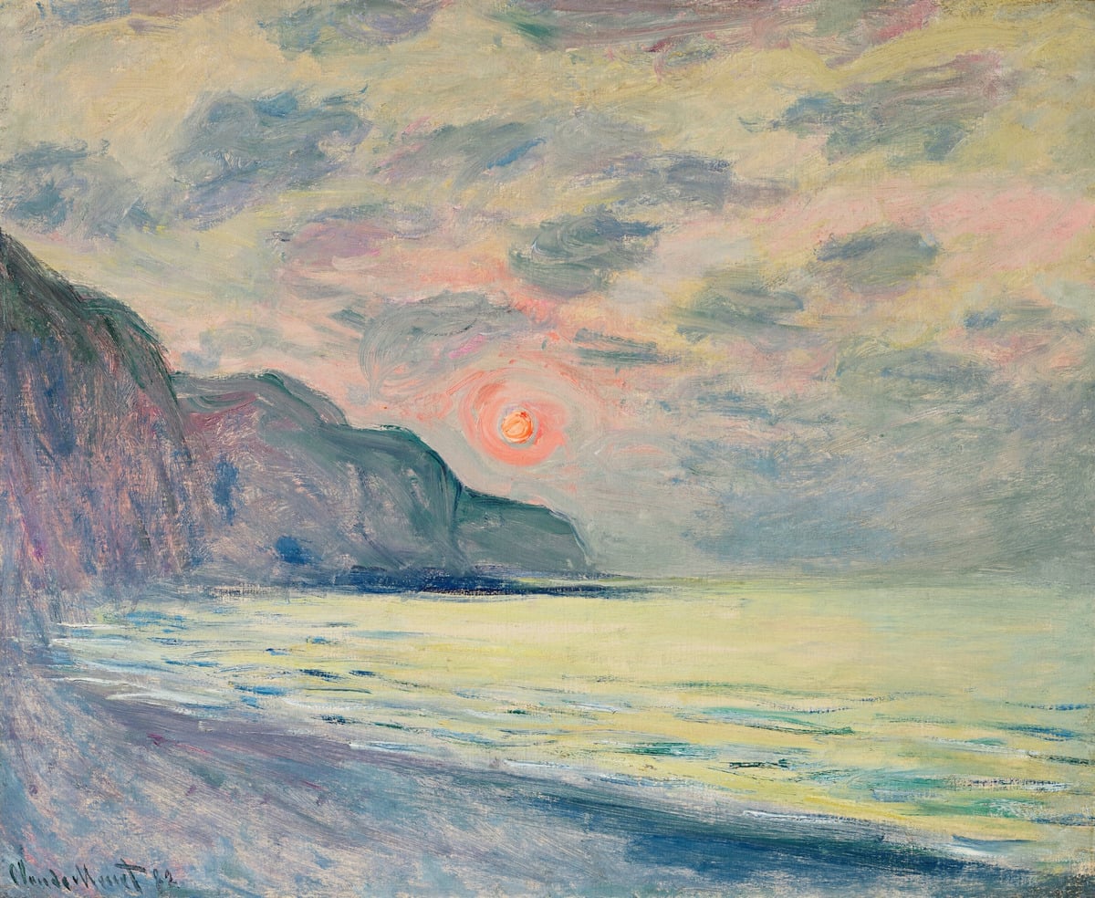
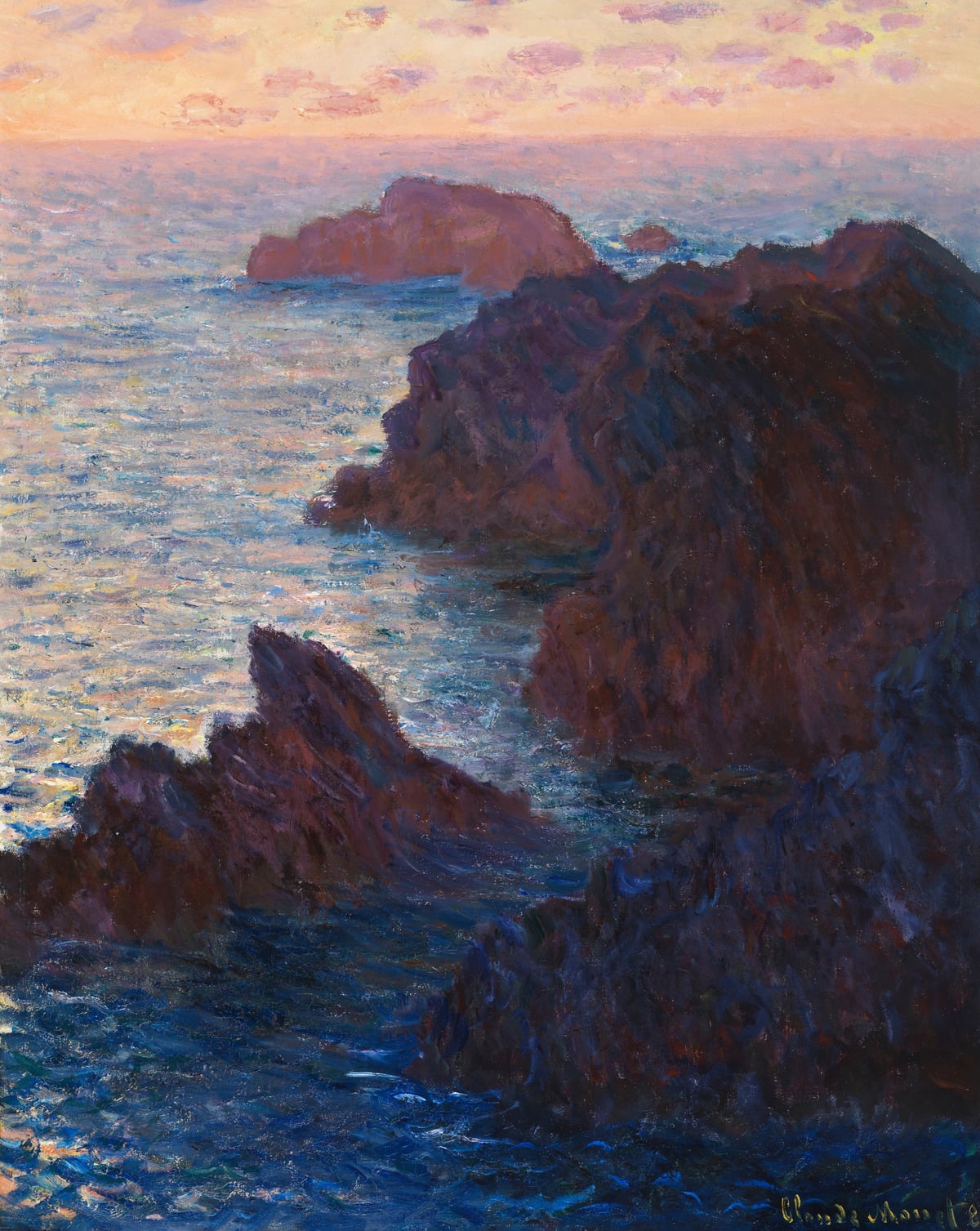
I wrote about this painting on Artists Network. It must be a magnificent sight in person. The sky glows warm against the dark cliffs. It takes up only a small portion of the painting, but you can feel its power throughout. And look how effective that brushwork is at conveying the idea of choppy, broken water.
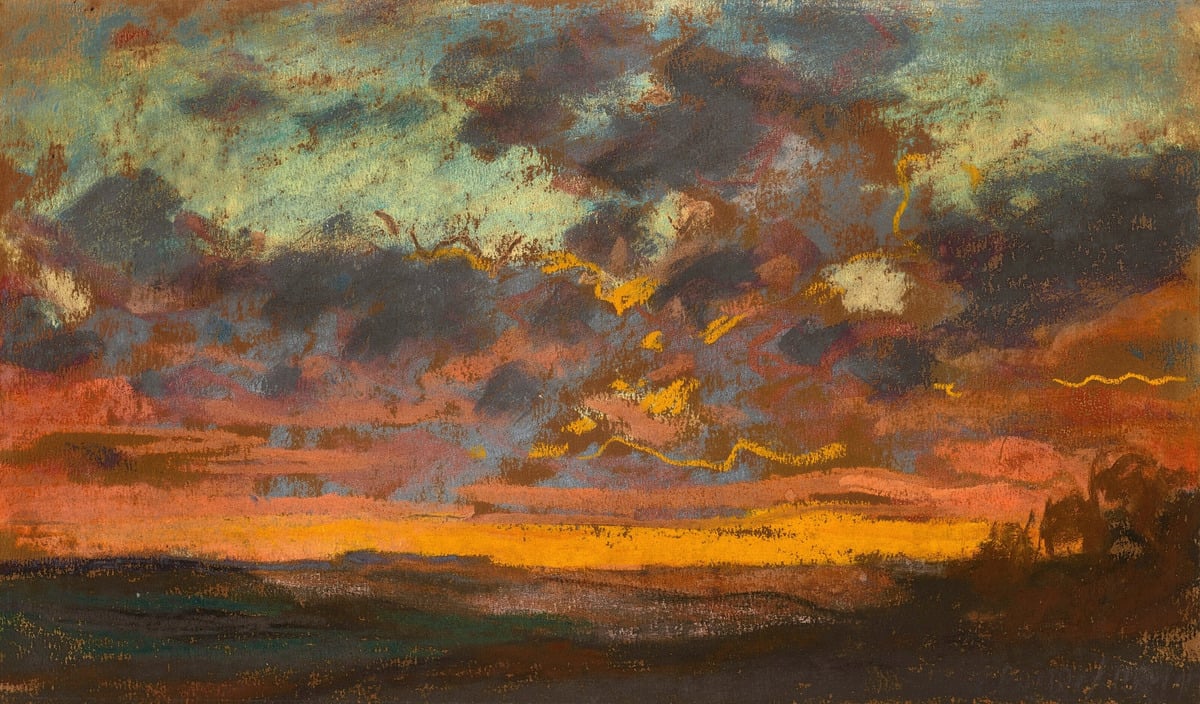
This one was done in pastel, as you can tell from the dry, chalky finish. It’s rough but honest. It has an almost playful quality, with squiggly outlines and patches of color.
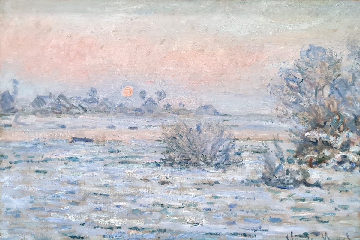
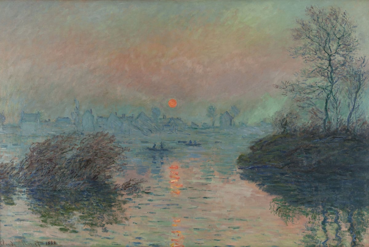
Sunset and sunrise don’t always need to be dramatic displays of light and contrast. Sometimes they are quiet and subtle, like in Sunset at Lavacourt. It’s interesting how this is basically a “cool” sunset painting, with the warm colors restrained and the pale blues and greens quietly dominant. It plays into the idea of a snowy landscape. I wonder if this is how Monet saw the scene, or if he exercised his artistic license to alter the colors.
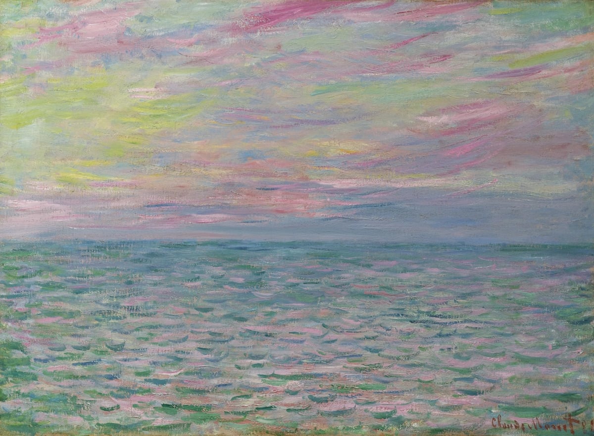
Sunset at Pourville Open Sea is an interesting take on sunset. It looks like Monet didn’t paint the sun itself (unless that vague red shape around the middle is meant to be the sun?), but rather a side view. The colors are interesting. Magenta, green, green-yellow, purple, and blue. Notice how there are no warm reds or yellows (like cadmium red or cadmium yellow). These are mostly secondary colors that you often see dancing in the sky around the sunset. For the water, Monet suggested movement with curved dabs of blue and green. This was one of his go-to techniques. Simple but effective! I feel like this is a technique a child might use if you ask them to paint the ocean. And often children are right when it comes to art. We adults tend to overcomplicate things.
Monet made strong use of pale green to convey atmosphere in many of these paintings, including the winter landscape below. It gives an eerie feel and acts as a point of contrast for the orange suns. Many students avoid green for the sky, but it can be a great addition.
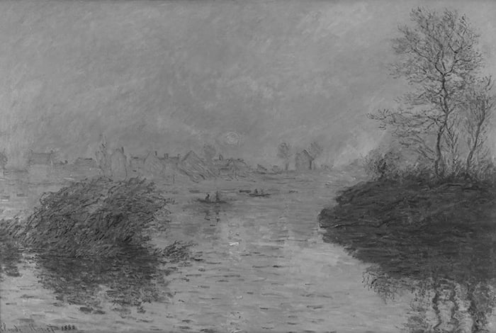
Again, the sun is almost invisible in the grayscale, as are the subtle color variations in the sky. This is known as a compressed value range. It’s an effective way of adding complexity to a painting without complicating the value structure.
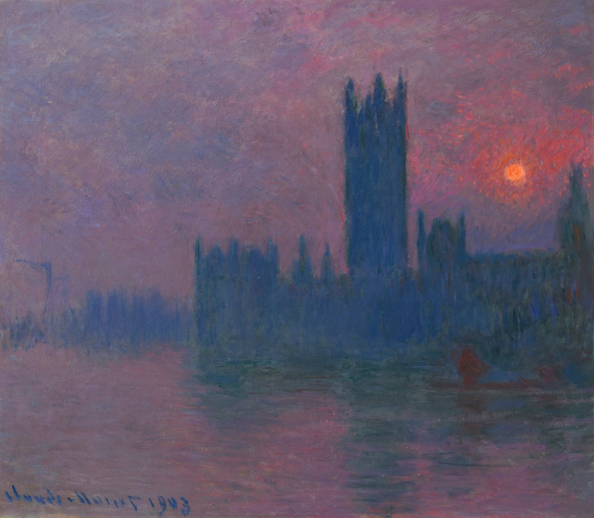
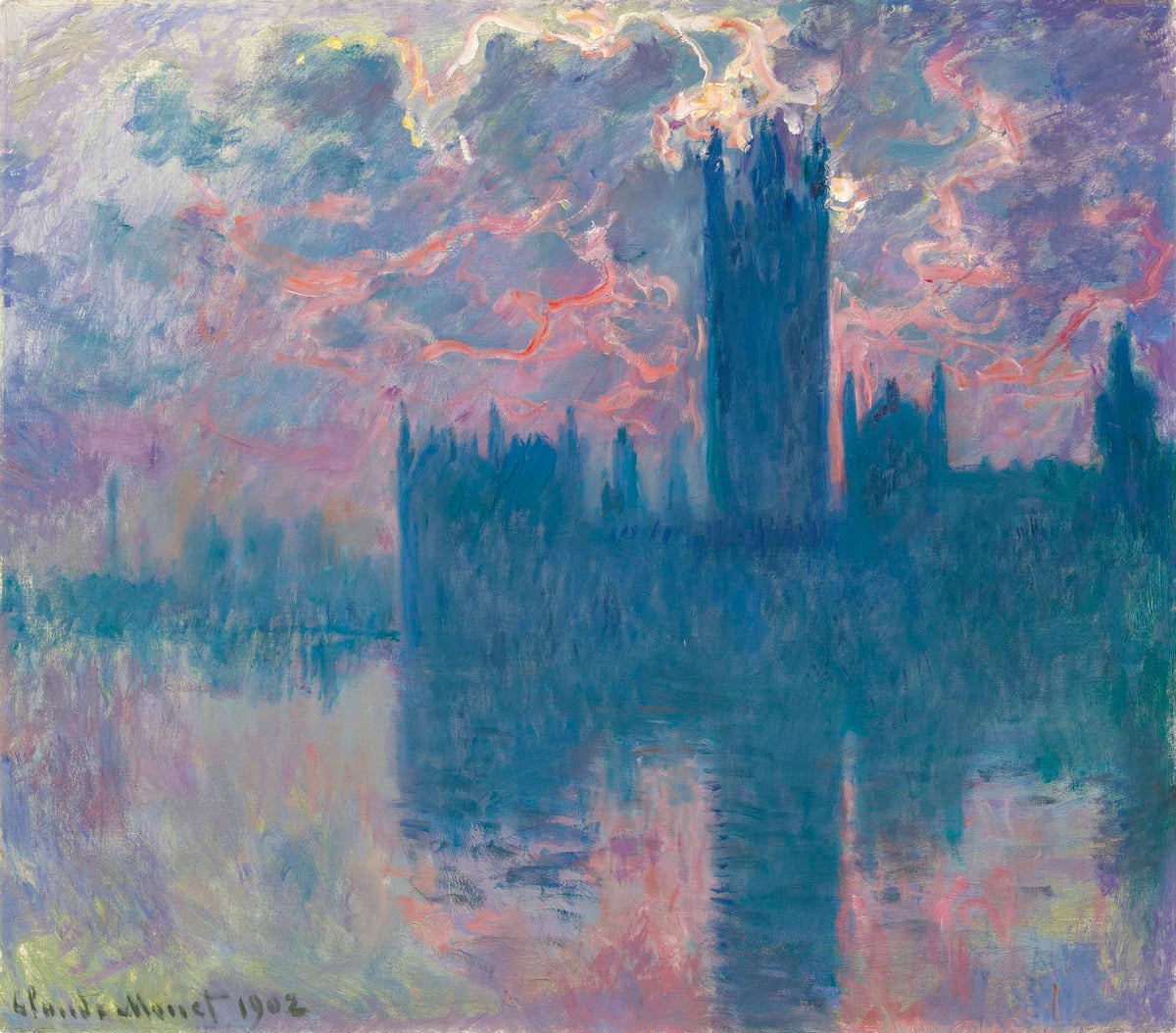
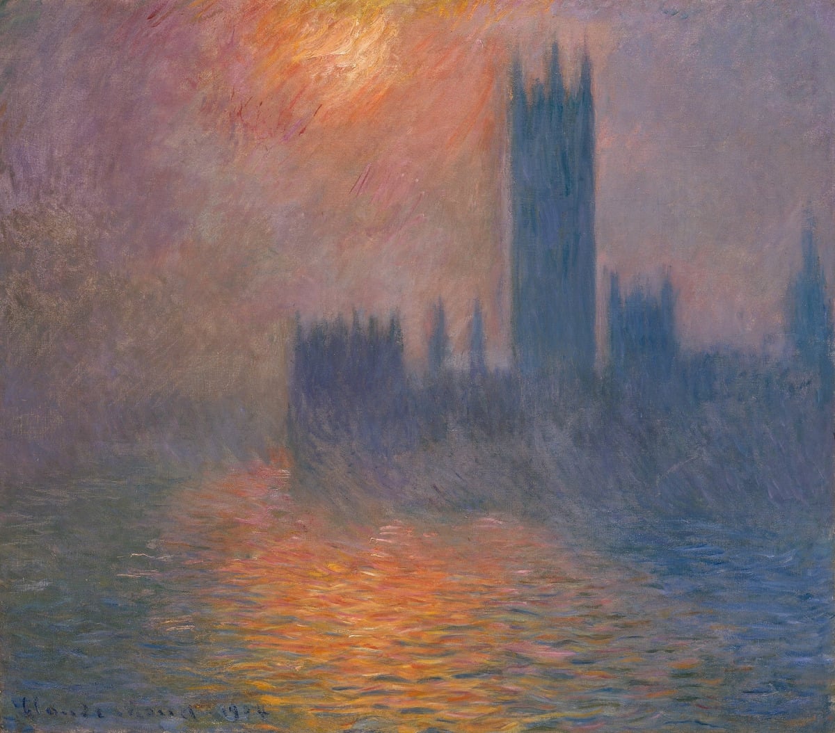
Below are three paintings from Monet’s Houses of Parliament series. This series is similar to his Cliffs of Étretat series in that the buildings form a simple shape in silhouette against a striking sky and its reflections. Look at those colors in the first one. The sun appears as a fireball, with orange and red bleeding into the surrounding sky. The colors remind me of George Henry’s River Landscape By Moonlight. This is one reason why it’s worth studying master paintings of history. You come across interesting color combinations that you can use in your own paintings.
I love the outlining in this one, with sunset light picking up the edges of the clouds. Take note of all the subtle color variance. It looks like Monet built up layers of scumbled color. The lack of contours and dark accents gives the water a still, unbroken appearance, despite its rough, unrefined surface.
This is a masterclass on painting a hazy atmosphere. It has a bit of a Turner feel. Almost all the edges are soft, and there’s just a bit of clarity around the sun and on the water in the foreground.
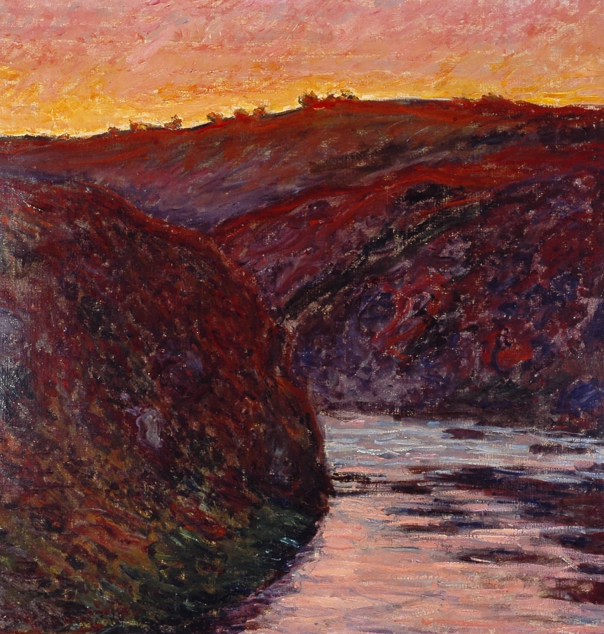
Finally, The Valley of the Creuse Sunset. The composition isn’t much, but it doesn’t need to be. The entire painting is set up to showcase sunlight’s brilliance and warmth. And it does a pretty good job! Again, notice how the dark areas merge together to form a single, abstract mass.
Thanks for reading! Let me know your thoughts in the comment section below.
If you ever want to learn more, check out our Sunrise and Sunset Workshop.
Kind regards

Dan Scott
Draw Paint Academy