
 Share to X
(First, a brief reminder that enrollment is now open for the Ponds and Lakes Workshop. You can join here if interested.)
The family and I visited the Monet to Matisse exhibition at the Art Gallery of South Australia in Adelaide last month. It was a wonderful showcase of color, brushwork, and Impressionism. They had some remarkable paintings there, some by artists I hadn’t heard of before.
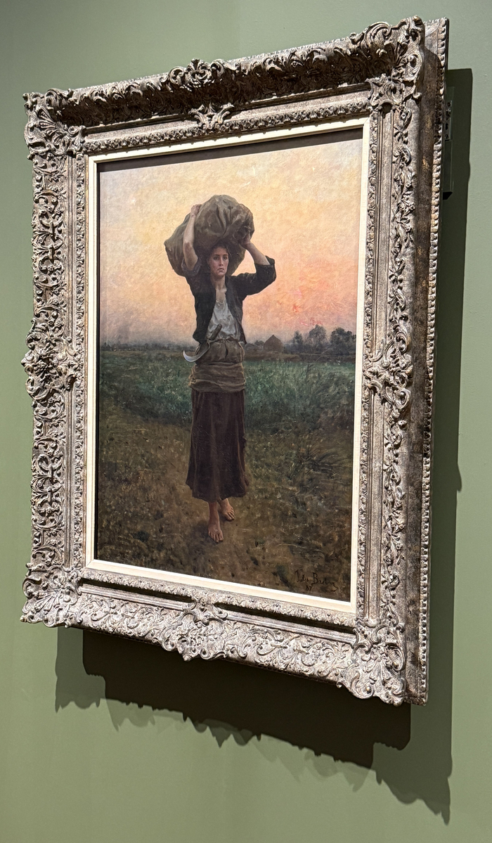
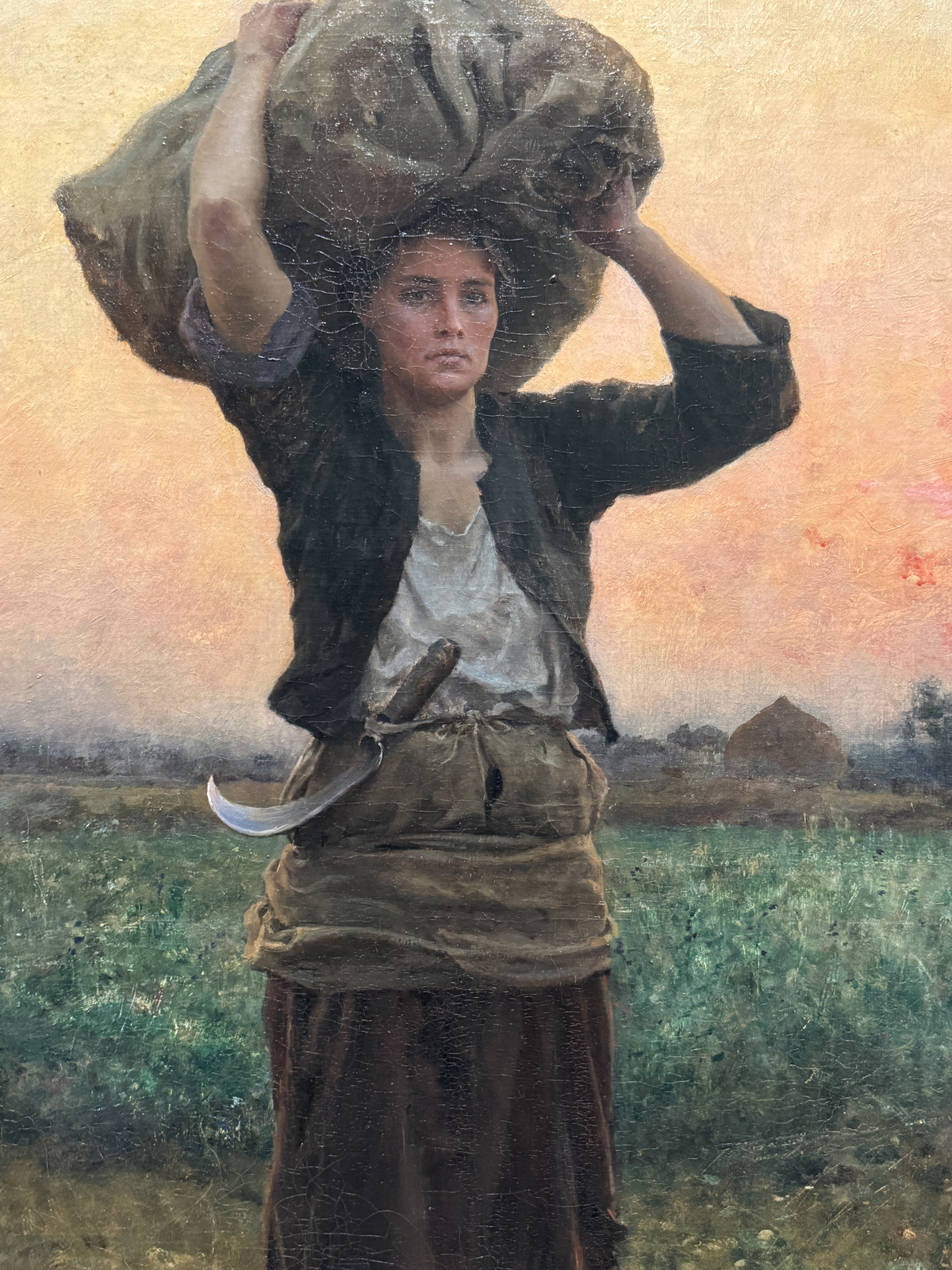
I had three favorites. First, Jules Breton’s The Shepherd’s Star. This artist was new to me. The glowing sky, contrasted with the dark and restrained colors of the figure and land, caught my attention. It has a remarkable sense of realism, but it doesn’t look tight or overworked. Beautiful!
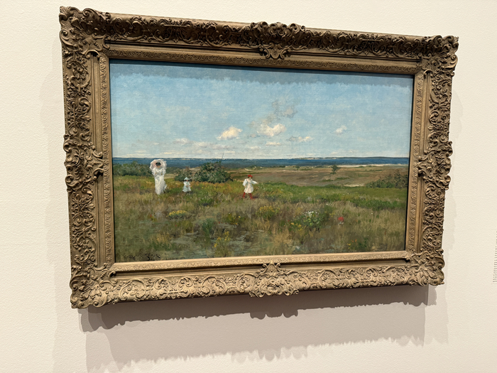
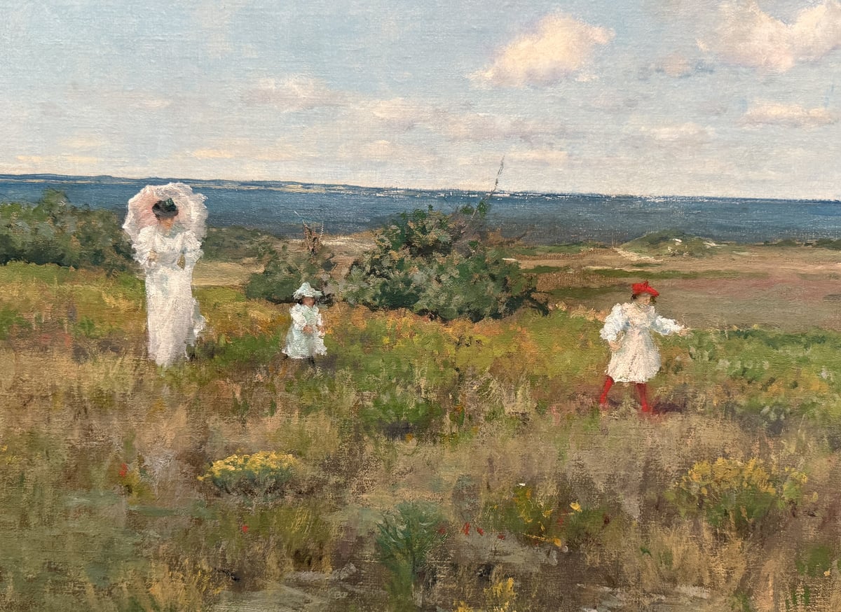
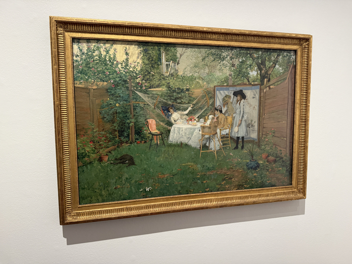
Second, William Merritt Chase’s Near the Beach, Shinnecock. This was quite large at 30 by 48 1/8 inches. I’m a sucker for these subjects. It reminded me of Chontele and our two girls. From a technical standpoint, notice all the color and brushwork variation of the ground. It’s a quiet and understated painting, but there’s a lot going on.
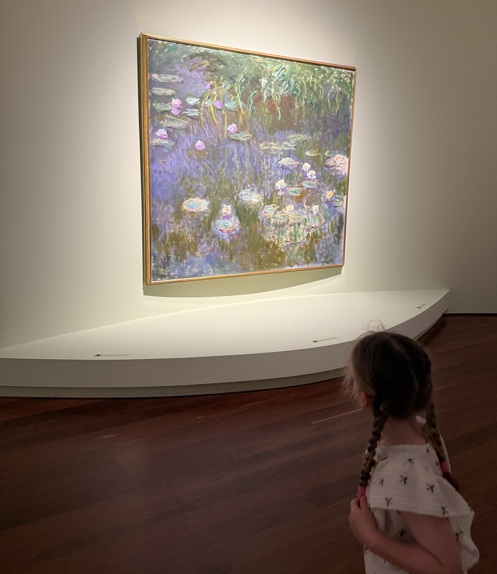
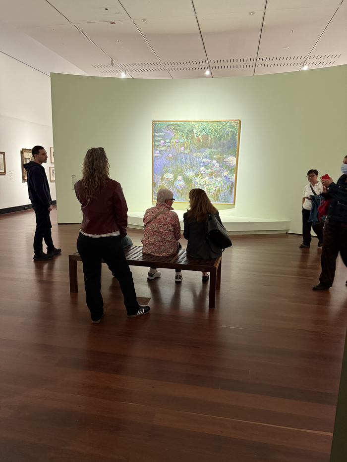
And of course, I couldn’t leave out Claude Monet’s Water Lilies from my favorites. This was the exhibition show-stopper. It entranced viewers with its harmonious colors. It’s large, measuring 79 by 84 inches, and was best viewed from afar, where all the colors and strokes melt together. This is a perfect example of photos not doing the painting justice. You really must see it in person to truly experience it.
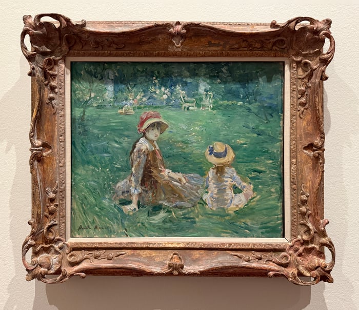
Chontele’s clear favorite was Berthe Morisot’s In the Garden at Maurecourt. It seems she is a sucker for these subjects as well. She saw our girls, Elora and Arabella, in it, and she is urging me to paint something similar. If only it were that easy!
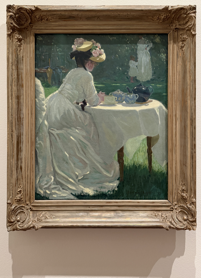
Chontele also loved Frederick Frary Fursman’s In the Garden. Notice how the figure in the distance is partially cropped at the head. An interesting compositional choice, but it works.
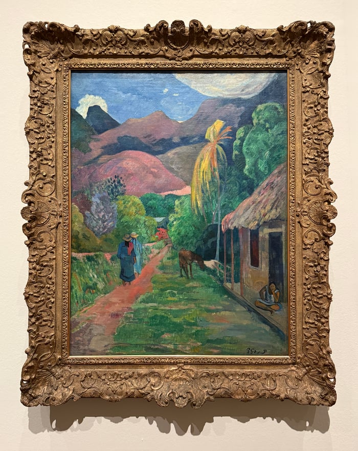
Elora was deliberate in her selection. She chose her favorite early and didn’t waver. Paul Gauguin’s Street in Tahiti. Something about it spoke to her, as great paintings often do. Interestingly, it has similar flat planes of color to her first-ever plein air painting that she did in New Zealand.
Arabella didn’t really have a favorite. She was more interested in the people. She babbled and laughed as she followed us through the exhibition. Off in her own little world!
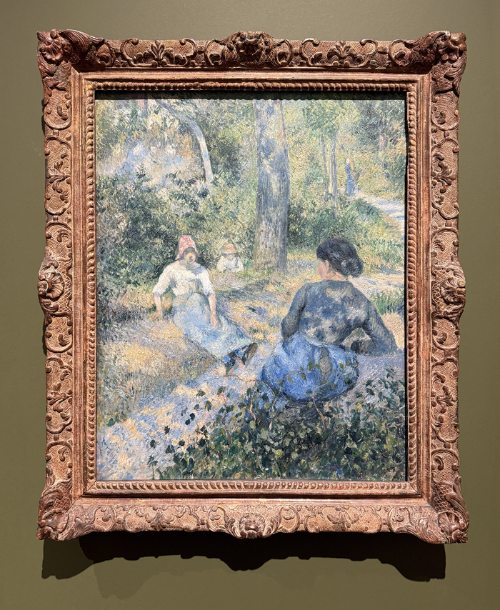
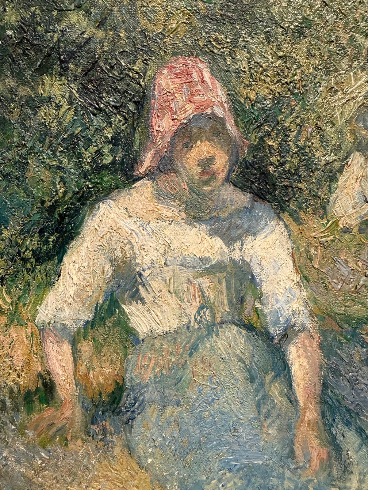
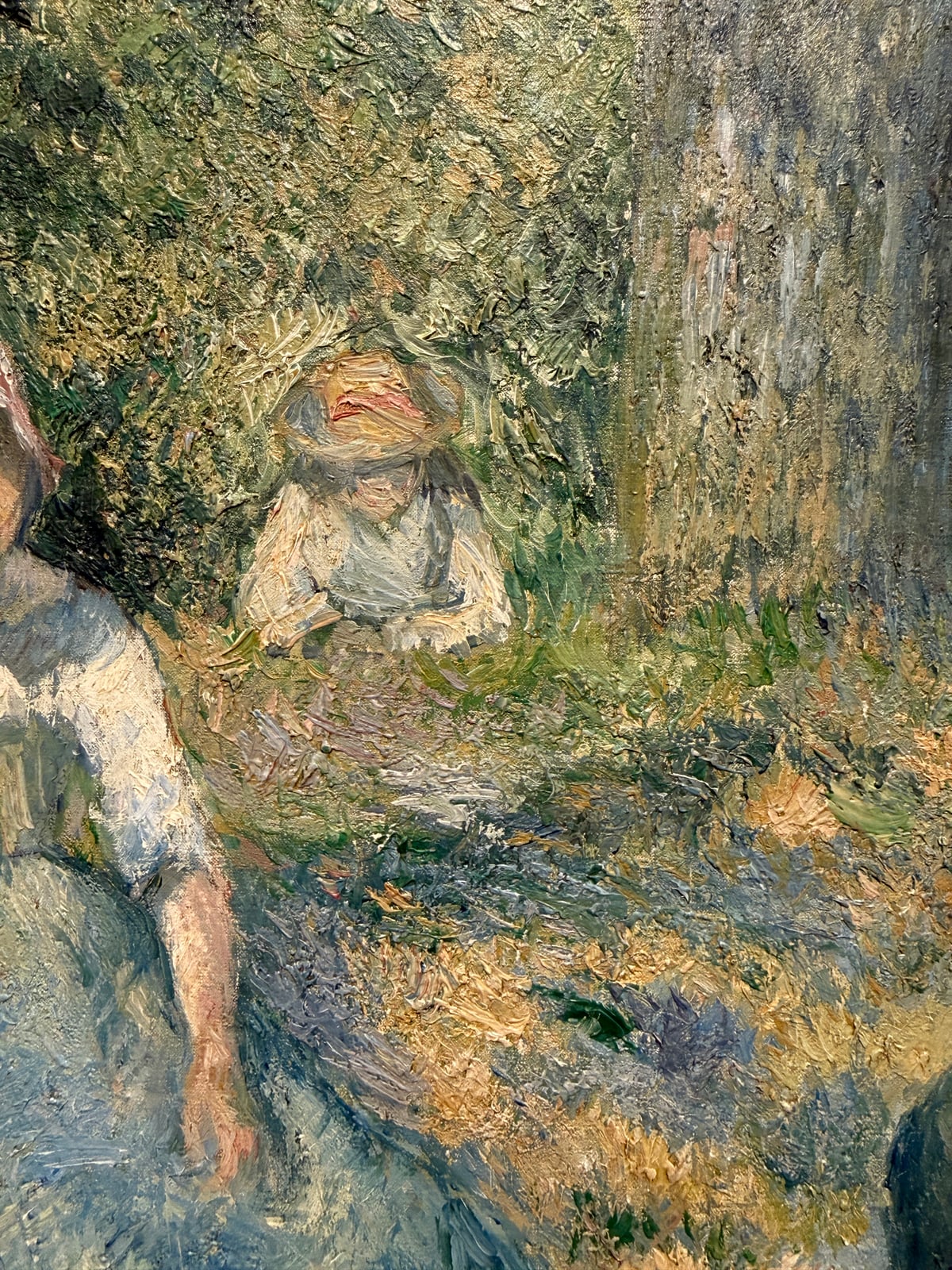
Below are the rest of my photos from the exhibition, along with some commentary here and there, starting with Camille Pissarro’s Peasants Resting. What’s interesting about this painting is that it’s not the best example of accurate figure and facial drawing. The face of the girl on the left looks warped up close. But if you step back and see the painting without judgment, it looks beautiful and realistic.
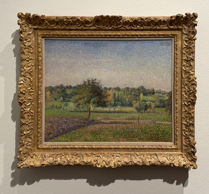
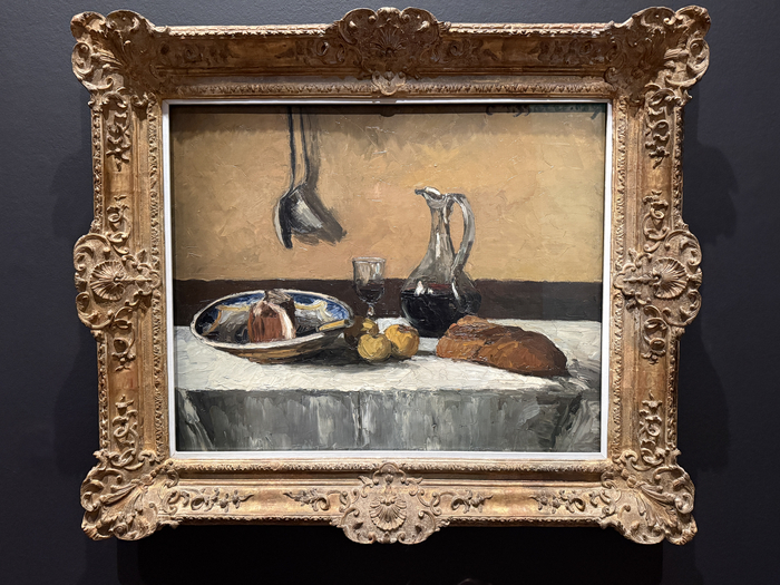
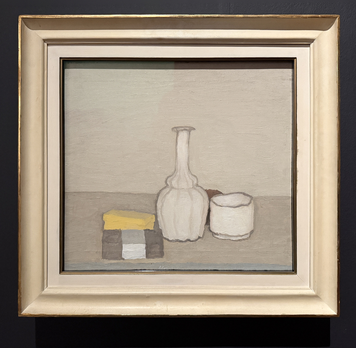
The still lifes were nice, but I certainly preferred the landscapes, with their sense of color and light.
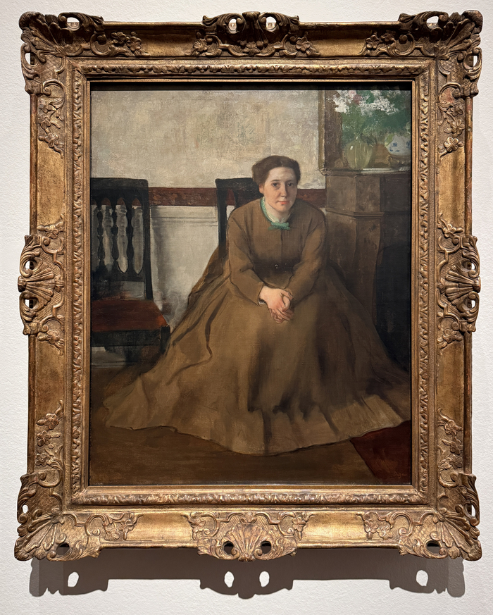
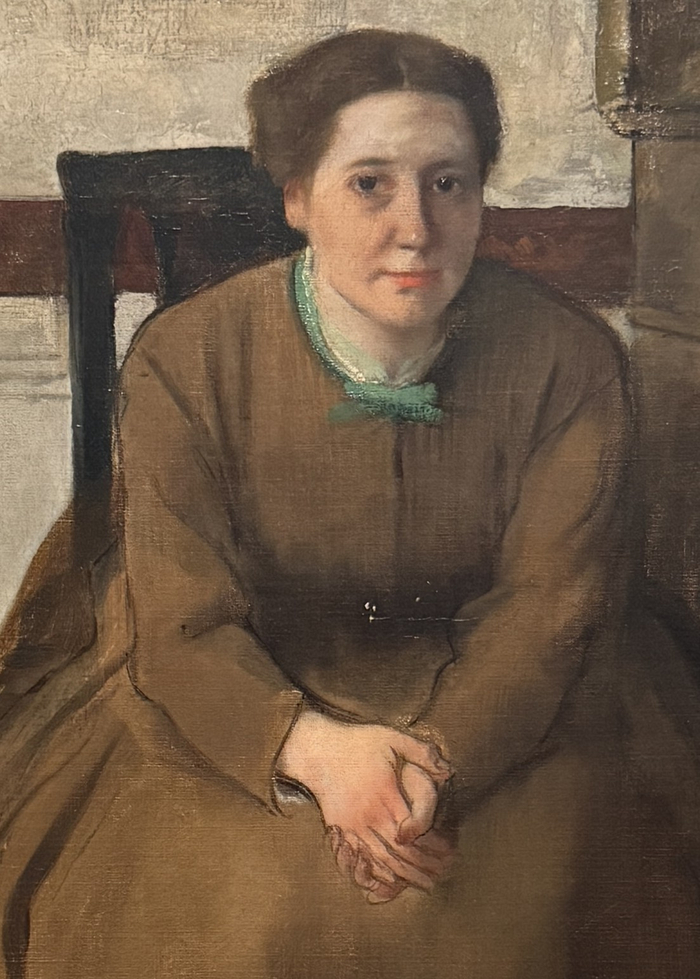
Edgar Degas made clever use of outlining in this one to define the simple color shapes. Look at the subject’s hands in particular. Outlining can be a powerful technique that adds a stylistic finish to your work. It doesn’t necessarily reflect how we see objects in life. Objects don’t typically have a distinct dark outline. But it can be effective in art nonetheless.
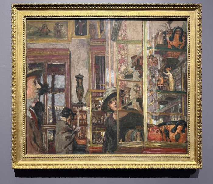
Édouard Vuillard’s The Clarac Gallery was a beautiful sight in person. It’s an unusual and cluttered composition, but it works well for the subject. It reflects how I feel in some busy galleries, filled with delicate artworks.
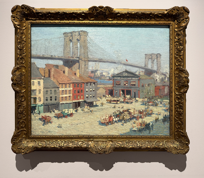
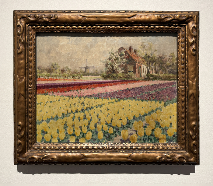
The small paintings struggled for attention. But this one caught my eye with its beautiful flowers and patterns. It reminds me of something Richard Schmid used to teach – that we tend to see more color on overcast days, not less.
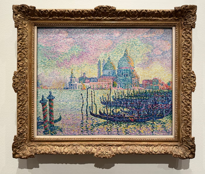
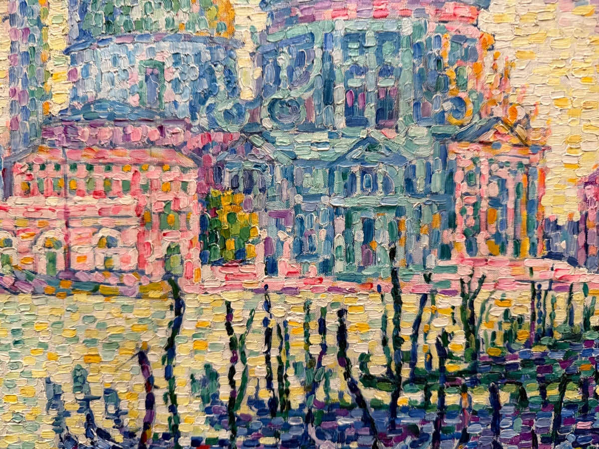
Paul Signac’s Entrance to the Grand Canal, Venice was a vibrant display of pointillism. Hundreds, perhaps thousands, of tiny dabs of distinct color, all coming together with a vague sense of realism. It’s certainly an interesting approach. I used to experiment with pointillism in my early painting days, when I was first learning about Impressionism. It’s really a sacrifice of fine brushwork and detail in favor of color and optical mixing.
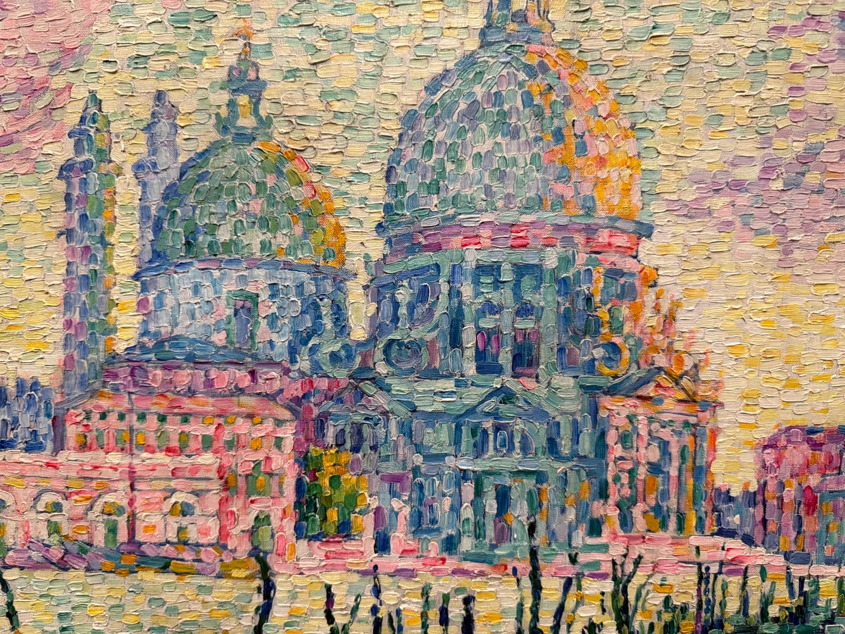
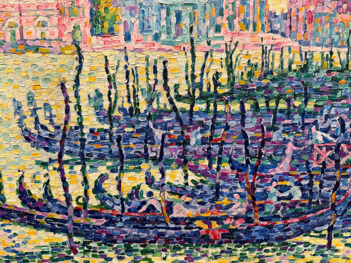
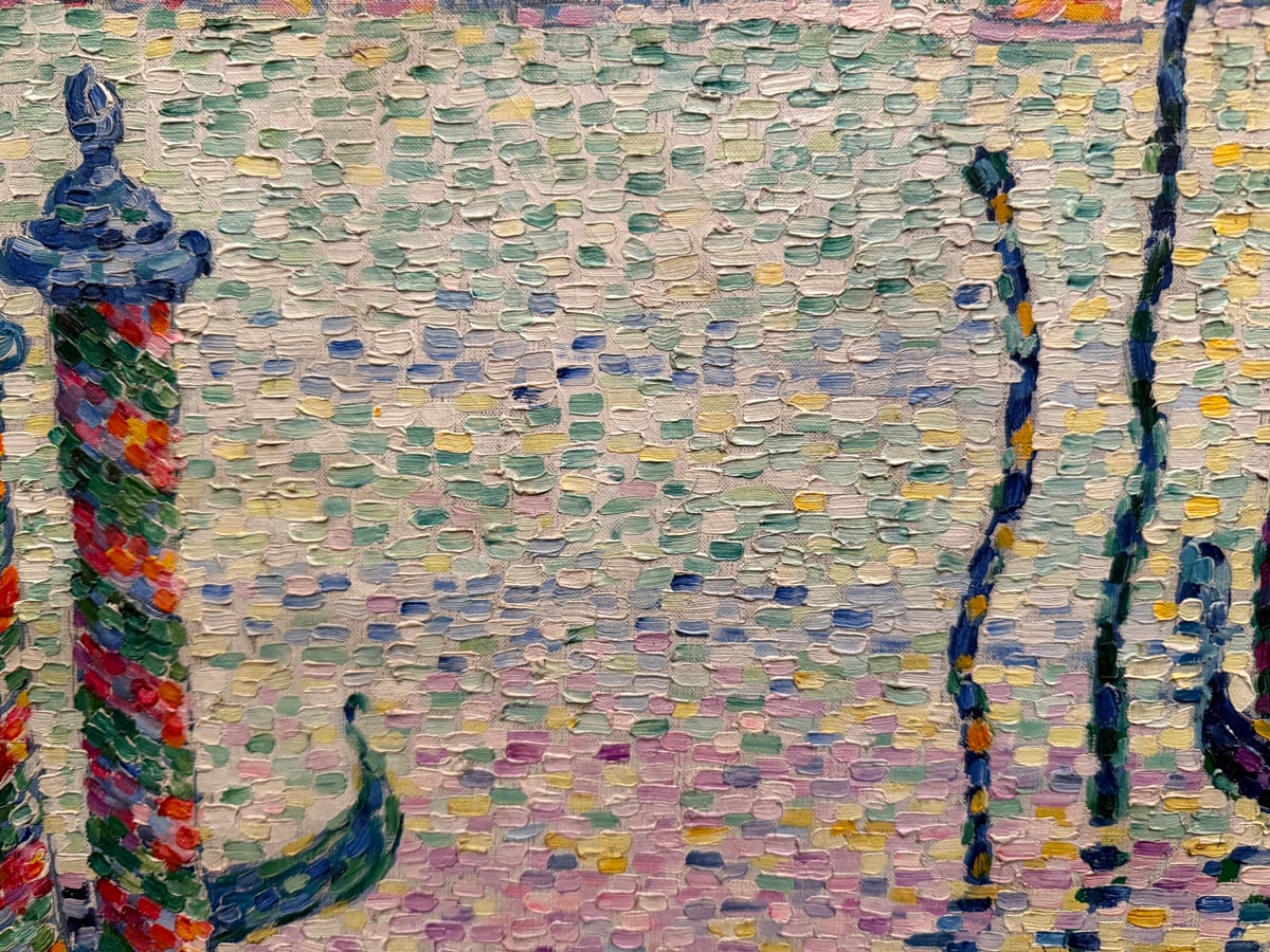
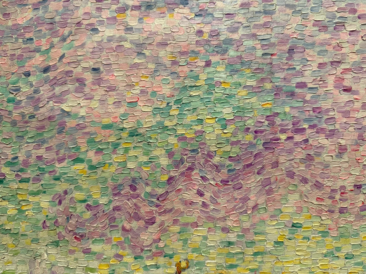
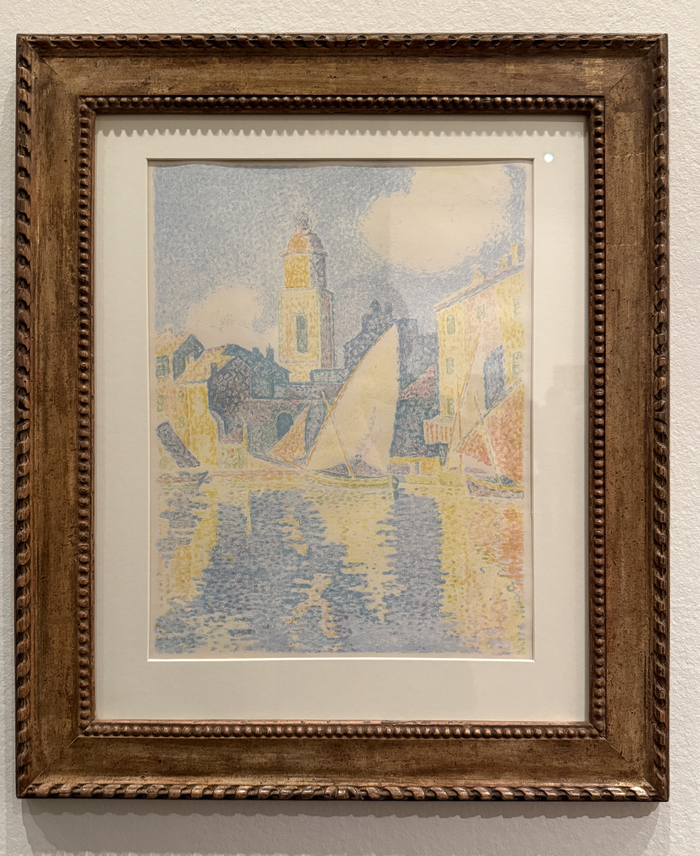
I wasn’t as fond of Signac’s pointillist approach in Saint-Tropez, The Port. It looked a bit timid and uncertain. But that may be because it’s a lithograph on paper.
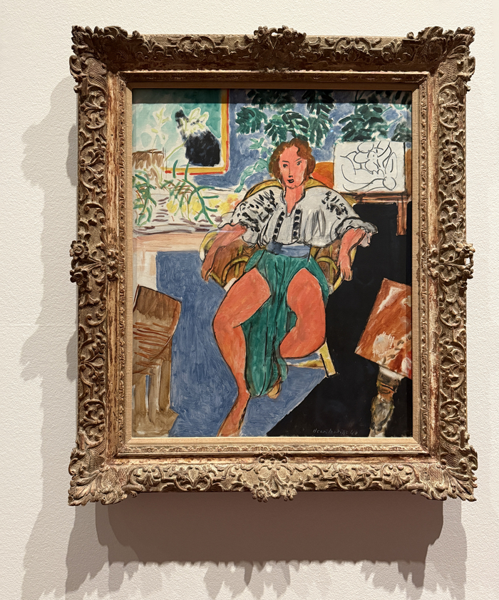
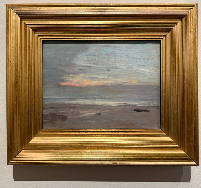
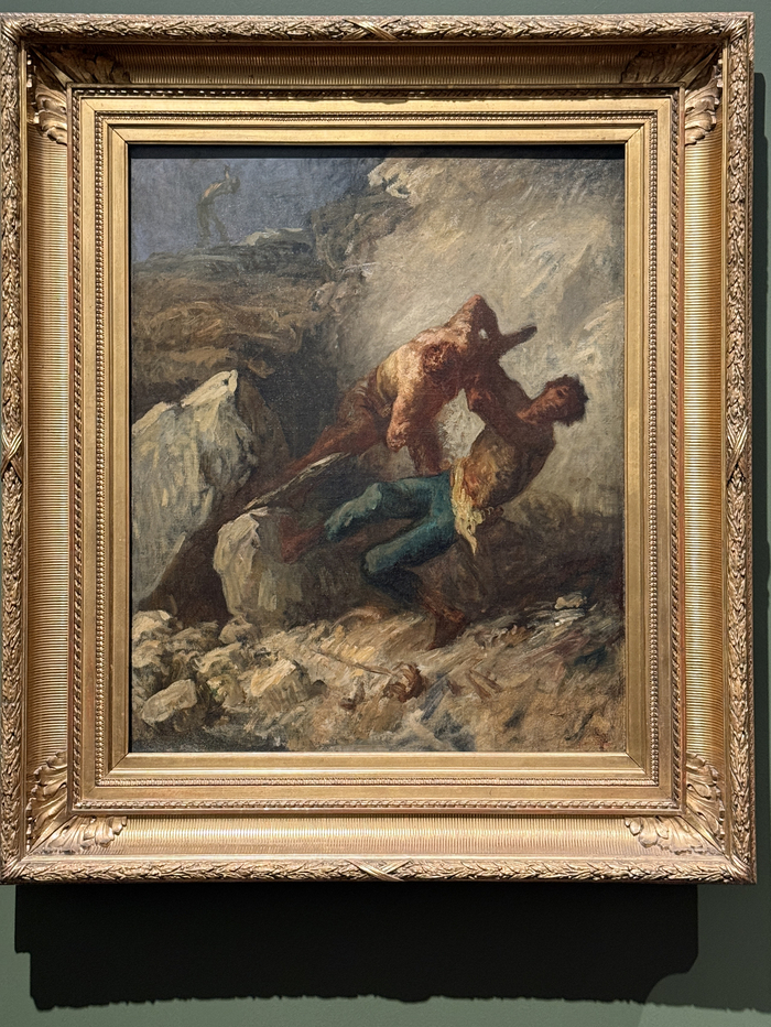
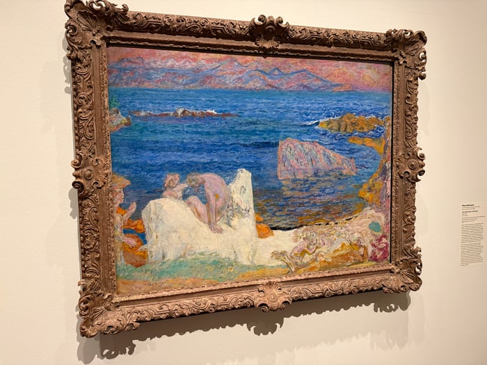
Pierre Bonnard’s The Abduction of Europa was stunning. Those blues and oranges really sang. This is another large painting, at 46 1/4 by 60 1/4 inches. The combination of strong colors and the large surface area really packs a punch. Almost as if they complement each other so that 1 + 1 = 3.
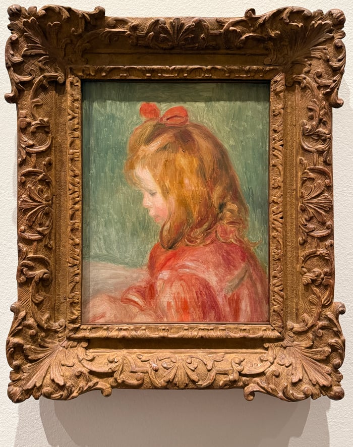
Pierre-Auguste Renoir’s Coco was a good reminder that you don’t need to bring each painting to a completely refined finish. Sometimes it’s okay to leave it a bit rough.
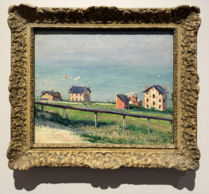
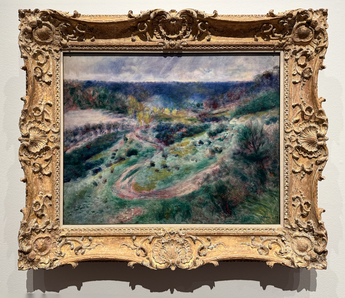
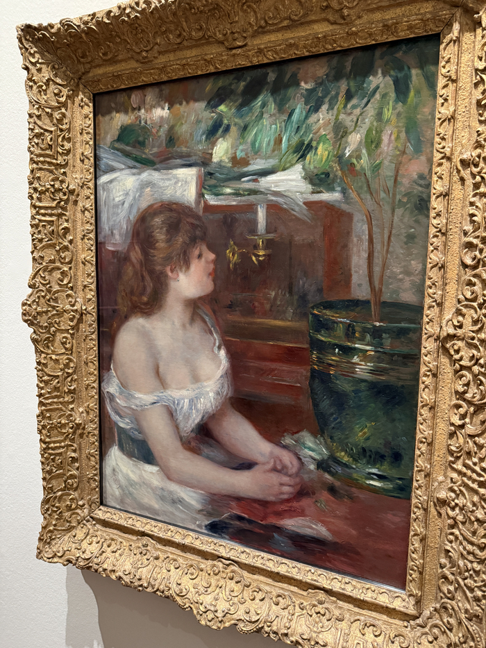
For me, Renoir’s work is a bit hit-or-miss. But he really hit with paintings like Road at Wargemont. It has a whimsical, almost ethereal feel that looked amazing in person and contrasted nicely against the rigid frame. On the topic of frames, aren’t they beautiful? They are a work of art in their own right. Though prohibitively expensive for us mere mortals.
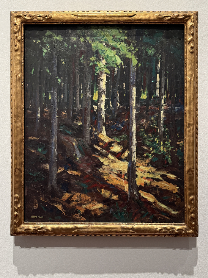
I write about Robert Henri often. He wrote one of my favorite art books, The Art Spirit. It was nice to see one of his paintings in person.
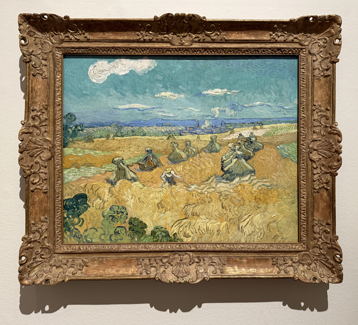
There was only one painting by Vincent van Gogh, Wheat Fields With Reaper, Auvers. It features his signature swirling strokes for the land and tiled strokes for the sky.
Let me know your thoughts in the comment section below. Which is your favorite? Have you been?
Happy painting!

Dan Scott
Draw Paint Academy
Hi,
Nice pictures, Dan. I have two favourites: Paul Signac, Entrance to the Grand Canal, Venice, 1905. The other one being Pierre Bonnard, The Abduction of Europa, 1919.
Cheers,
Kari
Thank you for showing some of the paintings from your exhibition. What caught my attention is Jules Breton The shepherd ‘s star . If you look at her face you can read the hard work she’ s doing .I like her empty feet . And the other one what I like is George Hitchcock Flower field near Leiden .
I agree, the Shepherd’s Star is amazing.
My favorite was Frederick Frary Fursman’s “In the Garden.” So luscious, and the background (a thing with which I struggle), is so lacking in detail and so perfect to foreground the DRESS and the hat and the tea set.
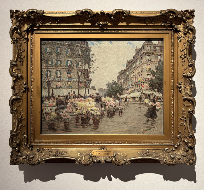
I also loved Luther Emerson van Gorder’s “Flower Market, Paris.” Lively and looked like Paris! Buildings with just enough details.
And Robert Henri’s “Cathedral in the Woods” is a great study in bringing the focal point forward with light and detail. Again, the background is progressively mere hints. Thanks for all the paintings and pointing out interesting features!
Love this collection and your comments. A lovely study of so many different styles of brush work. A total lesson/many lessons, all in one exhibit. Thank you Dan for sharing this.
Thank you for sharing these beautiful works of art and your perspective.
I enjoyed the Garden because of the light contrasts. It was relaxed and soft to me and the model, through the use of variant lighting really stood out to me.
Great post and one I will share with my students next time we talk about impressionism. We pick an artist and then they work from one of the artist’s pieces or just trial for the style. They enjoy this and have fun. They are young so they are open to trying new things. Thanks.
Thank you so much for sharing with us. I enjoyed it immensely.i visited, here in Toulouse, an excellent exhibition of some of Sorolla’s works, last month and it changed my approach to painting. There is a catalogue raisonne still available of the show that I recommend
Thank you again
Christian Riso
When I saw Shepherd’s Star by Breton, it immediately reminded me of Song of the Lark, one of my favorite paintings at the Art Institute of Chicago (which is my Happy Place whenever we have occasion to go to Chicago). I had no idea that he had also painted an evening scene that is so similar and just breathtaking.
Love your selection! And thank you for talking us through them.
At the moment I’m hooked on James Guthrie’s painting of a girl in a field cabbages entitled ‘the hinds daughter’ …..
(thinking of going to Scotland to see it in the National gallery in Edinburgh).
THANK YOU TREMENDOUSLY! What a treat and power-education you have shared here. You are so gracious.
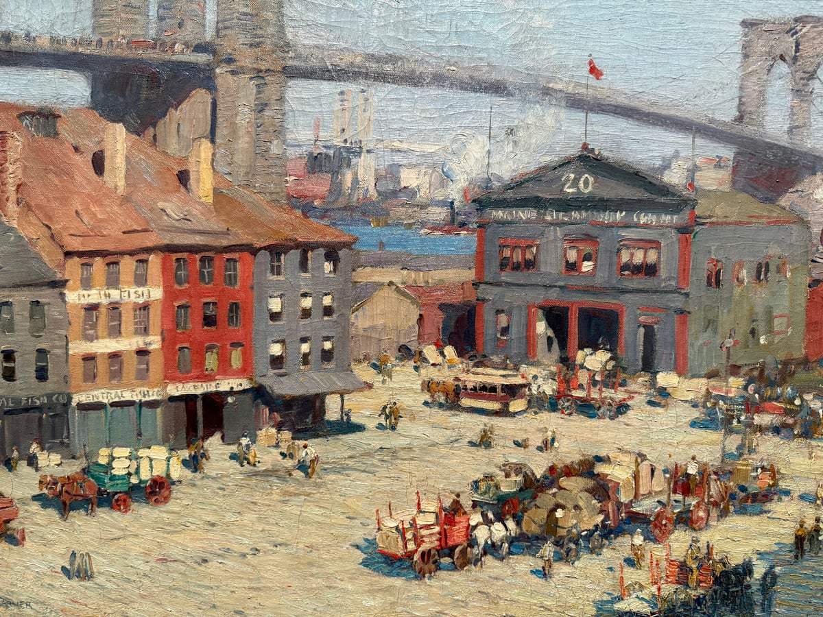
Thank you for sharing your visit to the gallery. I am now inspired to visit a gallery myself. I especially appreciated the “zoom in” pictures – provides a totally different perspective.
Mary
Thank you for sharing. Amazing tour of great works. I particularly enjoyed Renoir’s The Green Jardiniere 1882. And yes the frames themselves are impressive!
I am recovering from cataract surgery so I will make a point to revisit next week when I have both eyes seeing correctly. Seeing double creates havoc with the watercolors.
Thank you so much for sharing!
—Thanks for posting so many little-known works by seminal artists. In the Spring, my Art History Seminar students will be confronted with early modernism; what you have offered here will widen their grasp of the way technique itself became a core theme. Again, merci.
Yes , love whistler also
I loved the grand Canal in Venice. I paint mostly with palette knife and this was very interesting
The Shepherd’s Star. The realism is striking with the muted colors. Beautiful and fulfilling work to view!
Thankyou for taking the time to comment on each of these masters’ works! It was truly a labor of love, and gave me some new insights.
Amazing exhibition, thank you so much for sharing.
Whilst we have some great art galleries in South Africa, we don’t have these large exhibitions with so many fantastic artists all in one place. So, this was special to see through your eyes and thoughts.
Whistler does it for me. So quiet and calm.
Thank you Scott for displaying the wonderful paintings of such talented artists; paintings many of us will not see in person.
It appears you really enjoyed your visit to the exhibition.
Love the Henri. Just a pop of light in the background really works. Thanks for sharing.
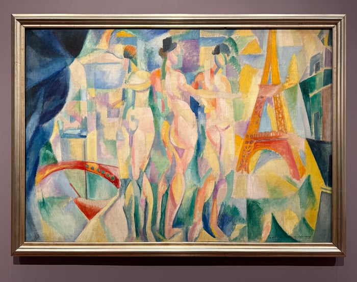
What a selection! Ask I live in the UK I am spoiled with access to London and European galleries – The Orangerie in Paris being among the best (Monet Lilies) and the Sorolla museum.
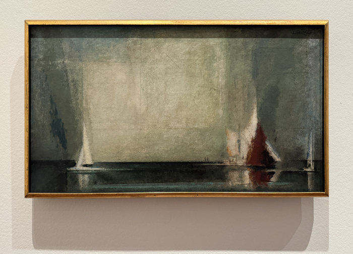
The most interesting picture in your selection for me is the Lionel Feininger. It’s taken lessons from colour and composition from the Impressionists but by abstracting has brought it up to date and also learned from great 20th C abstract artists like Monet, Winifred Nicholson and Terry Frost.
I am a huge Van Gogh fan and love this Wheat Filds and Reaper painting. Of all his wheat and reaper paintings the colors and brush stroke’s in this seem calmer. This is my favorite
Thank you!!
I thoroughly enjoyed the tour through the museum. Great to see some of these famous wonderful paintings. I have seen some in person but not all. It was fun to visit them again with you. Thanks for your enthusiasm and sharing. It is very motivating
I find it almost impossible to choose a favorite. I’m enraptured by them all. I have admired many of these artists for years. Thank you for introducing me to some new artists and some unfamiliar works.
I’m especially drawn to Cathedral in the Woods by Robert Henri I think because I recently completed your course on Trees. How extraordinary is this painting!
Beautiful collection! A reminder to visit museums. Wonderful commentary. Scenes with figures in the landscape and flowers are favorites.
Your brushwork reminds me of Pissaro –
I love two the best! The DUBOURG and The HENRI. Both make be stop and stare because of the light, I want to learn how to paint both of them. And own both….
Hi Dan,
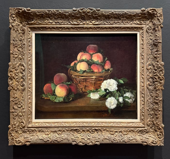
Thank you for this! What a gift you have for giving to others. My favorite was the peaches and flowers and I don’t much appreciate still life. I paint watercolors as best I can. The photos you took showed very much how a picture can read in an interesting way without perfection but I love the peaches for their perfection. I’m always amazed at art that makes the museum. You help me figure it out a little bit but I think you have some more work to do with me! lol! Thank you so much!
Only a bored artist would hang a urinal in an art exhibition to see how many people would stop to make up the meaning of it…it happens! Im sure you heard about that one. I don’t even know who it was. I am working on appreciating all the art things but sometimes…
keep going Dan! I wish great things for you!
Kathy Butkus
Such a great review. Thank you so much for displaying the Old Masters. Moreover that you showed the closeups!
Thank you for sharing. Nice way to start my day by seeing true art and beauty in those magnificent paintings!
My favourite is Crepuscule in Opal. Thanks for sharing your visit!
Thank you as always…and you have chosen absolute wonderful paintings of my favorite artists…so I will look at them again throughout the day…none better than the others…you chose all winners🤗🤗🤗🤗🤗