
 Share to X
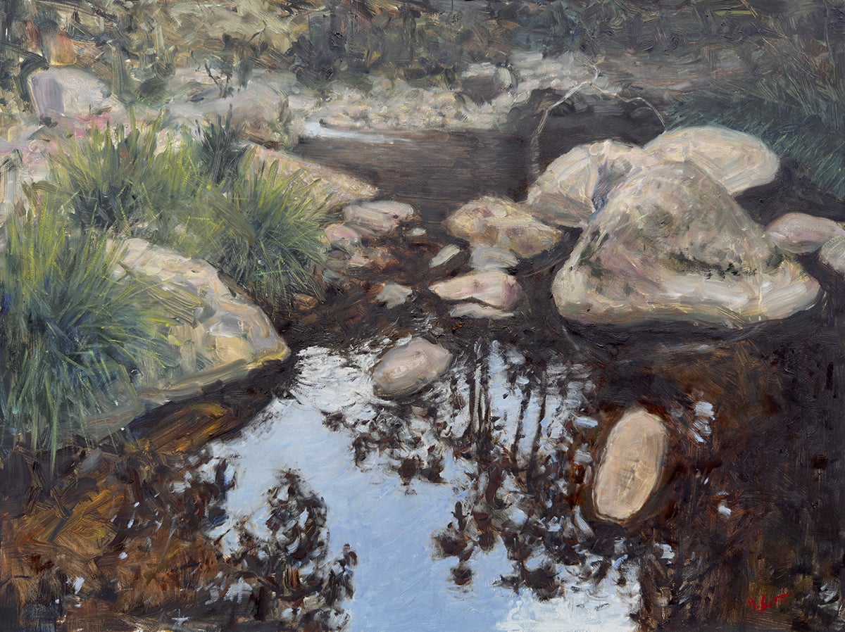
Below is my most recent painting, featuring a rocky creek in the Upper Portals of Mount Barney, Australia. I hiked to this spot with two friends back in December 2025. We camped around the corner for one night. I’ll walk you through how I painted it.
Reference Photo
Here’s the reference photo I painted from:
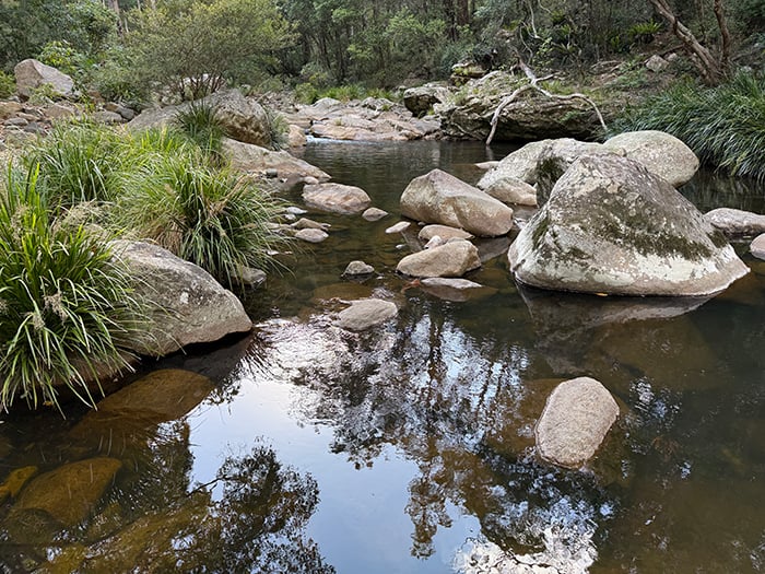
Feel free to paint it yourself. You can download a high-resolution version here. If you need more reference photos to paint from, check out the Reference Photo Library.
What I Used
Here’s what I used:
- Oil on Ampersand Gessobord, 18 by 24 inches.
- Main colors: Ultramarine blue, cobalt blue, cadmium red, magenta, cadmium orange, cadmium yellow, cadmium yellow deep, cadmium yellow light, yellow ochre, viridian green, raw umber, transparent red oxide, and titanium white.
- Rosemary and Co brushes and palette knives.
Refer to my supplies list for more details.
Step 1: Sketch
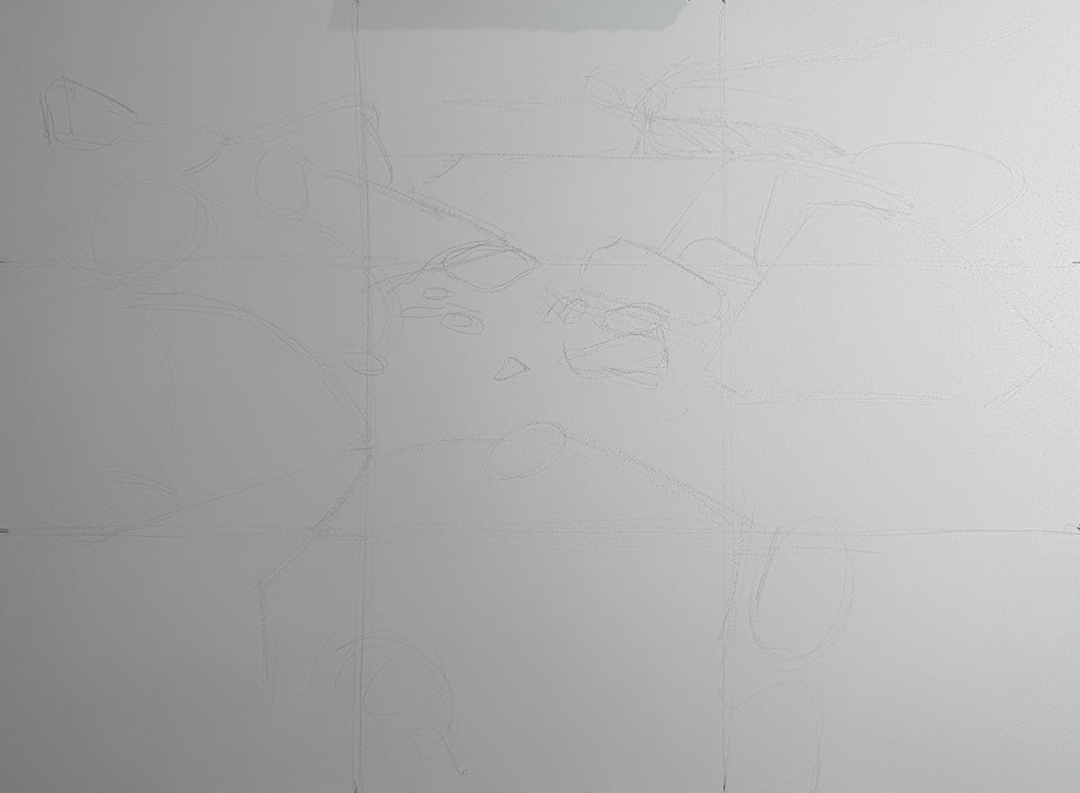
I start by applying a three-by-three grid over both the reference photo and the painting’s surface. This is to assist my initial drawing. Then I loosely sketch the composition, focusing on the major shapes.
Step 2: Map Out the Darks
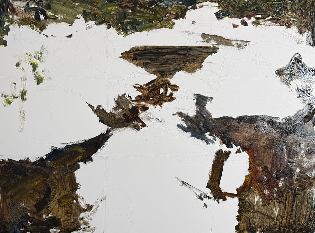
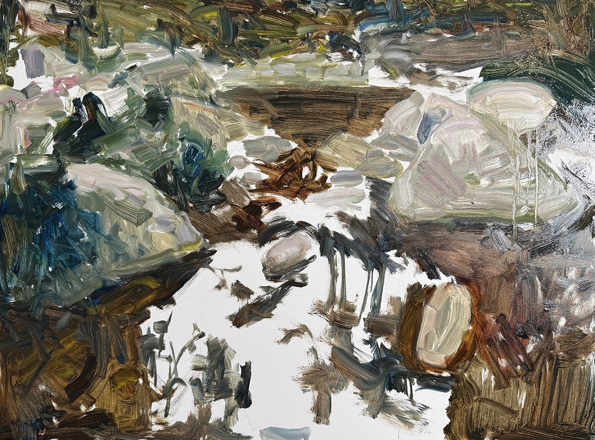
I map out the darks, which represent the water and the trees in the background. Notice the abstract pattern starting to form.
Step 3: Map Out the Rocks and Plants
Then I map out the rocks and plants. I must make the rocks appear solid and structural, whilst capturing all those subtle color shifts you can see in the reference photo. So I constantly adjust the colors whilst staying within a compressed value range (similar lightness). I’m also relaxed with my strokes. I want to be guided mostly by intuition and feel rather than calculated thought at the point in the painting.
Step 4: Map Out the Water
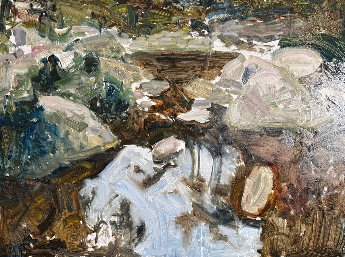
Then I map out the water. These sky reflections provide a burst of clarity and brightness amongst all the dark and earthy tones. I want the edges between these sky reflections and the dark tree reflections to be hard, so I want to avoid blending. But some blending is inevitable when working with a large flat brush and relaxed strokes. I do my best and will tidy it up later.
Step 5: Fill In the Gaps
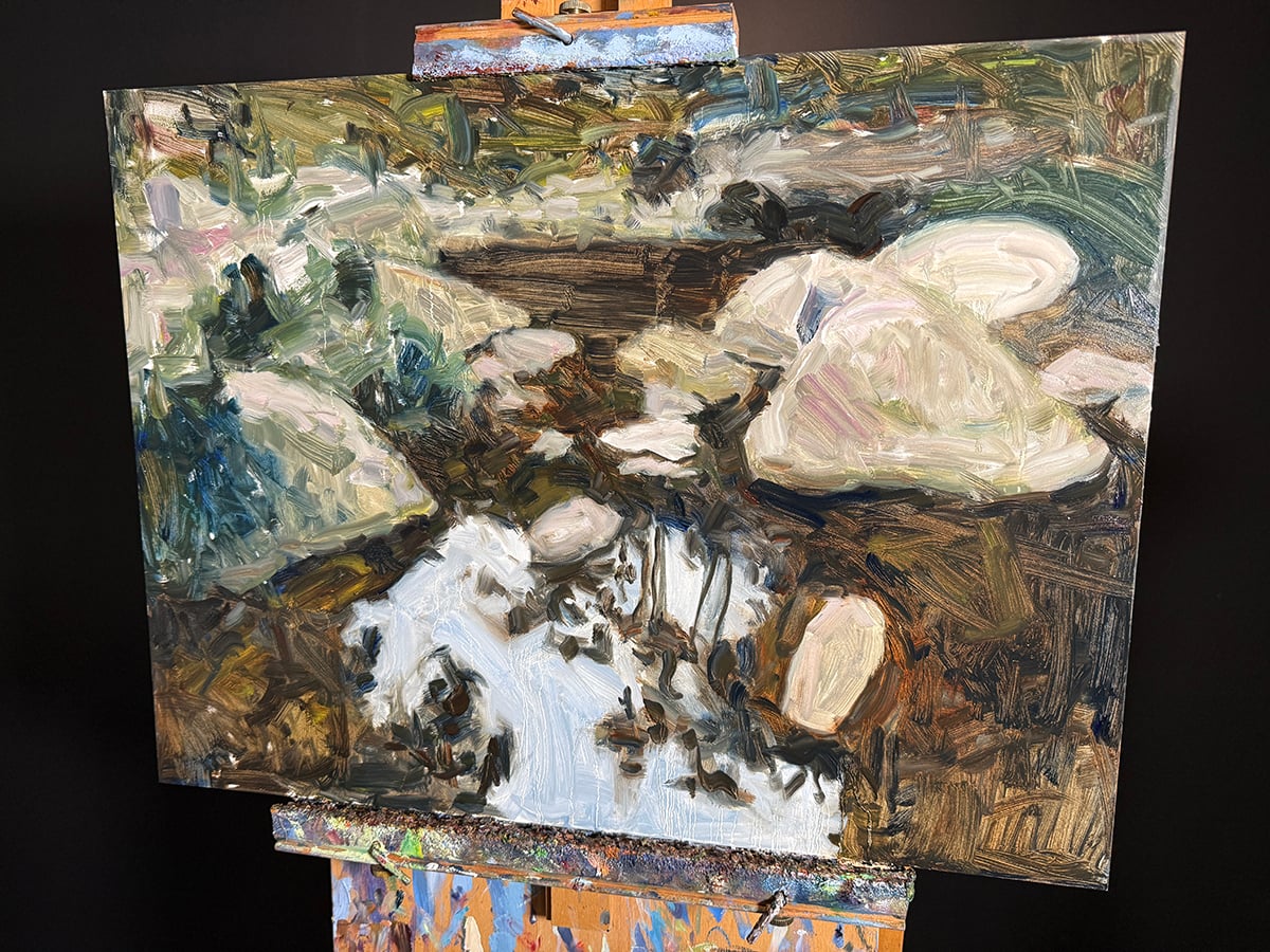
I fill in the gaps and complete the color block-in. Notice how the painting already shows a lot of realism. That’s the power of putting the right colors in the right spots.
Step 6: Distant Water and Plants
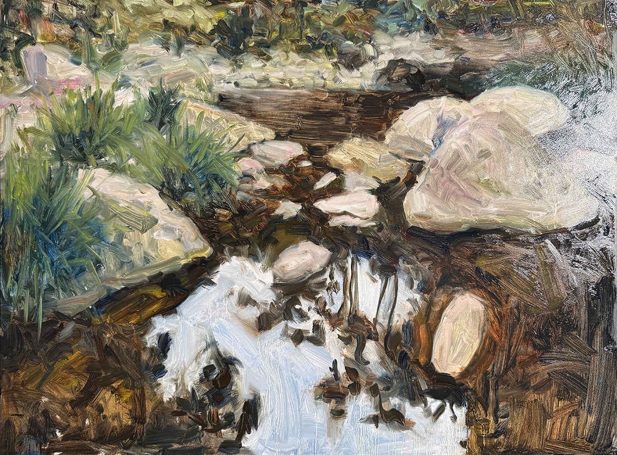
Now I must consolidate and refine what’s on the surface. I start to suggest the individual leaves of the plants scattered between the rocks. I continue to use the same large flat brush for this, but I turn it and use the thin edge.
Tip: You don’t need to constantly change brushes. You can do a lot with just a few. Instead of changing your brush, try varying your strokes by holding it a different way, or using more or less pressure, or going in at different angles.
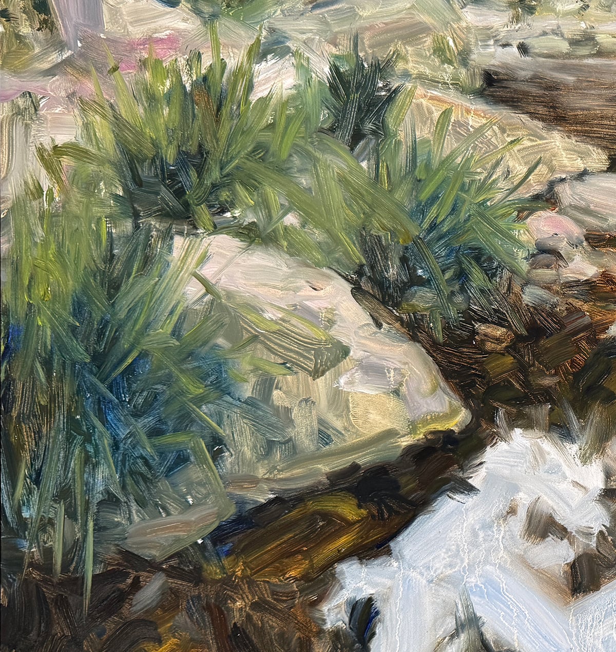
Step 7: Add Key Details
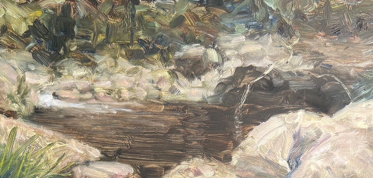
I add the whitewater at the back and a fallen tree hanging over the ledge. These are subtle but critical parts of the painting.
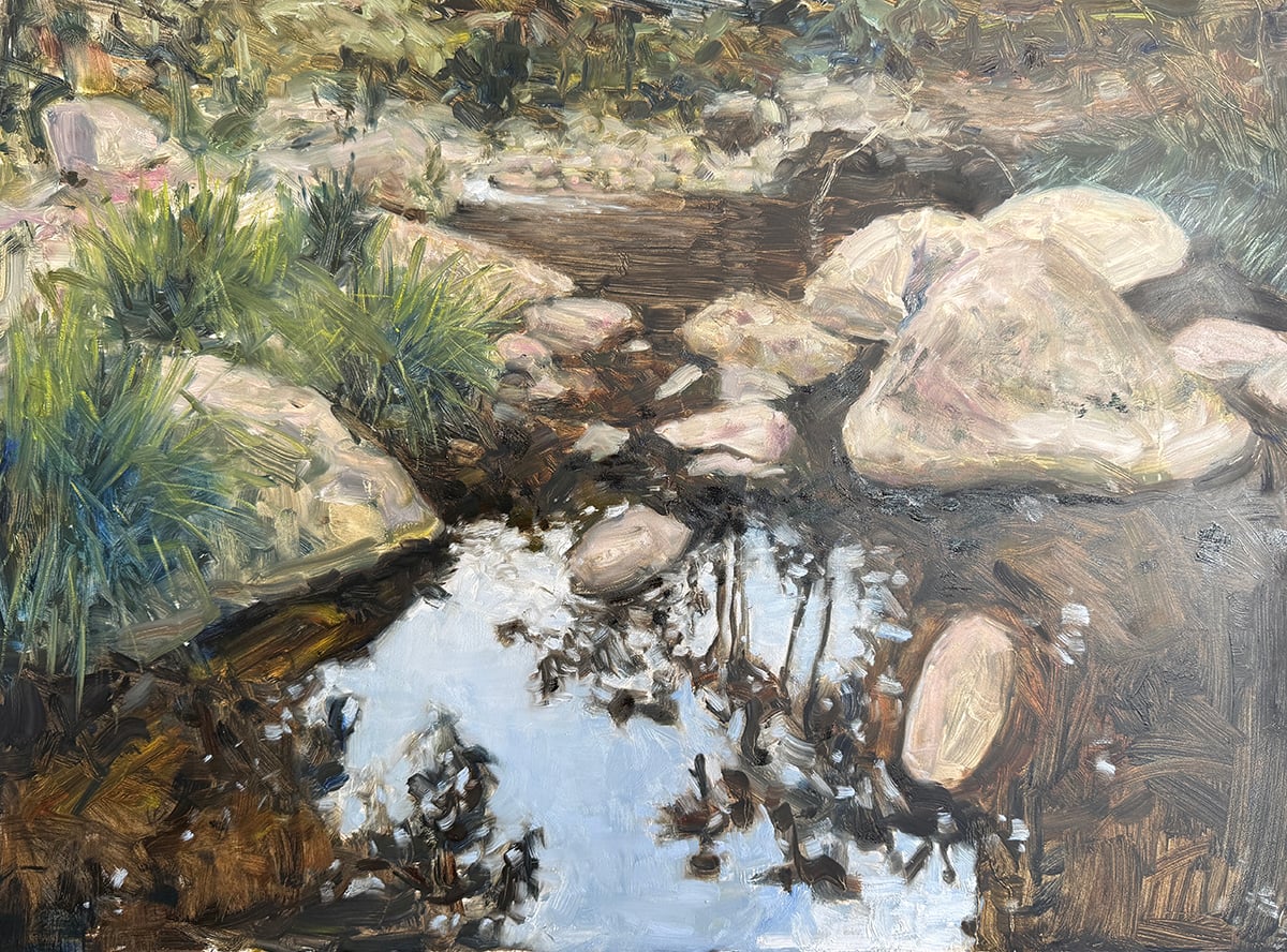
I also pick up some moss on one of the rocks.
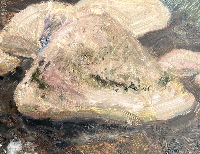
Step 8: Dark Glaze
I apply a dark glaze of linseed oil and raw umber over parts of the water. It was looking a bit weak and timid. This was my first time using glazing in a painting. It’s quite effective. It allows me to change the area’s color without compromising the underlying brushwork and structure.
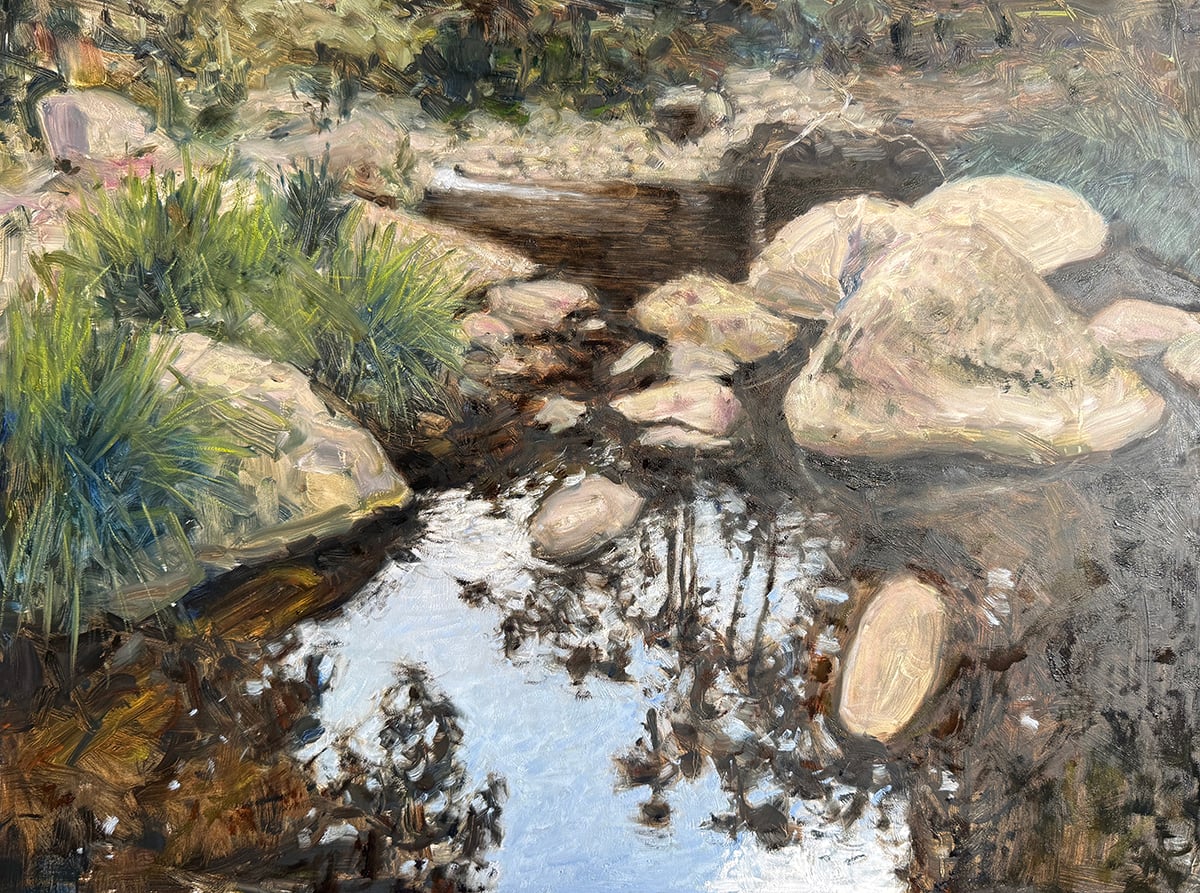
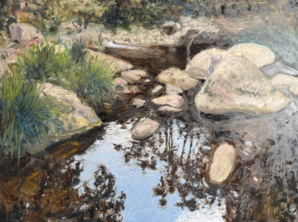
Step 9. Finishing Touches
I make a few finishing touches to bring the painting home. I suggest some individual tree branches in the background and better define the water’s reflections and ripples.
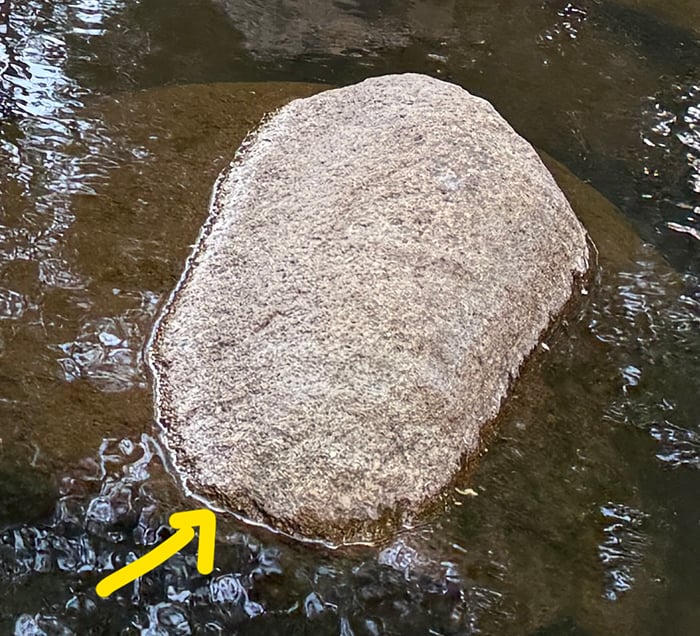
Below is a close-up of one of the rocks in the reference photo. Notice the highlight around the edge, and the subsequent ring of dark, rich color with the wet part of the rock.
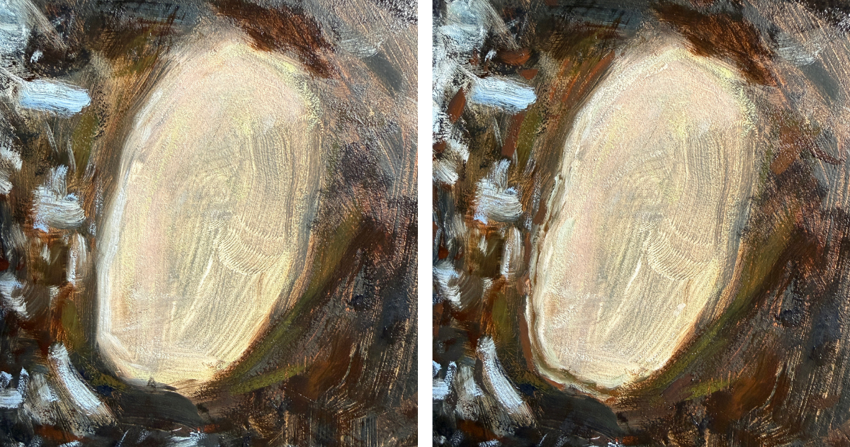
Below is a before and after of adding these details. Little details like this can convey a lot of realism!
Step 10. Sign the Finished Painting
I sign the painting in the bottom right corner using magenta.
Overall Thoughts
I think it turned out great. Of course, many areas for improvement, but I’m happy. My main criticism is that the reflections on the water need to be a bit crisper and sharper, and there needs to be a stronger sense of the water’s movement. I have a long way to go before I get to Frits Thaulow levels!
Thanks for reading. Let me know your thoughts in the comments.
If you want to learn more, check out our new Ponds and Lakes Workshop.
Regards

Dan Scott
Draw Paint Academy
Good, solid painting. The process of step by step building the image.. It’s like geee! I know it all.. why dont I stick with it!? Thanks for refreshing it for me, I so need it. “highlight around “the edge, and the subsequent ring of dark, rich color with the wet part of the rock” Yes!! such a minuscule detail but the effect is wonderful! thanks! Another great piece of the craft I learnt today.
Your work is astounding, truly it is! I am a jack of many trades in the art world so to speak. I have work on my walls and dry pastel, oil paintings, a watercolor or two, graphic drawings, and the multitude of my work is in the field of printmaking. As much as I love printmaking, there is still part of me that has a desire to paint but it seems as if there are not enough hours in the day, days in the week and weeks in the month, etc. to do everything I want to do of a creative nature. Thank you for allowing me to continue to be on your Email list and please now I do enjoy and am inspired especially with this particular one where you show us beautiful photos of the different stages of your paintings. Sincerely, a deep admire of your work. My FB and IG is Morrett Fine Art.
some a “fellars rock”
Thank you for this email. It was nice to see all the tips and tricks you use thanks for I am a self-taught. .
I am 77 years old and have painting since I was about 15 outside and then continued down and off. Thanks for the tips again.
Being a Tasmanian, I am appreciating finding your site and my familiar Aussie landscapes, beaches, Eucalypt trees, rocks etc…. I’ve learnt all sorts of things on the various northern hemisphere sites for soft pastels – but it didn’t help me get the right look for my countryside….
So I just had to try to do my version of your ‘Mount Barney Hike’! And I am quite happy with how it turned out – it still needs a bit of work on the textures of individual rocks, but it is getting there.
Thank you!
This was an amazing and highly helpful learning experience through the progress of your delightful painting of water and rocks. A reminder for me to avoid too much detail in the early steps.
Thanks!!!
It is interesting to see the progression and your steps in the that process. greeat job!
Penny
Wow, I think you have found your niche. Well Done
Chris Milner
Love your work!
This is truly beautiful ! I too thought it a photo ! Incredible !
I LOVE your work and your generosity in sharing knowledge & how you perform your skills . I look forward to your posts so much
You are such a talented artist and a wonderful person as well !
Warmest thanks Dan 🙏
Hi Dan,
This is lovely, and showing your work stages is wonderful.
Well done and thank you for sharing.
very nice and clear to understand thanks for putting this together! best, Laurel
Amazing!
Thanks so much for sharing.
Proved useful learning.
Just Beautiful. When I first saw the painting, I thought it was the photo. Its great.
Wow absolutely beautiful!!! When I first looked at it I thought it was a photo.. I look forward to each and every email you send and love looking at your work
Your choose of colour’s & strokes, makes a big difference in this rocks….amazing eye!!!
How incredible your water is. Your attention to detail is amazing. I wish my spider senses could see the world through your eyes. I do enjoy your newsletter very muc and in this picture you could be on Vancouver Island. Thanks for your inspiration.
This is really beautiful. Thank you.
Thank you for the great breakdown of how you painted this one. The painting is awesome – a real head turner. The beautiful contrast of the rocks and vegetation are eclipsed by that blue water and all its nuances. Great job – and thank you for sharing.
Thank you fromage Québec!
Very nice painting! Thank you to share with us your experience.
Wow! First impression is if an almost photorealistic painting, pull in close and see the brush strokes! I didn’t realise it was an oil painting untill I looked close up. The tips on getting water to look like water are really helpful, hopefully equally applicable to water colours? It’s a great painting and the step-by-step is so helpful. Thank you so much 😊
Beautiful!
Love the rocks…
?next workshop!
Lovely depiction and thank you for your step by step process… not a bit of “blarney” in my opinion!
Thanks for all the great tips! Your art piece is amazing!