 Share to X
I did more critiques this morning for students in the Ponds and Lakes Workshop. One student painted the swampy Florida wetlands where he and his brother own a fishing shack. The reference photo he painted from features three alligators in the water. (I won’t share the painting or reference as the student may want to keep them private.)
At first, I didn’t notice the alligators in his painting. I only learned about them when I read his accompanying description. They looked subtle and hidden amongst nature’s colors. That was a big tick for the student; that’s exactly how they should look.
We don’t have alligators here in Australia, but we do have saltwater crocodiles. They grow large, sometimes up to 20, 21 feet. But even at this size, they can be almost impossible to spot as they lie still and mostly submerged, with only a few hints of their presence above the water.
A common problem I see in student paintings featuring animals is a tendency to make them too obvious. I get the idea. They want to make the animals the focal point of the painting. But in doing so, they often compromise their character.
Animals rarely stand out in their natural environment. Unless you catch them with the right contrasting background or in transition. Or you are painting a colorful bird or a poisonous frog. Most of the time, animals partially blend in with their surroundings, either to hide from predators or to sneak up on prey. Have you ever stood in a forest and listened to the orchestra of birds, insects, frogs, and other animals, yet been unable to spot a single one?
If animals are the focal point or a key feature of your painting, you must be delicate in your approach and stay true to their character. Draw attention to them by putting them in a prominent position, or by leading the viewer toward them, or by leaving hints. Don’t overdo it with contrast, saturated colors, or pure titanium white.
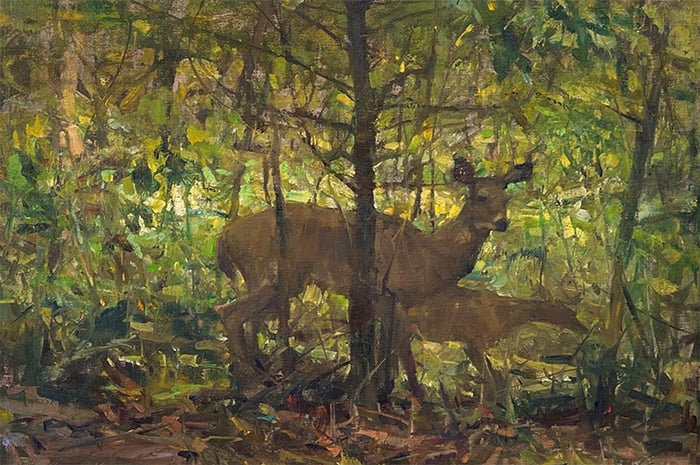
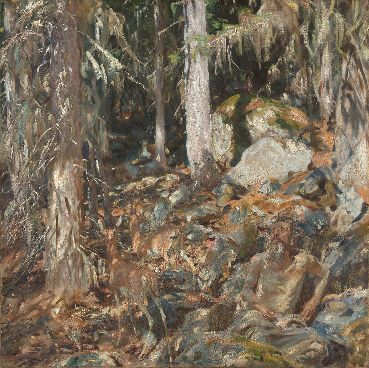
I can think of three great examples, all featuring deer. Quang Ho’s Oh Deer, Richard Schmid’s Mule Deer, and John Singer Sargent’s The Hermit (Il Solitario). In Ho’s Oh Deer (below), the deer and its fawn link with the surrounding dark greens and earth tones. Notice how the fawn is basically just an abstract shape. Ho did just enough to convey realism and left it up to our eyes to do the rest of the work. And their legs melt seamlessly into the ground. They look distinct, yet as one with nature. If not for the playful and high-key background, we would hardly be able to see them.
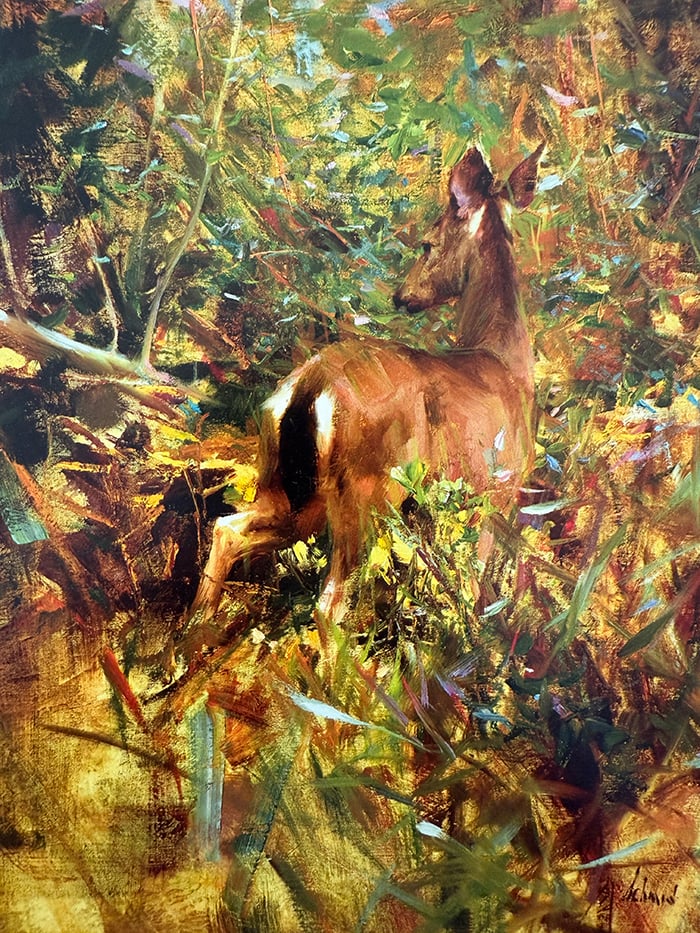
In Richard Schmid’s Mule Deer, again, the deer tapers off around the legs. There are also powerful color links between the deer’s raw umber tail, eyes, mouth, and ears, and the raw umber dark accents in the background. The background is an interesting play of color gradation. It goes from raw umber and orange tones, to dark greens, to warm and light greens. Also notice the use of pattern, with the painting dancing between light and dark shapes, particularly around the deer’s tail and legs. Schmid does all this so masterfully and gently that it’s hard to spot what’s going on. It’s organized chaos, and the more I look, the more I notice.
In Sargent’s The Hermit, the deer play a more secondary role, with the “hermit” being a quiet focal point. I wouldn’t be surprised if you missed the deer entirely, they blend in that well. The colors almost exactly match the surroundings. The light and brown patches of the deer to the brown patches on the dirt, and the light patches of the deer to the rocks and tree trunks.
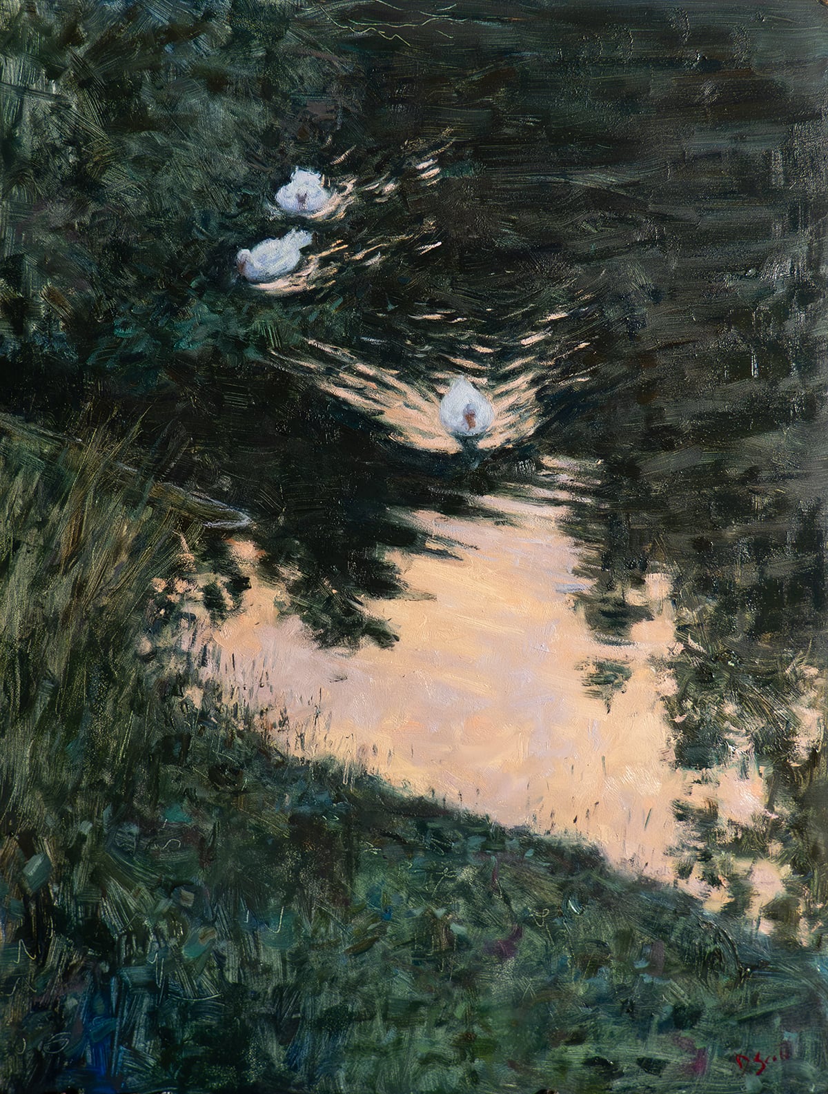
That’s enough deer! Here’s one of my recent paintings featuring three ducks at twilight. I had to be careful here not to make the ducks stand out too much. If I went a bit too strong with the lights or a bit too delicate with the brushwork, they would look out of place. The ducks may appear white in the painting, but I didn’t use any pure titanium white. I used mostly weak blues and grays. And much darker than you probably think.
It seems to be one of the greatest challenges in painting: to paint a delicate thing with vague brushwork. You’ll always feel a strong pull to get lost in the tiny details. But that may be a trap. More detail is not always better, especially in low-light scenes like this.
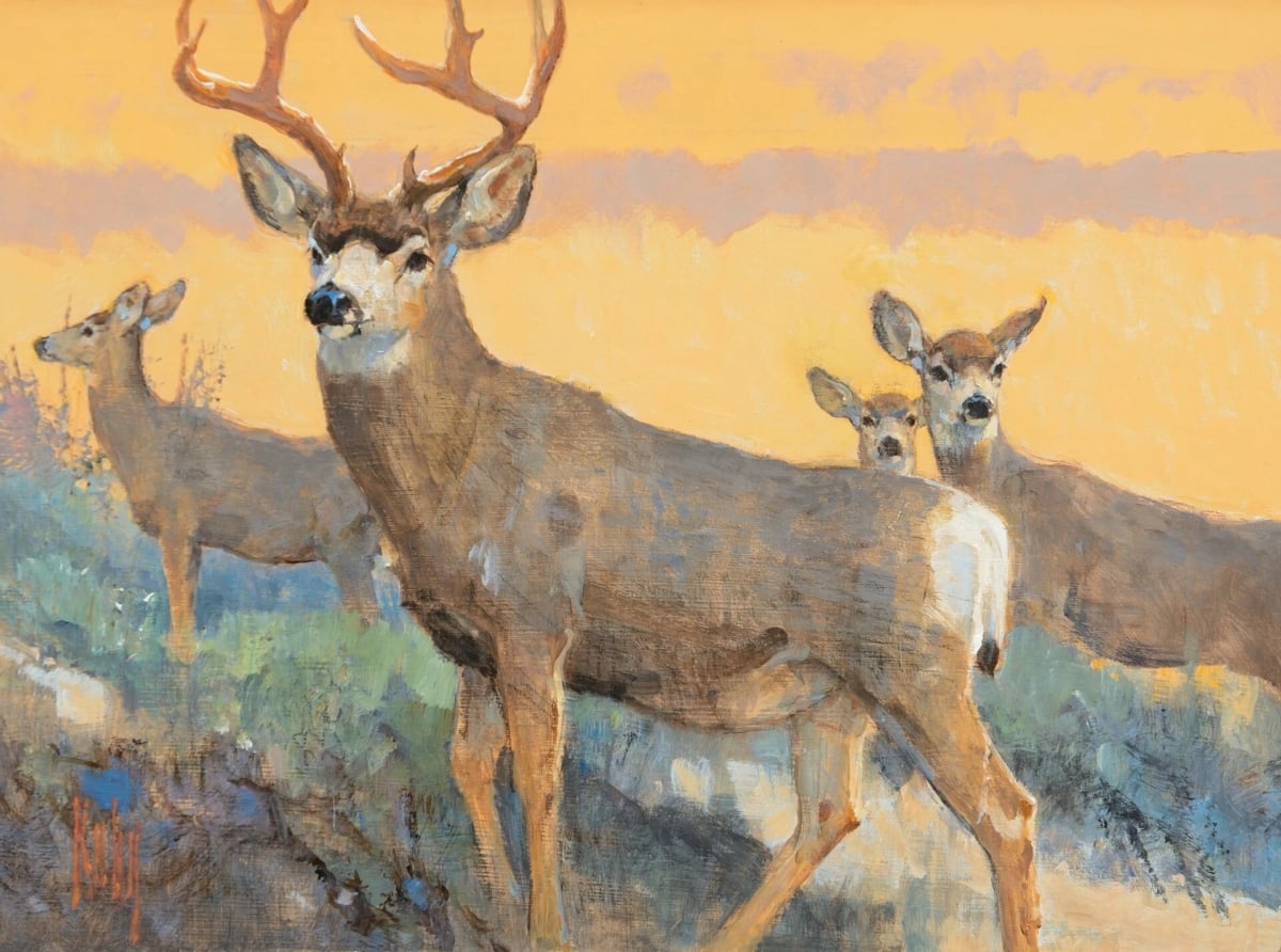
Of course, you can make animals stand out if you want. There are no rules here. Many great artists have painted animals as if they were a royal figure in a portrait. Take Bob Kuhn’s work for example (see below). But even here, you get the feeling the animals could disappear into the surroundings if they wanted.

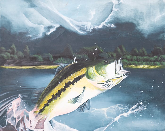
I’m also reminded of this fish painting I did back in grade 12. I must have been 16 or 17. Whilst it looks impressive, I can’t say it looks natural. Yes, fish jump out of the water, but we usually catch them as a glimpse out of the corner of our eye, or we might hear them jump and see the splash.
Anyway, just something to think about when painting animals.
Happy painting!
Dan Scott
Draw Paint Academy