
 Share to X
I did more critiques this morning for students in the Ponds and Lakes Workshop. One student painted the swampy Florida wetlands where he and his brother own a fishing shack. The reference photo he painted from features three alligators in the water. (I won’t share the painting or reference as the student may want to keep them private.)
At first, I didn’t notice the alligators in his painting. I only learned about them when I read his accompanying description. They looked subtle and hidden amongst nature’s colors. That was a big tick for the student; that’s exactly how they should look.
We don’t have alligators here in Australia, but we do have saltwater crocodiles. They grow large, sometimes up to 20, 21 feet. But even at this size, they can be almost impossible to spot as they lie still and mostly submerged, with only a few hints of their presence above the water.
A common problem I see in student paintings featuring animals is a tendency to make them too obvious. I get the idea. They want to make the animals the focal point of the painting. But in doing so, they often compromise their character.
Animals rarely stand out in their natural environment. Unless you catch them with the right contrasting background or in transition. Or you are painting a colorful bird or a poisonous frog. Most of the time, animals partially blend in with their surroundings, either to hide from predators or to sneak up on prey. Have you ever stood in a forest and listened to the orchestra of birds, insects, frogs, and other animals, yet been unable to spot a single one?
If animals are the focal point or a key feature of your painting, you must be delicate in your approach and stay true to their character. Draw attention to them by putting them in a prominent position, or by leading the viewer toward them, or by leaving hints. Don’t overdo it with contrast, saturated colors, or pure titanium white.
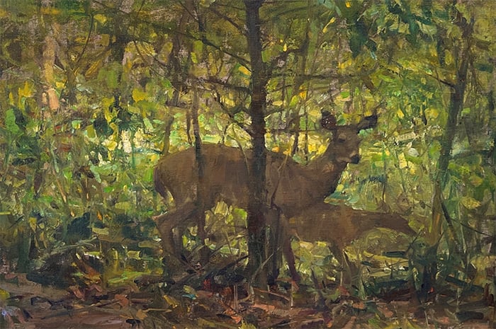
I can think of three great examples, all featuring deer. Quang Ho’s Oh Deer, Richard Schmid’s Mule Deer, and John Singer Sargent’s The Hermit (Il Solitario). In Ho’s Oh Deer (below), the deer and its fawn link with the surrounding dark greens and earth tones. Notice how the fawn is basically just an abstract shape. Ho did just enough to convey realism and left it up to our eyes to do the rest of the work. And their legs melt seamlessly into the ground. They look distinct, yet as one with nature. If not for the playful and high-key background, we would hardly be able to see them.
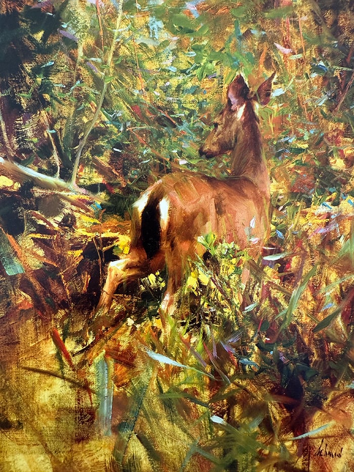
In Richard Schmid’s Mule Deer, again, the deer tapers off around the legs. There are also powerful color links between the deer’s raw umber tail, eyes, mouth, and ears, and the raw umber dark accents in the background. The background is an interesting play of color gradation. It goes from raw umber and orange tones, to dark greens, to warm and light greens. Also notice the use of pattern, with the painting dancing between light and dark shapes, particularly around the deer’s tail and legs. Schmid does all this so masterfully and gently that it’s hard to spot what’s going on. It’s organized chaos, and the more I look, the more I notice.
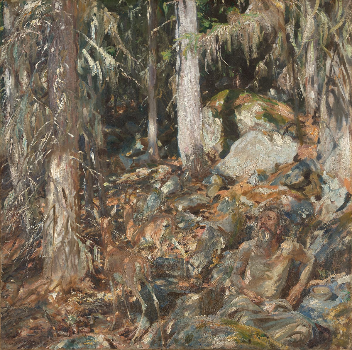
In Sargent’s The Hermit, the deer play a more secondary role, with the “hermit” being a quiet focal point. I wouldn’t be surprised if you missed the deer entirely, they blend in that well. The colors almost exactly match the surroundings. The browns of the deer to the browns of the dirt, and the gray patches of the deer to the rocks and tree trunks.
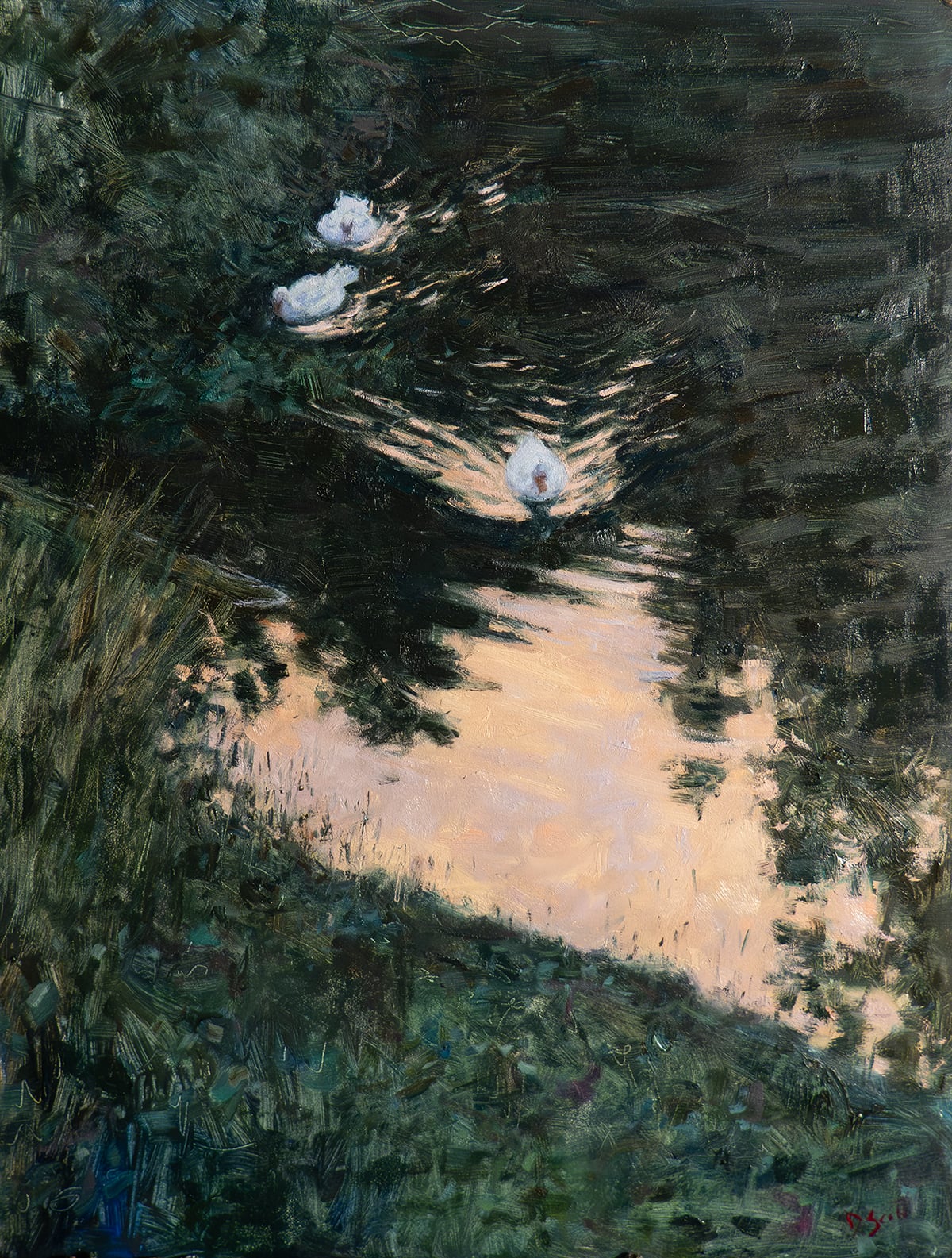
That’s enough deer! Here’s one of my recent paintings featuring three ducks at twilight. I had to be careful here not to make the ducks stand out too much. If I went a bit too strong with the lights or a bit too delicate with the brushwork, they would look out of place. The ducks may appear white in the painting, but I didn’t use any pure titanium white. I used mostly weak blues and grays. And much darker than you probably think.
It seems to be one of the greatest challenges in painting: to paint a delicate thing with vague brushwork. You’ll always feel a strong pull to get lost in the tiny details. But that may be a trap. More detail is not always better, especially in low-light scenes like this.
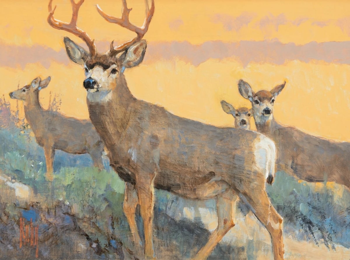
Of course, you can make animals stand out if you want. There are no rules here. Many great artists have painted animals as if they were a royal figure in a portrait. Take Bob Kuhn’s work for example (see below). But even here, you get the feeling the animals could disappear into the surroundings if they wanted.

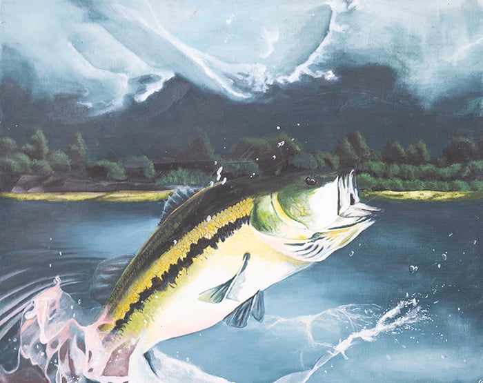
I’m also reminded of this fish painting I did back in grade 12. I must have been 16 or 17. Whilst the fish looks impressive, I can’t say it looks natural. Yes, fish jump out of the water, but we usually catch them as a glimpse out of the corner of our eye, or we might hear them jump and see the splash.
Anyway, just some things to think about when painting animals. Let me know your thoughts in the comment section below.
Happy painting!
Dan Scott
Draw Paint Academy
—
Most of what I put out is completely free, but if you ever want to dive deeper, check out the following:
Tree Workshop: Our latest workshop. Join me and hundreds of other students as we paint trees from around the world.
Painting Academy: Get up to speed on the fundamentals.
Landscape Painting Masterclass: A deep dive into landscape painting and how to capture nature’s beauty in a painting.



Thank you once again for sharing your critiques and your own inspiring work.
Hi Dan, Thank you once again for another interesting newsletter.
Great insight on painting animals which I really appreciate and will try and follow. Thank you Jean
Nice fish…exciting for a 17-18 YO. As always, your articles are wonderful…and those ducks ,,,an insspiration.
Wonderful examples. Thank you. I have been reading your posts for years, and watched in delight as your painting has transformed. I have been caught feeling bored with mere landscapes, wanting to put animals and people into my paintings. These are such inspirational examples, I am excited to try.
Interesting how each of the first 3 paintings use light & shadow emphasizing the camouflage aspect of animals as well as small area of brilliant light. The animals are within the landscape. In the last 3 the animals are on the landscape – the landscape is background to the prominent animal. Amazing childhood skills Dan!
Thanks so muvh for this.
It really helps me see!
I always enjoy reading your posts and am eternally grateful for your words of advice together with introductions to other artists. Many thanks!
Great insights Dan, thank you. I had to search for the eponymous Hermit, the deer took me a while longer! The three ducks – that’s one of my favourite paintings of yours, beautiful.
Thanks Dan, your insights are always spot on. You’re a really great teacher.
Maybe it’s because animals are my favorite subject (in painting and in life), or maybe it’s because of your equilibrium in whether or not animals should be so obvious in a painting, either way it is probably my most favorite article you’ve written to date.
While animals are always the highest contrast in my paintings, there is still a symmetry between them and the background, and I have cursed myself many times for not delving deeper into the backgrounds, which are generally vague and minimalist, this article made me realize that I still have that symmetry. This is quite the realization for me and it’s appreciated tenfold.
Nicely done, thank you.
Oh, and John Singer Sargent is my most favorite artist and every time he is mentioned, a little spark ignites.
I tried to fill out your New Subscriber Survey, but it gave me “Invalid Selection” for every answer to every question. Must be something wrong with it.
Thanks Jan I’ll take a look.
I was excited to learn another student painted gators in scenes from the Florida Everglades. But I bet you won’t see mine when you evaluate. Just another ripple.
Loved all the colors you got in the water with the three ducks.
In your comments about Schmid’s deer: did you see the second deer? The shift from realism in the rump to impressionism with distance was a real good lesson.
All those creatures we can hear are watching us and probably making rude comments.
Really enjoy your lessons. Tightly written. Great illustrations. Really pack a punch.
Thanks a bunch,
:
Great advise Dan, and very helpful.
Thanks, just what I needed & have always not done – fear. Love “The hermit – by Sargent & Mule deer by Schmidt. Will refer to often. You r the best Dan.
3 ducks…beautiful
Thank you. I love these examples of paintings of animals. Very inspiring.
Wonderful observations and reference art!
I’m trying to do a “ perspective” painting going from a beautiful drive on the cost to seeing climate change. I think your comments apply here. First see the beauty then notice the cut trees, volcano and erosion. Don’t know if I’ll be successful but it’s a great challenge
Totally inspiring!
Hi Dan,
I loved this newsletter and the examples you used to illustrate the subtleties of each painting. I was especially taken by your childhood fish painting, mostly because most my animals look unrealistic and forced. I am going to lean into this on my next watercolor and see if I can accomplish something more like your ducks. Gorgeous painting, too!
I haven’t painted animals in my landscapes, but as someone who enjoys them, it has occasionally occurred to me to include some. Now I believe I will do that, and your tips are exactly what I need to know in order to do it with some degree of success. Thanks so much!
Hello Dan ! First I want to say that the paintings you showed us with the animals ,most of them deers are beautiful .I am a person who loves animals and when I paint one usually the animal is the king of the painting .I paint all the colors that mother nature gave him surrounded by the beautiful nature . But as you say everyone should paint the way he wants or likes . I love to watch all the paintings from your emails . The painting of John Singer Sargent is very interesting .I managed to see the deers and the man only if I zoomed it . Your childhood painting with the fish is also beautiful and it has enough colors .
Thank you! What valuable examples and advice.
These are excellent examples of the obvious and subtle. I especially like the Mule Dear by Richard Schmid. And, the subtly of The Hermit is amazing and I love it!! He is one of my favorite artists!!
Me, being a fisherwoman, I love your bass! Makes me want to go grab a fishing pole! Beautiful work!!
Thanks for sharing.
~ jeannie
Dan, Great critique!
I can’t imagine a 21′ crocodile, I will take your word for it …
While I really like your fish painting, you make a great insite for the camouflage of animals.
Thank you!
Oh..
I like your Fish painting very much!!
Thank you for sharing.
Thank you for your wonderful article too!
Anh
I’m interested in painting animals and botanicals. I need to hone my skills, and I think this is the place to do it.
Thank you, Dan Scott, for sharing your work and workshops with us. Much appreciated.
Deepti
This is a very helpful post. Tonal delicacy is so hard to accomplish. Worth the effort though. Many thanks for your commentary!
Thanks that was very helpful. Lots of food for thought in painting animals.
Thank you so much I enjoyed that.!always wondered should I have the animal as more of a focal point or not, should I just let it be silent amongst the background. Thank you enjoy all your informative emails posts etc
Thank you for these tips! I enjoy painting animals very much and your comments give me good ideas on how to approach the subjects in a more subtle manner.
Your childhood fish painting is awesome! I love it!
This is extremely interesting and helpful and not something I’d ever considered. Thank you!
Love your paintings. That’s quite a fish from childhood but I also think your recent ducks are wonderful. Thank you for sharing.