For your inspiration today is Thomas Moran’s View of Venice. It’s an intricate watercolor painting of Italy’s Canal Grande.

(You can download a high-resolution photo of the painting here.)
Below are some key observations about the painting.
Compressed Values and Dark Accents
Here’s a grayscale of the painting:

The painting follows a theme of compressed values plus a few sharp, dark accents around the focal point. That is, most of the painting is similar in value (lightness) except for a few accents which are significantly darker. This is a tried and true strategy. The compressed values simplify the painting and the dark accents provide bursts of interest and activity.
I also created a 2-value notan using

Burst of Color Saturation
In addition to the dark accents, Moran also used bursts of color saturation around the focal point. Notice the tight concentration of strong reds, yellows, and blues. This helps draw our attention to this area. It also creates a sense of increased activity and movement.

Warm/Cool Temperature Contrast
There’s an interesting play between warm and cool colors, as if they are jousting for superiority. The warm colors appear to be winning around the focal point, but the cool colors seem to have the upper hand everywhere else.
Balance
Moran’s signature and the four birds in the bottom right corner play an important role in balancing the painting. Without these details, all the activity on the other side might appear too heavy.

Rule of Thirds
Here’s the painting with a three-by-three grid over the top:
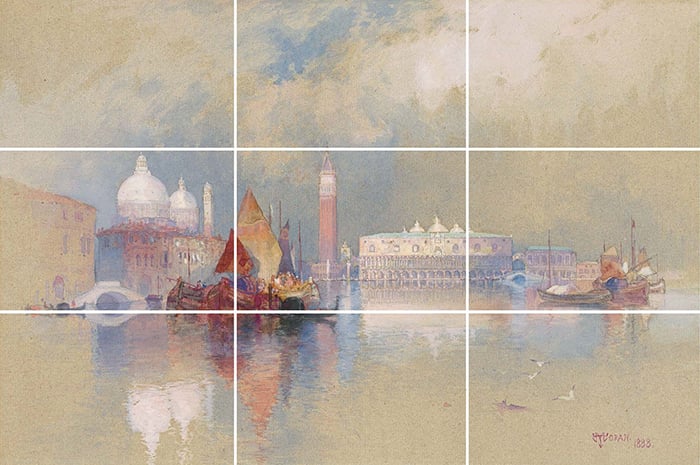
A few key points:
- The focal point is positioned around the bottom-left intersection;
- The peaks of the tallest buildings come to the top horizontal line;
- The boats are roughly aligned by the bottom horizontal line; and
- Each segment is unique.
Simplification of Detail
Moran simplified the detail around the edges of the painting. This focuses our attention around the middle and gives the painting a rustic, almost unfinished appearance. It’s similar to a vignette effect but with lighter edges.
Medium
When I first think of Moran’s work, vast and rich landscapes in oil come to mind. His watercolors, like View of Venice, give a much lighter and more delicate perspective. They also highlight how your choice of medium can influence the overall appearance of your artwork. Oils tend to be bolder and richer by nature compared to watercolors. It’s important to understand your chosen medium so you can play into these inherent strengths and limitations.

Want to Learn More?
You might be interested in my Composition Breakdown course. It’s a deep dive into 20 master paintings and what makes them tick. You can join today at a reduced price and receive several bonuses with your enrollment.
Happy painting!
Dan Scott

Draw Paint Academy