This is the ultimate guide on the idea of chiaroscuro for artists. I’ll cover:
- What Does Chiaroscuro Mean?
- Ancient Roots
- Chiaroscuro During the Renaissance
- Development of Oil Paint
- Caravaggio
- Tenebrism
- Caravaggisti
- Dutch Chiaroscuro
- Chiaroscuro by Candlelight
- Modern Chiaroscuro
- Key Takeaways
- Thanks for Reading!
What Does Chiaroscuro Mean?
Chiaroscuro refers to the use of light and dark to create the illusion of three-dimensional volume on a flat surface. The term translates to “light-dark”; chiaro meaning bright or clear and scuro meaning dark or obscure.
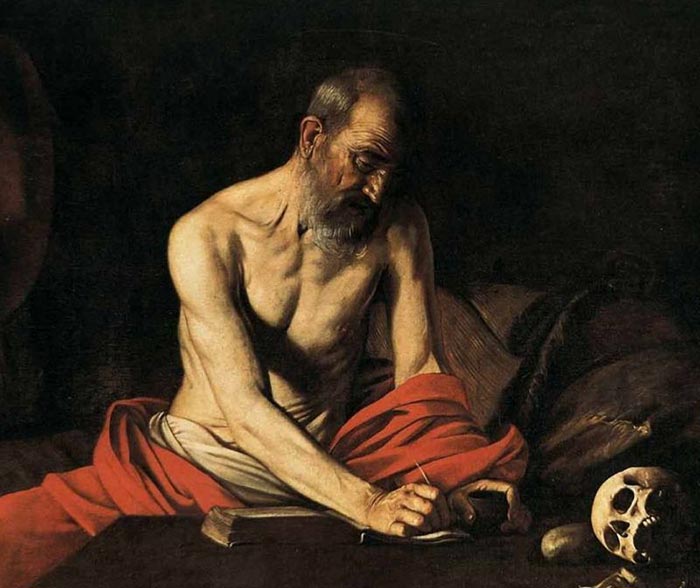
The term is also used in a more narrow sense to describe artworks that display an extreme contrast between light and dark, like the painting below.
Ancient Roots
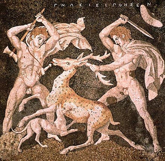
Chiaroscuro can be traced back to the work of Apollodorus Skiagraphos, a Greek painter who used hatched shadows to suggest volume. None of Skiagraphos’ works survived, but examples of his skiagraphia or “shadow-painting” technique can be seen in other Hellenistic artworks such as the “Stag Hunt,” a 4th century BCE carpet mosaic from a wealthy Macedonian home.
Chiaroscuro During the Renaissance
By the 15th and 16th centuries, the interest in all things classical saw Renaissance artists adopt and improve on earlier shading techniques. The first Renaissance master to develop existing shading techniques to achieve a true chiaroscuro effect was Leonardo da Vinci. Da Vinci brought life and volume to his drawings, starting with the darks on colored paper, then moving toward the lighter tones, and finally adding the highlights, usually with white gouache or chalk. Below is a great example of this. Observe the careful rendering in value from dark to light.
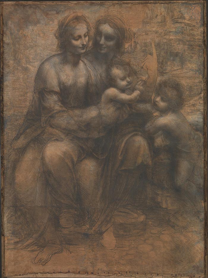
Da Vinci used charcoal or black chalk to sketch the subjects on brown-tinted paper. He created the illusion of shadows (in the folds of their clothing, on their faces and necks, etc.) by gradually building up lighter and lighter layers of chalk. He used white chalk to highlight areas of importance, such as the child and the other subjects’ faces. If you look at the bottom of the artwork, you can see parts of the unfinished drawing without any rendering.
Development of Oil Paint
Renaissance artists were interested in reproducing the world they saw around them. Architect Filippo Brunelleschi’s discovery of linear perspective gave artists a formula to create the illusion of depth and realistic proportion on a flat surface. But an equally important discovery during this period was the benefit of oil paint. Before the Renaissance, the most popular medium was tempera paint, a quick-drying medium created from egg yolk. The medium is difficult to blend due to its quick-drying time and it is not suited to layering because of its opacity.
Oil paint, which uses pigments ground in an oil medium such as linseed oil, dry more slowly. This slow drying time, combined with its translucence, make it possible to build up thin layers of paint (known as glazing). This made it much easier for Renaissance artists to blend and build up gradual tones of color – helping chiaroscuro become a viable technique to model realistic forms.
Caravaggio
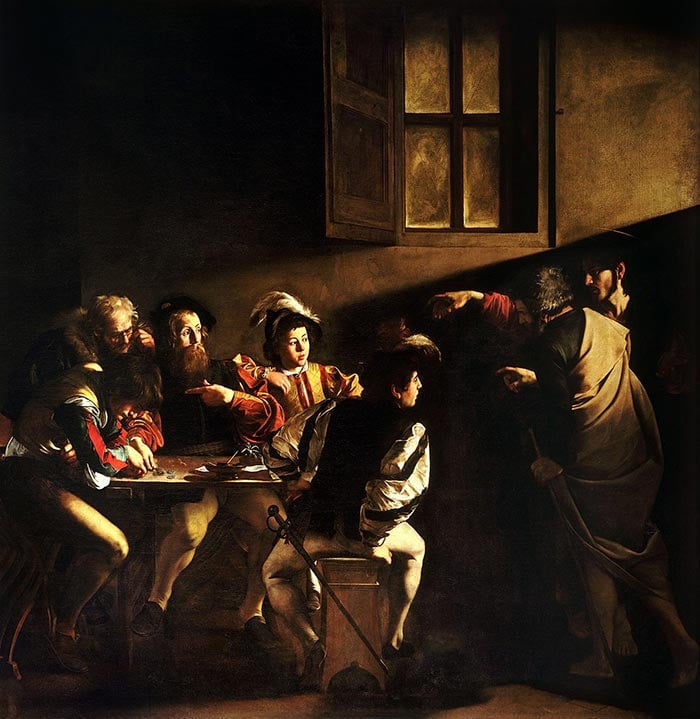
The 17th-century Italian painter Michelangelo Merisi da Caravaggio took chiaroscuro to the extreme, often blacking out large portions of the background and brightly illuminating large foreground subjects. This combination of using high contrast with a single focused light source had an incredibly dramatic effect.
In the painting below, the subjects are illuminated from a single light source coming from the right of the painting. The drama in the scene is intensified by the stark contrast between the deep shadows and the warm highlights and midtones. The light focuses your attention on the subjects seated at the table.
Tenebrism
The use of large patches of black background combined with brightly illuminated subjects is so closely associated with Caravaggio’s work that it is termed caravaggism. Another term for this style of chiaroscuro is tenebrism, which comes from the Italian term tenebroso, meaning dark, gloomy, or mysterious.
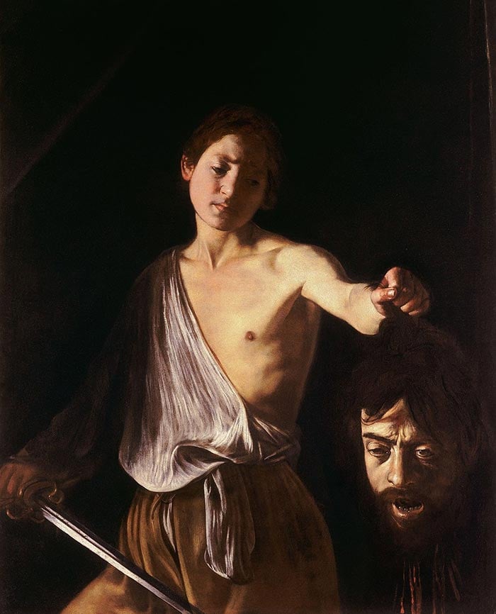
In the painting above, David takes on a luminous appearance as light falls on him from the left of the painting. He was painted with soft tones and edges. Also, notice how the parts of David in shadow gently blend in with the black background.
By contrast, Goliath’s severed head, with ribbons of blood still streaming from his neck, is thrust, slightly over-scale, into the lower right foreground. The light falls more directly on Goliath, harshly illuminating the shadows of his hair, his creased brow, and his sunken eyes.
With the painting placed just above eye level, a viewer standing in front of it will be looking almost directly into the face of Goliath’s green-tinged, oversized face.
Caravaggisti
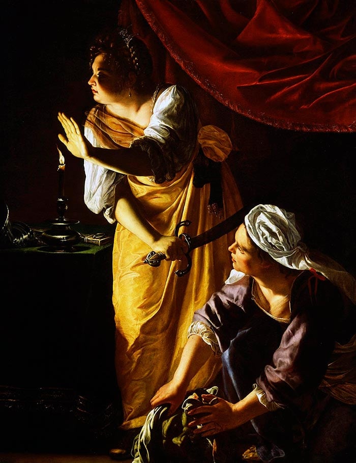
Caravaggio’s tenebrism was so successful that many enthusiastic artists began to mimic his style. These artists became known as the “Caravaggisti.” The Caravaggisti used a stark combination of dark and light for several purposes – to model three-dimensional volumes, to draw attention to certain areas of the painting, and to create a sense of drama.
Below is an example of Caravaggisti work. The subject, Judith, holds her hand out to block the light that streams in from the left. The result is a stark curve of shadow cast against her own face.
Dutch Chiaroscuro
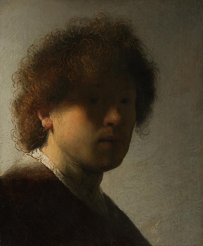
Other artists took a more delicate approach to chiaroscuro – using it to create a calm and reflective mood. The Dutch master Rembrandt van Rijn is renowned for his subtle handling of the chiaroscuro technique.
In the self-portrait below, Rembrandt used painterly brushwork to explore the relationship between light and shadow. Unlike many other portraits, most of Rembrandt’s face is in shadow, with only one side of his face slightly exposed to light. Also, the background is painted with mid-tones rather than deep black, like many of the other paintings in this post.
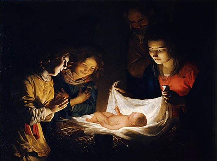
Gerard van Honthorst is another Dutch master who explored the use of chiaroscuro. In the painting below, the subjects are brought forward from the darkness, and your attention is focused on the child, who appears to be glowing with light. The other subjects are basked in a more subtle light, with the man in the background only just emerging from the darkness.
Chiaroscuro by Candlelight
French artist Georges de La Tour often used candles as the main light source for his paintings. In the painting below, he used candlelight bouncing off a mirror to illuminate a seated Mary Magdalene.
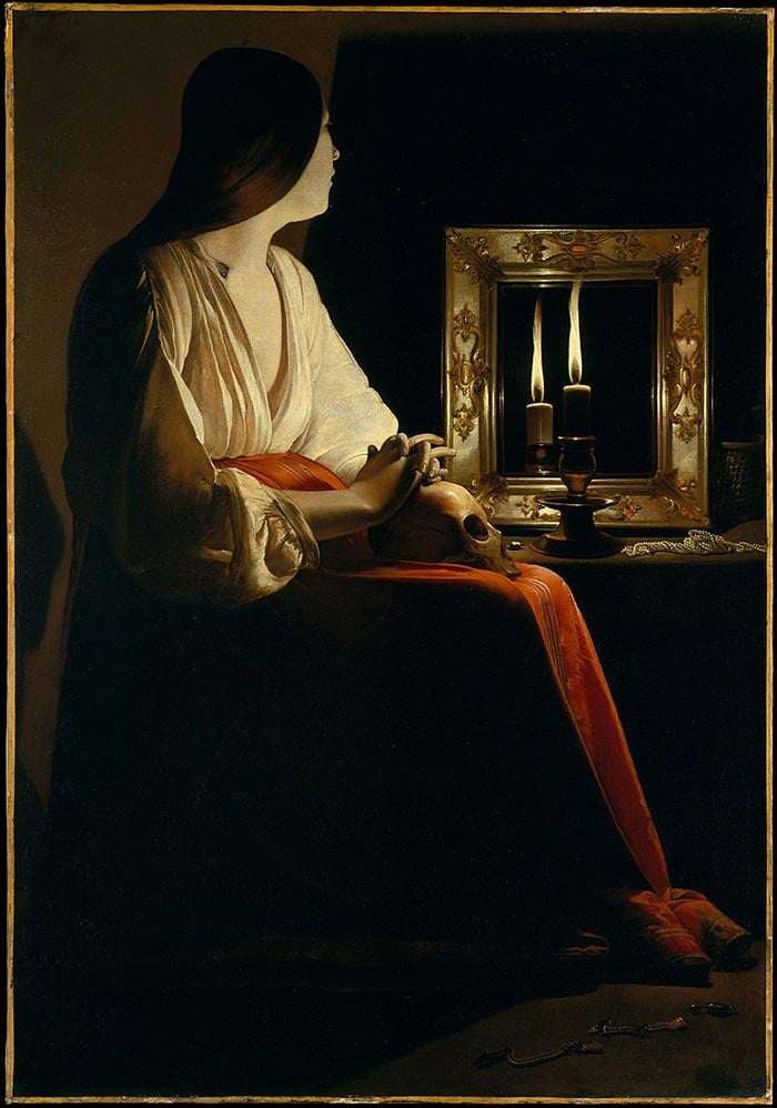
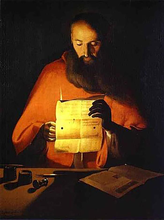
In this painting, you can feel the warmth of the candlelight. The paper in the subject’s hand glows like burnished gold.
Modern Chiaroscuro
Many other artists made creative and accomplished use of chiaroscuro.
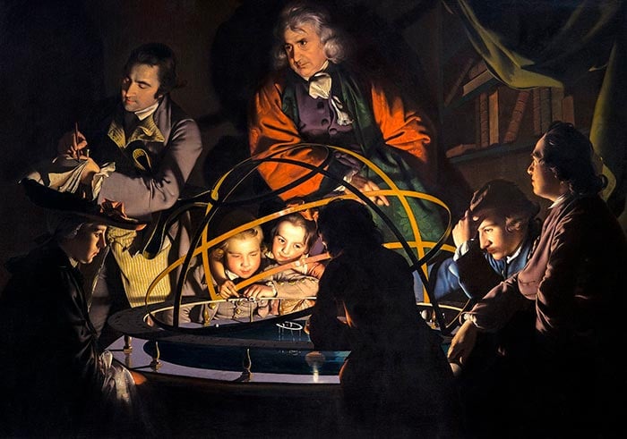
Joseph Wright of Derby used chiaroscuro when painting scenes of scientific interest during the industrial revolution. In his painting below, an orrery (a mechanical model of the solar system) is illuminated by an oil lamp that is placed at the center of the model to represent the sun.
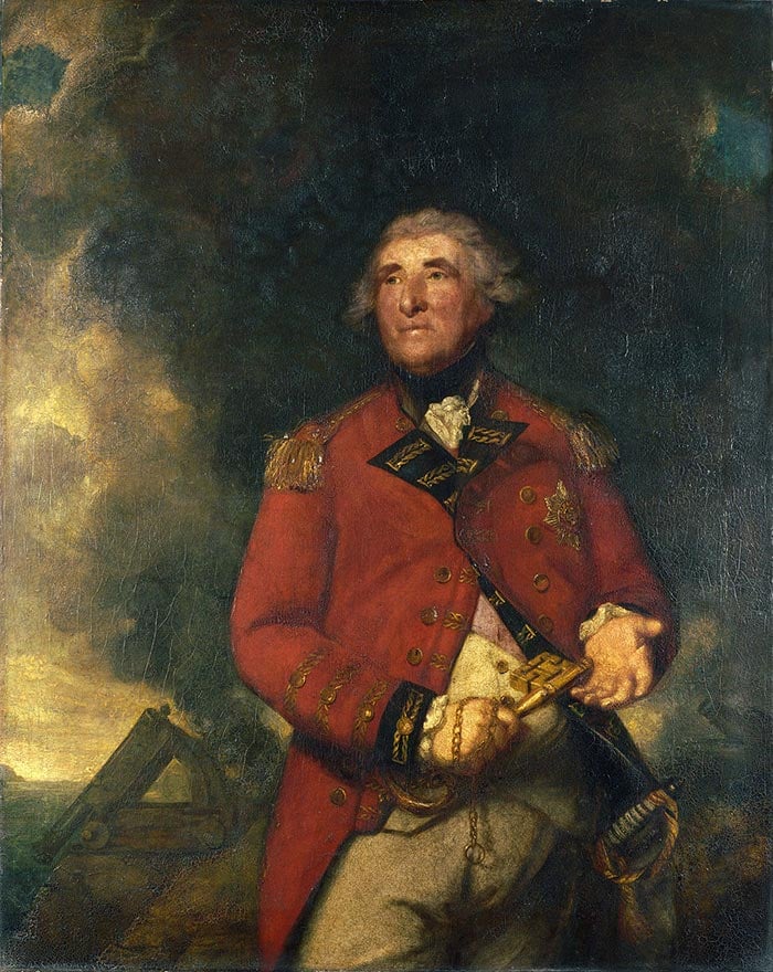
English artist Sir Joshua Reynolds used chiaroscuro to lend a regal quality to his eighteenth-century portraits.
Francesco Goya adopted Caravaggio’s more dramatic tenebrism to depict the tension and heightened emotion associated with modern warfare.
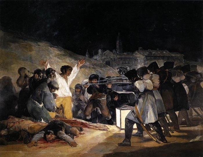
Chiaroscuro is also used in a variety of other mediums, such as photography and cinematography.
Key Takeaways
- Some of the shading techniques used for effective chiaroscuro include hatching, shading with parallel lines, and layering tones of the same color.
- For building up tonal gradations, it is usually most effective to work dark to light.
- For more drama, you may want to consider using only one strong light source.
- Our eyes are naturally drawn to the lightest areas, so these tend to be the focal points in the painting.
- The level of contrast between light and dark helps determine the mood of the painting.
- Tenebrism, which refers to particularly high contrasts between the dark and light areas of the image, can be used to create a strong sense of drama.
- Compositional choices, such as positioning the subjects prominently in the foreground, can heighten the effects of chiaroscuro.
Thanks for Reading!
I appreciate you taking the time to read this post and I hope you found it helpful. Feel free to share it with friends. If you ever want to learn more, check out my Painting Academy course.
Happy painting!
Dan Scott

Draw Paint Academy

Easy and well explained subject, very useful!
Hi all,
I was under the impression that chiaroscuro painting (and drawing) usually would start with the middle tone paper or canvas – not the completely dark surface. this can be seen in drawings by both Leonardo and Rembrandt and many others. Preparing drawings for a large oil painting would require the use of brownish or blueish paper and the use of brown, and white crayons for highlights, thereby imitating the gradations of dark and light in the final painting. The most convincing oil paintings therefore are those in which layers of paint have been gradually painted unto a middle tone background, beginning with the darkest areas and finishing with the highlights, also following a gradual thickness of paint layers, from thin dark layers to the thick blobs of paint to represent the highlights. Virtuoso such as Rembrandt and Turner would of course often reverse the process either by scratching into the thicker layers of light paint, or draw quickly and with a very light hand over the brighter surfaces.
I am quite ignorant about technical aspects of painting. I found this article because I’ve become interested in the Italian Renaissance which — of course! — includes the graphic art. This article was perfectly suited to my level of knowlege, easy to read, very informative, beautifully displayed. A minor suggestion: at the beginning you could indicate that “chiaro-” is pronounced “key” instead of “she” in English.
Thanks very much for this wonderful article.
easy to read, nice works, i understand.thanks for this wonderful article too!.
I love painting in heavy contrasts due to living in a desert. I avoided the term chiaroscuro because of the tenebrism. However, now knowing there is that distinction between contrast and drama, I guess I could be classified as a chiaroscurist.
Thanks for the clarity!
We’ll explain in my understanding of the 4 canonical modes of renaissance painting. I’ve been using these methods in my work for over 20 years. Johannes Phokela.