
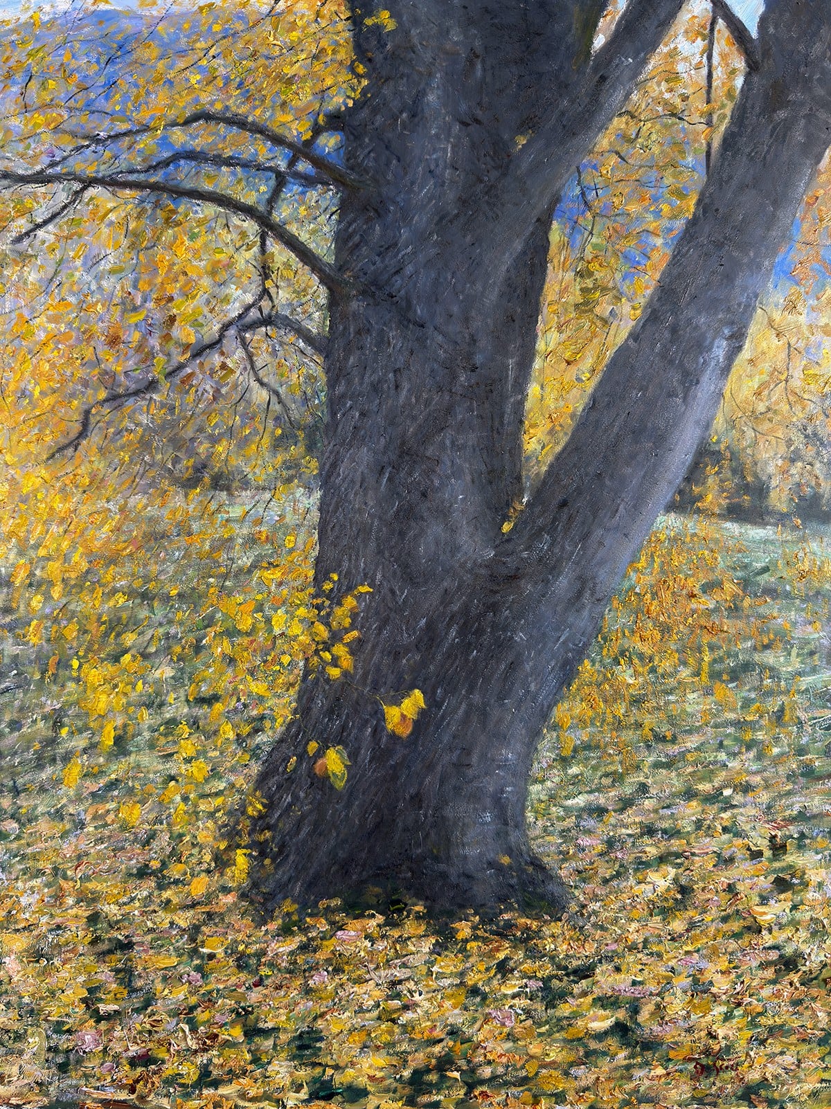
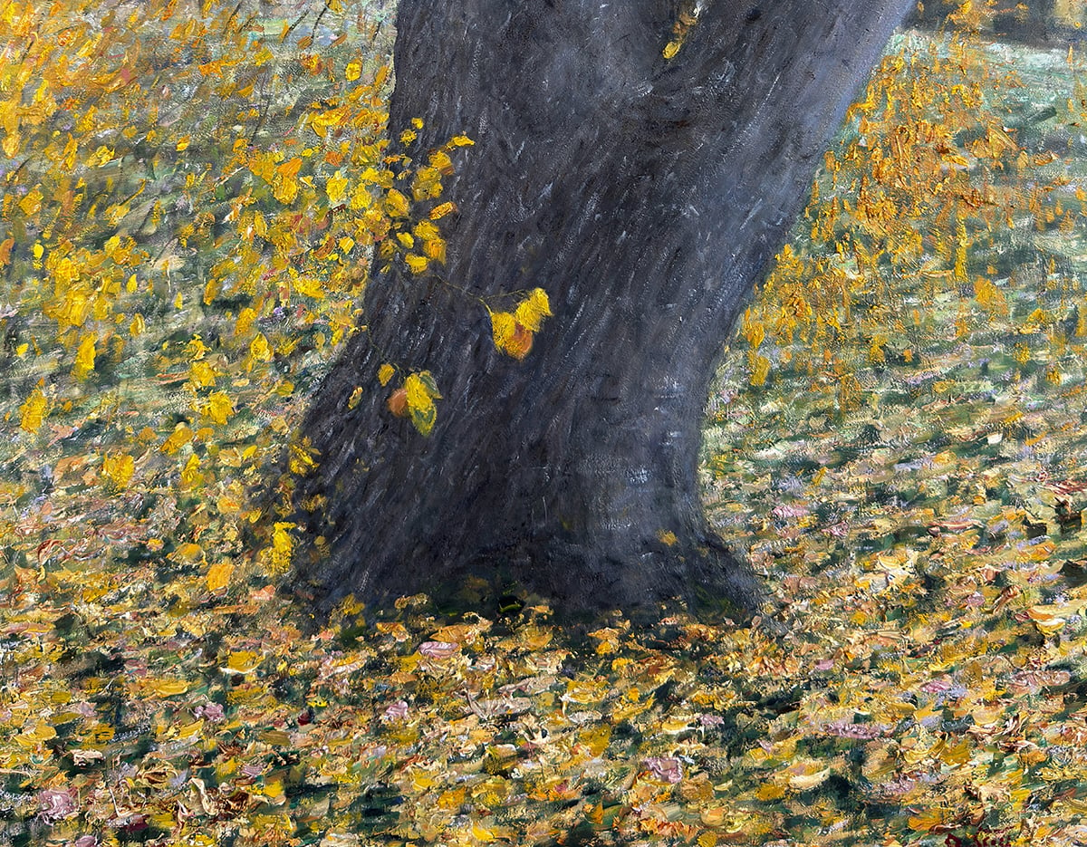
My recent New Zealand, Autumn Colors painting is a great demonstration of painting fallen leaves and other ground matter. Let’s go a bit deeper on that topic. The ground plays an essential but understated role in almost all paintings, and especially landscape paintings. It also seems to be a common problem area for students. They tend to do either too much or too little, or they convey the ground with little regard for its role in the painting. I’ll cover:
- Role of The Ground
- What Are You Really Painting?
- Different Types of Ground and How to Paint Them
- Weaving the Parts Together
- Key Takeaways
I’ll walk you through the entire process using one of my recent paintings. You’ll see how I go from idea all the way through to reflecting on the finished painting.

Role of The Ground
The ground will rarely be the dominant focal point. It can be, but it will usually play more of a dynamic support role. You could use it as quiet space for the viewer’s eyes to rest. You could use it to lead the viewer into the foreground and around the painting. You could use it to add depth and to make the distant areas appear more distant by comparison. Or you could use it to showcase some playful brushwork and color patterns. Whatever the case, the ground is important and you should consider its role in your painting. Don’t just paint it in with no purpose.
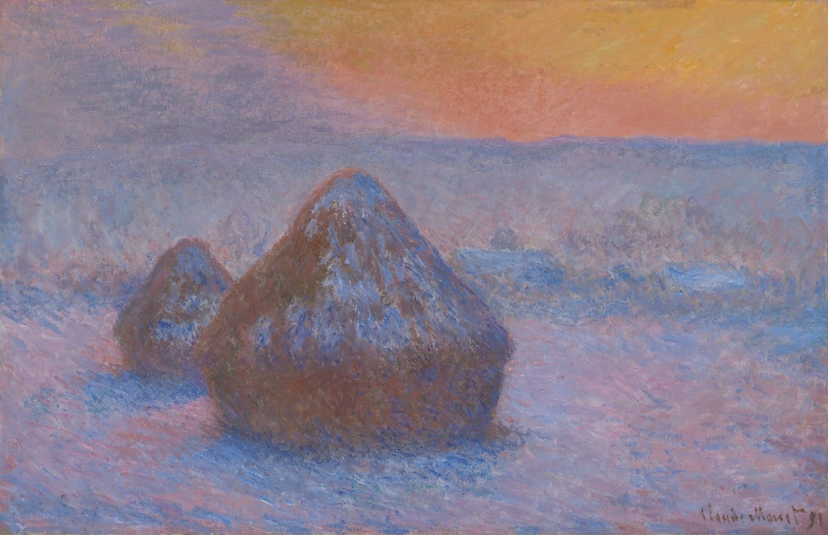
In Ľudovít Čordák’s Wooded Landscape With Little Birches, the ground acts as quiet space and helps lead us through the painting. It also ties it all together nicely.
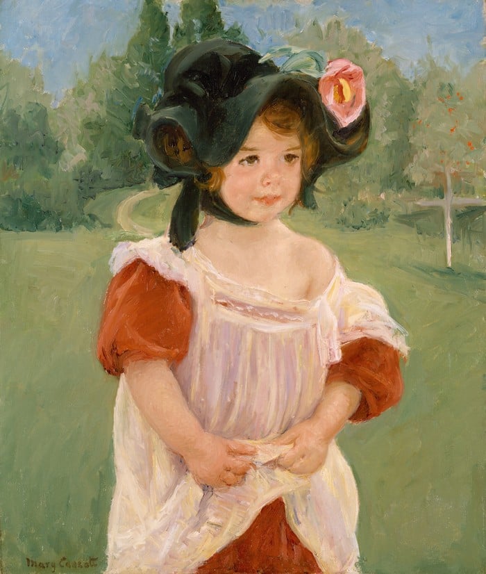
In Mary Cassatt’s Spring, Margot Standing in a Garden, the ground provides depth, context, and a contrasting background for the child. Notice how the less in focus the ground is, the less you need to do with it. In Cassatt’s painting, all she needed to do was block in the greens for the ground to serve its role. Whereas in Čordák’s painting, the ground is more prominent, which warrants the greater color variance and texture.
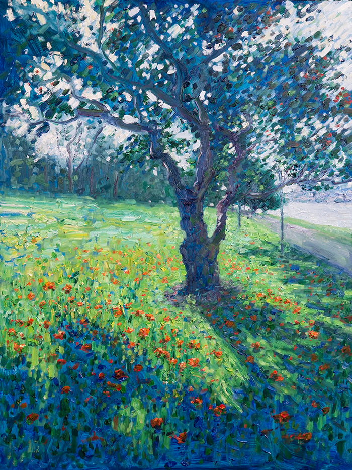
Whilst the ground will rarely be the focal point, it can be a complex and interesting feature in its own right. My painting below is a good example. The tree is the focal point, but the ground is a key feature, with its interesting light and shadow patterns, the fallen flowers, and the dancing greens.
If you want the ground to be the dominant focal point, then you’ll probably need to zoom in. There’s a Brisbane-based artist named Pat Hall. She does some wonderful work featuring close-ups of leaves and flowers. I’m sure you could do something similar with fallen leaves on the ground, or other ground subjects.
What Are You Really Painting?
It pays to get up close to the subject and see what it is you are really painting. From afar, a grassy field may appear as a simple green mass. But as you look closer, you might notice all kinds of other wonderful colors and details. Flowers, rocks, insects, twigs, leaves, patches of dirt, plants, etc. You must capture all this information without getting lost in the tiny details. It’s not easy to do!
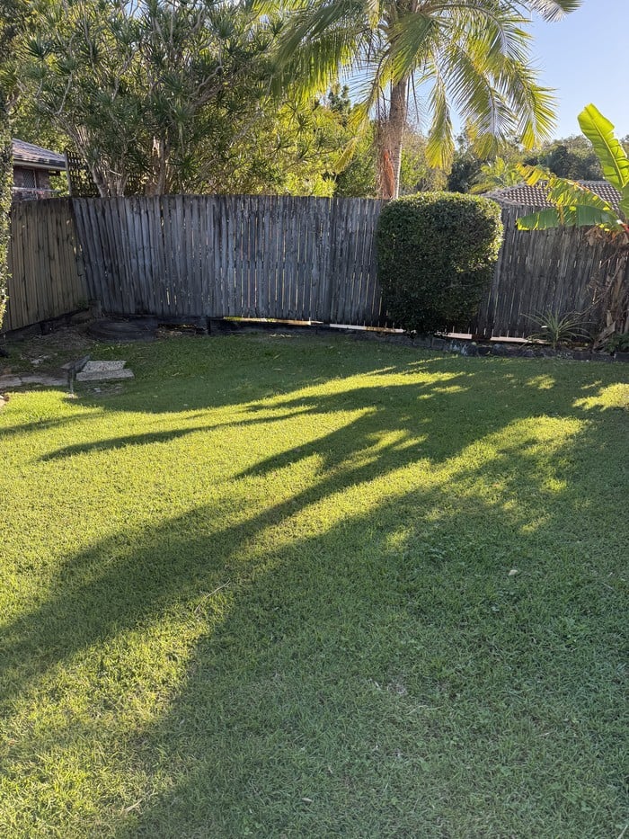
I’ll show you what I mean. Below is a photo of the grass in our backyard. It just looks like a simple green mass, with a few light and dark shapes.
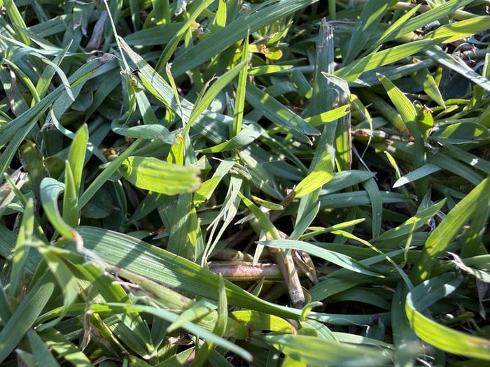
But if we look closer, we can see a diverse range of detail and color. Highlights, shadows, color shifts, dead or damaged strands of grass, dark accents where we can see down to the soil. This is what the subject is made up of. We may not paint all this detail, but it’s important to be aware of it.
Different Types of Ground and How to Paint Them
Below are practical tips for painting the common types of ground that you’ll encounter: fallen leaves, grass, dirt, rocks and pebbles, snow, puddles, and sand. I have kept this succinct and in bullet points as there’s a lot to cover.
Fallen Leaves
- Naturally involves a lot of detail and “noise”. You must aim to capture this without getting caught up in the tiny details. Focus on painting the idea of the fallen leaves, rather than rendering each and every one. Impressionist techniques come in handy here. Multicolored strokes, pointillism, and broken color.
- Color variance is key. You want your colors to dance and flicker on the surface. Constantly tinker with them and make them warmer/cooler, lighter/darker, weaker/richer.
- Consider starting with a flat foundation, then building the fallen leaves on top. That’s what I did in New Zealand, Autumn Colors. I started with a flat green foundation, then gradually built up layer upon layer of fallen leaves.


Grass
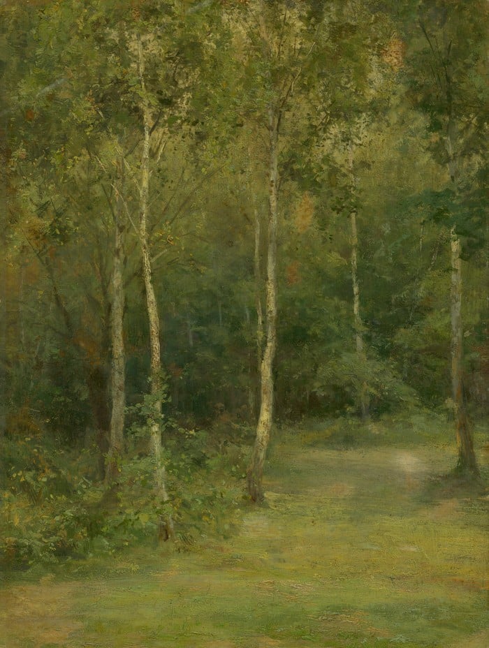
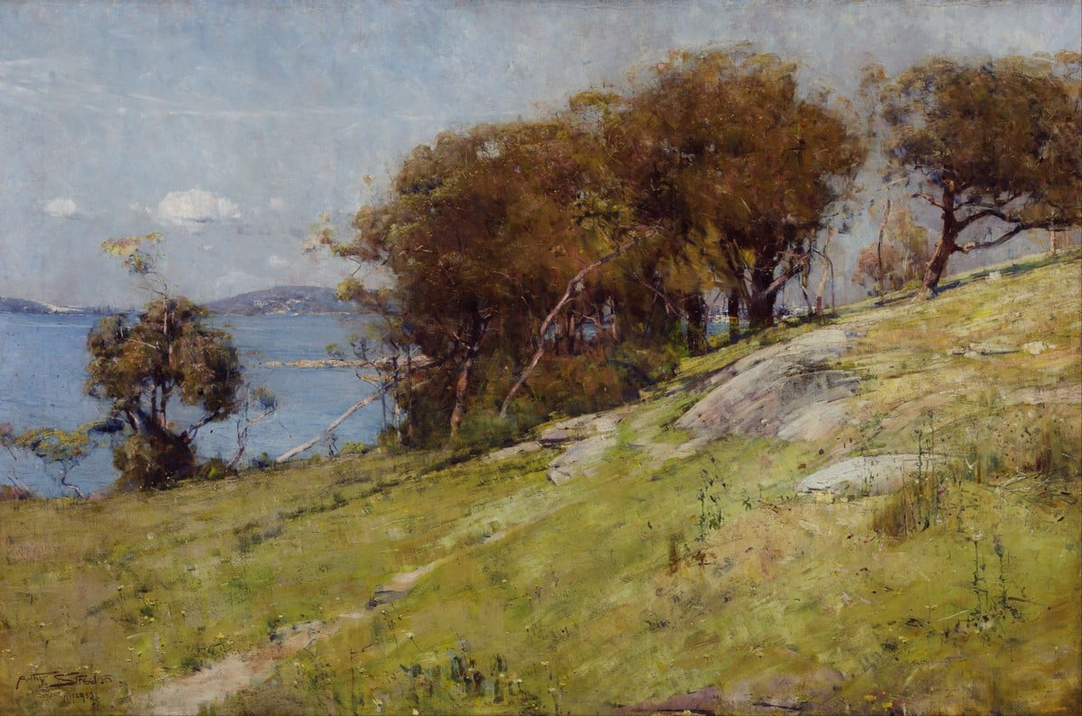
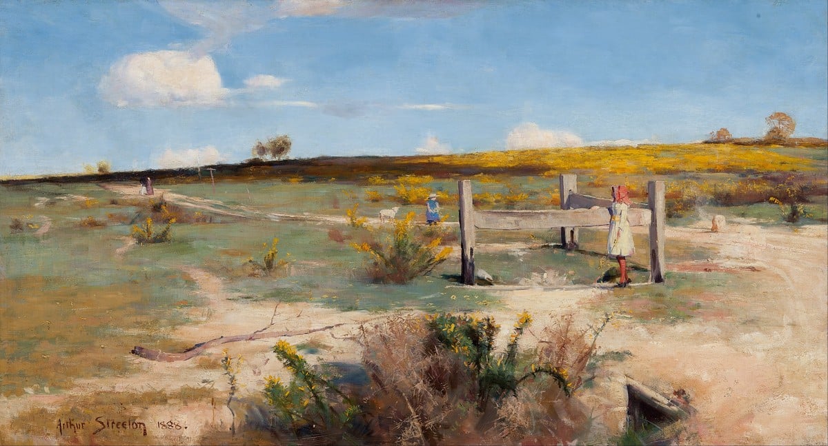
- Simplify! First, see the grass as simple masses of color. Then add detail as needed in the form of individual strands or clusters of grass. Let a few feature details do most of the work in conveying realism. Sir Arthur Streeton did this well. Refer to his Cremorne Pastoral below.
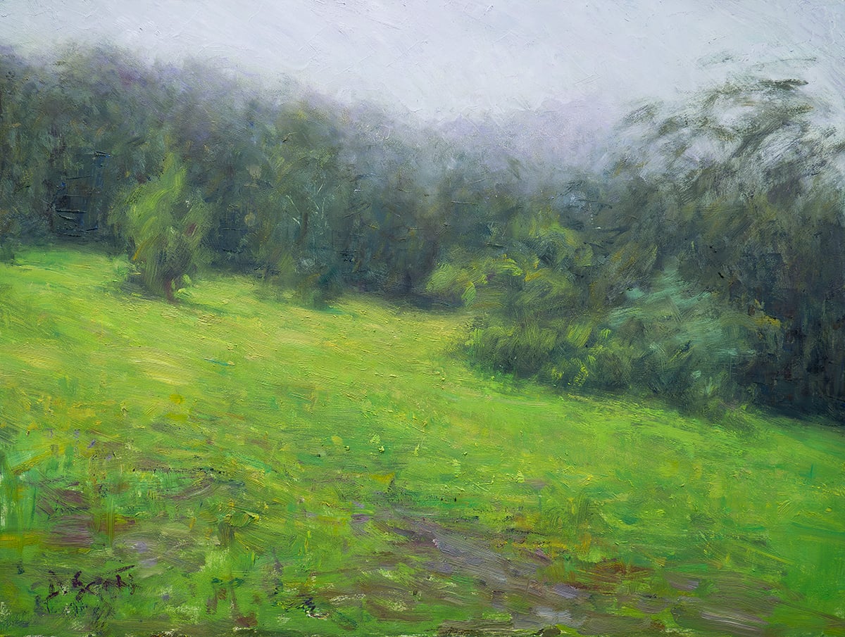
- Pay attention to color temperature, particularly with green grass. There will often be subtle but important temperature shifts that you must convey. If you get the temperature wrong, your colors will appear muddy and out of place. In Misty, Green Landscape below, can you spot the temperature shifts in the grass?
- Use your strokes to convey the broad gesture and contours of the grass and land.
- I typically use more vertical brushwork for foreground areas, and flatter, more horizontal strokes for distant areas.
- You can inject flare without compromising the fundamental structure using subtle color variance and visible brushwork.
- Give your grassy areas purpose and intention. Don’t just have them take up space.
Dirt
- Good for adding bursts of warmth and for breaking up large, simple masses of grass.
- Consider using different brushwork than that of the surrounding grass and plants. I typically use more horizontal strokes to reiterate the contours of the ground.
- Multicolored strokes are effective here.
- Use small, dark accents to suggest stray rocks and debris.
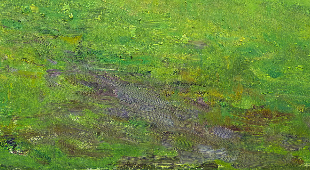
My Misty, Green Landscape painting featured earlier is also a good example of dirt. See a close-up from that painting below. Notice the warm strokes around the bottom. This is a key feature of the painting. Without it, I’m not sure the painting would work. It would be too green and there wouldn’t be any temperature contrast.
Rocks and Pebbles
- Requires a similar approach to fallen leaves. You must aim to capture all the noise without getting caught up in the tiny details.
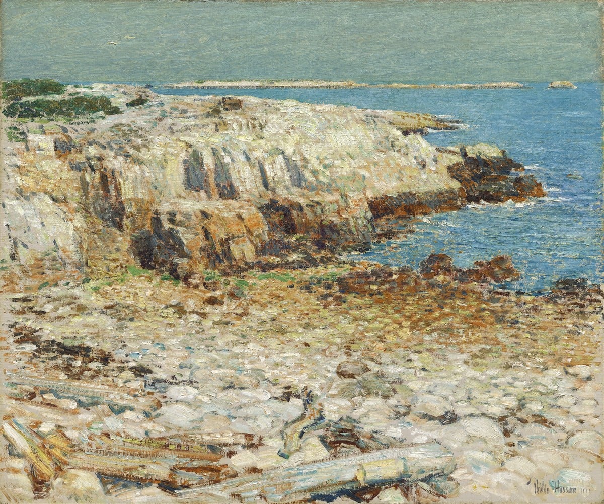
- Play into the idea of pattern and repetition, particularly with pebble shores, where the pebbles tend to be rounded and of similar sizes. My Pebble Beach painting is a good example.
- You’ll typically use lots of highlights and dark accents. But don’t get carried away. Start conservative then build up from there.
Snow
- Don’t default to pure titanium white. Lean into the grays and weak blues, reds, purples, etc. Reserve pure titanium white for the brightest highlights. This will usually be small areas catching direct sunlight.
- For soft, fluffy snow, use softer brushwork and less contrast.
- The palette knife can be effective for creating the appearance of icy surfaces.
- Snow will often provide opportunities to showcase interesting color temperature plays. Follow the rule of thumb: warm lights, cool shadows; cool lights, warm shadows.

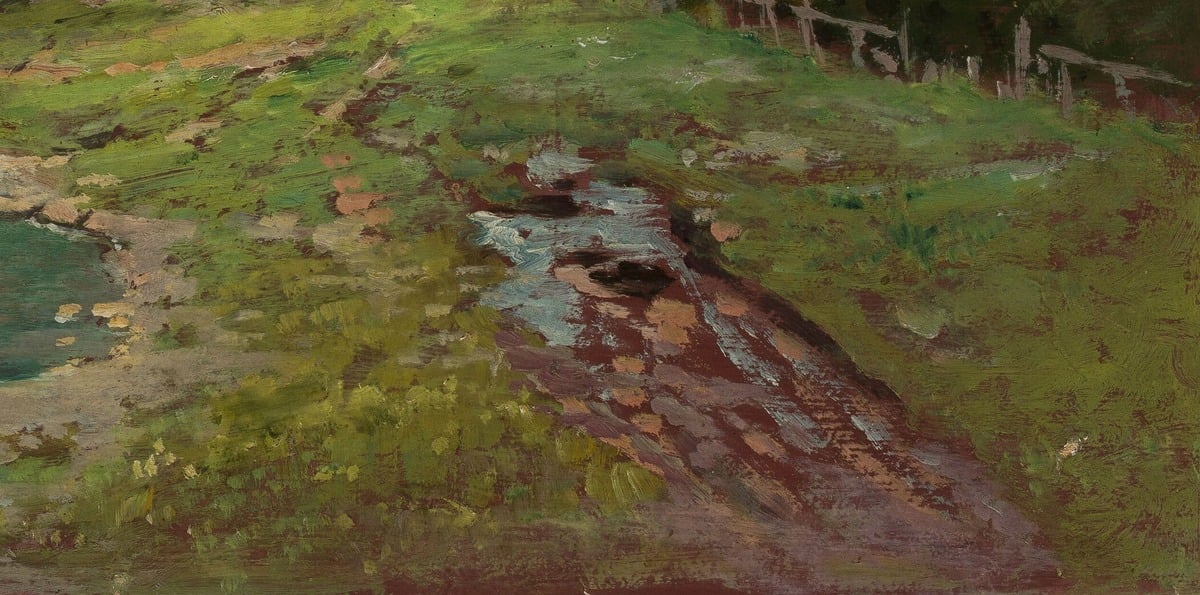
Puddles
- Act as a mirror reflecting whatever sits above/behind. The reflections will change based on the surroundings and your vantage point.
- For reflections, compress the colors a touch. Make the lights a bit darker and the darks a bit lighter than the object being reflected.
- The edge of the puddle should be irregular and broken. Avoid neat, oval puddles.
- The ground around a puddle is typically wet and has a darker, richer appearance.

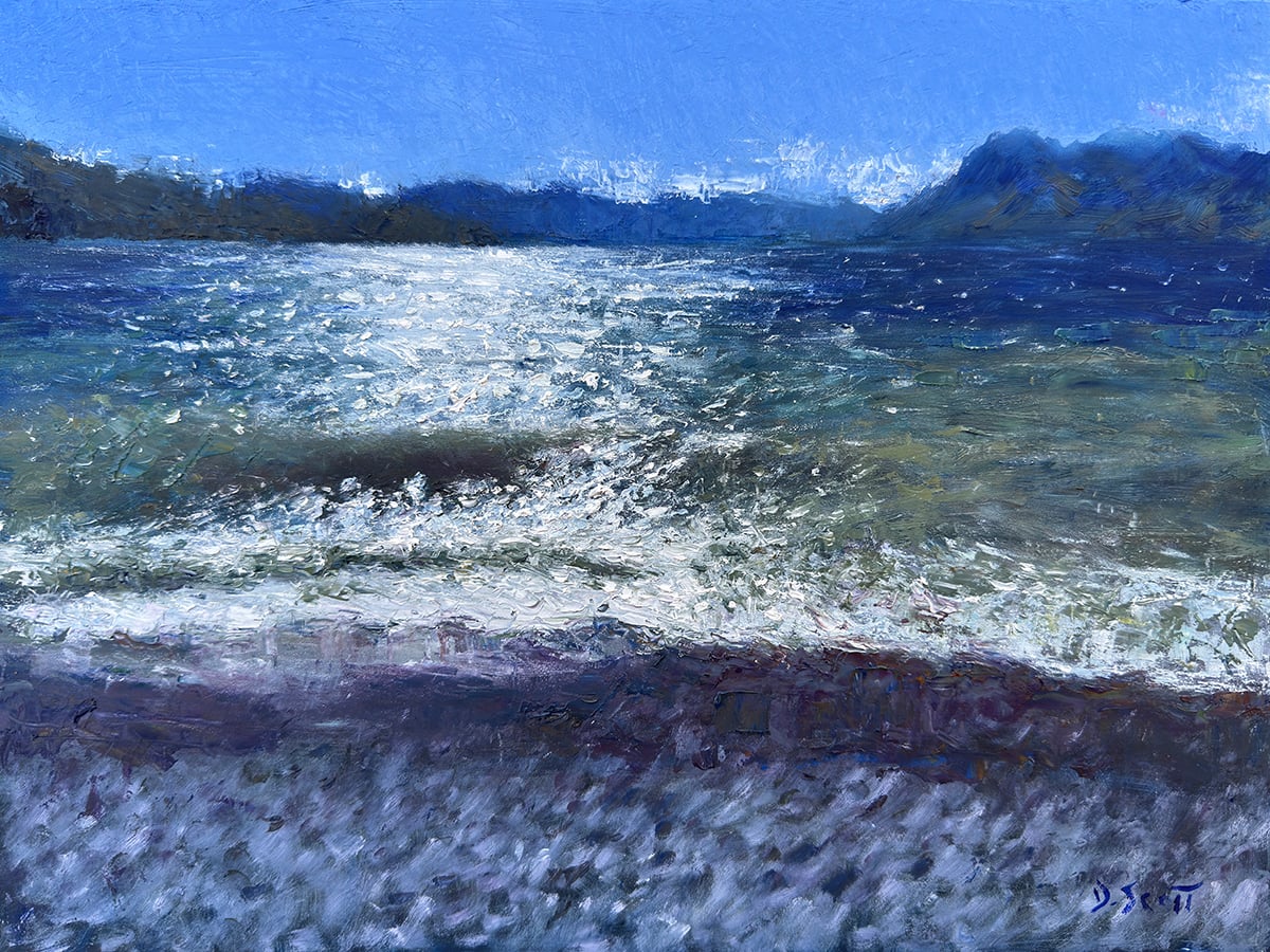
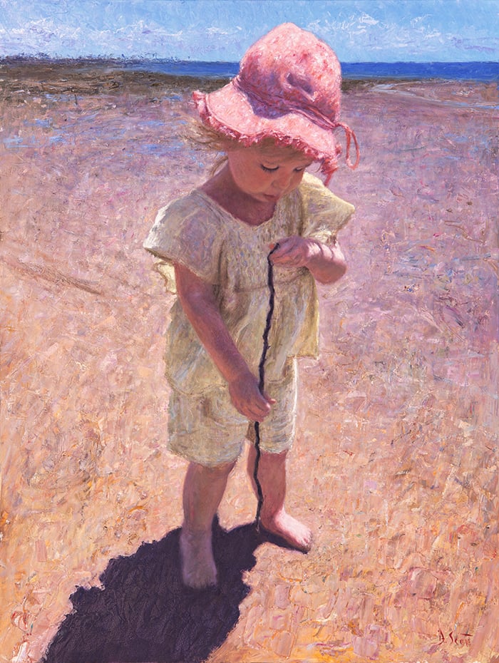
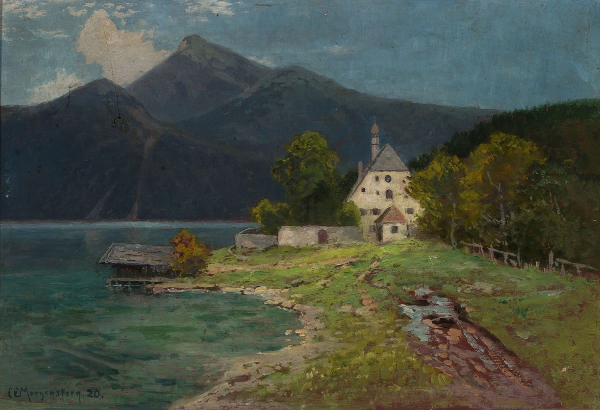
(I know the above painting is more of a pond than a puddle, but it is a great demonstration of how you would go about painting puddles. Two other examples are my Elora at the Beach and Carl Ernst Morgenstern‘s Landscape With a Lake in the Mountains, which are featured later in this post.)
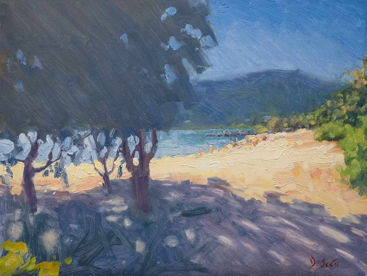
Sand
- Requires a similar approach to grass, but with less detail and variance.
- Don’t make your colors too rich and saturated (lean more towards yellow ochre than cadmium yellow).
- Compress the values and add subtle variance in terms of hue and saturation.
- Use soft edges and broad strokes for the main body of sand. Then break it up with tiny accents and details.
- The edge along the water tends to be wet and have a darker, richer appearance. It will also be more reflective in nature.
- Think about how you can use your brushwork to reiterate the contours and gesture of the sand.
- For finishing touches, add subtle hints of shells, seaweed, pebbles, and debris. Don’t overdo it.

Weaving the Parts Together
It’s not enough to paint the grass, dirt, or rocks well. You must weave it all together in a way that your painting reads as a united whole. Always think about how you can link distinct areas together and how you want the viewer to navigate through your painting. Perhaps you can soften an edge or use common colors.
Let’s go back to my New Zealand, Autumn Colors painting. Look around the foot of the tree. Notice how the dark colors of the tree bleed into the dark colors of the exposed grass. And the several yellow leaves in shadow which ease the transition into the darks of the tree trunk. And how the yellow leaves on the ground link with the yellow leaves hanging off the branch. These things help link the areas together and make them read as a whole.
Carl Morgenstern’s Landscape With a Lake in the Mountains is another good example. The ground features grass, patches of dirt and sand, rocks, paths, and even a puddle. All of this is somewhat distinct, but also woven together nicely. It reads well as a whole; not too noisy or busy. This is partly due to the compressed values. Most of the ground colors are similar in value, plus a few dark accents and subtle highlights. This makes it read as a similar shape. The colors also overlap slightly. There are patches of dirt and paths running through the grass areas. The puddle tapers off through the dirt. And throughout the whole area, you can see glimmers of the warm underpainting below.
Key Takeaways
- The ground is important! Give it a role and paint it with purpose.
- Whilst the ground will rarely be the dominant focal point, it can be a complex and interesting feature in its own right.
- What are you really painting? From afar, a grassy field may appear as a simple green mass. But as you look closer, you might notice all kinds of other wonderful colors and details.
- Match your techniques to the subject. For fallen leaves, broken color and pointillism work well. Whereas for grass, more subtle techniques may be required.
- The ground must mesh with the rest of your painting. Consider how you can create subtle links with the surrounding areas through common colors, soft edges, or patterns.
Thanks for reading! Let me know your thoughts in the comments.
If you ever want to learn more, check out our Landscape Painting Masterclass or our Tree Workshop.
Happy painting!

Dan Scott
Draw Paint Academy
This has been very helpful! I love to paint trees and, of course, there will be leaves that come with them. I work in watercolors so I have to think of how your tips are the same for that medium, or do I need to modify your ideas to be successful. Either way this post will help me think of grasses, rocks, sand, and leaves with better thought on how to deal with them in a painting. I also love the way you have used greens in your paintings.
Dan I love all the paintings and instructions. Do you ever do watercolor? Hope so, thanks so much for all your inspiration!! Mary lee
Hi Dan,
I really love your big tree painting, with the masses of fall leaves on the ground. So beautifully done. My favourite of all your pieces and an inspiration. Thanks for sharing all these examples of other artists’ grass, ground and snow, which I will look back on as needed.
Very good reading and ideas for me. Your painting of Elora at the Beach is beautiful, reminds me of a Mary Cassatt. Nice work Dan!
Very good. Thank you!
Very helpful. Thank you! Lots of important tips, with valuable, relevant examples to clarify your tips in a practical way.
There is a huge amount of information in this guide which I intend to keep for further reference. Shadows on the ground are always a challenge for me . Too dark and they can look like a mass of undifferentiated black/blue these pointers you have published will be a big help. thanks a lot
Thanks so much for this post, Dan, it came at exactly the right moment for me. I am painting scrubland on a derelict building site and have been puzzling for days about where to begin. This has given me so much information and possibilities I’m raring to go again. Incidentally, I adore your painting of Elora not just for the warmth and love you have painted now.
Thank you Dan.
Mmm! I will learn a lot from this email.
I have just got back into painting. . it’s been a long time.
Thank you.
Thanks Dan for this tutorial. It is chalked full of important observations you have made and illustrated so thoroughly with paintings from the masters as well as your own art work. I truly appreciate the time you and Chontelle give in helping others who love to paint. I started painting 8 years ago, at 64, and treasure these emails.
Thank you, i needed this for my current painting – about to tackle gum leaves and bush debris into a rather prominent foreground – i want it to look real but not detract from the main subject!
Thanks Dan. This was extremely helpful, and you have shown me that was bothering me about many of my landscapes. I now have a project for rainy days!
Thank you so much for this tutorial, Dan! Every landscape I do, I fret over how best to deal with these aspects of the scene. Especially vexing is sorting through the too much or not enough problem. You have distilled the subject down to very helpful techniques for handling ground litter, sand and dirt, water, etc. I am just about to start a new piece which has leaves, sand, and ground litter. I think I will handle it more confidently now that you have identified the process.
Not only informative and helpful, but also inspiring and delightful. These posts are gems and I keep them in a special folder – they never get deleted. I’m relatively new to painting and your informative emails are on top of my list.
Delightful, well presented tutorial. One of your best Dan. I will try to adapt your lessons to watercolor, my current medium. All your examples helped me realize what I enjoy and want to emphasize in my painting, which ultimately is light and the play with shadows and contrast. Also I’d like to focus on hints of representation rather than painting entire objects in detail in my pieces allowing the viewer to imagine what they see. Thank you for all you emails, especially this one. Happy painting!
Such great overview and detailed information which is just as important if you use watercolor like I do. Thank you so much again for your generous sharing! I love receiving your emails. They are always helpful and encouraging.
You and your wife are contributing to the joy, contentment, and peace, of all who read your emails. Thanks, and God Bless!
Absolutely brilliant. I’ve looked at ground, leaves, grass and puddles etc etc in a different light. More aware of everything involved in light and shade and brushstrokes. Thank you Dan.
Excelente liçã o. Imensamente grato pela forma como foi dada a explicação de cores .tons e recomendações nas diferentes obras apresentadas.
Thank you for sharing your wonderful experience and knowledge with others. You have helped me immensely over the last couple of years.
Your easy to understand explainations accompanied with pictures make me continue to keep learning from your emails.
This one was especially useful.
Thank you for sharing. I always learn something from your posts.
You are so generous with everything you share Dan. Your comments and descriptions are easy to understand as you relate each topic to specific areas of the painting.
Although I paint with watercolours it is mostly just as relevant.
Thank you. One of the best!
This is a really good tutorial ! How the masters did it is a truely astonishing thing
to me. These examples are beautiful ! Thank you for sharing.
This was a really good explanation which has inspired me more about “the importance of the ground” and how it must link into the whole picture. Thank you. 👍😁
Great article. Lots of important info,thank you!
Dear Dan and Chontele, I love receiving your emails! Thank you for sharing your love of art and techniques with us.