
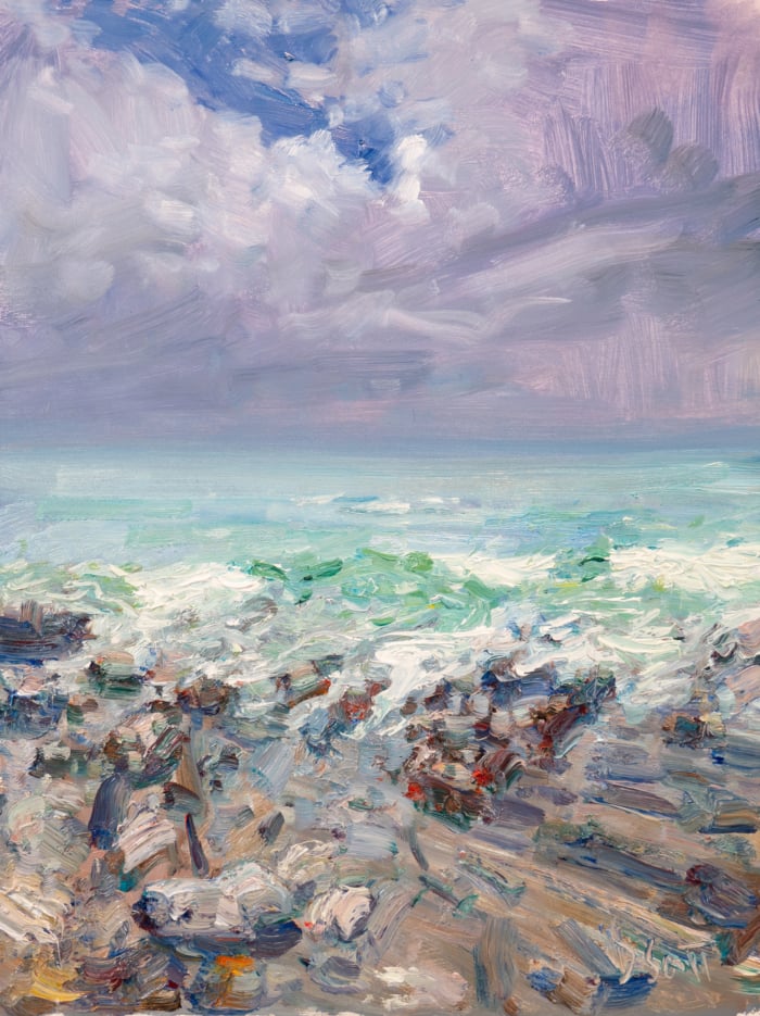
I’m about to start a new painting. But before I make the first strokes, I want to invite you behind the scenes of my painting process.
The subject I want to paint is a pebble beach Chontele and I visited on our New Zealand honeymoon back in 2024. It was a very paintable spot (like most of New Zealand). The distant mountains glowed blue. The lake had this wonderful gradation from a pale sandy color around the shore, to turquoise, to deep blue. It was so windy that you had to lean into it to stay upright, and this was chopping up the water. But the most striking part of the subject was the blinding light bouncing off the water’s surface. I had to squint as I took photos.
I have been set on painting this for some time now, it has just taken me a while to get around to it. The problem is, I have eight photos of the subject with slight variations.

I want to share how I decided which one to paint. It may not seem like a big deal, but I put a lot of thought into it. I sat there for some 20 minutes scrolling back and forth through the photos to work out which was the one. Below are my thoughts.

Not feeling this one. The water appears a bit blocky and rigid. I also prefer moments when the water has receded a bit, leaving parts of the sand glistening wet.

Better. But I don’t like how the wave is breaking on the edge of the frame. It draws our attention out of the painting.

The highlights feel a bit static through the middle (notice how it forms a rough triangular shape). I would prefer more of a zig-zag motion.

Decent, but I find the wave detracts from the highlights on the water. I want the highlights to be the focal point, not the wave. I imagine many people would pick this one to paint.

Same with this one. The wave detracts from the highlights on the water.

The dark part of the water creates too much of a break in the visual path. I little bit of a break is fine; too much is distruptive.

The water lacks a sense of structure and movement. It appears too flat and stagnant.

This is the one! There’s a sense of continuity and flow with the highlights on the water as they zig-zag through the waves. The water has a sense of movement and activity, but not so much that it becomes the focal point. And most importantly, it just feels right.
Which variation would you paint? Feel free to let me know in the comments and why. (There are no wrong answers here.)
Now, time to start painting! I’ll let you know how it turns out.
Thanks for reading! If you want to learn more, you may be interested in our Landscape Painting Masterclass.
Regards

Dan Scott
Draw Paint Academy


I chose the last one, no. 8 immediately. It was the only one that would naturally take me through a painting. Starting at the shore moving through the water to the horizon.
Well, I would have combined elements from two or more, and/or would have “winged it” on aspects I didn’t like. Copying a photo EXACTLY rarely, if ever, works for me
If the shimmering light off the water and the movement of waves share the primary subject, then #8 is a good choice.
But I’d cut the sand area down. In #8 the sand is about 1/4 the area. The light on the sand is wonderful but the lighted water is the path.
Plus the beach as it is in the photos is a bit featureless – unless the mood you’re going for is the tension between the movement of water and the solid grounding of the sand.
Agree that the calmness of shimmering light on the sand echoes and contrasts that on the water – so if light is the main focus it works as a tension/serene duo in #8.
I like variation #3 because the water is forming a triangle inverted to the mountains at the top, which I think is interesting compositionally.
It’ll be fun to see your finished painting and the sparkle though!
I’m sure it will be beautiful!
Hi Dan, I chose 4 because I liked the wave. I would use artistic license to bring the highlight through the wave
at the front giving a sea green pop of colour and some warm white foam.
You are right. Number 4 for me. The memories the photo conjures up.
I can hear the water, as the wave rolls in and reaches the beach, releases and withdraws to build again. Love it. The water line on the beach has great appeal for whatever reason! The moonlight showcases the whole scene. Thanks for sharing.
I have been sneaking in and watching you for sometime and I believe it’s time that I say thank you to you. I am an art educator and and have appreciated the effort that you put in to all of your postings. Thank you very much for being there.
respectfully, Lyn Taylor
Number 5 has more energy and interest for me. But sometimes we choose what reminds us most of the memory and feelings of the moment. The place.
Do you have a watercolor course?
I would have chosen #6. It’s very similar to #8.
Unlike all the other comments I’ve read , I would choose 3. The problem for me with 8 is that the several dark areas in the foreground take up about a third of the photo and I find them not very interesting. I like the foam in 3, and it fits this scene for me (though I wouldn’t know how to paint it). However, I would adjust 3 so the highlights on the water are in the 1/3 area of the painting, as they are in 8. That is one of the appealing things about 8.
I often paint from reference photos, but that is to ensure that the colours are as true as I can paint them. If I had all these photos, I would probably change the sea to suit my mood.
Thanks for your descriptive analysis, of what to look for, and how to discriminate between each photo. As a beginner painter, I respond really well to this type of teaching. I also enjoy your time-lapse videos of constructing a painting, from beginning to end. I appreciate you! (From an ex-Queenslander).
I would have chosen 4 or maybe even 5, but I see your point with the one you chose.
In 4 I would continue the glisten on the foreground receding wash, to lead you back, via the motion of the water, to the main focal point which is the glimmering ocean.
Thanks Dan for sharing this with us. This sort of thinking really helps with our own decision making.
I recognise the dilemma (or is that an octo-lemma?). My usual approach to this is to draw a few thumbnail sketches to try out different compositions, then a larger sketch to check it really works. Often this combines elements of several reference photos, and cheerful manipulation of elements until I land on a painting design. That being said, I agree with your option 8 and thanks heaps for showing us all the reasoning that lay behind your choice – really helpful!
I would combine the wave in 4 and 5 so that it rolls back and leads your eye to the sparkle. Also these types of waves are a challenge to me so there’s that. Thanks for thinking out loud for us!
This was my choice as well. Most probably from what I have learned from your courses Dan. Thank you for all you do for fellow artists
I suspect you did not lay them out for yourself as you did for us since you mentioned flipping back and forth. I would paint the one which immediately captured my eye in that layout of 8 photos…which was the same one you ended up with.
I’ve done that flipping back and forth of photos on my phone, but never again. I’m going to lay out the photos as you did here. Lesson learned!
Further, I would increase the curve of the receding water slightly to lead the eye just a bit more. I would extend the glisten of the damp sand a little closer to the viewer in a convex curve in opposition to the concave curve of the receding water to invite the viewer more into the experience. Since I enjoy punching visual holes in my canvases, I’d also play with the blue of the farthest mountain to extend the impression of distance and move the right shore closer to the viewer.
Great choice for the right reasons. I also have trouble choosing which photo or parts of 2 photos to paint.
Thanks for this.
I would have chosen 4. You see more of the dominate element (water) and get a strong sense of motion and the feeling of pending motion with the forming wave in the mid ground.
Without reading your comment I chose #8, it is the one that felt right to me.
Thank you for sharing your process. Personally I love the rhythm in the composition of version 5. The transparency of the water on the shore balances the solidity and the curve of the edge of the lapping wave creates an amazing pattern and continuous movement with the glimmering light though it offers different textures. Fabulous photo!
I like number 5. Almost a line across the middle made by breaking wave, another almost line of green wave forming above and action middle foreground of new wave breaking and previous wave water receding.
Your description of the weather conditions and your reasoning for painting this scene should be enough to put your feelings into the painting. Paint your emotions rather than copying a photo rote. Pick elements from all the photos and paint and emotional composite.
I would choose 5. The wave adds interest to the foreground, and its triangular shape points to the triangular shape of the highlights in the midground. It’s beautiful and doesn’t lead your eye off the sides of the page.
I agree with your choice. I see what you mean about waves breaking at the edge of the painting. I’ve painted waves like that, and now see that is a mistake. Thanks. Good lesson.
Thanks again Dan, your perspective makes me think. I would have probably chosen #4 liking the wave action in the middle and not considering it could be taking away from the overall effect of the painting.
Can’t wait to see your painting
I would combine #s 4 & 8, as to me the wave will always take precedence. Normally I use many photos to create a painting but then I’m a photographer not a painter & if I can take an awesome photo why paint it(?). So I try to paint unseen reality I suppose. Thnx as always for sharing!!
Personally, I would have picked 5. It looks more balanced to me somehow. I really like the movement of the water in it. The waves, the light in the water behind those, and the thin layer of water on the sand (I like that there’s more of it in this shot).
This is most interesting, and a quandary I am also dealing with (also with a beach scene). I like your choice, and I also like the idea of painting #5, with just a touch of “bumped up” highlights in the receding wave, to draw the viewer toward the focal point. I like the way the wave that is just about to break shows the light and the way it affects the color of the water. I also like the way the line of the wave echoes the horizon (being careful not to make the value too dark).
Nice photos, they all bring something different to the table. My vote is for number 5. I like the wave and agree with Mary and the others who liked that scene too. I know you will do justice to the scene you chose…thanks for making us think about what makes or breaks a scene.
I might have picked 2. The extreme light is still the main topic but the water to the right and left show movement. The best of both worlds.
Thank you for this!
Definitely variation 5!
The middle wave in the middle shows vigorous movement and it leads the eye up towards the relatively ‘calmer’ waters further offshore and then back to the beach. The result should introduce a to-and-fro sensation of continual movement.
I would avoid most of the others because the horizontal ‘bars’ of light/dark areas tend to kill a composition
Thank you for sharing your thoughts on all of these. I find the thoughts behind the artist (kind of like behind the scenes) is the best way to learn. I agree with your choice. My choice was between #5 and #8. Can’t wait to see your final creation!
I would pick #5, to me it has everything you were looking for, plus it’s beautiful!
Thank you for sharing and including us in your journey.
I really appreciate the insight on your analysis, it’s very educational. Please post more like this. Thank you.
I would have chosen the same variation as you. I like the way the wave edge has an arc-shape which is sort of repeated in the almost breaking wave. That arc leads my eye into the painting and the shimmering water and then, because those lines slightly angle up to the right hand side, my eye travels beyond the shimmer to around the corner of the middle distance (roughly speaking) headland. For me the balance of elements feels ‘right’.
I believe the energy in #5 would be interesting to try capturing in a painting. The eye runs to the wave area first, then moves to the highlight area. You mention it was not a calm day, and the photo showcases a dynamic moment in time…
Great post , as usual, and thanks especially for pointing us to Benjamin Zander’s TED talk – it was wonderful on so many levels.
I would like to go for No 4 or 5 for the waves although I think no 7 might be less difficult to paint. I am sure no 8 will look spectacular.
I love waves and water so would probably go for No 5 – if I could paint waves and water splashing like that! I look forward to seeing your finished painting
I would have chosen 6 or 8 because of the better ratios of land to foam to sea to mountain. I think too much foam will end up as mud (well certainly if I painted it myself LOL). The foam is too consolidated in all of the photos, and the mountains are too narrow a band in all of the photos. But 6 and 8 are the best.
I would agree I feel this is the photo I would use. The sand lead you through the waves into the middle of the lake towards the light. And then veers one off around the curve to the right in between the mountains. It is a photo that directs one.
I would have chosen the same one as you. The moment l saw it, it felt ‘right’!