
George Henry (1858-1943) was a talented Scottish painter who attended the Glasgow School. His paintings demonstrate rich colors and strong contrasting elements.
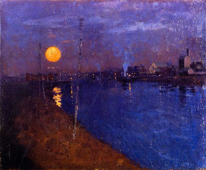
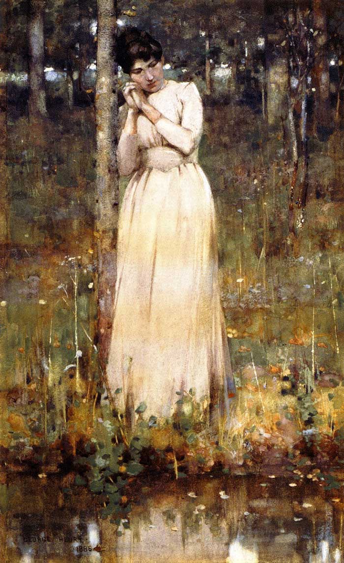
My favorite painting by far is River Landscape By Moonlight. This is a perfect demonstration of how you can paint the illusion of light. As you are probably aware, we are not able to duplicate the effect of light itself with our paints. But we can come pretty close by painting the relative contrast of light, as shown in this painting. Henry used a sharp contrast in not only value, but also saturation and hue. The result is a small area of great impact, similar to what light itself would look like. Also, notice how this small area of impact seems to balance against a much larger area of more subtle elements.
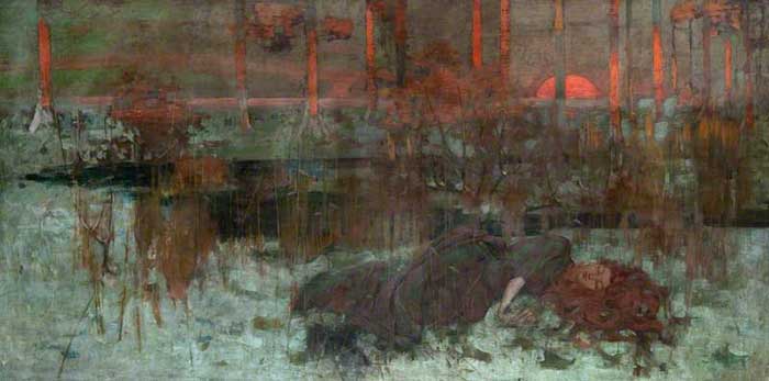
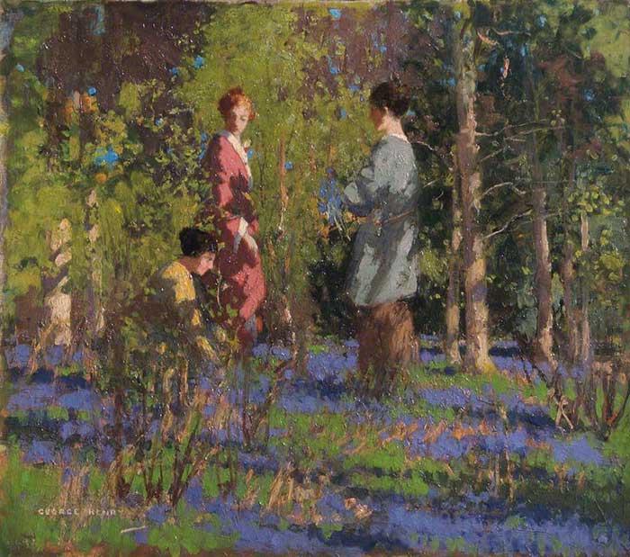
Below is another painting by Henry which utilizes sharp contrasting elements to create a very close rendition of light. The painting can be broken into two main areas – the foreground which is in shade and the background which is in light. These two distinct areas provide an interesting design.
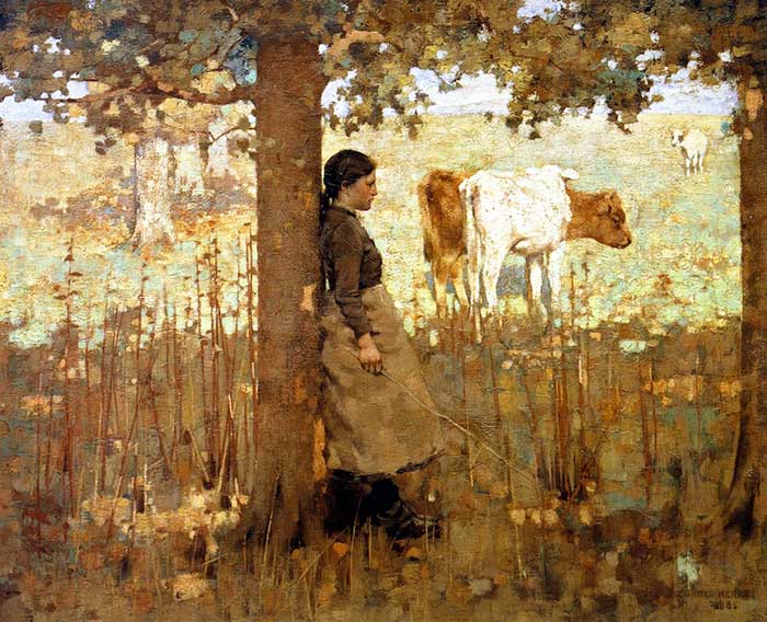
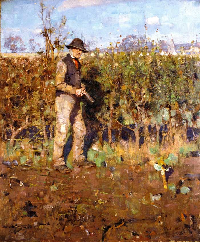
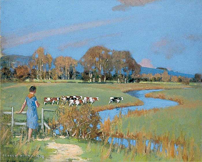
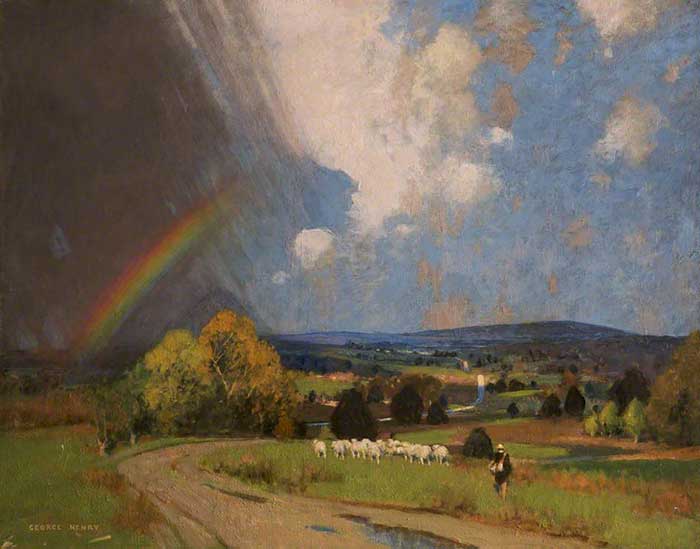
Here are some more paintings by George Henry for your enjoyment:
Want to Learn More?
You might be interested in my Painting Academy course. I’ll walk you through the time-tested fundamentals of painting. It’s perfect for absolute beginner to intermediate painters.
Thanks for Reading!
I appreciate you taking the time to read this post and I hope you found it helpful. Feel free to share it with friends.
Happy painting!
Dan Scott

Draw Paint Academy


In the presentation of any artwork, there are ‘five’ pieces of information that must be included in the caption: name of the artist, title of the work, medium, size/dimensions, and the date the work was executed. I always ask my students to be very precise and specific if they include any images in their papers. I also make sure that I would give these along with the images I include in the handouts I create for them. Since I often refer them to your site (as an excellent reference–kudos!), please make sure that you also include the complete set of information with each image. It is only fair to the visitor.
He caught a rainbow, that is so neat. So much unusual detail for a time with out cameras like we have today. I appreciate your sharing. Feels like we’re going to a museum of art with someone who appreciates and can express the feelings from the art. Thanks. ?
No problem Kat 🙂 Yes he created such unique paintings. I love the rainbow painting.
Dan
beautiful; an inspiration to a young painter, sadly, envy from one who hasnt started ’til he was old and gray.
Thanks Dennis. That comment really makes you think. Dan
Very nice paintings. My favorite are “Noon” and “Landscape with rainbow”. Also I understand what complicated is to put in practice the notion of value, hue and saturation. When I accumulate more knowledge it seems that painting became more difficult.
Hi Valentina. Interesting comment. It reminded me of the following quote by Edgar Degas:
“Painting is easy when you don’t know how, but very difficult when you do.”
Dan
Beautiful paintings. Thank you so much. What a gift he had.
No problem Ginger 🙂 Dan