(My “On the Easel” posts give you a behind-the-scenes look at what I am working on, what went well, what went wrong, and lessons learned.)
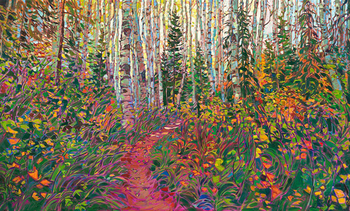
Below is one of my recent paintings, Montville, Red, Yellow, and Green. It depicts the beautiful landscape of Montville, Queensland, Australia. We spent a few nights there around the end of 2022. It was wet and overcast, but the colors were out in true force.

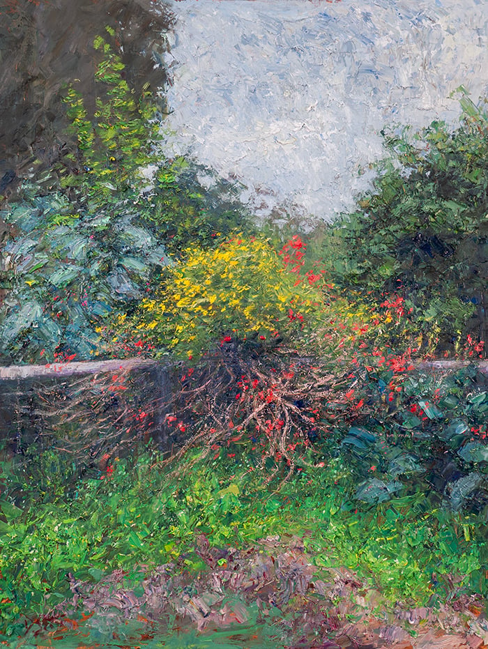
Reference Photo
Below is the reference photo I painted from. Feel free to paint it yourself. You can also download a high-resolution version of the photo here.

Supplies
Here’s what I used:
- Brushes and oil paints. I also used palette knives sporadically.
- Surface: Ampersand gessoboard, 12 by 16 inches.
- Main colors: Ultramarine blue, cobalt blue, cadmium red, magenta, cadmium yellow, cadmium yellow light, viridian green, transparent brown oxide, and titanium white.
Refer to my supplies list for more details.
Notes and Lessons Learned
- The painting is all about contrast. Contrast between the vivid red and yellow flowers and the dull surrounding greens. Contrast between the light sky and the dark landscape. Contrast between the warm greens and cool greens. Contrast between the intricate details and simple masses.
- This was a challenging subject to paint with all the detail and “noise.” It was essential to tune out the noise and see the subject as an arrangement of basic shapes and colors. Otherwise, it would have been easy to get lost in the detail.
- To help simplify the subject, I broke it down into parts that I could tackle one by one. This also helped me convey a sense of order and structure.
- There are many different greens that I needed to pick up: rich greens, dull greens, cool greens, warm greens, light greens, and dark greens.
- I left the intricate details until last, such as the vivid flowers, the branches shooting out from the middle, and the fence wiring. I find that if I paint the intricate details too early, I end up spending the rest of the painting trying to protect them. It’s also easier to paint the intricate details with all the other shapes and colors in place, as I can make more informed decisions.
Progress Shots
Below are some progress shots. My overall process for this was to stain the surface, map out the major shapes and colors, refine, and finish with the intricate details.


Thanks for Reading!
I appreciate you taking the time to read this post. Feel free to share with friends. If you ever want to learn more, check out my Landscape Painting Masterclass.
Happy painting!

Dan Scott
Draw Paint Academy