

John Singer Sargent rose to fame for his finely rendered oil portraits. At his peak, he was one of the most sought-after artists for portrait commissions. But, he was also a remarkable watercolorist. I cover the following in the post:
- Impressionist Brushwork
- Strong Accents
- Thin Washes
- Intricate Detail
- Light, Shadow and Color Temperature
- Some Other Interesting Facts and Ideas
- Other Resources
- Thanks for Reading!
Watercolors brought out a different side to Sargent’s work. His meticulous oil portraits feature muted colors, dark and imposing backgrounds, and finely rendered subjects. On the other hand, his watercolors are generally much more relaxed, with loose brushwork and an impressionist feel.
I imagine that after slaving away over his portrait commissions for important (and probably also needy) people, some of the joy may have been taken out of painting for him.
“Every time I paint a portrait I lose a friend.”
His watercolor work probably felt like a refreshing break. He ended up creating over 2,000 watercolors during his illustrious career. I feature some of them in this post along with my commentary.
I’ll walk you through the entire process using one of my recent paintings. You’ll see how I go from idea all the way through to reflecting on the finished painting.

Impressionist Brushwork
If you were not familiar with Sargent, you could easily mistake him for one of the Post-Impressionists based on his watercolors alone. He used loose and expressive strokes and left much up to the imagination.
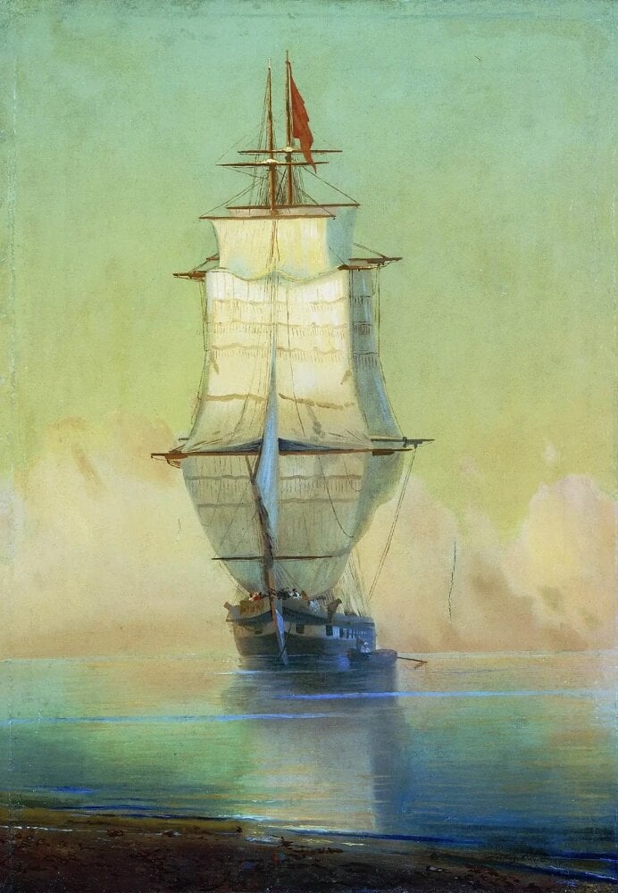
In Ships. Venice, Sargent used long, sweeping strokes for the water. The colors weave into each other, creating the illusion of movement. The boats, by contrast, were painted with more rigid and broken brushwork.
Tip: Most of the time, it can be effective to match the nature of your brushwork to the nature of the subject you are painting. If you are painting smooth and calm water, then use smooth and calm brushwork. If you are painting rigid architecture, then use rigid brushwork.

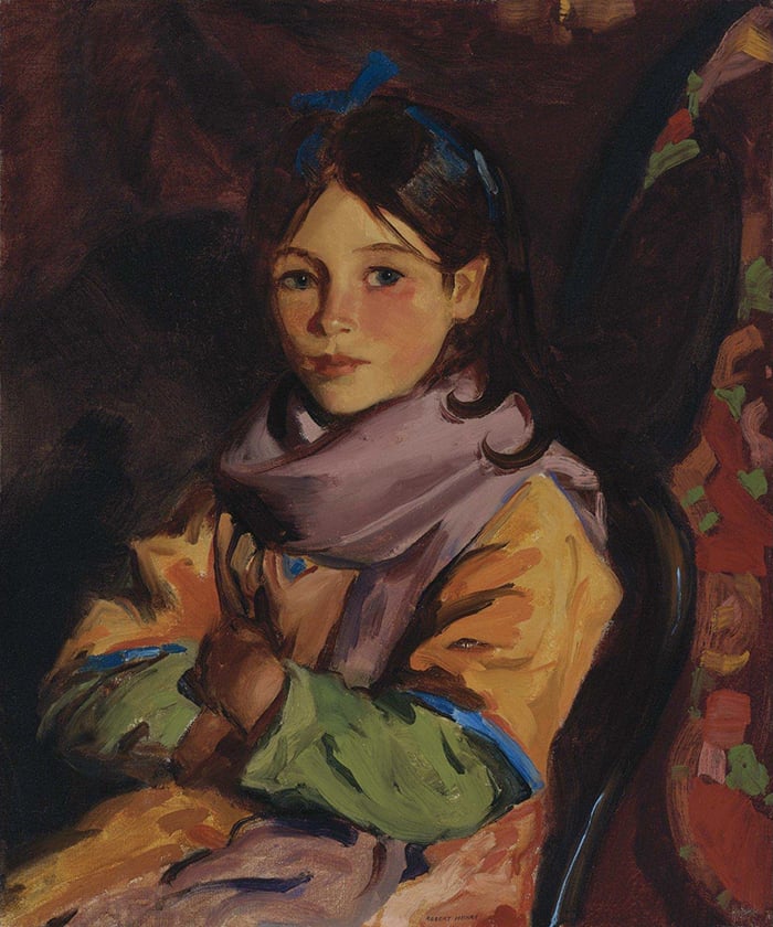
In the painting below, Sargent used relatively intricate brushwork to match the girl’s face. For the rest of the painting, Sargent used a variety of strokes to merely give the impression of a dress and the surrounding nature. Without the subject’s face, you may struggle to understand what is going on in the painting.

Take a close look at the rocks in the painting below. It is really nothing more than an abstract arrangement of light and dark shapes.

For comparison, below is one of Sargent’s oil paintings based on the same subject.
Although the watercolor was painted with much less detail, it still appears realistic on first glance. That is because Sargent used fairly accurate values, colors, and shapes.

Strong Accents
Sargent often used large areas of “flat” color shapes along with strong accents to draw your attention. By accents, I mean small areas of significant contrast (usually light, dark or vivid color).
Below is a great example of this. Sargent used thin, transparent washes of color for most of the painting (it reminds me of J. M. W. Turner’s work). Sargent then added dark, opaque accents around the center to really draw your attention.

In Abandoned Boats, simple color shapes make up the trees and parts of the water. Strong accents were used to paint the abandoned boats and their reflections.

Sargent painted many watercolors of Venice like the one below. For the buildings, notice how they are basically just large color shapes with dark, yet simple accents over the top. This is a powerful combination which you will see in many of Sargent’s watercolors.

Thin Washes
Many of Sargent’s watercolor landscapes are nothing but simple and playful washes of color. (This goes to show that you don’t need to try and create a sophisticated masterpiece with every canvas you touch).


, 1896")
Intricate Detail
The intricate watercolors below appear more like realistic drawings than paintings. Sargent demonstrated his remarkable control and accuracy with a rather limited color palette.


Light, Shadow and Color Temperature
The watercolors below feature interesting patterns created by light and shadow. Also, notice the clever use of temperature contrast throughout the paintings. Sargent was constantly jumping from warm to cool to warm, whilst maintaining a consistent theme throughout the paintings.
For the white ox painting in particular, the overall theme seems to be warm lights and cool shadows (rich browns for the lights and cool blues for the shadows). Sargent took it a step further by using temperature contrast within the shadows. The end result is a sophisticated interplay between warm, cool, light and dark colors.


Some Other Interesting Facts and Ideas
Before I wrap this up, here are some other interesting facts about Sargent’s watercolors:
- Sargent’s watercolor palette comprised of Alizarin Carmine, Brown Pink, Burnt Sienna, Cadmium Yellow Pale, Chrome Yellow, Cobalt Blue, Gamboge, Lamp Black, Rose Madder, Ultramarine Blue, Vandyke Brown, Scarlet Vermillion, Deep Vermillion, Viridian, and an opaque white (source).
- From what I have read from other artists, photos really do not do his work justice. You need to see his watercolors in person to truly see his brushwork, transparent washes, and use of opaque colors. Unfortunately, his watercolors are not displayed as prominently as his oils, perhaps due to the fact watercolors tend to be more fragile and fade in light.
- Unlike oils, watercolors are highly portable and dry fast. This allowed Sargent to create so many artworks whilst traveling all over the world to places such as North Africa, Switzerland, Spain, France, and Italy.
- Sargent never made attempts to sell his watercolors out of principle. He made most of his fortune from his portrait commissions, so selling his watercolors was probably not a high priority and did not align with his vision as an artist.

Other Resources
- John Singer Sargent Gallery: Showcases Sargent’s best drawings and paintings.
- How to Paint like John Singer Sargent: Details about Sargent’s techniques and processes.
- A Closer Look at Portrait of Madame X by John Singer Sargent
Thanks for Reading!
I appreciate you taking the time to read this post and I hope you found it helpful. Feel free to share it with friends.
Happy painting!
Dan Scott

Draw Paint Academy


I admire Sargent’s paintings! I appreciate the numbers of his work you have and the explanations! This is like a study and I hope to remember your comments.
Thanks for putting this together and sharing. His brushwork and these watercolors are intriguing, so different from Sargent’s usually seen work. I did google ‘John Singer Sargent watercolors’ and a lot of pictures came up and also some Amazon books. It would be interesting to see what surface he painted on and what size these watercolors are. I work as a commercial artist doing advertising for pharma companies so even his ‘paughtraits’ would probably seem like liberating work to me!
Hi, I am wondering if Sargent sometimes did not sign his watercolors?
Thought this might be of interest regarding his oil commissions: In 1907, Sargent declared that he would no longer paint portraits on commission. “No more paughtraits,” he wrote to his longtime friend Ralph Curtis, using his personal and satiric spelling of the genre that had made him famous. “I abhor and abjure them and hope never to do another especially of the Upper Classes.”
No wonder he felt free with his watercolors. My mother was an artist and during the Depression she was asked to paint a rich woman’s child who happened to be obnoxious. Despite badly needing the money she declined! At the end of her life she said she was lucky she had chose not to be a commercial artist and been able to do the art she wanted.
Great story!
Thanks Dan, really loved your take on this.
Really inspiring.
Thank you for putting this lovely work together.
Really kind! Also if I find a goodie I will let you know
Thank you so much. I love his vibrant colour glazes and no-one can beat him for his way with fabric. Can you tell me the best book of his watercolours please.
Thanks Vivienne! Not sure regarding the book. But I will have a look round as I would be interested in such a book myself. Cheers!
I do a lot of studies of Homer’s works – it’s a whole diff experience with Sargent; he is so intuitive and organic with his brush work that studies come of forced. Not that it isn’t worth doing – you really get an appreciation of brush strokes and his palette (very cool that Dan Scott talks about this above). I’ve also heard that photos don’t do justice to his work – I look forward to seeing some of these in person!
I am learning so much from the many artists you feature – almost like being in a class with them. I look forward to learning more as I view those to come. Such a great education! and all at my finger tips. Thank you Dan.
Enjoyed all of John Singer Sargent’s work..thank you so much for posting them
Excellent post, thank you! Really enjoyed seeing his watercolors.
Thanks, for seeing work of Great Artist, &detail ,explain by Dan,
Excellent summary of Sargent’s watercolours. I was lucky enough to see his watercolour exhibition at Dulwich gallery London year before last. You’re right – photos don’t do them justice.
BTW I just discovered your site. Great range of articles!
I love Sargent portraits. Was unaware that he did so many water colors. Lovely. Thank you for sharing.
Thanks again for another informative article. I’ve just seen the Sorolla Exhibition at the National Gallery and thought that some of his paintings were similar in style to Sargent, what do you think?
Hi Sheila. I am jealous! Yes I completely agree. Though I think Sargent is a bit more refined in his oil paintings. Thanks, Dan
Hi Dan,
Thanks for this …just beginning so would you please explain MORE ABOUT what you mean by temperature contrast within the shadows? In the ox painting.
Thanks, S. KELSO
Hi Shonna. If you look within the shadows, notice how some colors are slightly warm and some colors are slightly cool. But, as a whole, the shadows are cooler than the lights. Kind regards, Dan
I really find your articles most informative and interesting. Thank you, this teaches us so much.
Thank you, thank you!
Happy 30th Birthday for the 29th Dan.
Thanks for all the inspring art info. you keep sending.
What an inspiration for my artist block! Thank you, Dan. Into the studio go I!
Thanks so much Dan . Actually never knew about the watercolours . They made my heart beat faster !
?
Thank you Dan, I enjoy reading your articles and find this one particularly inspiring as I endevour to paint with watercour myself. This collection by John Singer Sargent teaches us so much about the medium.
Really enjoyed this blog. I’d never seen Sargent’s watercolors.
Loved them!
I really enjoyed this series and have a new found repect for the man and his work.
I have saved all your posts and look at them to get strength from them. Today’s write up about John Singer Sargent ‘s beautiful work is excellent. Thank you. I love to copy some aspect of ever painting and incorporate in my work. The way Sargent uses dark and opaque accents, is so unique in his work of boats and landscapes.
Thank you.
Thanks for an enjoyable read this morning.
Excellent! I had ignored Sargent because of his dark portraitures. As you pointed out, much to learn from his watercolors.
Very helpful article. Sargent is one of my absolute favorite artists and I have seen a large exhibition of his oils, with a few watercolors thrown in the mix. I had no idea he has so many that don’t get as much exposure. Learning from the masters!!
I’ve seen an exhibition of Singer Sargent’s watercolours at the Dulwich Picture Gallery in London. You are right, photos really don’t do them justice, he is a master of the medium. But this is a lovely analysis, especially about warm and cool contrasts. I’m too inexperienced to see that sort of thing, thanks.
Thanks so much! I really enjoyed this article; John Singer Sargent continues to inspire. You’re such a good writer, thank you!
What us a good book to read on Seargent? I read one this winter, mostly on his drawings. It was dry and not interesting.
Reading you and looking at your chosen painters ,Dan, is always a pleasant and instructional moment though I only paint soft and Oil pastels
Thanks for your insight. I take the time to read all your emails but as a water colour painter, I found this analysis very helpful and most interesting! Thank you!
Thanks Dan, very nice paintings and talks!
What a way to start my day! Thanks Dan for a glimpse at amazing work!!!
Thanks, Dan. Your analyses challenged me to be more creative with my watercolors!
Bill
Very interesting. Really enjoyed reading this. Thank you very much.
Stunning – how simple shapes and patterns of light/dark translate into finished images.
Lots to think about and practice. Thanks.
Thank you so much. Your explanations and pictures about John Singer Sargent’s watercolours have inspired me to keep persevering with water colour which I was despairing over!
Thanks for this Dan it was very interesting to see water colours analysed.
Thank you for the variety of watercolour paints that use many colours well with
Each other. You are amazing
You are sharing good and knowledgable paintings of different artists thanks
So very interesting, had never seen so many of Sargents water colors. Loose strokes until the coat of arms, such detail!!!
Your explanations with the paintings are a wonderful way to explore the paintings, artist and techniques. Thank you.
Unbelievable!….
Thanks,
Orline