
For your inspiration today is Joaquín Sorolla’s Courtyard of the Casa Sorolla. I love Sorolla’s garden paintings. They are so full of life and color. They also have a candid and effortless feel.

You can see the painting in incredible detail at this link. Just zoom in on the brushwork.
There is some good commentary about the painting on the Carmen Thyssen Museum Málaga website:
In 1909 Sorolla invested most of the money he had earned at his New York exhibition in building a house that he himself had designed. Following the advice of his friend, the painter Aureliano de Beruete, he bought a plot of land in the highest part of Madrid – between the Chamberí district and the Paseo de la Castellana or Paseo del Obelisco, as it was then known.
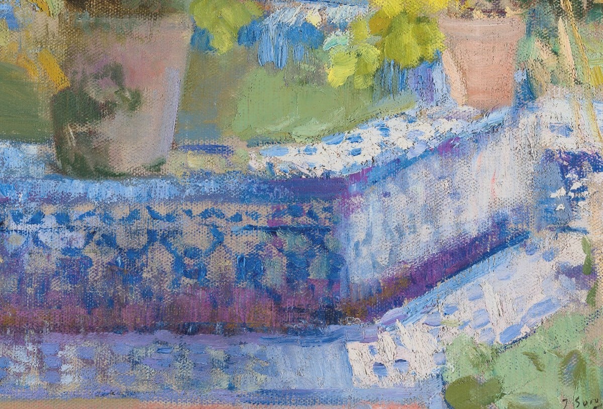
The house was built to plans by the architect Enrique María Repullés. Sorolla himself designed the surrounding garden, greatly in the Valencian and Sevillian styles. He decorated it with fountains and statues, arranged with a great sense of harmony, and with a beautiful collection of Valencian tiles of blue on a white background. The house was finished in 1911.
This painting belongs to a series of studies which Sorolla did of the garden and patios of his house in Madrid. Although most are neither dated nor signed, it is known that they were painted between 1914 and 1920, at different times of the day and in all seasons. However, the garden was mainly depicted in the spring, when the flowers were in full bloom. Bernardino de Pantorba catalogued the twenty-eight views which belong to the Museo Sorolla in Madrid. The others belong to private collections.
In 1917, Sorolla worked intensively on his major series The Regions of Spain, commissioned by Archer Milton Huntington for the Hispanic Society of America Library in New York. However, between February and October of that year, he interrupted his travels through Spain and returned to Madrid, one reason being the birth of his first grandchild. He also took the opportunity to spend the summer in San Sebastián. Courtyard of the Casa Sorolla was no doubt painted in the spring of that year, during his stay in Madrid.
Most striking when one sees this painting for the first time is the colour. The artist displayed his skill in rendering the effect of light with broad brushstrokes. The colours he chose for this picture were those he used in his landscapes and seascapes: yellows, reds and violets. The brushstrokes are uneven, but never unsteady. This is how, a few months after completing this painting, Sorolla explained his particular technique to a French newspaper reporter: “I do not have a recipe, because in my opinion painting is a mental disposition. My brushstrokes are short or long depending on the subject and the occasion.”
Below are some of my observations about the painting:
- There’s a lot going on in this painting, but there seems to be a sense of organization and structure to it. It’s an interesting mix of chaos and harmony, which I think is a key ingredient in both a good painting and a well-designed garden (I don’t like gardens that appear too neat and clean).
- About half of the garden is bathed in direct sunlight, while the other half is in shadow. But there isn’t much value contrast (the darks are not that dark). See the grayscale below. That’s because there is just so much light in this scene that even the shadows are being hit with a fair bit of ambient light and reflected light. Hue and saturation seem to play stronger roles in the painting, with all the distinct greens, blues, yellows, and reds.

- Luscious color is how I would describe this painting. I remember a story about Sorolla’s approach to painting passed down from one of his students. “He painted like a pig eats.” I think this painting showcases that well.
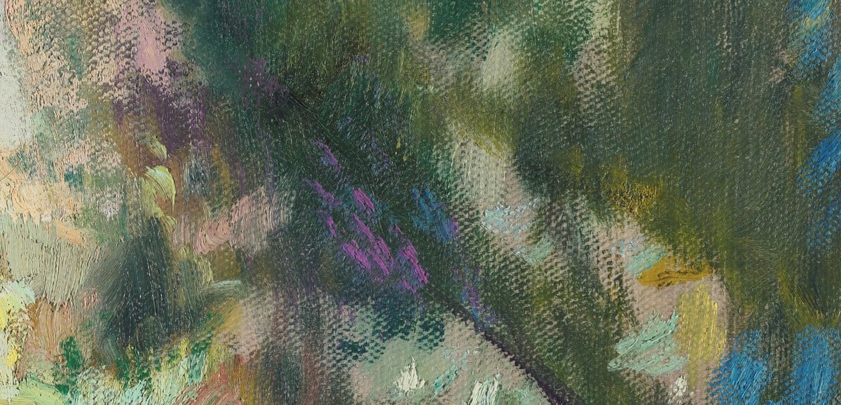
- Look at how the greens vary in temperature and saturation. They get warmer / cooler / weaker / stronger as you make your way around the painting. They appear diverse and dynamic.
- There’s an interesting play between the rigid geometry of the architecture and the organic shapes and forms of nature, and how they are woven together.
- There’s a theme of warm lights, cool shadows, suggesting the warm sunlight from above. If this were an overcast scene, you would probably go with cool lights, warm shadows.
- Each area in the painting appears distinct yet also melts in with the surrounding areas via soft edges and overlapping colors. This gives the painting a strong sense of unity. It also helps our eyes transition through the painting. This is a common problem area I see in student works. Too much attention is given to each part and not enough attention is given to the relationships and transitions between them.
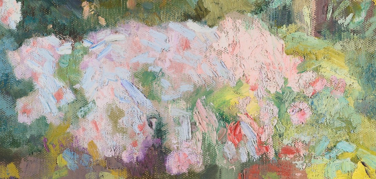
- The white/pink flowers are partly in direct sunlight and partly in shadow. Notice how this is conveyed through the shift in color. The flowers get a bit darker and cooler in shadow (warm light source, cool shadow). Those flower colors in shadow are a bit of an optical illusion. I bet they are darker than they appear. I won’t go into detail on this here, but it’s due to something called color constancy if you want to research it further.
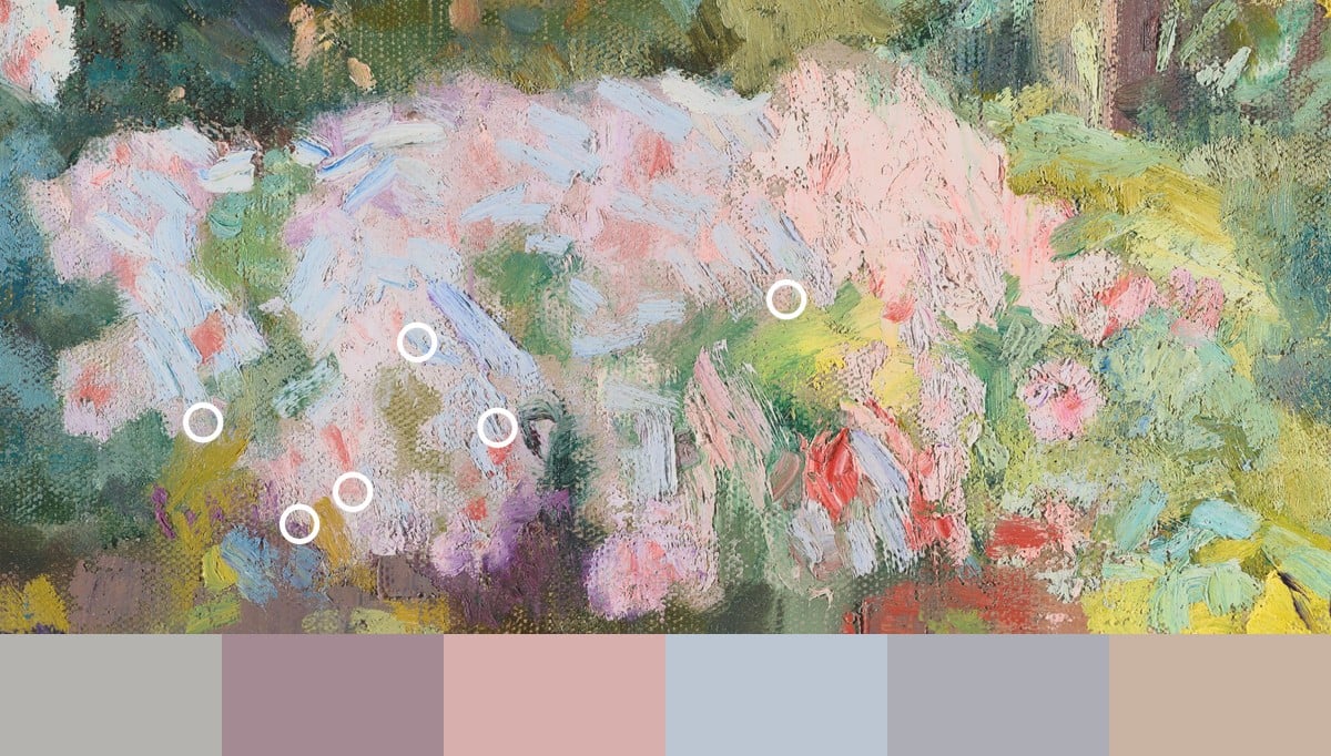
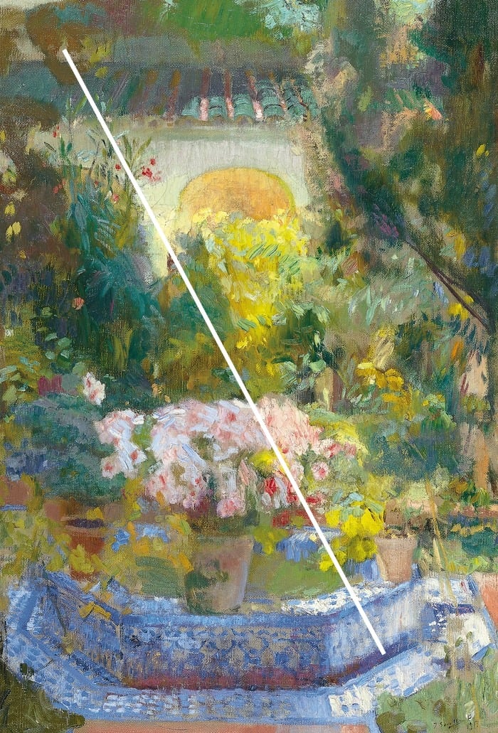
- The subject lines up pretty neatly through the middle, with the main pot plant and the arch at the back. There’s also a subtle diagonal theme, with a major diagonal that starts from the light hitting the tiles at the bottom-right and extends along the edge of the greenery. See the image below to see what I mean.
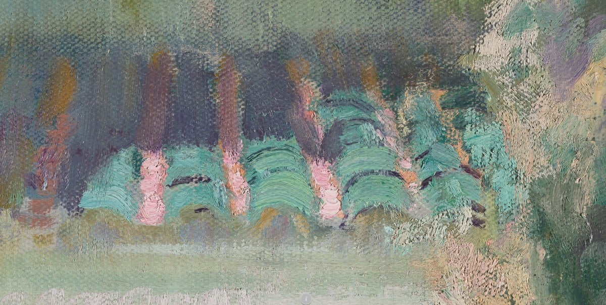
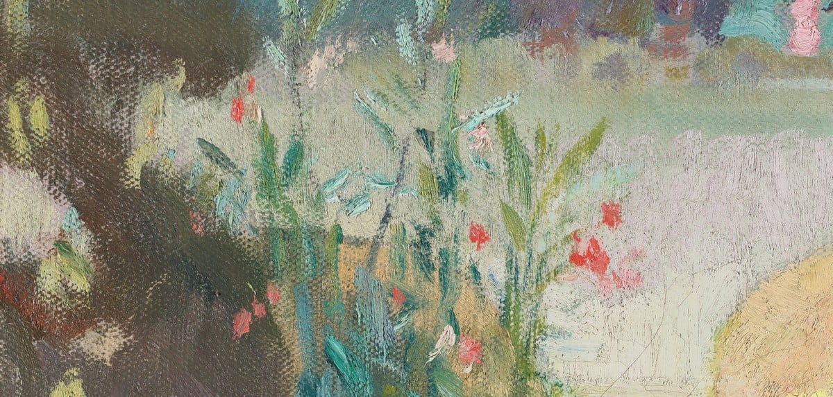
Here are some close-ups of the brushwork:
If you want to learn more, you may be interested in Composition Breakdown. For the next 3 days, you can join at a reduced price plus bonuses:
Enroll in Composition Breakdown
Happy painting!

Dan Scott
Draw Paint Academy


So interesting. Thank you.
At first glance, it’s a cavalcade of colors, but the background and the jungle of plants immediately enchant the viewer.
First, the bouquet of flowers in the foreground, then the arch of the castle rising in the background, draws the eye. The whole scene is embraced by richly shaded green vines and bushes. The observer senses an invisible path leading toward the arch and the entrance.
The vase filled with flowers, set on a blue ceramic base, together with the softly shaded green beside it, provides an excellent frame for the white, the dominant golden-yellow, and the scattered reddish clusters of blossoms.
I agree wholeheartedly with Charlotte. I could have written her comments… this is exactly what I would have written!
Thanks for all you do!
Great impressionist work, period. 🙂
Well described…lots of expressionism through the colors…and the brush strokes ¨non-descript¨…good blending of color…loved the comment ¨he paints like a pig eats¨…gourmandise…beautiful. Thanks for sharing….
It looks like the texture of the canvas shows through under the heavier strokes. Is that the case?
I don’t like it. I don’t like the composition. Too busy. You don’t know where to look.
Wonderful commentary!
I went to his home and museum. I really like his work!
Although I paint with watercolor, I learn so much from you commentary that I carry onto my work. I appreciate your analyzation of various artist, many I am not familiar with. I know your comments are a lot of work, but please know they are appreciated.
Charlotte
I LOVE Sorolla’s work, I wouldn’t have recognized this one as his painting, not my favoured. I am lost in it, lacking structure. Nice colours…….