 Share to X
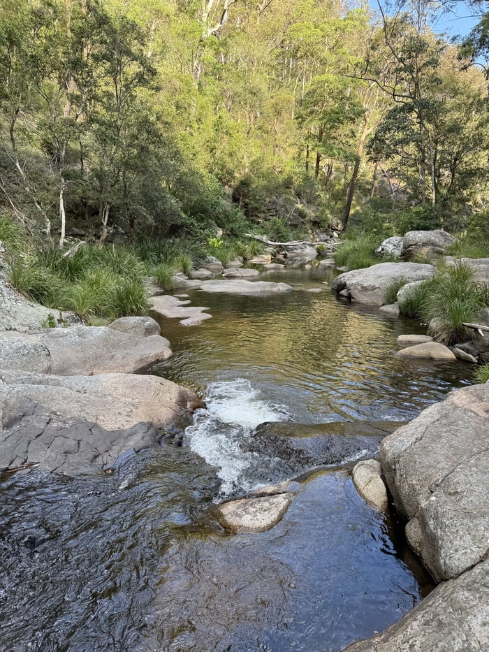
Here’s a brief lesson on observation from a painting I’m working on. Take a look at the reference photo. In particular, the cascading water.
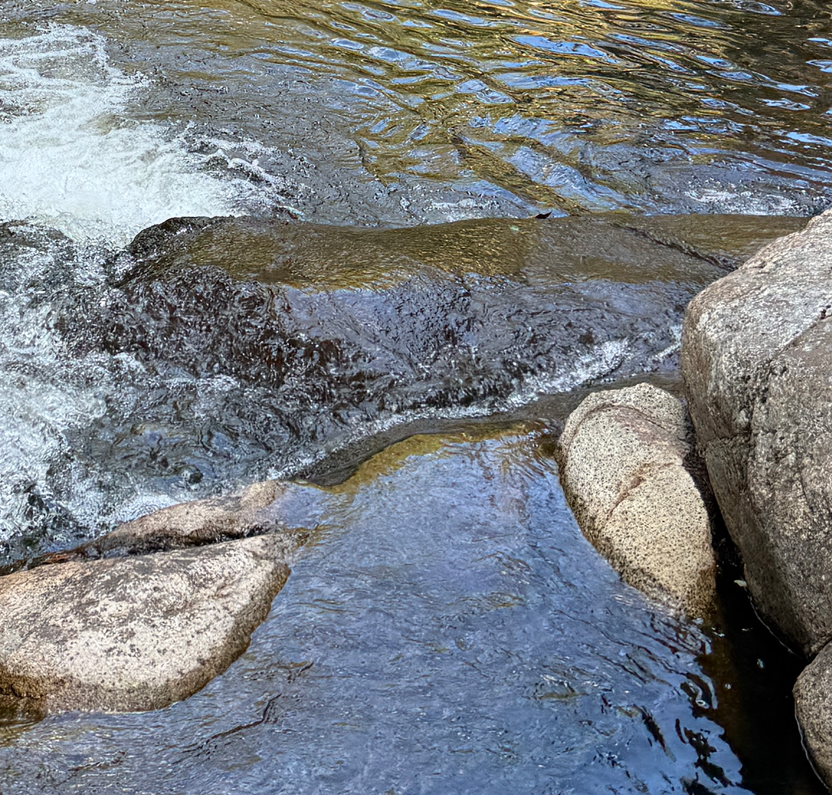
There’s a lot going on here! Let’s try to make sense of it. See the annotated image and my accompanying notes below.
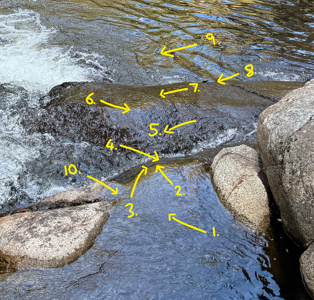
1. A calm area where the water is pooling. The colors are mostly the reflections of the blue sky above.
2. There’s a pale, warm yellow area where the water begins to fall. These are reflected colors from the trees in the background. It seems the water’s plane is sloping down and that’s why this area is picking up the tree colors. Different plane = different color. The value of this area is tricky. It looks fairly dark, but a grayscale reveals it is really part of the lights and is not that far from the light blue color.
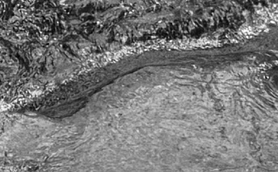
3. Then there’s a dark line which reads as a core shadow. I would say this area is reflecting some of the dark trees in shadow. It’s a subtle but important detail.
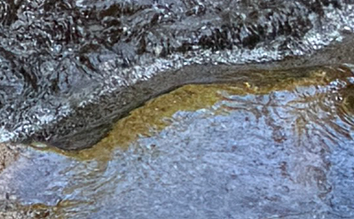
4. The water gets a little bit lighter from reflected whitewash colors. But this area must still read as part of the darks.
5. The water breaks on the surface, creating whitewash. Notice the increased turbulence and contrast here.
6. A relatively soft edge marks the change in plane. The colors push into each other and weave together.
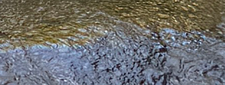
7. The water falls again over the rocky surface, but at a gentler angle than before. It seems to be picking up mostly reflected tree colors, and some reflected sky colors.
8. A fairly hard and clean edge as the water flattens out again, with some whitewash.
9. The water pools again, with more defined contours and ripples. There’s a strong sense of pattern and rhythm to the water’s movement here.
10. I almost missed this one. The water in this area takes a detour out the side and across a rock. It creates some interesting curves.
The big takeaway from this is how the colors describe the different planes of the water. Light blue color = flatter and calmer water, or water tilting towards us. Pale and warm yellow = slight tilt away from us, towards the distant trees. Dark accents = tilt away from us towards the trees in shadow. This is important! It means you can use color to help describe how it’s moving through the landscape.
Breaking the subject down like this can help you make sense of what you’re painting. Instead of just trying to paint what you see, you can start to make logical assumptions about the subject and what should go where. Your thought process might go something like… “Okay, the water seems to be tilting down here as it falls over the rock, so it should be picking up more of the tree reflections in the background. And the water is pooling here, so I’ll use more light blues and calmer brushwork. And here the water is turbulent as it cascades down here, so I’ll use rougher brushwork, palette knife strokes, and increased color contrast.”
If you ever want to learn more, start with our fundamentals course.
Happy painting!

Dan Scott
Draw Paint Academy