
In this post, I will be taking a look at several master winter landscape paintings.
Sadly, I don’t get much of a chance to paint snowy, winter landscapes. There is not much snow in Australia as you would expect. But next time I travel to the snow, I will draw inspiration from the master paintings in this post.
Before I get into it, I want to reiterate that everything you learn from this post can be applied to other subjects. It is just as much a post about how to see and analyze art as it is about painting winter landscapes.
- Alfred Sisley, a Village Street in Winter, 1893
- Isaac Levitan, Winter in the Forest, 1885
- Richard von Drasche-Wartinberg, in the Deep Winter, 1923
- Ilya Efimovich Repin, Winter Landscape, 1903
- Paul Gaugin, Breton Village Under Snow, 1894
- Key Takeaways
- Want to Learn More?
- Thanks for Reading!
(Before diving into this post, make sure to pick up a copy of my free Landscape Painting Starter Kit.)
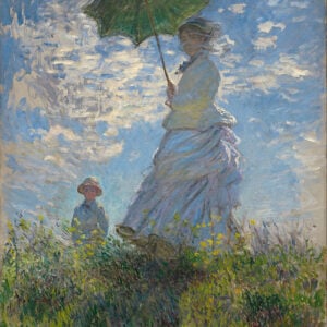
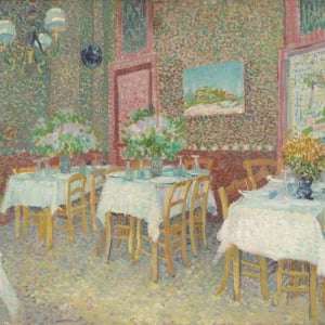
Alfred Sisley, a Village Street in Winter, 1893

As with most of Alfred Sisley’s work, this painting demonstrates some very confident and loose brushwork. It is one of those paintings which do not look like much up close, but come together from afar.
In terms of composition, there is an interesting contrast between the linear objects (being the buildings and fences) and the organic objects (being the trees, bushes and the subject walking on the path). The linear objects also provide a strong sense of one point perspective, with all the lines converging towards a vanishing point around the middle of the painting.
This painting is a great example of how to paint the illusion of detail and texture. Notice the building walls – they are painted with nothing but scattered brushwork and broken color within a tight value range. You should also pay close attention to the use of edges in this painting. The edges and accurate values are what give the painting a quality of realism without there actually being much detail.
There is a strong warm light, cool shadow relationship. This indicates this may have been painted around sunrise or sunset. This is particularly evident in the snow, which is painted with light yellows in light, and dull blues and grays in shadow.
Isaac Levitan, Winter in the Forest, 1885

This is one of Isaac Levitan’s more intricate paintings. He usually painted in a much looser style.
There is a strong vertical theme in this painting, contrasted against the horizontal lines which represent the bottom and top of the tree line. The trees provide rhythm to the painting, much like the beating of drums in music. The small plants, twigs, lone wolf and other details add interest and complexity over the top, much like a violin solo in a symphony. There are many connections you can draw between music and art.
Hardly any color is used. Instead, it would appear Levitan relied on a strong value contrast between light and dark to create interest. Levitan also organized most of the values into neat groups, forming a strong notan design.
Tip: If you are painting with a dull color palette, then it is important that you look to other elements like value or brushwork to create interest. Otherwise, you may end up with a bland and uninviting painting.
The main subject appears to be the lone wolf, which is painted with fine detail. This seems to contrast against the bold and imposing trees which surround it.
Richard von Drasche-Wartinberg, in the Deep Winter, 1923

This painting has a pleasing three-value notan structure, with there being three fairly distinct value groupings; the snow for the lights, the background trees for the mid-tones and the lake for the darks. There are also a few dark accents scattered throughout the painting which represent the trees and fences.
Notice the clever use of shape in the snow. Drasche-Wartinberg simplified the snow into distinct light and dark shapes. This indicates the snow is soft, fluffy and untouched. Most of the other paintings in this post feature a rougher approach to painting snow, with broken color and scattered brushwork.
The colors in this painting are very cool, indicating it was perhaps an overcast day. As with the earlier painting by Levitan, hue is not a strong feature of this painting. Instead, value contrast is heavily relied on with there being mostly different blue and green tones.
The small plants shooting up through the snow help lead you into the painting. They also represent a simple way to add a level of sophistication to the painting without having to do all that much work. Sir Arthur Streeton did this in many of his paintings. He would paint with large, solid shapes then add a few finer details over the top.
Once your eyes enter the painting, the snaking river, fence posts and arrangement of other shadows and objects continue to guide you.
Ilya Efimovich Repin, Winter Landscape, 1903

This painting is much looser than the work we typically see from Ilya Repin. But it still looks very realistic despite the lack of intricate detail. This is because of the accurate values and the use of detail only where it matters.
Repin used a subtle variation in saturation and value to create a sense of depth amongst the dense trees. The trees in the background are nothing more than a block of dull green with some thin, light-gray lines over the top.
The painting feels very warm, which gives an earthy and natural feel. If I were to try and paint this, I would consider using some cooler colors in the darker areas of the painting to push the warm light, cool shadow relationship. It is always a worthwhile exercise to ponder over what you might do differently, or even better, compared to the master paintings.
Paul Gaugin, Breton Village Under Snow, 1894

I selected this painting by Paul Gaugin because of the awkward perspective used. Most of the other paintings in this post are fairly standard compositions, but this painting breaks many of the “rules”.
I think it is good to paint these awkward compositions from time to time. They can break up your thinking and free you from painting the same standard composition over and over again.
The houses appear squished into the painting, with very little negative space used.
The colors appear muddy, which indicates heavily trodden, dirty snow. There also appears to be a subtle contrast between warm lights and cool darks.
The hard edges used to outline most of the objects give the painting a very stylistic feel, kind of like an illustration. Sometimes, it is effective to step away from painting a subject exactly as you see it in order to push a certain style. Just be careful if you go this direction, as it is difficult to pull off.
Key Takeaways
- You should not just use pure titanium white to paint snow. In fact, pure white should only be used to paint the brightest highlights of snow. The color of the light illuminating the subject will determine the color of the snow.
- These winter paintings demonstrate the influence that light has over the colors we see. If you don’t understand the light, then you will struggle to use color well.
- If you are painting a subject without much color, then you need to rely more on value contrast.
- Subtle details like small plants or rocks can be used to add a level of complexity and sophistication without actually doing much. You can also use these details to help draw your attention into the painting, like in Drasche-Wartinberg’s painting.
Want to Learn More?
You might be interested in my Painting Academy course. I’ll walk you through the time-tested fundamentals of painting. It’s perfect for absolute beginner to intermediate painters.
Thanks for Reading!
I appreciate you taking the time to read this post and I hope you found it helpful. Feel free to share it with friends.
Happy painting!
Dan Scott

Draw Paint Academy
Hi Dan, thank you for this article. I’m going to send you a photo I took today of the hills near our house! Snow everywhere in Montana. I am going to work on the different colors that might be used for snow in different lights and just do some little practice thumbnails as this is not something I am good at. I took a number of photos today that I can use – today is strong sunlight. Thanks again, this article and these paintings help a lot.
Glad to help Joan! Look forward to receiving your photo. Thanks, Dan
Thank You so much for this most informative post! It has really given me motivation to go ahead and try !
Dan,
I look forward to your articles. You have a knack of breaking down a painting and pointing out areas that one does not usually pay any attention which makes a painting ‘a painting’.
Bill
Thanks Bill! Dan
Thank You………….
No problem Hope 🙂 Dan
Thanks Dan, for a fine and helpful article. We never stop learning about creating better paintings.
My pleasure Earl! Thanks, Dan
Thanks, Dan. We’ve had snow recently. I’ve wondered how to paint it…
It’s really helpful to have these examples to study.
And your comments about each painting are illuminating.
Nancy
Thanks Nancy! Glad to be able to help. Dan
A very informative article, Dan. Th
ank you. I enjoyed reading it. I especially like the Sisley and found it helpful to hear how to paint snow and that pure white should only be used for the highlights.
Thanks, Dan. I have so much to learn but your insight and guidance are such a help.
Glad to hear Cheryl! Dan
Thank you, Dan! I learn a lot from your analysis of master artists’ work! Keep these articles coming!
Liz
Will do Liz! Thanks, Dan
Hi Dan ,I look forward to your articles. I am understanding a lot more about painting every week. You seem to have a way of writing that helps me to see tings when I look at my own paintings and evaluate what I’m doing. I’m a somewhat beginner,I stared on my own some 40 years ago and life happened so I stopped. Tried again 20 yrs.later and again life got in the way, but now I’m retired and have put my foot down to my family and I’m going to accomplish my my dream . Thanks to you sharing your wisdom and appreciation for art. I will be getting your e_book soon. Thanks again Dan Scott.
Thanks for your comment Judi. Glad to hear you are getting back into painting again! Look forward to seeing your completed paintings. Dan
Hi Dan, thanks for your inspiring articles. I am enjoying being a member of your e books.
Thanks Anne, great to hear! Dan
Dan, your posts are always so helpful. Your emails are like gems among the trash Of the other emails I receive. Thanks for taking the time to do this.
Happy to hear this Linda! Glad to be able to help you out. Dan
Hello Dan; Thank you so very much for posting your insights into a variety of ways and means. I appreciate your expertise and your wonderful choices of beautiful paintings explained.
No problem Helen! Happy to hear you are enjoying the information. Dan
Your analyses of the paintings are extremely useful giving an insight that we normally do not think of. We can incorporate your advice into our own attempts.I am retired and I paint as a hobby. Is it feasible to forward a picture of my paintings and obtain some valuable guidance from you.
Thanks Ananda, glad to hear this! Yes, feel free to email me a photo of your completed paintings. Dan
Hi Dan, living in Queensland I don’t have much experience with painting snowy scenes. This post has given me the inspiration to try painting some of the photos I took of Venice last year with buildings and gondolas under blankets of snow. Looking forward to your next post.
Happy to have helped Susan! Thanks, Dan
Thank you for this and all your informative articles. I am a beginning watercolor “ artist…or should I say “artist-want-to-be” taking my first class at the grand ‘ol age of 74! Your in-depth analysis is most helpful.
My pleasure Judi. Good luck with your first class! Thanks, Dan
Thanks for the examples of approaches to winter painting. This gave me a nice vocus and approach. Your descriptions and the examples brought to life the lesson.
Thanks! Happy to help. Dan
a Thank you so much from me either. I’m still learning. Love to read your articles and tips.
I saw the painting of Isaac Levitan, Winter in the Forest, 1885, really liked it straight away, even it looks a bit gloomy. Also the painting from Richard von Drasche-Wartinberg, In the Deep Winter, 1923 guess its a personal thing wich one you find attractive. Anyway thank you for the tips how to look like the brushstrokes, never thought about that.
No problem at all Francien! Thanks, Dan
In regards to snowy landscapes, if you have a chance, check out Lawren Harris, one of the members of the Group of Seven (Canadian). He is one of my favourite artists. His later works took on a unique style (ie: Lake and Mountains) while his earlier works leaned more toward traditional painting (ie: Red House in Winter, Winter Woods (one of my favourites), Snow II).
Thanks for letting me know Ramona, I will look into this. Dan