
Let’s discuss the primary colors as they relate to art, or more specifically, painting. These are the first colors you’ll learn about in art. Even my 1-year-old daughter, Elora, has been introduced to the primary colors through her children’s shows and at daycare. Perhaps it’s because we’re introduced to the primary colors so early in life that many of us take them for granted. But make no mistake, the primary colors are at the heart of color theory and mixing. It’s essential that you truly understand what they mean and how to use them effectively if you want to paint well.
I’ll cover:
- What Are the Primary Colors
- Primary Color Mixing
- Warm and Cool Primary Colors
- Fechin on the Primary Colors
- Primary Colors of Light
- Want to Learn More?
- Thanks for Reading!
What Are the Primary Colors
The primary colors are red, yellow, and blue. These colors are, in theory, able to mix all the other colors in the visible spectrum. They also cannot be created by mixing other colors. You’ll find them evenly spaced around the color wheel, forming a triangular relationship.

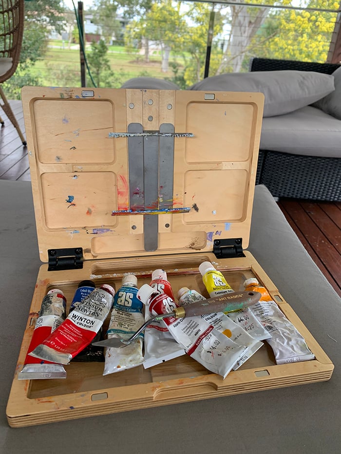
In practice, however, color is not so simple. There are many different reds, yellows, and blues available to us. Cadmium red, alizarin red, spectrum red, crimson red, etc. Each color has a different position on the color wheel. Which of these colors are the true primary colors? The answer would be the paints which represent the purest and most saturated forms of red, yellow, and blue. Cadmium red, cadmium yellow, and cobalt blue would be good picks. These are what I use as the primary colors on my palette. They are vivid and relatively pure compared to other paints. But it’s worth noting they are not perfect primary colors in that they do not hold up to the definition of being able to mix all the other colors in the visible spectrum. You would struggle to mix a good purple or a good green with these colors.
A better representation of true primary colors would be yellow (say cadmium yellow light), cyan, and magenta. With these colors, you would be able to mix a far wider gamut of colors. The Handprint website has some detailed information on this if you want to go deeper.
The reasons I still adopt red, yellow, and blue as the primary colors, despite their obvious limitations for that role, are for simplicity and to be consistent with other art education.
It’s important to remember that color theory is not a perfect science in art. There are far too many variables for it to be treated like that. Our paints vary in terms of brand, batch, age, condition, etc. Just look at the difference between cadmium yellow by Winsor and Newton and cadmium yellow by Art Spectrum:

The most important aspect of color is how you use it in your work. It doesn’t matter how you got there. Sometimes, that means simplifying the theory into a more practical form. That’s what color theory is in art. It’s not always scientifically correct, but it does the trick.
Primary Color Mixing
When you mix two primary colors together, you get a secondary color. Red and yellow = orange. Yellow and blue = green. Red and blue = purple. Here you can see the shortcomings of cadmium red, cadmium yellow, and cobalt blue as primary colors. They do well with orange, but not so much with green and purple. The best I could do for purple was a dull, cool red.

When you mix all three primary colors together, you get some variation of gray or mud.


When you add white to a primary color, it gets lighter in value. It also gets cooler in temperature and weaker in saturation.
When you add black to a primary color, it gets darker in value. It also gets weaker in saturation.
When you add gray to a primary color, it gets weaker in saturation. It will also get lighter or darker in the direction of the gray.

When you mix a primary color with its complementary color, you make the color weaker in saturation. It will also get lighter or darker in the direction of the complementary. In the right proportions, mixing two complementary colors should create gray.

Warm and Cool Primary Colors
In painting, there are warm and cool variations of the primary colors. These definitions rely on the positioning of the color on the color wheel. A primary color that leans towards a warm color is considered warm and one that leans towards a cool color is considered cool. And keep in mind, I am using the term “primary color” loosely. Below are some examples:
Manganese blue – cool (leans towards yellow on the color wheel)
Ultramarine blue – warm (leans towards red on the color wheel)
Cadmium yellow deep – warm (leans towards red on the color wheel)
Cadmium lemon – cool (leans towards blue on the color wheel)
Cadmium scarlet – warm (leans towards yellow on the color wheel)
Alizarin crimson – cool (leans towards blue on the color wheel)
This is important knowledge for mixing vivid secondary colors (orange, green, and purple). To mix vivid secondary colors, you must combine primary colors that lean towards each other on the color wheel and do not contain traces of a third primary. Remember, when you mix all three primary colors together, you get mud.
In the image below, the two blues from top to bottom are cobalt blue and manganese blue. The yellows from left to right are cadmium yellow in Winsor and Newton, cadmium yellow in Art Spectrum, and cadmium yellow light. I reference the brands of the first two yellow paints as they appear to differ considerably in temperature; the Winsor and Newton yellow is much warmer. Notice how the cobalt blue produces dull greens. The most vivid pairing was manganese blue with cadmium yellow light, though the image did a poor job at capturing this. Cadmium yellow in Art Spectrum with manganese blue was a close second. (I did this experiment previously using more blues and yellows. You can read about that here.)

Fechin on the Primary Colors
Nicolai Fechin, a true artist’s artist, had some wise words on the primary colors:
“As a matter of fact an artist has to deal with only three basic colors: red, blue, yellow (all the rest are combinations of these fundamental colors). Everyone knows this, but few pay attention to the fact. Thus the first step for the artist to learn to see these primary colors and to distinguish them separately one from the other.” (Source)
“To avoid murky results, it is necessary to learn how to use the three basic colors and to apply them, layer upon layer, in such a way that the underlying color shows through the next application. For instance, one can use blue paint, apply over it some red in such a manner that the blue and the red are seen simultaneously and thus produce the impression of a violet vibration. If, in the same careful manner, one puts upon his first combination a yellow color, a complete harmonization is reached – the colors are not mixed, but built one upon the other, retaining the full intensity of their vibrations.” (Source)
Primary Colors of Light
The primary colors of light are different from that of our paints. They are red, blue, and green. This is a complex area and requires a separate post. I’ll let you know once it is published.

Want to Learn More?
You might be interested in my Painting Academy course. I’ll walk you through the time-tested fundamentals of painting. It’s perfect for absolute beginner to intermediate painters.
Thanks for Reading!
I appreciate you taking the time to read this post and I hope you found it helpful. Feel free to share it with friends.
Happy painting!
Dan Scott

Draw Paint Academy
Very informative and interesting read.
But now as their are so many shades available , some even irridiscent in texture , does it make it easier or not for artists today ?
Thanks Very helpful I am a beginner
Thank you. As always, very informative.
Dan,
I’ve been painting for 10 years as a hobby painter and still I find color mixing such a challenge, especially in my realistic landscape painting. Thanks for this helpful information.
Joan
Very insightful and inspiring! I like reading about art and how to improve one’s craft! It makes it much easier for us who don’t have an experienced artist one can call on in a time of need.
Best regards,
Rose 🌹
Wonderful information! Thank you.
Beginner, very helpful
How interesting to revisit colour mixing as an amateur artist for many years. An abstract colourist whose courses I have attended for several years always says “To avoid mud use only two colours and maybe add white.” You have shown how important that advice is too. Thank you
One also must consider the quality/permanence and lightfast properties of pigments. As well, the degree upon which a pigment reflects the color you desire, especially with mixing. That is based on light theory and what colors reflect which parts of the spectrum. It’s a complicated thing! And finding the ideal palette is challenging. I’ve found that to get deep violets, I have to consider the above otherwise you may end up with muted violets. As I’ve learned over the years, color theory is more akin to speaking a different language, and has so many nuances — it can be fun and utterly frustrating! 🙂
In the USA I use Golden Brand “Primary Red”, “Primary Blue”, and “Primary Yellow “. I find that making a color chart I can refer to helps a lot. I forms blocks of mixed color and write down the proportion of each color mixed.
Mixing colors seems to be a never-ending process, but your lesson is very helpful.
You are definitely a pillar of the art community. You are always clear and informative.
Thank you for your support.
Thank you, Dan. As always, the info is so helpful. I sometimes watch art tutorials with the artist using only the primary colors, black and white..
I have done that a few times for fun and to see what would happen.
Your info will be filed away with all my other helps and tips .
Thanks again,
Another great article! I’m a plein aire acrylic painter and I use only one of each primary plus white. Using a plastic box with deep compartments, I premix the secondaries, a “burnt sienna “, “yellow ochre”, deep grey, and several greens and blues. I end up with about 16 colors from just the 4 tubes and because I mixed all of them it’s really easy to understand how to alter each one. I started this as a basic color mixing exercise but it has simplified painting outdoors so much. My primaries are Cad. Yellow Medium Hue, Napthol Crimson pr170 , and Ultramarine Blue. Happy painting everyone!
I will forever be a color theory student. There is so much to learn! Thank you for always being there to support, teach, encourage and share your knowledge!
I appreciate you providing this information. I also looked deeper into the web site provided. I have recently returned to painting, and I am trying to set my foundation on a firm footing. Because I use acrylics’ I was hoping you might consider providing data assessing acrylics to better equip us in color use fundamentals for this medium. As you well noted various brands offer different color complexities, maybe a how to approach for our chosen brand might be warranted. Thanks for your help and I have been following you for some time.
Regina
Great eye opener for me. I enjoy reading about color but this one is the first.
Thank you for your hard word putting all this helpful and needed information in one place!!
Much appreciated.
Learn painting and colors
Something to remember, when making a green, use the blue and yellow you are using in the painting. It will mean all the colours will go together. This will especially help with watercolour
I found that tip really useful Yvonne and will be mindful of that in future.
thanks
Sarah
It helps to remember that mixing colours of light is additive, while mixing pigments is subtractive. Mixing the three light primaries gives white, while mixing the three pigment primaries gives black (with perfect primaries).
Hallo Dan, I’m painting approx. 5 years now with only the primary colors. In acryl. I make every color with them, even (almost) black, even skin color. But I use the ‘real’ primary, cyan, magenta, yellow. Not every brand sells them, that’s very strange. I use the brand ‘Amsterdam’. The primary colors you describe are in my opinion the colors of the ‘Bauhaus’.
Well, it’s all very interesting! Greetings, Charlotte
A complex subject handled very clearly. Very well-written and illustrated.
In the 40+ yrs of random classes I’ve taken, NO one has Once presented color mixing like this! Aha! No wonder I end up w mud so often! “The Colors of Light” was when I think I “got” it! Thank you so much! I cannot wait to read your next post!
Very interesting and informative article. Thank you Dan
Honestly? I dislike the phrase ‘making mud!’
Why not say brown? Or, Earthen colour. Mud does imply earth, right?
Many times in painting we NEED that colour, and yet using the term ‘mud’ implies there is something less desirable. I happen to like the colour you mixed with the three primaries.
It can be seen in hundreds of thousands of paintings (millions?).
Mixing the three primaries gives us another colour, either with a bias toward brown or grey.
find the beauty in it and share that too, Please!
When I purchased colour printer ink in separate containers the first time, the colours were not red, yellow, and blue. They were magenta, a very light yellow, and cyan. They selected those colours to acheive the greatest range of tints.
So I use Cad Yellow light, Quinacridone Magenta, and French Ultramarine (I know, a better match for cyan is Phthalo Blue green shade, but I hate working with it, it overpowers everything).
I’m pleased how nice the reds, oranges, and purples are with this combination, and the greens are pretty good too.
Thanks buddy
I read your article on your Dad’s superb sketch. Thank you for sharing such beautiful taonga (artefact). I then went onto click another article to read, and then another. There is so much to take in but made all the more easier with the insights & encouragement from your articles.