
“For me … a painting should be something to cherish, joyous and pretty, yes pretty!” Pierre-Auguste Renoir
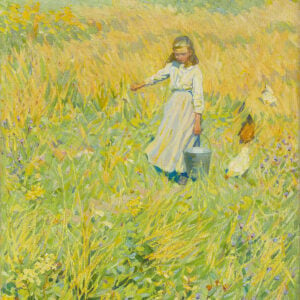
Let’s take a look at how to paint like Pierre-Auguste Renoir. I’ve never been much a fan of Renoir’s work. That was until I saw one of his paintings at the European Masters exhibition. A Young Girl With Daisies (see below). It captivated me as a great painting should and it prompted me to take another look at Renoir’s work.
I’ll cover:
- Wispy Brushwork
- Rich Colors and Tinted Pastels
- Broken Color and Texture
- Sharp Accents
- Simplification
- Busy Compositions
- Other Thoughts on Renoir’s Style
- Key Takeaways
- Additional Readings

Wispy Brushwork
Many of Renoir’s paintings feature thin, wispy brushwork that melts together. Berthe Morisot did a similar thing, but most of the other Impressionists were more distinct with each stroke.
This wispy brushwork gives Renoir’s work an almost ethereal feel, as if it’s part of a dream or distant memory. Chestnut Tree in Bloom is a perfect example. Notice how it goes in and out of clarity and how the sky melts into the trees which melt into the grass which melts into the water. The areas are both distinct yet part of this one dreamy picture.

To execute this brushwork, I imagine Renoir worked wet-on-wet with thin paint and perhaps a rounded brush like a filbert. But this is just my speculation. And he only did this for some of his paintings. As you’ll see throughout this post, Renoir was adventurous in terms of style and technique.

The main downside of this brushwork is that it can come off as timid and vague if done poorly. That’s why Renoir often paired it with small bursts of detail and clarity, as he did in Reading Girl. This is an effective combination that makes the wispy brushwork appear even more vague and fleeting and the bursts of clarity even sharper by comparison. Renoir also made unusual choices when it came to what areas to give clarity to. For example, instead of painting the subject’s face with clarity, he did so for her hat and flowers. It makes you ponder over what the focus of the painting is.

Wispy brushwork plays particularly well into the idea of an overcast day. See Regatta Near Argentea below. Look at how the strokes of blue, yellow, and gray melt together and gradually build up to a concentrated area of light and contrast.
Tip: Certain styles and techniques work particularly well with certain subjects. Like wispy brushwork and a moody atmosphere. Before starting a painting, consider what style and techniques would best convey the subject. The right choice will make the painting process much smoother.

Rich Colors and Tinted Pastels
Renoir used clean and distinct colors rather than relying on blacks, browns, and grays. He typically combined bursts of rich and saturated color with tinted pastels. And he used his wispy brushwork to weave it all together.
Below is a perfect example. Renoir used saturated reds, yellows, and blues for the flowers, the vase, and parts of the background. For the rest, he used tinted pastels. This creates an interesting dynamic. The woman appears to be the focal point given her prominent position. Yet, the flowers and their rich colors compete for our attention.

The Garden in the Rue Cortot, Montmartre vibrates with color. The colors get stronger and richer as they build up to the bright flowers. Like an orchestra building up to a crescendo. There’s also a striking temperature contrast, with cool greens and blues against warm yellows, reds, and oranges. So there’s a contrast in both saturation (rich against dull) and temperature (warm against cool). Remember, you can always create a sharper contrast by overlaying multiple elements like this.
There’s also a pleasing balance between the flowers and the surrounding landscape. The flowers are conveyed with richer and stronger colors but they only take up a small area in the painting. The cool greens and blues are weaker but they take up a much larger area.

Two Sisters (On the Terrace) is a cheery display. The landscape in the background is made up of wispy pastels. It’s vague and out of focus. The two sisters are conveyed with relative sharpness and are framed by bursts of color and clarity. Notice how the almost garish garments and flowers make the skin tones appear softer and more lifelike by comparison.
, 1881")
The Piazza San Marco, Venice is a cityscape example of sharp bursts of color amongst tinted pastels. There’s also an interesting play between the bursts of vivid red against the bursts of deep blue (temperature contrast). I would usually avoid using vivid red and vivid blue together in the same painting, as it might appear overdone. But it works in this case as they only take up a small area in the painting.

Broken Color and Texture
Renoir took a more typical broken color approach in many of his landscapes. These paintings look much more similar to Claude Monet’s or Camille Pissarro’s works. He often painted with Monet and I imagine they influenced each other in some ways.
In Bateau and Grand Canal, Venise, Renoir painted the water with dabs and scumbles of distinct color. This is particularly effective for conveying the broken reflections and the tiny contours and movements in the water.


The Seine at Argenteuil features an interesting play between the plants and trees in the foreground and the sky, water, and land in the background. Look at the range of strokes and techniques Renoir used. Thin lines for the branches, punchy dabs for the leaves and dark accents, scumbles of various blues for the water and sky, patches of broken color parts of the land. This variance plays well into the idea of nature and all its detail and complexity.

Piore has a striking color theme, with cool blues and greens against warm yellows and oranges, plus a few dark accents to define the tree.
One of the downsides of broken color is that it comes at the sacrifice of intricate drawing (you cannot paint with dabs of color and match the realism of John Singer Sargent or Joaquín Sorolla). To combat this, you can use dark, light, or saturated accents to define and accentuate key details, as Renoir does here.

Broken color is also particularly effective for capturing dense clusters of leaves, flowers, and plants. Instead of meticulously painting every strand of grass, leaf, flower, highlight, shadow, color, line, and shape, you could use broken color to create an illusion of their appearance.
Renoir also used broken color to help soften the edges between the couple and the surrounding nature. Look at the person on our left. Light greens push into his white sleeves; the off whites of his clothing push into the surrounding nature.

Sharp Accents
Unlike many of the other Impressionists, Renoir painted with black on his palette and used sharp, dark accents to command attention. This is particularly evident in his portraits, like Portrait of Madame Henriot.

Portrait of Mademoiselle Legrand is a stunning painting and done in a more realistic style than what we would typically expect from Renoir. My only criticism would be that the arms look a tad blocky and rigid.
Tip: When analyzing master paintings, always consider what you might improve on or change. No painter is infallible. And doing this will help you take the masters down from the pedestal and see them as they were: artists who trained, made mistakes, and traveled their own art journey.

Portrait of Jeanne Samary is a more typical Renoir painting. It’s an effective combination of small, sharp accents against a large area of tinted pastels and wispy brushwork.

Simplification
Of course, simplification played a key role in Renoir’s paintings, as it did with all the Impressionists. He focused on capturing his impression of the subject, rather than trying to mimic life in all its detail and nuance.
In Rocks in Guernsey, Renoir did just enough to capture the essence of the scene. Each part in isolation looks reckless and sloppy. But as a whole, it works. In those brief moments of first looking upon the painting, you get to experience Renoir’s impression of the scene. It’s only as you start to scrutinize the painting in greater and greater detail that you see the missing details.

First Departure is an interesting painting. Renoir painted the main person with vague and wispy brushwork, similar to that of the surroundings. This lessons our focus on her and makes it a painting about the event and the atmosphere rather than her identity. That’s the point of simplification-it allows you to convey what you think is important and how you want people to view your painting.

Busy Compositions
Some of Renoir’s most famous works are busy compositions with numerous people. He took a more careful approach with these paintings and they showcase his technical abilities. See Luncheon of the Boating Party below.

Renoir adopted a more impressionistic approach for Grenouille. It looks realistic at first glance, despite the vague detail. That’s how you know the fundamentals of the painting are strong, particularly the values (how light and dark each color is).

Renoir painted Grenouille alongside Monet. See Monet’s version below. I always find it interesting to see how different artists interpret the same scene. It highlights our unique perspective of the world. And I would have to admit this is one of the rare occasions where I prefer Renoir’s work over Monet’s. Renoir’s is more lively and honest.

Other Thoughts on Renoir’s Style
- He was inconsistent in terms of the quality of his work, particularly with his portraits (see below). He has been heavily criticized for this, but I think it’s better to judge an artist for his best work, not his worst.


- He was experimental with his style, sometimes painting realistic still lifes, fresh watercolor landscapes, and blocky portraits. This might explain why some paintings turned out better than others. Being experimental puts you in a vulnerable position, but it’s the only way to keep improving over the long run.

")

Key Takeaways
- Wispy brushwork gives Renoir’s paintings an almost ethereal feel, similar to that of a dream or memory.
- He wove together clean and distinct colors rather than relying on blacks, browns, and grays.
- He used dark, light, or saturated accents to define and accentuate key details amongst the wispy brushwork and broken color.
- Broken color is particularly effective for conveying water and dense nature.
- He paired sharp accents with light pastel surroundings to command your attention, particularly with his portraits.
- Simplification plays a key role in his work. Instead of painting every detail, color, shape, and line, he simplified the subject down to only the essentials.
Additional Readings
Broken Color and Optical Color Mixing
Impressionist Art Movement – Masters Of Light And Color
European Masterpieces – Monet, van Gogh, Rubens, Velázquez, and More
Want to Learn More?
You might be interested in my Painting Academy course. I’ll walk you through the time-tested fundamentals of painting. It’s perfect for absolute beginner to intermediate painters.
Thanks for Reading!
I appreciate you taking the time to read this post and I hope you found it helpful. Feel free to share it with friends.
Happy painting!
Dan Scott

Draw Paint Academy
Thank you for your comparisons and synopsis. I’m looking forward to trying a few new things!
Why are there adds in this fine program that one has to keep delegating? Haven’t seen this in your program before. Most annoying.
I have always loved Renoir and thanks for your comments and insight.
Thanks Dan! This is very depth article about Renoir’s painting style and I learnt a lot, specially about brush strokes and experimenting. Appreciate for your thoughts and analysis!
Thank you for this amazing article! I learned so much. Thank you also keeping the content free. Ads are a small price to pay, and I’m glad you can get the revenue you need to keep this going.
I agree Marci.
Thank you Dan. Another great (free) learning experience. Visually, they touch our souls.
I also find the complainers more annoying than the ads.
Thanks Dan….As always, a wonderful article!
Excellent instructive and interesting article. So much appreciate your posts.
Yes, the ads were distracting and very annoying. I lost my train of thought about your teaching.
Thankyou for your wonderful instructive articles, always clear and easily understood.
Kind regards
Great analysis, really helped me appreciate Renoir. Especially liked seeing comparison with Monet when they painted same scene side by side.
Thank you Dan for your perespective as a painter rather than a historian. I have many take aways to try, especially for water and dense foilage.
Hans Roomamker in Modern Art and the Death of a Culture also says Renoir was more honest than Money in his painting style. Thank you for the great art and art history lesson!
Another great article! Thank you, Dan! I appreciate your work ethic.
For those complaining about the ads, how hard is it to scroll? You are receiving wonderful instructive content for free. People have to make a living. Welcome to the real world. Who do you think you are to expect everything for free?
Totally Agree Beth….everyone wants something for nothing!
I agree with Beth, it is not hard to scroll down.
Thank you Dan for sharing your knowledge and the amount of time you put in to help others .
What an abundant information you gave us Don!! Thank you very much! You are an inspiration!!
What a fantastic amount of work!! Thanks Dan – I enjoy reading your assessments and find it educates my eye for my own work!!
Not all of Renoir’s work photographed well. I was at an impressionist exhibition when I saw this simple Renoir that took my breathe away. It was a building, hill behind, and tree in front. The tree was amazing. It stood out. I sat in front of it trying to see how he accomplished this effect. Everyone who walked by commented on the colours and there were a few of us sitting in amazement. I tried to buy a postcard of this painting and found it looked completely different in a photo. Boring and ordinary. The camera could not capture the effect of Renoir which was the opposite of Van Gogh where photos improved his work. So it has to stay in my memory. Cannot remember the name of it.
Thanks, Michelle. I found this too in seeing Renoir originals vs photos. Photos just can’t capture either Monet or Renoir.
Very good article. It made me look at Renoir in a different way. Thanks!
Some of the late paintings by Renoir are very bad (e.g. the examples at the end of this article), but we should bear in mind that in his later years Renoir was suffering terribly from rheumatoid arthritis and could scarcely hold a paint brush.
I’m amazed at how much I learn from you that I didn’t even know I wanted to learn. I’m nearly 75 and not interested in becoming an artist myself, but I enjoy your ability and desire to share your thoughts and knowledge. The ads didn’t affect my reading at all. In fact, I had to go back and look for them after reading the comments.
Great post, Dan! I now understand the strategy of detailing only what you want the viewer to focus on. His variety of strokes – wispiness to stippling among details – create different eye paths in the paintings. I was particularly struck in First Departure by the two black dot eyes on the woman on the left as a secondary focal point among wispiness and how the main woman’s gaze directed my eye to those dots. Without those two dots, my eye would have nowhere to go. So cool! I’m a Renoir fan now – thanks for that.
Thank you for this informative article. As for ads, no problem. I am so used to them I barely register ads now days, so I can’t empathize with those who are bothered by them.
Commenter above was correct about Renoir’s arthritis. Can you imagine how awful it must have been for him to have great technical ability and not be able to use it because of physical disability? I shudder to think and pray none of us ever has to face the diminution of our ability to transfer what we know into physical reality.
Thank you Dan for the wonderful article and the rehabilitation of Renoir. I always loved his work, especially the nature scenes and the ones with busy parties. I like his colors. I loved less the portraits of the pink young girls ( you showed one), maybe because my inability to paint portraits, but I can understand why he loved them. I have seen many of his originals, (especially at Gare D’Orsay museum in Paris, the Barnes Foundation in Philadelphia, the Metropolitan in New York and there are a few of his works in the Tel Aviv museum of Art). In the impressionist museum collections, as in many books about the impressionism you can see the same subject painted by different painters, as you showed the comparison to Monet, and it is very instructive. The most encouraging is that different artists see and paint the same subject differently and there is not a single answer on how to paint like in a mathematical equation.
Thank you Dan. I am always trying to find my own style. It helps to understand how the masters interpreted their subjects and how they identified their focal points.
Thanks for your lovely, teaching article about Renoir. It’s so helpful to us art students (no matter our age) to have the masters’ works broken down into understandable bits. One question that I’m left with….do you think Renoir’s severe arthritis (from 1890’s until the end of his life) greatly changed his style, including his less detailed portraits? I read one article that said he had to even tie brushes onto his arthritic hand to paint.
Thank you so much Dan! So much valuable information! It will take time and effort to absorb all this let alone put it to use in my work but such a great starting point to get more serious about my painting. Thank you again!
Thank you for this informative article. Love reading about the technical approach. I can see why these artists are called masters. Even the so called not so good ones carry an air about them almost transporting one to another time and place creating the most amazing sence.
Thanks Dan… great article. I loved looking again at Renoir with your guidance.
This was extremely helpful to my efforts to understand the use of color and value. The detailed explanation and demonstration of broken color and brush technique is what I needed to help me with my own work. Thanks ever so much.
Thanks Dan for a great post. Now I see Renoir in a new light!
I have always loved Renoir… Thanks, this gave me wonderful new insights into his work… also the ads I just scrolled past. Thanks again!
I have loved Renoir since I was child, my parents were antique dealers, they introduced me as a small child to beautiful art, antiques and works of art. I also have and collect art and antiquities.
I would like to say I love your website, just incredibly inspiring. I have painted for years but I had a big gap…. Children and University but my passion is truly creating art.
My strength is Dioramas and creating beautiful miniature scenes.
Watercolour painting is incredibly inspirational but unlike acrylic it’s not as unforgiving! Despite that I will continue to learn. Thank you so much for your free tutorials. I live in Tasmania now which is very similar to New Zealand, I lived there for many years and see such similarities.
Thank you for your inspiration!
Kindest regards
I
I really enjoy reading all your knowledge and insight especially on Renoir. I do love his work. Thank you again
Hi Dan,
Not only are your comments and the information you share about each artist and their paintings that is so informative and insightful, but the comments also add valuable information, too. I look forward to opening up your emails and getting an in-depth insight into each artist’s work and the techniques they had used… and in Renoir’s case, the challenges he had to deal with just to be able to paint. Thank you so much for taking the time and effort in sharing this knowledge with us.
Very refreshing Thank you!!!
Your wonderful insights and distinct comparatives are true & educational. Thanks always, Dan.
THANK YOU once again for insightful and instructive commentary. I love how you show all different types of an artist’s work and let me see for myself what ‘works’. I love that you always encourage me to keep experimenting and learning; at 84 years old I need to keep that fresh and fun perspective so I can keep from being ‘boring’!
I read and looked at the paintings a few times, and every time I saw something new that I had missed the previous time. Very informative, and thanks for your time. Looking forward to seeing and reading more of your work.
Your pointing out some inconsistencies of the great master painters, as skillful as they were, is a valuable lesson in and of itself which inspires me more. Thank you, Dan.
Thank you!
I love the artwork explanation and comparisons.
Happy Easter!
Beth
I love YOUR garden painting, and enjoy studying it, plus of course; the examples you provide with guidance on how to look at different aspects of Renoir’s work. I feel so lucky to have your guidance and kindness, sharing your knowledge with any and every one that has an interest. I really dislike criticism of your methods of sharing also. Please excuse such ignorance, and continue to guide and teach in any way that works for you.
Happy Easter ~;)
What I noticed about Renoir paintings is how differently he painted from one to the other. It was like he was in a different mind set each time. Some were very detailed with lots of color and others were very almost blurred except for the main focus. His landscape and seascapes were beautiful with the use of a short stroke. Adding another color here and there put such a great feeling on the painting. His not so clear was as if his mind was cloudy and this transposed onto the canvas. Foggy at best where the main subject almost faded into the background. Still like most of his work.
Thank so much, Dan, for this article. I really like Renoir’s art so I enjoyed reading your synopsis. Very educational. I’m a young painter (although not in age) and I’m learning a lot with your commentaries.
Keep them coming.
(The ads maybe annoying sometimes but I like free).
Thank you, again.
Dan, your writing shows great insight and appreciation for Renoir. Thank you for making Monday morning (4/18) a great inspiration to try some of his painting techniques!
Enjoyed the comparison and contrast of Renoir and Monet’s paintings of the swimming & boating place (Grenouille). Renoir appears to enjoy the movement and gestures of people, the life of the scene. Not that Monet does not, but he appears to use the human figures as a design element in his overall composition, and it gives me pause to consider if he was thinking of the Japanese prints as he worked out the different colors for the background and foreground.
Great and thoughtful article. I have always loved Renoir.
What a lot of people don’t know is that Renoir painted with transparent paint (I think you mentioned thinned paint at the beginning of the article). He continued with transparent paint from his porcelain painting days. Renoir mixed Linseed oil with his pigments and likely some turps. He used soft brushes.
I confess I never loved his Harsh Period (the Umbrellas) but loved his Iridescent Period. I think he might have been conflicted between classical painting/French academic painting and Impressionism.
Thanks Dan. What a great painter Renoir was. I especially like the sisters on the balcony, and have copied that picture for practice. I also like his boats, and Venice paintings.
Thank you Dan for a great article on the techniques Renoir used and his experimentation. He was constantly evolving. I have the pleasure of being a docent at the Barnes Foundation where we have 181 Renoir artworks and frequently seeing the variety of his techniques.
For anyone who wants to see less well know artworks (the foundation was only open to students attending classes there from 1925-1961) you can search the collection at
https://collection.barnesfoundation.org/
Thank you so much, Kathy. I’m an impressionist painter and Renoir is my favorite painter of all time. I can’t wait to view the collection.
Lynne
Hi Dan,
I enjoyed learning about Renoir and learn so much from your posts. I’ve been printing most of them and putting in a binder for easy reference. Having said that, the ads don’t bother me as I scroll through, but is there a way to create a link that we can print the content without the ads? Thank you for sharing your knowledge and skills!
I’ve always loved the Impressionists, but not until viewed Renoir’s painting Luncheon of the Boating Party id I realize how truly great a painter he was. I had the privilege of living in DC for a number of years, and upon visiting the Phillips Gallery, I sat in front of the painting many a day, and often for quite a long time. The first time I saw it in person, it brought tears to my eyes. Visiting that painting is one of my fondest memories of living in DC. If you get a chance, don’t miss it.
Thank you, gives more confidence in accepting my own trial and error….
a tinch of colour brush canvass and you creating a visul orchestra josemon antony adoring you
A wonderful and extremely informative article on Renoir. In your explanation of each of Renoir’s painting’s, come across to me in a very simple manner. Easy for beginner/intermediate painter to digest.