
Texture in art is a visual element that refers to the surface quality of a painting (i.e. smooth, rough, matte, glossy, etc). Many artists seem to overlook the importance of texture, but I find it to be one of the most versatile tools at our disposal.
In this post, I discuss what texture is and how you can successfully incorporate it in your paintings. I’ll cover:
- Different Types of Texture in Art
- Taking Advantage of the Physical Texture of Your Paints
- Creating the Illusion of Texture
- Specific Examples of How to Use Texture in Art
- Want to Learn More?
- Thanks for Reading!
Different Types of Texture in Art
In art, texture could mean two things:
- The physical texture of our paints which we experience visually and through touch; or
- The illusion of texture which we only experience visually.
Here is an example of a rough physical texture by Vincent van Gogh which is a key feature in many of his works:


This watercolor painting by John Singer Sargent demonstrates the illusion of the rough texture of the land and mountains, but the paint itself is rather smooth. This is done through clever use of color, contrast and other visual elements. A downside of watercolor painting is that you are not able to build up a thick physical texture with the paint like you can with oils or acrylics.

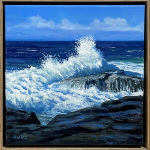
In the painting below I used physical and visual texture to paint the foreground next to the river. I first painted a thin coat of grays and dull greens to give the illusion of rocks, soil, grass and so on. Then I loaded my brush and applied thick dabs of dull yellows to render the plants in the foreground. This creates an interesting contrast between smooth and thick textures.


Taking Advantage of the Physical Texture of Your Paints
The main purpose of painting is to create the illusion of a three-dimensional subject on a flat surface. But, that does not mean you should ignore the physical properties of your paints.
Paint that has been applied smoothly across the canvas appears very different to paint which has been applied in a thick, impasto fashion. A general guideline I find useful is to try and match the physical texture of my paint to the characteristics of the subject I am painting.
Smooth texture can be useful for painting calm, out-of-focus, dark or distant areas. In my painting below, observe the smooth texture of the sky, clouds and distant trees.


Thick texture can be useful for painting dramatic, emotional, active or close areas. Going back to the above painting as an example, I built up thick texture in the foreground using a palette knife to create a sense of depth in the painting. The idea was to have a progression from rough, to medium to smooth texture as you go from the foreground through to the background.


Impasto texture also creates tiny shadows on the canvas depending on the direction of the light. This can produce some interesting results.
Creating the Illusion of Texture
There is only so much value you can get out of the physical texture of your paints. Usually, you will need to call on the help of the other visual elements to create the illusion of texture. This involves the clever arrangement of colors, contrast, brushwork, shapes and so on to mimic the texture of the subject you are painting.
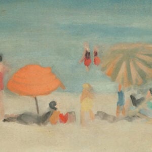
For example, if you were painting glassy, calm water, you could use long, consistent strokes of high-key colors with very little contrast. This is demonstrated in the harmonious painting below by Claude Monet:

On the other hand, if you were painting the turbulent seas, you could use short, choppy strokes of varied colors with a sharp contrast between the elements. Frederick Waugh was a master of this.

Specific Examples of How to Use Texture in Art
Below are some specific examples of how I incorporate texture in my paintings.
Clouds: I like to use thick texture for clouds, contrasted against a relatively smooth texture for the general sky. This creates a nice sense of depth. I also use thicker paint for areas which are hit by light and leave the shaded areas of the clouds a bit thinner.

Grass: I take advantage of visible brushwork and subtle changes in color to mimic the texture of grass. A useful technique is to grab a large flat or filbert brush and load it with varied colors (greens, yellows, grays). I use bold strokes to create the illusion of glass clusters.
Water: For turbulent water, I use thick paint which mimics the general flow of the water. I really try to feel how the water is moving and my brush will often follow this movement. For areas which are calmer, I use less texture and contrast. If you want to read more about this, then you should check out my post on painting realistic water.

Blue Sky: I use a smooth texture for a clear, blue sky but that does not mean I ignore brushwork altogether. I take advantage of subtle brushwork to create some kind of interest throughout the sky. Otherwise, large areas of monotonous color may appear overly bland.
Buildings: I often use a relatively thick texture for buildings to create a sense of depth in the painting (this bring the buildings forward in perspective). The palette knife can come in handy here for painting thick, clean blocks of color.
Rocks: When painting the highlights on rocks, I often use the palette knife to scrape thick paint over a dark base color. These broken colors closely mimic the way the light hits the edges of the rocks.
Want to Learn More?
You might be interested in my Painting Academy course. I’ll walk you through the time-tested fundamentals of painting. It’s perfect for absolute beginner to intermediate painters.
Thanks for Reading!
I appreciate you taking the time to read this post and I hope you found it helpful. Feel free to share it with friends.
Happy painting!
Dan Scott

Draw Paint Academy
thanks u have helped us all old and new ??
Thanks Paul
Thanks, Dan, for being so generous with sharing your painting techniques. I have learned a lot from your posts.
Glad to hear Linda thanks!
Thanks a lot Dan for your generous and continuing sharing of painting knowledge . They are very helpful and grateful. I am really appreciated from bottom of my heart.
winnie
Thanks Winnie means a lot! Dan
Thank you so much for the very helpful informations. You are helping me grow as an artist.
Thanks a lot, Dan! It is an excellent post! However I am not an absolute beginner I learnt a lot from you.
Best : Imola
Glad to hear thanks Imola!
Thank you so much for this! I’m so glad i got to read your article..