
This is a detailed guide on color schemes. I’ll discuss what they are, the different types, and provide master examples.
- What Are Color Schemes in Art?
- Analogous Color Scheme
- Complementary Color Scheme
- Split-Complementary Color Scheme
- Triadic Color Scheme
- Rectangular Color Scheme
- Monochromatic Color Scheme
- Thanks for Reading!
What Are Color Schemes in Art?
A color scheme is used to describe the overall selection of colors in an artwork. The major color schemes in art are analogous, complementary, split-complementary, triadic, rectangular and monochromatic. These color schemes utilize colors at certain locations on the color wheel.
Before I get into it, I should point out that I don’t really think about color schemes all that much whilst I’m painting. Color is not so simple that you can just apply a color scheme and everything will work out. But it is important that you understand what the popular color schemes mean as they are frequently referenced to describe the use of color in art.
Analogous Color Scheme

An analogous color scheme uses colors which are next to each other on the color wheel. For example, blues and greens, or oranges and yellows. These colors have a close relationship with each other.
There is not that much hue contrast between analogous colors, so you need to make sure you are creating enough contrast using the other elements like value or saturation.
When I think of analogous colors, Claude Monet’s paintings first come to mind. In this painting, Monet used mostly blues and some greens. There is hardly any hue contrast in this painting. Monet relied more so on value and saturation contrast.

Below is one of Monet’s paintings from his water lilies series. It features all kinds of greens, blues and purples. There are some red accents used for the flowers, but I still consider this to be an analogous painting as red is not a dominant color here.

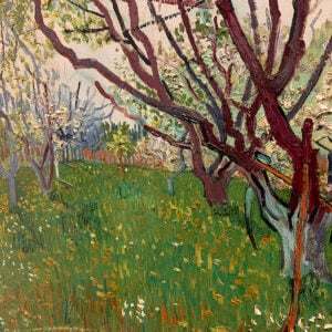
In Vincent van Gogh’s flower painting below, he used an analogous color scheme of yellows and greens. He also made clever use of line to outline the flowers.

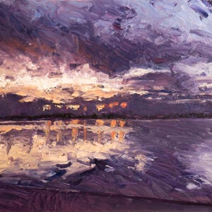
Below is a warm analogous color scheme with mostly reds, oranges and blacks.

Complementary Color Scheme

Complementary colors are opposite each other on the color wheel. When placed next to each other, there is an extremely strong contrasting and vibrant effect. If overused, your painting may become jarring and uncomfortable to look at.
You should select a dominant color and use the other color as an accent. In van Gogh’s sunflower painting below, he used a dull background of blue to complement the orange for the flowers.

Here is another example of an orange and blue complementary color scheme. In this case, both colors are relatively strong and they fight for your attention.

Below is a more subtle blue and orange complementary color scheme by John Singer Sargent. The blues of the water complement the oranges of the female subject and the shore.

The painting below by Childe Hassam demonstrates just how sophisticated a complementary color scheme can look. Hassam used directional brushwork, broken color and value contrast to create such interest with so few colors.

Split-Complementary Color Scheme

A split-complementary color scheme utilizes a base color and two secondary colors. It is similar to the complementary color scheme, but one of the complements is split.
Below is an example of a split-complementary color scheme by Claude Monet, with orange contrasting against the greens and blues.

Triadic Color Scheme

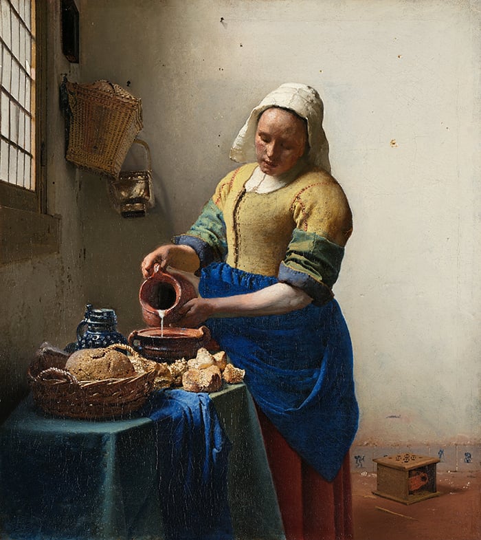
A triadic color scheme utilizes colors which are evenly spaced on the color wheel. For example, yellow, blue and orange, like in the painting below by Johannes Vermeer.
If using a triadic color scheme, I suggest you pick a dominant color and two secondary colors. Otherwise, it would be tricky to balance all three colors without it appearing jarring to look at.
Rectangular Color Scheme

A rectangular color scheme utilizes four colors positioned around the color wheel in the shape of a rectangle. This is a tricky color scheme to manage, as there are four colors involved.
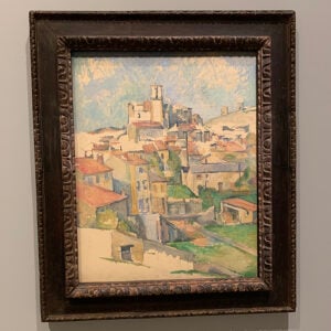
Monet’s painting below of poplars features a rectangular color scheme of orange, yellow, green and purple. However, the purple is fairly weak and used more so as a secondary color to complement the stronger greens, yellows and oranges.

In the painting below by van Gogh, there are four fairly distinct color shapes – yellow for the flowers, green for the vase, blue-green for the wall and a dull orange for the desk.
")
Monochromatic Color Scheme
A monochromatic color scheme utilizes just one color with varying levels of saturation and value. In oil painting, many artists start with a monochromatic layer then build color on top. This way, the value structure can be established without having to worry about multiple colors.
Below are two examples of almost monochrome color schemes for the painting below, with their being mostly varying tones of blue. But there is some hue variance.


Thanks for Reading!
I appreciate you taking the time to read this post and I hope you found it helpful. Feel free to share it with friends. If you ever want to learn more, check out my Painting Academy course.
Happy painting!
Dan Scott

Draw Paint Academy
Thankyou. All of this colour wheel information, complete with pictorial references has broken the code for me at last. I think I understand now. Thankyou again
your welcome beibi
This is the best reference I have read regarding colour theory! Thank you so much.
lovely put
A Rectangle Color Scheme is called a Tetradic or Double Complementary Color Scheme
Before your article my colors have been random, now you give me direction! Thanks
Thanku very much…I actually understood what I was reading for once 😁
Really appreciated
Cheers Kaz
This is truly helpful
It is a very good and important colour lesson to learn thoroughly and retain.
Thank you Dan
For stable color tones, monochromatic is the best to select.
ive been trying to teach myself color schemes since ive mostly been trying to make them up myself this has helped a lot. thank you!
CAN SOME ONE TELL ME ONE THING THEY LEARNED.
This helped me alot, Thxs Beibi :& this website made me hard.
If you don’t think about color schemes while painting, what ARE you thinking regarding color as you paint?
Thanks…this is good stuff
JRS
Very helpful. Thanks! But/and, Yellow, Blue and Orange, are not equidistant on the color wheel. How are they triadic? Seems like the “orange” is really a slightly orangey red?
I see your point, but I think that like the blues of the composition by Vermeer you can see the dark shaded blues of the jar, the tinted blues of the table cloth and the intense blues of her apron set against the yellowish tones of the blouse, straw basket, and bread with accents of the “redish” hues of her dress and terracotta pottery, which plays into the ~60/40/10 “rule” of color theory.
Perhaps word choice from orange to reddish would be a good edit.
I’m so pleased and happy with this knowledge and examples thanks a lot
Thanks Dan – still getting my head around it – especially the split complementary colour scheme. Not sure if this has to have two secondary colours in it or if I am overthinking? Anyway- there will always be those who comment badly – however- your post is great! Thanks for sharing
Thank you for this detailed post. Well-articulated and helpful. I also believe that knowing how to use color effectively is an essential skill for any artist. Color can be used to create moods or to evoke emotions. Different color combinations can be used to create a visually exciting image or to convey a certain message. A good color scheme can make a piece of artwork much more powerful. Having a basic understanding of color theory, the principles of color harmony, and color psychology can help you create a successful art piece. With the help of a color wheel, you can easily create a great color scheme.