
Many beginner painters start out just trying to paint those bright, sunny days. But it is the days when the weather is miserable which can make for fantastic painting inspiration.
You get a completely different spectrum of colors and emotions with bad weather. The grays come out in full force, with touches of bright reds, yellows, greens and oranges. These scenes are also perfect for learning how to paint ambiance. This post will go over the following:
- What to Look for When Painting a Bad Weather Scene
- Working With Gray
- Relaxing Your Painting Style
- Experiment With Color
- Thanks for Reading!
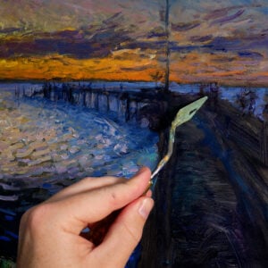
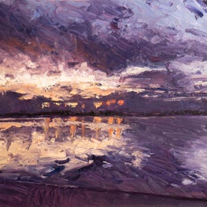
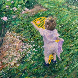
Check out these three paintings which were all based on stormy or otherwise miserable days.
, Oil On Canvas, Daniel Scott")
, Oil On Canvas, Daniel Scott")

What to Look for When Painting a Bad Weather Scene
The general principles of selecting your scene to paint are still the same, regardless of the weather. You need to pick an interesting composition with consideration to color combinations and other art fundamentals.
What I like to look for is interesting contrasts in color, usually in the form of sunlight breaking through the dull and gray clouds. Using your knowledge of color theory, you can really enhance your light areas by using complementary colors (for example, orange light bursting through toned, blue clouds).
With these scenes, I am not that interested in finding complex objects to paint. I am much more interested in how light is portrayed in the scene.
Working With Gray
One of the reasons painting bad weather scenes is so interesting is the vast range of grays you get to make use of. I like to start by mixing all three primary colors (red, yellow and blue) and a touch of white. This will give me a nice neutral gray. From here I add a tint of my dominant color depending on what I want the painting to look like. For example, I might want the painting to have a green dominance, so I will add a tint of green to my gray.
Now the key to keeping your painting interesting is to make sure you use many different variations of the gray. Do not just use the same all the way through the painting. Add in some more white, some different tints, some more saturation, etc. The whole beauty of painting bad weather scenes is the variation.
Relaxing Your Painting Style
I find painting bad weather scenes is the perfect way to loosen up and relax your painting style.
On bright, sunny days, the level of detail is very clear and you could end up painting very tight. But when you are painting a bad weather scene, everything will appear slightly out of focus due to the poor lighting and general ambiance. This will help you focus less on the tedious details and more on the overall composition.
Experiment With Color
Painting bad weather is a great chance to experiment with colors you don’t usually use.
I urge you to challenge yourself by trying to paint scenes with colors you would not usually use. For example, if you rarely paint with orange, then try and find a scene with orange sunlight bursting through the clouds.
I find it can be very easy to fall into a routine with color selections. It is important to learn how to use certain colors well, but you also need to learn how to use a wide range of colors.
What are your thoughts? Do you find painting inspiration from gloomy, stormy scenes or do you prefer the bright sunny days? If you have any tips for painting bad weather scenes please share them in the comment section.
Thanks for Reading!
Thanks for taking the time to read this post. I appreciate it! Feel free to share with friends. If you want more painting tips, check out my Painting Academy course.
Happy painting!
Dan Scott
Draw Paint Academy

My favourite dark colour is a mix of Prussian blue, viridian and cadmium red. My mixing it incompletely it enhances the character and gives it some sparkle. Handy for bad weather paintings, especially in the foreground.
Interesting mix Norm. I will have to try it myself (but will need to go buy some Prussion blue – never used this before).
Dan