
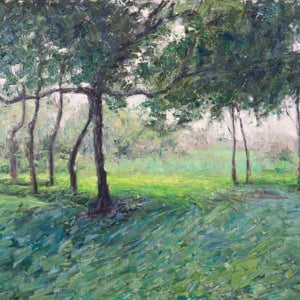
Cool/warm generally refers to the position of a color on a color wheel. Half of the color wheel is cool (purple to green) and the other half is warm (green-yellow to red).
By using colors just from either the warm or cool side of the color wheel, you can achieve interesting color harmonies. For example, Claude Monet used a cool analogous color harmony in many of his paintings, using many variations of greens, blues and purples. The result of this is a very calming and peaceful harmony.
The balance between cool and warm in your painting is very important, arguably more so than the actual colors you decide to use. This is because of the contrasting emotions warm and cool colors evoke and the role of warm and cool colors in establishing the overall composition of your painting.
When you are mixing your colors, one question you should always ask yourself is how warm or cool do you want the color to be.
Want to Learn More?
You might be interested in my Painting Academy course. I’ll walk you through the time-tested fundamentals of painting. It’s perfect for absolute beginner to intermediate painters.
Thanks for Reading!
I appreciate you taking the time to read this post and I hope you found it helpful. Feel free to share it with friends.
Happy painting!
Dan Scott

Draw Paint Academy


May I use this information in a book I am putting together. I teach a class in watercolor at an Adult Center and would like to use this if possible. Thank you
Hi Joan! Sure, just refer back to me and this website.
Cheers!
Dan